Writing about the building of Innistrad is a difficult task. First off, it took place a couple years ago, and my memory has never really been particularly good to begin with and the passage of time really hasn't helped, so I'm finding that there's a lot of sifting necessary to find nuggets worth mentioning. Second, there are aspects of the task that just aren't interesting to write about. There's a real danger of the whole thing devolving into a list in paragraph form of everything I was responsible form — I drew this building, and then I drew this tree, and then I drew this monster, and so forth. That type of thing isn't really interesting to read or write, and so there's a lot of summing up that was done to make it less mind-numbing. While resulting in a tighter narrative, my editing efforts resulted in the omission of some interesting anecdotes due to the fact that they either brought the tale to a screeching halt, or required rather elaborate and eye-rolling segues. Still, I wanted to share some of these things because I thought they added a certain something to the mix. So, despite attempting to avoid a list-like post, I now bring you an actual list.
• The hellhound concept drawings were the very first time I've ever colored something digitally. Sure, to that point I'd done a bunch of digital value studies, but nothing in color. The result of my efforts is quick, dirty and not very polished, but I think it got the point across. I guess the fine folks at Wizards agreed as they didn't ask Daarken to redo it.
• By far my favorite image created during the three weeks came out of an exploration Steve Prescott was doing of treants. For those who just scratched their head and raised an eyebrow, a treant is basically just an ent. You know, those tree guys from Lord of the Rings? Those things. Steve took on the task of trying to create a unique look for them in Innistrad, and came up with a fairly wide variety. The race as a whole was later dropped, but not before Steve did a priceless image which consisted of an upright log that had a pair of sexy, female human legs complete fishnets and high heels sticking out the bottom of it. Obviously it loses something in my description, but it tickled my funnybone and I really hope Steve chooses to share the image on his sketch blog sometime.
• As I believe I've mentioned before, I often watch movies while I work, and my three weeks during the concept push were no exception. The obvious difference being that I wasn't the only member of the audience. Whenever consensus dictated, I'd pop a DVD into the computer and we'd watch something that was in some way pertinent (or not), to the task at hand. Some of the films we watched included but were not limited to: Brotherhood of the Wolf, Bram Stoker's Dracula and The Last of the Mohicans (which Steve managed to tarnish for me by pointing out a cloth rock that ripples as Daniel Day Lewis runs past it during the climactic foot chase). While watching these movies, we'd close the door to the room so as to keep from disturbing the rest of the office, and the lack of air circulation that resulted caused the room to heat up to somewhere in the area of a thousand degrees. The sweat was worth the entertainment, though.
• Matt Cavotta was, in fact, the fourth member of the concepting team, though he was trying to do his part remotely from Ohio. Due to his separation, he was completely cut off from the rest of us, and periodically would send sketches in blindly. I attempted several times to get images of our work out to him via email and text message, but none of them ever went through, so I'm sure he felt like he was spinning his wheels. But I think he had other things on his mind, anyway. While working on the world, he was also going through the application and interview process for the staff job he now holds at Wizards. I'm guessing he was more than a little overwhelmed at the time. I know I'd have been.
• One day, Mark Purvis popped his head in to say hello. Mark is a brand manager for Magic and for some reason began talking about Japan as though we'd all been to tournaments there. I believe at the time, only Daarken had, and Steve and I were more than happy to let him know that we hadn't yet been and were absolutely interested. I'm not sure if a direct line can be traced to this chance meeting, our conversation, and my eventual trip to Nagoya (where I'd again meet Mark), but it can't all be a coincidence...can it?
• I consumed a lot of caffeine while working at Wizards. Almost without fail, there was either coffee, tea, or Coke sitting on my desk. I'm not sure why I found it so necessary to keep my caffeine levels so high (maybe it had something to do with the warm room and the late nights painting the Badass: Birth of a Legend cover in my hotel room), but I'd have gotten next to nothing done if it weren't for the constant pick-me-up. Next to the ubiquitous caffeinated beverage was an apple which I took from the front desk of our hotel each morning. These apples were complimentary and I generally took one to supplement the days when my lunch was self-catered (and thus lackluster). The upside, however, was that no matter who provided the lunch, I could always look forward to the free cookies which replaced the apples each evening at the hotel's front desk. Steve, Daarken, and I greedily gorged on these cookies with a great deal of satisfaction after a long day's work, and in preparation of the work that each of us had ahead of us in our respective hotel rooms each night.

The Work and Musings of Illustrator Steven Belledin
Friday, June 29, 2012
Thursday, June 21, 2012
Closing the Door On Innistrad, Part 3
Hopefully you've noticed that this is part 3. It's sort of the end. The beginning can be found here. The middle can be found here. If you haven't already done so, go back and read those other bits so this bit makes more sense (assuming it makes any sense to begin with).
Anyway...
Truth be told, Steve Prescott had done a great deal of ground work for the human costuming. He'd also done a good job of building on the designs of the vampires and their corner of the world. While Mike Lim and I attempted to add to this stuff a bit, it became fairly obvious early on that we weren't going to be contributing much, as Steve had pretty much nailed it. So, we spent our time asking ourselves what priests or mages would wear and then trying to come up with corresponding drawings to answer those questions.
From there, Steve and Mike spent some time designing the werewolves. This I avoided like the plague, and it turned out that I could afford to as they'd managed to find a direction that I thought really worked, and the Wizards team agreed. Relieved that I could avoid that subject, I moved on. I had a hankering to start working on some landscapes and architecture.
*Record scratch*
Architecture? Seriously? Steve Belledin working on buildings? That's like Superman brushing his teeth with Kryptonite toothpaste for the fun of it! Seriously? Yup. Can't say why, but it was the one thing I was sure about design-wise and I set out to pin it down as much as possible. Plus, at the time, no one else seemed interested in taking it on. My inspiration was largely Prussian and Germanic architecture, with a gothic churchy vibe mixed in. It's fairly well trodden ground, but I knew I could provide a decent baseline for future illustrators to build on, and my fellow concept artists didn't seem to argue. These drawings took an inordinate amount of time — especially due to my refusal to use a ruler for much of them — but I'm pretty happy with them on the whole.
The landscapes were based off of strange memories of Universal monster movies, and parts of England and New Zealand I've seen. Both Steve and Mike added to this pile of imagery and we slowly started to get a real feel for what the world looked like — what it felt like. It's weird, but I feel that if a concepting team has done its job, you can easily imagine what a given place smells like. That's what I was striving for. I wanted people to smell the wood burning in fire places, the wet pine needles decaying on the ground, the odor of the damp grass as it's trodden upon. It's an element of the game, and indeed the world, that will never come completely across, but I was certainly thinking about it while I worked on the thing.
When concepting in-house at Wizards, there's a process involved. As drawings are finished, they are affixed to a long, magnetic dry-erase board that's somewhere in the neighborhood of 20-25 feet long. This is done using magnets that are one of the five colors of the Magic color pie, so that foresty stuff gets a green magnet, demony stuff gets a red magnet, and so forth. Over time, the board is divided into five sections. Everyday, we'd spend about fifteen minutes going over the progress and deciding what made the cut, what didn't, and what needed to be revised. Surprisingly, very little was ever changed, and though there was a small reject pile, most of what we did stayed on the board and eventually made it into the styleguide.
The free form nature of the three weeks is still surprising to me. We had no set things we were each responsible for. There was a list of needs that we strove to fulfill, but we were free to shift gears at any time and move on to something completely different should we grow tired of a given subject. As a result, we were never bored, and the list of needs for the set got shorter and shorter. We didn't even strictly stick to a given medium. Daarken did some pencil drawings (some of which have been confused with mine) and a bunch of digital concepts and paintings. I worked mostly in pencil, but did a watercolor painting then switched to digital when I worked on the geists and spirits. Prescott, on the other hand, stuck to pencil, and the mileage he put on that thing was phenomenal.
Admittedly, I am not the world's fastest drawer. Mike is pretty quick with his stylus and easily put me to shame as he was able to do a full-color image in the amount of time it took me to do a solid pencil drawing. Steve, on the other hand, would crank out page after page after page of concepts — often with two or three fully rendered drawings per page. I think at his peak he put out three pages to my one and I'm still amazed two years later.
Despite what felt like my lagging productivity, the three of us ended up covering the dry-erase board. We were told that our efforts had produced the most usable concepts from a single concept push in Magic history. Well, at least to that point. But we weren't satisfied. We continued until we'd covered much of the wall, as well.
While three weeks seems like a long time, I assure you that it is not. The time flew by and before I knew it, I was checking out of the hotel and on my way to the airport. Steve left the next day, but Mike had signed on for four weeks, so he was left to do some clean up work and refinement. Before long, he was gone too, and Richard began to fill in gaps. If he didn't do the work himself, he farmed the work out to other folks like Wayne Reynolds or Vincent Proce. Additional folks who had their fingers in the punch bowl include Matt Cavotta, Adam Paquette, James Paick, and Jung Ho Park.
Eventually, the work got compiled into the styleguide, the styleguide got sent to all the Magic artists working on the world, and their efforts, in turn, resulted in the Innistrad, Dark Ascension, and Avacyn Restored sets of Magic. Six hundred, seventy-four pieces of art, not including that which was produced for promotional cards, packaging and advertisements were created (link). I'm sure that if those other things were counted, you'd easily end up with a clean seven-hundred or so. It's daunting to think about what goes into a set on the front end, and what that translates to when it's all said and done. Either way, I'm tickled to know that my efforts helped Innistrad come to be.
I'm not sure if I'll ever get another crack at helping to create a new Magic plane, but I'm grateful to have gotten the opportunity for this one. The three weeks I spent working with those other guys were among the most fun I've had in my career. It was quite reminiscent of my years at Pratt Institute, bouncing ideas off of other artists, swapping input, and watching movies together (both bad and good), while getting our work done. It made me wish that I could afford to share a studio with other artists every day in hopes to keep some of that going. But another part of me is content with the fact that only sounds in my studio right now are the humming of the ceiling fan and the clicking of the keys under my fingers as I write this.
Despite the fact that the fun of the concept push was over, the fun that the set would provide would continue. After all, I got to work and play in that world for the next year. And so did everyone else. I have been utterly amazed to see where all the other artists took our raw designs and ideas. It has been awe-inspiring to say the least. Unfortunately, however, with the release of the last set, Avacyn Restored, even that fun has come to an end, and I have to say that I'm sad to see Innistrad go. The entire year was a blast. Still, there's much to look forward to. Before long, a new styleguide will arrive at my door, and with it will come the excitement and joy of unwrapping a whole new world and getting to play in its recesses for a while. Man, it's going to be sweet! But that's not all.
The biggest side-effect of this experience has been that I've discovered the bliss of building new worlds just for myself.
Anyway...
Truth be told, Steve Prescott had done a great deal of ground work for the human costuming. He'd also done a good job of building on the designs of the vampires and their corner of the world. While Mike Lim and I attempted to add to this stuff a bit, it became fairly obvious early on that we weren't going to be contributing much, as Steve had pretty much nailed it. So, we spent our time asking ourselves what priests or mages would wear and then trying to come up with corresponding drawings to answer those questions.
From there, Steve and Mike spent some time designing the werewolves. This I avoided like the plague, and it turned out that I could afford to as they'd managed to find a direction that I thought really worked, and the Wizards team agreed. Relieved that I could avoid that subject, I moved on. I had a hankering to start working on some landscapes and architecture.
 |
| ©Wizards of the Coast |
*Record scratch*
Architecture? Seriously? Steve Belledin working on buildings? That's like Superman brushing his teeth with Kryptonite toothpaste for the fun of it! Seriously? Yup. Can't say why, but it was the one thing I was sure about design-wise and I set out to pin it down as much as possible. Plus, at the time, no one else seemed interested in taking it on. My inspiration was largely Prussian and Germanic architecture, with a gothic churchy vibe mixed in. It's fairly well trodden ground, but I knew I could provide a decent baseline for future illustrators to build on, and my fellow concept artists didn't seem to argue. These drawings took an inordinate amount of time — especially due to my refusal to use a ruler for much of them — but I'm pretty happy with them on the whole.
The landscapes were based off of strange memories of Universal monster movies, and parts of England and New Zealand I've seen. Both Steve and Mike added to this pile of imagery and we slowly started to get a real feel for what the world looked like — what it felt like. It's weird, but I feel that if a concepting team has done its job, you can easily imagine what a given place smells like. That's what I was striving for. I wanted people to smell the wood burning in fire places, the wet pine needles decaying on the ground, the odor of the damp grass as it's trodden upon. It's an element of the game, and indeed the world, that will never come completely across, but I was certainly thinking about it while I worked on the thing.
 |
| ©Wizards of the Coast |
When concepting in-house at Wizards, there's a process involved. As drawings are finished, they are affixed to a long, magnetic dry-erase board that's somewhere in the neighborhood of 20-25 feet long. This is done using magnets that are one of the five colors of the Magic color pie, so that foresty stuff gets a green magnet, demony stuff gets a red magnet, and so forth. Over time, the board is divided into five sections. Everyday, we'd spend about fifteen minutes going over the progress and deciding what made the cut, what didn't, and what needed to be revised. Surprisingly, very little was ever changed, and though there was a small reject pile, most of what we did stayed on the board and eventually made it into the styleguide.
 |
| ©Wizards of the Coast |
The free form nature of the three weeks is still surprising to me. We had no set things we were each responsible for. There was a list of needs that we strove to fulfill, but we were free to shift gears at any time and move on to something completely different should we grow tired of a given subject. As a result, we were never bored, and the list of needs for the set got shorter and shorter. We didn't even strictly stick to a given medium. Daarken did some pencil drawings (some of which have been confused with mine) and a bunch of digital concepts and paintings. I worked mostly in pencil, but did a watercolor painting then switched to digital when I worked on the geists and spirits. Prescott, on the other hand, stuck to pencil, and the mileage he put on that thing was phenomenal.
Admittedly, I am not the world's fastest drawer. Mike is pretty quick with his stylus and easily put me to shame as he was able to do a full-color image in the amount of time it took me to do a solid pencil drawing. Steve, on the other hand, would crank out page after page after page of concepts — often with two or three fully rendered drawings per page. I think at his peak he put out three pages to my one and I'm still amazed two years later.
 |
| ©Wizards of the Coast |
Despite what felt like my lagging productivity, the three of us ended up covering the dry-erase board. We were told that our efforts had produced the most usable concepts from a single concept push in Magic history. Well, at least to that point. But we weren't satisfied. We continued until we'd covered much of the wall, as well.
While three weeks seems like a long time, I assure you that it is not. The time flew by and before I knew it, I was checking out of the hotel and on my way to the airport. Steve left the next day, but Mike had signed on for four weeks, so he was left to do some clean up work and refinement. Before long, he was gone too, and Richard began to fill in gaps. If he didn't do the work himself, he farmed the work out to other folks like Wayne Reynolds or Vincent Proce. Additional folks who had their fingers in the punch bowl include Matt Cavotta, Adam Paquette, James Paick, and Jung Ho Park.
Eventually, the work got compiled into the styleguide, the styleguide got sent to all the Magic artists working on the world, and their efforts, in turn, resulted in the Innistrad, Dark Ascension, and Avacyn Restored sets of Magic. Six hundred, seventy-four pieces of art, not including that which was produced for promotional cards, packaging and advertisements were created (link). I'm sure that if those other things were counted, you'd easily end up with a clean seven-hundred or so. It's daunting to think about what goes into a set on the front end, and what that translates to when it's all said and done. Either way, I'm tickled to know that my efforts helped Innistrad come to be.
 |
| ©Wizards of the Coast |
I'm not sure if I'll ever get another crack at helping to create a new Magic plane, but I'm grateful to have gotten the opportunity for this one. The three weeks I spent working with those other guys were among the most fun I've had in my career. It was quite reminiscent of my years at Pratt Institute, bouncing ideas off of other artists, swapping input, and watching movies together (both bad and good), while getting our work done. It made me wish that I could afford to share a studio with other artists every day in hopes to keep some of that going. But another part of me is content with the fact that only sounds in my studio right now are the humming of the ceiling fan and the clicking of the keys under my fingers as I write this.
Despite the fact that the fun of the concept push was over, the fun that the set would provide would continue. After all, I got to work and play in that world for the next year. And so did everyone else. I have been utterly amazed to see where all the other artists took our raw designs and ideas. It has been awe-inspiring to say the least. Unfortunately, however, with the release of the last set, Avacyn Restored, even that fun has come to an end, and I have to say that I'm sad to see Innistrad go. The entire year was a blast. Still, there's much to look forward to. Before long, a new styleguide will arrive at my door, and with it will come the excitement and joy of unwrapping a whole new world and getting to play in its recesses for a while. Man, it's going to be sweet! But that's not all.
The biggest side-effect of this experience has been that I've discovered the bliss of building new worlds just for myself.
 | ||
| ©Adam Lee From left to right: Richard Whitters, Mike "Daarken" Lim, Steve Prescott, and some other art nerd. |
Wednesday, June 20, 2012
Closing the Door On Innistrad, Part 2
If you haven't caught part one of this tale, it can be found here. If you have read that first part (or at least pretended to read it and looked at the pictures), check out the second part below.
Wizards of the Coast's offices are an odd mix of corporate architecture and gaming wonderland. The fact that there are cubicles throughout belies the head space of those who dwell within. Take a peak into any given workspace and you'll find more gaming and fanboy odds and ends crammed into the various shelves and cabinets than your average booth at a comic convention. A dragon statuette here, some DnD miniatures there, and posters and product pinned to just about every wall imaginable. It's a little overwhelming aesthetically, as there's just so much to look at, and a man like me can get lost in picking over someone's Happy Meal toy or assorted PEZ dispenser collection.
The Magic writing and art team sit clumped together and are arranged adjacent to a couple of empty rooms that I believe were designed to be private offices, but instead one room provides a place for visiting artists to work while the other functions as what might just be the world's most cramped conference room.
I was the second artist to arrive on the scene and while waiting for instructions found Steve Prescott's belongings tossed casually into a cubicle opposite the artist bullpen where I was to make my home. The bullpen consisted of two work stations with a computer and WACOM tablet a piece, two drafting tables, and a shelf containing various art supplies that could just as easily be found in the supply closet of a day camp's arts and crafts center (minus the glitter). I took one station and awaited Daarken's arrival before settling in. I figured I'd give him the opportunity to swap if he wanted to, but it turns out that one station was supplied with a far more modern tablet that was clearly intended for him, leaving me to take the station with the more primeval tablet. I tried to make myself at home and unpacked my sketchbook, pens and pencils.
Steve Prescott had been there a full day ahead of me and had jumped into the deep end upon arrival. He filled me in on the wide variety of stuff he'd been working on, which was pretty awesome indeed. We caught up, talked a little about the direction of the set, and began leafing through the many books collected on the shelves for research and inspiration. With a bit more direction in mind, I also took some time to pour through Google Images for anything I could get my hands on that felt right.
Daarken eventually arrived later that day, but he wasn't alone. With him was his very lovely wife, Midori, who I learned would also be sharing our space from time to time. While it might sound like that would make for a cramped work environment, it surprisingly was anything but. In fact, before long, irritated by what I can only assume was separation anxiety, Steve joined us in the bullpen and three became four. The room from that point forward could best be described as cozy and blazingly hot.
With all parties present and accounted for, we finally got the official brief with all the writers, art directors, artists, and research and development folks in one room. This is where we learned the following things:
•The world was to have among other things as inspiration, 18th century Prussia.
•The world was almost constantly about 45-50 degrees Fahrenheit.
•The world was to be built entirely around horror tropes.
•These tropes included, but were not limited to: werewolves, vampires, mad scientists, zombies, Frankenstein's monsters, ghosts, devils, and demons.
•There was a religion having something to do with angels (this was still being fleshed out).
•This was the home world of the vampire planeswalker, Sorin Markov.
I remember furiously writing notes down during this meeting. Notes which I don't believe I ever looked at again. I had gotten the gist, which was the important part, and the notes seemed less important as we went along. Truth be told, I was itching to get to work, but before the work truly began in earnest, Steve, Mike and I spent some time tossing around ideas on where to begin. I mean, how do you start to visually define an entire world? What's the most important thing to nail first?
As I mentioned, Steve had done this before, and Mike has a great deal of concepting experience, as well. I was the neophyte on the team, so I likely was the only one who was completely clueless. Aside from the list of influences, we knew what Sorin Markov looked like, so we had some real tangible ideas for vampires. Outside of that, we would be making it all up as we went along. Steve suggested that getting the humans and their costuming right was paramount. Figuring out how the people dressed, what their tools and weapons looked like, etc., would help inform the rest of the world and how the humans had shaped it. It would also probably help us develop the zombies, as well as further develop the vampire race. I appreciated the simple logic in this and Mike seemed to nod in agreement so, with that, all three of us went to work.
Now, a quick aside. Steve Prescott and I have a certain level of comfort with one another. We tend to joke around, poke fun and say generally horrible things. It's just what we do. Our souls drip with sarcasm and the need to force other people to bathe in said sarcasm. We can't help it, it's in our nature. Daarken, on the other hand, is a very quiet guy. Even in our discussions about direction, his contributions were pretty brief and typically verbally minimalist. It didn't help that he was suffering from an epic cold. Having two idiots bantering back and forth around him probably didn't make him feel any better.
Midori, on the other hand, is pretty outgoing by comparison. She was willing to talk, if only to keep boredom at bay, which I assure you was a task beyond my own abilities, at times. Unfortunately, she was sharing custody with Daarken's cold, and it was clearly playing one parent against the other.
The point is that it took a while for Mr. Lim to warm up to Steve and me. I suspect he didn't quite know what to make of us at first, and who could blame him? There was probably part of him that hoped every morning that Steve and I wouldn't show up, thus leaving him in relative peace. Still, by the end of our three weeks in that little room, he was slinging zingers with the rest of us, and I'm happy to say that I got to know him a bit, as a result.
Anyway, with a direction and a starting point established, the three of us began to chip away at the world of Innistrad, revealing each secret in turn. And while our starting point was the same, we quickly branched out and began covering ground rapidly.
Wizards of the Coast's offices are an odd mix of corporate architecture and gaming wonderland. The fact that there are cubicles throughout belies the head space of those who dwell within. Take a peak into any given workspace and you'll find more gaming and fanboy odds and ends crammed into the various shelves and cabinets than your average booth at a comic convention. A dragon statuette here, some DnD miniatures there, and posters and product pinned to just about every wall imaginable. It's a little overwhelming aesthetically, as there's just so much to look at, and a man like me can get lost in picking over someone's Happy Meal toy or assorted PEZ dispenser collection.
 |
| ©Wizards of the Coast |
The Magic writing and art team sit clumped together and are arranged adjacent to a couple of empty rooms that I believe were designed to be private offices, but instead one room provides a place for visiting artists to work while the other functions as what might just be the world's most cramped conference room.
I was the second artist to arrive on the scene and while waiting for instructions found Steve Prescott's belongings tossed casually into a cubicle opposite the artist bullpen where I was to make my home. The bullpen consisted of two work stations with a computer and WACOM tablet a piece, two drafting tables, and a shelf containing various art supplies that could just as easily be found in the supply closet of a day camp's arts and crafts center (minus the glitter). I took one station and awaited Daarken's arrival before settling in. I figured I'd give him the opportunity to swap if he wanted to, but it turns out that one station was supplied with a far more modern tablet that was clearly intended for him, leaving me to take the station with the more primeval tablet. I tried to make myself at home and unpacked my sketchbook, pens and pencils.
 |
| ©Wizards of the Coast |
Steve Prescott had been there a full day ahead of me and had jumped into the deep end upon arrival. He filled me in on the wide variety of stuff he'd been working on, which was pretty awesome indeed. We caught up, talked a little about the direction of the set, and began leafing through the many books collected on the shelves for research and inspiration. With a bit more direction in mind, I also took some time to pour through Google Images for anything I could get my hands on that felt right.
Daarken eventually arrived later that day, but he wasn't alone. With him was his very lovely wife, Midori, who I learned would also be sharing our space from time to time. While it might sound like that would make for a cramped work environment, it surprisingly was anything but. In fact, before long, irritated by what I can only assume was separation anxiety, Steve joined us in the bullpen and three became four. The room from that point forward could best be described as cozy and blazingly hot.
 |
| ©Wizards of the Coast |
With all parties present and accounted for, we finally got the official brief with all the writers, art directors, artists, and research and development folks in one room. This is where we learned the following things:
•The world was to have among other things as inspiration, 18th century Prussia.
•The world was almost constantly about 45-50 degrees Fahrenheit.
•The world was to be built entirely around horror tropes.
•These tropes included, but were not limited to: werewolves, vampires, mad scientists, zombies, Frankenstein's monsters, ghosts, devils, and demons.
•There was a religion having something to do with angels (this was still being fleshed out).
•This was the home world of the vampire planeswalker, Sorin Markov.
I remember furiously writing notes down during this meeting. Notes which I don't believe I ever looked at again. I had gotten the gist, which was the important part, and the notes seemed less important as we went along. Truth be told, I was itching to get to work, but before the work truly began in earnest, Steve, Mike and I spent some time tossing around ideas on where to begin. I mean, how do you start to visually define an entire world? What's the most important thing to nail first?
 |
| ©Wizards of the Coast |
As I mentioned, Steve had done this before, and Mike has a great deal of concepting experience, as well. I was the neophyte on the team, so I likely was the only one who was completely clueless. Aside from the list of influences, we knew what Sorin Markov looked like, so we had some real tangible ideas for vampires. Outside of that, we would be making it all up as we went along. Steve suggested that getting the humans and their costuming right was paramount. Figuring out how the people dressed, what their tools and weapons looked like, etc., would help inform the rest of the world and how the humans had shaped it. It would also probably help us develop the zombies, as well as further develop the vampire race. I appreciated the simple logic in this and Mike seemed to nod in agreement so, with that, all three of us went to work.
 |
| ©Wizards of the Coast |
Now, a quick aside. Steve Prescott and I have a certain level of comfort with one another. We tend to joke around, poke fun and say generally horrible things. It's just what we do. Our souls drip with sarcasm and the need to force other people to bathe in said sarcasm. We can't help it, it's in our nature. Daarken, on the other hand, is a very quiet guy. Even in our discussions about direction, his contributions were pretty brief and typically verbally minimalist. It didn't help that he was suffering from an epic cold. Having two idiots bantering back and forth around him probably didn't make him feel any better.
Midori, on the other hand, is pretty outgoing by comparison. She was willing to talk, if only to keep boredom at bay, which I assure you was a task beyond my own abilities, at times. Unfortunately, she was sharing custody with Daarken's cold, and it was clearly playing one parent against the other.
The point is that it took a while for Mr. Lim to warm up to Steve and me. I suspect he didn't quite know what to make of us at first, and who could blame him? There was probably part of him that hoped every morning that Steve and I wouldn't show up, thus leaving him in relative peace. Still, by the end of our three weeks in that little room, he was slinging zingers with the rest of us, and I'm happy to say that I got to know him a bit, as a result.
 |
| ©Wizards of the Coast |
Anyway, with a direction and a starting point established, the three of us began to chip away at the world of Innistrad, revealing each secret in turn. And while our starting point was the same, we quickly branched out and began covering ground rapidly.
Tuesday, June 19, 2012
Closing the Door On Innistrad, Part 1
The Innistrad expansion block of Magic: the Gathering has come to an end, and before I put it to rest, I want to go back to its beginning. At least my involvement in its beginning. Several times I've teased the idea of a post wherein I talk about the concepting process. I thought I'd write some fun stuff and maybe get the other guys involved to contribute. Possibly even do a round robin of articles for our various blogs or some such. Turns out that coordinating such things requires more time than I can currently afford to spend on the blog. While a post like this, where I simply ruminate on my own, can be done in fits and starts throughout my schedule, actually planning ahead has proven to be much more difficult. I just have too many projects to juggle right now. However, given Innistrad's waning relevance, it seemed imperative that I put something together. This and the next couple posts are that thing. Perhaps if I get called upon to contribute on another Magic concept push, I'll have the wherewithal and forethought to do a daily diary, but for now, for Innistrad, this post will just have to do.
In the beginning of May 2010, I found myself slogging through sketch changes to the cover for Badass: Birth of Legend, minding my own business. I want to stress that last part because I rarely look for trouble, and almost never go searching for major projects that will mess up an already full schedule. Unprecedented was the fact that I had actually planned out the timing for my various jobs fairly well so that I wouldn't be too stressed over time management and could actually enjoy the summer. Or so I'd thought. Richard Whitters had other plans.
Richard, for those of you who don't know, is the lead concept artist at Wizards of the Coast. He's got a staff job which requires him to endure sitting one cubicle wall away from Magic's art director, Jeremy Jarvis, and do whatever bidding is necessary. In short, he spends his days hunched over a pad of paper or a Wacom tablet creating many things that have come to fruition over his tenure, and many more that have not. He was also in charge of assembling a crack team of illustrators to help create the world that would eventually become Innistrad. Turns out I would be on this team.
I got the email from Richard inquiring as to whether I'd be able to spend three weeks at Wizards' offices doing concept work for the upcoming Magic block. I would need to be there in three weeks. Now, the fact that Richard emailed me with such short notice indicated that I wasn't his first choice. I don't know who or how many had turned him down up to that point, but it didn't really matter. I intended to say yes. While you'd think I might be incensed that I wasn't considered the pick of the litter, I wasn't. Experience has taught me to just keep my head down and try to do a good job when called upon. Being the third or fourth — or even tenth — person called doesn't matter. An opportunity is an opportunity, and you've got to make the most of those when they come.
I gave Richard the affirmative provided I could suss out the impact on my cover deadline, which thanks to the good graces of my art director at Harper Collins, I quickly managed to do. About a week after agreeing to join the team, my plane tickets were bought, my schedule was fixed, and my excitement finally subsided enough to recognize that I was missing a couple bits of vital information. First bit: what was the set's theme? Second bit: who would I be working with?
Richard provided the following information: 1. The set was to be gothic horror themed. This was all I could get out of him. 2. My fellow artists would be Steve Prescott and Mike "Daarken" Lim.
Steve Prescott
I've known Steve for quite a while, having first met him at GenCon eight or nine years ago, and he's one of the most likeable people I've ever known. As I believe I've said before, he also happens to be one of the most naturally gifted draftsmen I've ever met, to boot. The combination of talent and personality results in a guy you wish you could hate but simply can't. At least I can't. Of the three of us, I believe he was the only one who'd done work concepting for Magic before, as he'd done a great deal of excellent work for the Lorwyn/Shadowmoor block, much of which can be seen on his blog (link), as well as in his excellent book, Aggregate. Clearly Steve's roll was to be the foundation, the rock, the elder statesman, if you will.
Mike "Daarken" Lim
Up to this point, I'd only known the guy as "Daarken." If I'm honest, I didn't know his real name or much about him. I saw him once at the Spectrum show opening at the Museum of American Illustration at the Society of Illustrators a year or two before. Someone pointed him out to me, so I had an idea of what he looked like. At the time I felt like I should have gone over and introduced myself, but I was afraid he'd just stare blankly at me having no idea who I was or why I was wasting his time. I didn't get the sense that he was that kind of guy, I just made a rather bold (and it turns out, inaccurate) assumption. Either way, he was a mystery to me, and I was a little nervous about meeting and working along side him. It seemed to me that his role was two sided: he was the finisher and the guy who had mastered the mystical art of digital painting — a skill that Steve and I both lack.
After being filled in, I prepped myself for the long haul ahead: three weeks holed up in a hotel adjacent to the Wizards offices in Renton, Washington, drawing all day and painting a cover piece by night. If nothing else, I was going to be productive. At least I hoped.
 |
| ©Wizards of the Coast |
In the beginning of May 2010, I found myself slogging through sketch changes to the cover for Badass: Birth of Legend, minding my own business. I want to stress that last part because I rarely look for trouble, and almost never go searching for major projects that will mess up an already full schedule. Unprecedented was the fact that I had actually planned out the timing for my various jobs fairly well so that I wouldn't be too stressed over time management and could actually enjoy the summer. Or so I'd thought. Richard Whitters had other plans.
Richard, for those of you who don't know, is the lead concept artist at Wizards of the Coast. He's got a staff job which requires him to endure sitting one cubicle wall away from Magic's art director, Jeremy Jarvis, and do whatever bidding is necessary. In short, he spends his days hunched over a pad of paper or a Wacom tablet creating many things that have come to fruition over his tenure, and many more that have not. He was also in charge of assembling a crack team of illustrators to help create the world that would eventually become Innistrad. Turns out I would be on this team.
 |
| ©Wizards of the Coast |
I got the email from Richard inquiring as to whether I'd be able to spend three weeks at Wizards' offices doing concept work for the upcoming Magic block. I would need to be there in three weeks. Now, the fact that Richard emailed me with such short notice indicated that I wasn't his first choice. I don't know who or how many had turned him down up to that point, but it didn't really matter. I intended to say yes. While you'd think I might be incensed that I wasn't considered the pick of the litter, I wasn't. Experience has taught me to just keep my head down and try to do a good job when called upon. Being the third or fourth — or even tenth — person called doesn't matter. An opportunity is an opportunity, and you've got to make the most of those when they come.
I gave Richard the affirmative provided I could suss out the impact on my cover deadline, which thanks to the good graces of my art director at Harper Collins, I quickly managed to do. About a week after agreeing to join the team, my plane tickets were bought, my schedule was fixed, and my excitement finally subsided enough to recognize that I was missing a couple bits of vital information. First bit: what was the set's theme? Second bit: who would I be working with?
 |
| ©Wizards of the Coast |
Richard provided the following information: 1. The set was to be gothic horror themed. This was all I could get out of him. 2. My fellow artists would be Steve Prescott and Mike "Daarken" Lim.
Steve Prescott
I've known Steve for quite a while, having first met him at GenCon eight or nine years ago, and he's one of the most likeable people I've ever known. As I believe I've said before, he also happens to be one of the most naturally gifted draftsmen I've ever met, to boot. The combination of talent and personality results in a guy you wish you could hate but simply can't. At least I can't. Of the three of us, I believe he was the only one who'd done work concepting for Magic before, as he'd done a great deal of excellent work for the Lorwyn/Shadowmoor block, much of which can be seen on his blog (link), as well as in his excellent book, Aggregate. Clearly Steve's roll was to be the foundation, the rock, the elder statesman, if you will.
 |
| ©Wizards of the Coast |
Mike "Daarken" Lim
Up to this point, I'd only known the guy as "Daarken." If I'm honest, I didn't know his real name or much about him. I saw him once at the Spectrum show opening at the Museum of American Illustration at the Society of Illustrators a year or two before. Someone pointed him out to me, so I had an idea of what he looked like. At the time I felt like I should have gone over and introduced myself, but I was afraid he'd just stare blankly at me having no idea who I was or why I was wasting his time. I didn't get the sense that he was that kind of guy, I just made a rather bold (and it turns out, inaccurate) assumption. Either way, he was a mystery to me, and I was a little nervous about meeting and working along side him. It seemed to me that his role was two sided: he was the finisher and the guy who had mastered the mystical art of digital painting — a skill that Steve and I both lack.
After being filled in, I prepped myself for the long haul ahead: three weeks holed up in a hotel adjacent to the Wizards offices in Renton, Washington, drawing all day and painting a cover piece by night. If nothing else, I was going to be productive. At least I hoped.
 |
| ©Wizards of the Coast |
Thursday, June 7, 2012
Brindle Shoat
This one's an oddity. An oddity for two reasons, I guess. The first reason is that it's just a critter. Doesn't feel like a Magic painting in some way. It's just a... piglet? Boarlet? Shoat, apparently. Simple little guy running out being all aggressive and whatnot. Fairly straightforward.
The second reason this is an oddity, is that the piece didn't come to me through the usual channels. As some reading this may know, the art director for Magic is Jeremy Jarvis. Usually, he's the guy that sends the art order, makes the comments, and brings the pain. But on this set, he got a little backup, and for me, it was the best backup ever and came in the form of Dawn Murin. In fact, it didn't just come in her form, it was Dawn Murin.
Some of you may know the name. Others may not, but Dawn is easily one of my favorite art directors ever. It was Dawn Murin that let me into the Wizards of the Coast gates, which allowed me to survive as a full-time, freelance illustrator. You see, Dawn used to be the art director for Dungeons and Dragons, a game and a product that I hold pretty close to my heart. It's work I no longer get and certainly miss, but I feel fortunate to have gotten to do a stint working on the game at all, and even more so for the time I got to work with Dawn. She's an awesome person, a lot of fun to be around, and an artist's art director — something the world could use a lot more of.
Anyway, Dawn eventually moved on from DnD to art direct a bunch of stuff that my work just wasn't right for, so we hadn't worked together in years. I try and make a point of catching up with her every time I'm in Seattle, but we don't see each other very often. Then, suddenly, one day she shoots me an email wondering if I'd like to do a Magic piece for her. I didn't hesitate.
At the time, I had no idea what the piece was for. Turns out that it was for Planechase 2, and it was a piece that was about as free of drama as they come.
Essentially, I was being asked to do a young version of a Brindle Boar. The key was that it had to feel dangerous. In order to accomplish this, I decided the little guy needed to be charging and whipped this sketch up:
The sketch was approved as is, and I went to finish. The finish looks like this:
It's oil on paper on hardboard and measures 12"x9".
It's a simple piece and was pretty fun to work on. It was also a nice break from the horror and darkness that I'd been painting at the time. While I like doing that other stuff, it's nice to to step back from it a bit periodically. Especially to paint a pig. 'Cause...you know...pig.
Anyway, here's the card in all it's glory:

You'll note that Dawn pumped the contrast up a bit. She checked with me first to make sure I wasn't offended. She's good like that, and that kind of thing rarely bothers me. The client's gotta be happy, and the fact that the work was already done for me was pretty sweet.
Unfortunately, I suspect that it'll be another long while before Dawn and I have a chance to work together again. In all reality, it may never happen at all. But boy do I appreciate that I got to revisit, in some way, the early years of my career with one of the people who made it possible.
The second reason this is an oddity, is that the piece didn't come to me through the usual channels. As some reading this may know, the art director for Magic is Jeremy Jarvis. Usually, he's the guy that sends the art order, makes the comments, and brings the pain. But on this set, he got a little backup, and for me, it was the best backup ever and came in the form of Dawn Murin. In fact, it didn't just come in her form, it was Dawn Murin.
Some of you may know the name. Others may not, but Dawn is easily one of my favorite art directors ever. It was Dawn Murin that let me into the Wizards of the Coast gates, which allowed me to survive as a full-time, freelance illustrator. You see, Dawn used to be the art director for Dungeons and Dragons, a game and a product that I hold pretty close to my heart. It's work I no longer get and certainly miss, but I feel fortunate to have gotten to do a stint working on the game at all, and even more so for the time I got to work with Dawn. She's an awesome person, a lot of fun to be around, and an artist's art director — something the world could use a lot more of.
Anyway, Dawn eventually moved on from DnD to art direct a bunch of stuff that my work just wasn't right for, so we hadn't worked together in years. I try and make a point of catching up with her every time I'm in Seattle, but we don't see each other very often. Then, suddenly, one day she shoots me an email wondering if I'd like to do a Magic piece for her. I didn't hesitate.
At the time, I had no idea what the piece was for. Turns out that it was for Planechase 2, and it was a piece that was about as free of drama as they come.
Essentially, I was being asked to do a young version of a Brindle Boar. The key was that it had to feel dangerous. In order to accomplish this, I decided the little guy needed to be charging and whipped this sketch up:
 |
| ©Wizards of the Coast |
The sketch was approved as is, and I went to finish. The finish looks like this:
 |
| ©Wizards of the Coast |
It's oil on paper on hardboard and measures 12"x9".
It's a simple piece and was pretty fun to work on. It was also a nice break from the horror and darkness that I'd been painting at the time. While I like doing that other stuff, it's nice to to step back from it a bit periodically. Especially to paint a pig. 'Cause...you know...pig.
Anyway, here's the card in all it's glory:
You'll note that Dawn pumped the contrast up a bit. She checked with me first to make sure I wasn't offended. She's good like that, and that kind of thing rarely bothers me. The client's gotta be happy, and the fact that the work was already done for me was pretty sweet.
Unfortunately, I suspect that it'll be another long while before Dawn and I have a chance to work together again. In all reality, it may never happen at all. But boy do I appreciate that I got to revisit, in some way, the early years of my career with one of the people who made it possible.
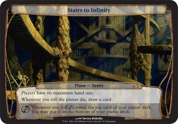
Tuesday, June 5, 2012
Stairs To Infinity
Here's the story behind the land piece I did for the recently released Planechase 2 set for Magic: the Gathering.
Typically, I'm a guy who avoids architecture like the plague. Painting straight lines is torture for me as I don't have the steadiest of hands. On the occasions I have done work with lots of buildings and such, it's been a constant and painstaking series of brushstrokes that are inevitably wiped away with a rag, only to be repainted anew and likely removed yet again. So, when I got the following description in the old inbox, my heart kind of sank.
After being defeated in my initial attempts, I reread the description again, this time with the idea of layering staircases in various positions, different directions, and opposing perspectives so that you'd see the sides of some, the tops of others, etc. But what caught my attention in the description was the specificity of the top and bottom aspect of things. I wasn't sure, but I felt there might be a mechanical aspect to what the card does that was driving that idea. Balling up 10 different points of view would destroy the notion of a strict top and a bottom to the world, so I abandoned that effort, as well.
My next step was to go ahead and look at the Escher pieces noted in the art order. Under normal circumstances, I would have taken this step much earlier on, but I'm pretty familiar with the pieces in question and I wanted to see if I could solve the various problems in the piece first, then come back to the Escher pieces and sort of check my work. Since the situation didn't come together quite as I'd hoped, I now picked over the Escher pieces in hopes that I would find something — anything — that would get me off the ground.
It didn't help.
Finally, I just asked myself this question: what does the architecture in this plane actually look like? If I could figure that out, maybe I could begin to build a piece around the aesthetic. So I began drawing. After a while, I started to come up with some stuff that I thought could actually work. I began layering things, and flipping the sketch over periodically to make sure it worked in both directions. Finally, I arrived at this:
I'm not going to lie. It's not one of my prettier sketches, but it got my point across. I imagine that this plane (or this portion of the plane) is completely hewn from rock. The architecture is largely monolithic, broken up only by vast spaces where stair cases flow from one "building" to another. The facades are sculpted to a point, but dissolve into natural formations from time to time. Shafts of light filter in here and there, and I would suspect that there are places in the Stairs to Infinity that are receive some light all day and night as the sun rotates clear around the thing, infiltrating gaps along the way from every angle. Or something.
Anyway, I got approval to move forward on the painting with only a request that I make sure there were clear figures on the bottom of the world, not just the top. Seemed simple enough, so I put out my palette and went to work. Here's how it came out:
The piece is 16" x 12" and is the usual oil on paper on hardboard.
What would have helped me quite a bit is if I could render things in 3-D. It would have saved me a lot of grief to have completely designed this piece on the computer so that I didn't have to do so much math in my head. But I don't know any pertinent programs that would have helped. As a result, there are almost certainly some horrendous perspective errors. The best I could do was a few cardboard and clay models of a few chunks of the piece, but their accuracy was limited. Still, I'm not entirely unhappy with how the thing came out. I just accept that there are flaws.
That being said, there's an odd thing about the piece. When describing it to someone the other day, I made note that the reproduction was less than accurate. I made the claim that the color was far more intense and that it was very much a play between orange and blue. After taking a look at it this morning, I'm pretty disappointed in my memory. The image above is as accurate as I can make it, and the cards weren't too far off. At least the couple I've seen so far (I didn't get my own copies as it's a promo card and thus I don't get any, myself).
Anyway, when I submitted the piece to Wizards of the Coast, I let them know that they were free to publish it either as I presented it or upside-down — whichever worked better with the card boarder. They went with my original orientation, and it was printed thusly:

And here's a link to download a wallpaper of the thing: link.
Planechase cards are a lot of fun. They're twice as large as a normal Magic card, and on top of this fact, the art is full-frame. Add to this that they're landscapes and you've certainly got my interest. The two pieces I've gotten to do for the set have certainly been a lot of fun, and I'm not going to lie, I'm hoping for a Planechase 3.
Typically, I'm a guy who avoids architecture like the plague. Painting straight lines is torture for me as I don't have the steadiest of hands. On the occasions I have done work with lots of buildings and such, it's been a constant and painstaking series of brushstrokes that are inevitably wiped away with a rag, only to be repainted anew and likely removed yet again. So, when I got the following description in the old inbox, my heart kind of sank.
ART DESCRIPTION:My first instinct was to really latch on to the mood statement: dizzying and surreal. I thought it'd be cool to look down into a deep, cavernous hole with staircases winding this way and that. The problem with this idea, it turns out, is that the moment you're looking down you only see the tops of the various staircases (or bottoms as the case may be). This more precarious perspective would eliminate any chance of a clear representation of the world being two-sided. Sure, you could have folks peering over the edge and looking back up at you, but the potential issues of readability after reduction were enough to make me abandon the whole idea.
Color: None -- represents a location within a plane
Location: see below
Action: We're looking for an Escher-like composition here, similar to his Relativity or Concave/Convex. In this planar location, a zigzagging set of stone stairs seems to lead nowhere and is mirrored horizontally, so that what happens on the top side seems to have a loose equivalency on the inverted bottom side. Ideally the scene is mostly architecture but includes some small figures and incidental actions.
Focus: the paradoxical stairs that lead into each other
Mood: Dizzying and surreal
After being defeated in my initial attempts, I reread the description again, this time with the idea of layering staircases in various positions, different directions, and opposing perspectives so that you'd see the sides of some, the tops of others, etc. But what caught my attention in the description was the specificity of the top and bottom aspect of things. I wasn't sure, but I felt there might be a mechanical aspect to what the card does that was driving that idea. Balling up 10 different points of view would destroy the notion of a strict top and a bottom to the world, so I abandoned that effort, as well.
My next step was to go ahead and look at the Escher pieces noted in the art order. Under normal circumstances, I would have taken this step much earlier on, but I'm pretty familiar with the pieces in question and I wanted to see if I could solve the various problems in the piece first, then come back to the Escher pieces and sort of check my work. Since the situation didn't come together quite as I'd hoped, I now picked over the Escher pieces in hopes that I would find something — anything — that would get me off the ground.
It didn't help.
Finally, I just asked myself this question: what does the architecture in this plane actually look like? If I could figure that out, maybe I could begin to build a piece around the aesthetic. So I began drawing. After a while, I started to come up with some stuff that I thought could actually work. I began layering things, and flipping the sketch over periodically to make sure it worked in both directions. Finally, I arrived at this:
 |
| ©Wizards of the Coast |
I'm not going to lie. It's not one of my prettier sketches, but it got my point across. I imagine that this plane (or this portion of the plane) is completely hewn from rock. The architecture is largely monolithic, broken up only by vast spaces where stair cases flow from one "building" to another. The facades are sculpted to a point, but dissolve into natural formations from time to time. Shafts of light filter in here and there, and I would suspect that there are places in the Stairs to Infinity that are receive some light all day and night as the sun rotates clear around the thing, infiltrating gaps along the way from every angle. Or something.
Anyway, I got approval to move forward on the painting with only a request that I make sure there were clear figures on the bottom of the world, not just the top. Seemed simple enough, so I put out my palette and went to work. Here's how it came out:
 |
| ©Wizards of the Coast |
What would have helped me quite a bit is if I could render things in 3-D. It would have saved me a lot of grief to have completely designed this piece on the computer so that I didn't have to do so much math in my head. But I don't know any pertinent programs that would have helped. As a result, there are almost certainly some horrendous perspective errors. The best I could do was a few cardboard and clay models of a few chunks of the piece, but their accuracy was limited. Still, I'm not entirely unhappy with how the thing came out. I just accept that there are flaws.
That being said, there's an odd thing about the piece. When describing it to someone the other day, I made note that the reproduction was less than accurate. I made the claim that the color was far more intense and that it was very much a play between orange and blue. After taking a look at it this morning, I'm pretty disappointed in my memory. The image above is as accurate as I can make it, and the cards weren't too far off. At least the couple I've seen so far (I didn't get my own copies as it's a promo card and thus I don't get any, myself).
Anyway, when I submitted the piece to Wizards of the Coast, I let them know that they were free to publish it either as I presented it or upside-down — whichever worked better with the card boarder. They went with my original orientation, and it was printed thusly:
And here's a link to download a wallpaper of the thing: link.
Planechase cards are a lot of fun. They're twice as large as a normal Magic card, and on top of this fact, the art is full-frame. Add to this that they're landscapes and you've certainly got my interest. The two pieces I've gotten to do for the set have certainly been a lot of fun, and I'm not going to lie, I'm hoping for a Planechase 3.
Subscribe to:
Posts (Atom)