So... I haven't been around in a while.
You got me. I've been slacking. Just been sitting around on my giant, cushy chair, popping bonbons in my mouth and watching the world go by. That's how I roll.
Actually, I don't own a cushy chair and I'm pretty sure I have never eaten a bonbon. And I haven't been watching the world go by, though I have been utterly amazed as I've watched the time do so. Anyway, here's what's been going on:
As I mentioned previously, Amy's been out of a job. After settling into being home all day, she immediately began creating a website, updating her portfolio, and applying for new positions. These activities wouldn't have much of an affect on me and this blog if we had more than one computer. But we don't, and so I have deferred to her needs, which are greater than my own. After all, I can print all my reference out as necessary and do whatever else I need to do in order to open up the computer for her use.
This sacrifice, unfortunately, has included giving up on updating this blog nearly as regularly. In fact, it's been an embarrassingly long time since last I typed anything up and published it. But, in my defense, I've been busy and without a computer to call my own. Not to mention all the stress.
What stress you ask? Simple. During the job search, it became clear early on that there was nothing in the Boston Metro Area for Amy. Not even so much as a freelance job. There being no means of keeping us afloat otherwise, she was forced to begin searching outside of Boston for employment. This meant that we would be moving. Again. But where and when became a huge mystery, and trying to figure out how that would impact my deadline-ruled life began to become an issue.
The good news is that after a few months of leg work and interviews the possibilities are beginning to narrow. We're very close now to answering those two questions and the stress of not knowing has been replaced with the stress of the impending reality. While moving isn't the end of the world, it does cause me a bit more stress than it does Amy. Whereas she gets to escape the sea of boxes during the day and go to work, I am forced to live among them and hammer a studio back into some serviceable condition before I can even begin to relax.
Of course, much of what I just spoke about is irrelevant and has no bearings on the blog. At least I thought it didn't. But it turns out that my stressed mind doesn't always think straight, is flustered easily, and is far less efficient at editing text. Plus, the case remains that I am still sharing a computer — in fact, I was only able to put this post together while Amy was out having the car inspected.
So when's this all going to end and correct itself? Soon, I hope. Certainly by the end of January. In the meantime I hope to hammer a couple of articles begun a while back into some sort of shape that's worth reading. Plus, once I've gotten a chance to get my personal piece fixed up and photographed, I'll have the daily progress shots for you all to check out and heckle. It's important to note, though, that I haven't burned out on my blog or run out of ideas. In fact, I have a bunch of stuff I want to write about, and I shall endeavor to do my best to get back into the swing of things and make that happen.
For now, I'm just going to have to be content with a life full of painting, very little writing, and no bonbons.

The Work and Musings of Illustrator Steven Belledin
Monday, November 28, 2011
Friday, October 21, 2011
Ann Bonny and A Foray Into Digital Painting
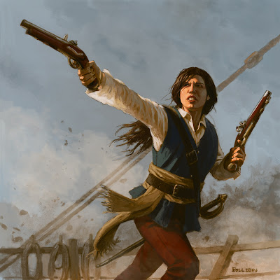
I have painted the female pirate, Ann Bonny, seven times now. The first five were for a card game called Anachronism, published by Triking Games. That game has since vanished from the shelves of your local game store, but the images I did for that game have drummed up more work than any other images I have thus far produced. To boot, I get requests to use to one image in particular come regularly — around two to three a year. This is that image:
As much as I'd like to sell the use of this image to the various companies and individuals that have requested it, I simply don't own the copyright. The parent company of the publisher does, for this was a piece done as work-for-hire.
At this point, I could take the opportunity to step into the work-for-hire debate. It's a worthy debate, indeed, and one about which I have mixed feelings. For those not in the know, work-for-hire is when all copyright (and in some cases even the original, if one exists) are purchased from the artist. This prevents the artist from selling additional printing rights to other clients down the road, and in some cases even restricts how the artist themselves can utilize the image (be it in self-promotion or the manufacturing of prints). While this might seem like an okay thing provided that the monetary exchange is advantageous to the artist, the truth of the matter is that more often than not the rates offered are far below what organizations like the Graphic Artists Guild consider to be fair.
Now, having gone through the trouble of bringing everyone up to speed, I'm not going to delve any deeper into the work-for-hire topic. Instead, I'll leave you with the pertinent information regarding the piece above. I needed the work, Triking was my highest paying client at the time, and work-for-hire is fairly common practice in the fantasy, gaming industry. Unfortunately, being work-for-hire and not owning the copyright myself, I now miss two to three opportunities each year to make additional monies on a piece for little to no additional effort on my part.
Thus was the case a month ago when I was once again approached about using the image. This time, however, I put some effort into sleuthing. You see, despite the fact that I don't own the image, I thought it worth trying to hunt down those who do — either the folks at MK3 or (if they'd been dissolved) whoever may have bought the assets from them. After doing a bit of research, I was unable to confirm whether or not MK3, as an entity, even continues to exist. Nor was I able to find out if they'd been bought, or folded into a new company. I made a go of contacting the folks who used to run the company and had limited success.
What was my end game for all the legwork? Simple. Admittedly, it seemed pretty unlikely that I would get any money out of the deal, but I could at the very least gain exposure. I figured at the very least, someone could make a couple bucks and my work could see the light of day and reach a new audience.
Despite doing my due diligence, as fate would have it, my search had a rather anticlimactic end. I never managed to track down anyone who could tell me anything useful. There was no one to point this new client to and have them work out a deal. Even in the month since, I have been unable to confirm or refute any of the conjecture I've heard, nor have I gotten a reply from those who would definitely know something. In short, I had nothing to tell my potential new client.
So that's it, right? Another opportunity lost. Well.... not exactly. Like I said, I've painted Ann Bonny seven times. While five of those pieces are out of bounds, I do own the rights to the other two. In an attempt to salvage the situation, I offered up usage to either of those versions.
Immediately the client was dismissive of one of the images. It was the image of Ann Bonny from the original Badass book cover (link). I completely understood. It's part of a larger piece and really didn't work for them out of context. The second image was a black and white painting of Ann, done for the interior of the same book.

While this image intrigued them, the fact that it was black and white was kind of deal breaker. Still, I thought I could help them, so I did the obvious thing: I asked them if they'd be interested if I colorized the black and white piece digitally.
They were a little leery. I don't blame them. My portfolio isn't exactly brimming with digital work. In fact, there are zero digital pieces in my portfolio. Still, I assumed that between my own limited experience, and my wife's far more vast Photoshop knowledge, we'd be able to give them something useful. To allay their fears, I offered to give them a progress shot within a couple of hours and based on that, they could run with it or kill the whole thing. They agreed and I went to work.
The short story is that I painted over the original oil painting in Photoshop. CS5 if you must know. I turned the oil painting into a brown monochrome image, converted the whole thing into RGB, and painted on top of that in a new layer. It's mostly just the paint brush and smudge tools. Nothing fancy. About as straightforward as my oil painting, really.
I started with the head and hands and worked out from there. Once everything above the waist was complete, I blocked in the rest and submitted the half-finished work. They liked it enough to ask me to complete it and I did. A couple hours of work, an extra couple bucks made, and a lot of lessons learned. Not a bad way to spend the afternoon. Anyway, here's how it came out:
Admittedly, I am still new to the whole digital painting thing, and I can't say that I'm in love with it as a whole. Painting with actual paint is an experience. There is a smell of oil in the air. You can feel the painting's surface through the brush much as you can feel the road through the steering wheel of a car. All that unevenness creates all kinds of happy accidents along the way. You can move the paint around with your fingers or a paper towel, or any number of other implements that they haven't yet managed to simulate digitally.
Digital painting lacks a lot of this. There is no smell. The physical surface is smooth and even. The stylus is more a fat pencil than a brush. It's a little colder to me. A little less exciting. As a result, I have resisted the industry's trend toward all things digital.
However, I do recognize that it's just another tool. A tool that, used properly, can do great things. I can't say as I'm to that point yet, but I've finally started giving it a real try. My toes have been dipped, and I've even finished off a couple of assignments digitally (mostly because it allowed me to easily give more than one option to my art directors). Whether I'll ever get to the point where I'm doing a piece from start to finish without ever using so much as a pencil... well... I'm really not sure. For me, having the painting as an artifact — having that physical embodiment of my labor — is still important. But, without a doubt, in this instance digital painting saved me and salvaged a situation that could have easily fallen apart. It allowed me to do something I simply could not have accomplished with oils in the time I had to do it. And to me, there's not a whole lot to dislike about that.
 |
| ©MK3 International |
As much as I'd like to sell the use of this image to the various companies and individuals that have requested it, I simply don't own the copyright. The parent company of the publisher does, for this was a piece done as work-for-hire.
At this point, I could take the opportunity to step into the work-for-hire debate. It's a worthy debate, indeed, and one about which I have mixed feelings. For those not in the know, work-for-hire is when all copyright (and in some cases even the original, if one exists) are purchased from the artist. This prevents the artist from selling additional printing rights to other clients down the road, and in some cases even restricts how the artist themselves can utilize the image (be it in self-promotion or the manufacturing of prints). While this might seem like an okay thing provided that the monetary exchange is advantageous to the artist, the truth of the matter is that more often than not the rates offered are far below what organizations like the Graphic Artists Guild consider to be fair.
Now, having gone through the trouble of bringing everyone up to speed, I'm not going to delve any deeper into the work-for-hire topic. Instead, I'll leave you with the pertinent information regarding the piece above. I needed the work, Triking was my highest paying client at the time, and work-for-hire is fairly common practice in the fantasy, gaming industry. Unfortunately, being work-for-hire and not owning the copyright myself, I now miss two to three opportunities each year to make additional monies on a piece for little to no additional effort on my part.
Thus was the case a month ago when I was once again approached about using the image. This time, however, I put some effort into sleuthing. You see, despite the fact that I don't own the image, I thought it worth trying to hunt down those who do — either the folks at MK3 or (if they'd been dissolved) whoever may have bought the assets from them. After doing a bit of research, I was unable to confirm whether or not MK3, as an entity, even continues to exist. Nor was I able to find out if they'd been bought, or folded into a new company. I made a go of contacting the folks who used to run the company and had limited success.
What was my end game for all the legwork? Simple. Admittedly, it seemed pretty unlikely that I would get any money out of the deal, but I could at the very least gain exposure. I figured at the very least, someone could make a couple bucks and my work could see the light of day and reach a new audience.
Despite doing my due diligence, as fate would have it, my search had a rather anticlimactic end. I never managed to track down anyone who could tell me anything useful. There was no one to point this new client to and have them work out a deal. Even in the month since, I have been unable to confirm or refute any of the conjecture I've heard, nor have I gotten a reply from those who would definitely know something. In short, I had nothing to tell my potential new client.
So that's it, right? Another opportunity lost. Well.... not exactly. Like I said, I've painted Ann Bonny seven times. While five of those pieces are out of bounds, I do own the rights to the other two. In an attempt to salvage the situation, I offered up usage to either of those versions.
Immediately the client was dismissive of one of the images. It was the image of Ann Bonny from the original Badass book cover (link). I completely understood. It's part of a larger piece and really didn't work for them out of context. The second image was a black and white painting of Ann, done for the interior of the same book.

While this image intrigued them, the fact that it was black and white was kind of deal breaker. Still, I thought I could help them, so I did the obvious thing: I asked them if they'd be interested if I colorized the black and white piece digitally.
They were a little leery. I don't blame them. My portfolio isn't exactly brimming with digital work. In fact, there are zero digital pieces in my portfolio. Still, I assumed that between my own limited experience, and my wife's far more vast Photoshop knowledge, we'd be able to give them something useful. To allay their fears, I offered to give them a progress shot within a couple of hours and based on that, they could run with it or kill the whole thing. They agreed and I went to work.
The short story is that I painted over the original oil painting in Photoshop. CS5 if you must know. I turned the oil painting into a brown monochrome image, converted the whole thing into RGB, and painted on top of that in a new layer. It's mostly just the paint brush and smudge tools. Nothing fancy. About as straightforward as my oil painting, really.
I started with the head and hands and worked out from there. Once everything above the waist was complete, I blocked in the rest and submitted the half-finished work. They liked it enough to ask me to complete it and I did. A couple hours of work, an extra couple bucks made, and a lot of lessons learned. Not a bad way to spend the afternoon. Anyway, here's how it came out:

Admittedly, I am still new to the whole digital painting thing, and I can't say that I'm in love with it as a whole. Painting with actual paint is an experience. There is a smell of oil in the air. You can feel the painting's surface through the brush much as you can feel the road through the steering wheel of a car. All that unevenness creates all kinds of happy accidents along the way. You can move the paint around with your fingers or a paper towel, or any number of other implements that they haven't yet managed to simulate digitally.
Digital painting lacks a lot of this. There is no smell. The physical surface is smooth and even. The stylus is more a fat pencil than a brush. It's a little colder to me. A little less exciting. As a result, I have resisted the industry's trend toward all things digital.
However, I do recognize that it's just another tool. A tool that, used properly, can do great things. I can't say as I'm to that point yet, but I've finally started giving it a real try. My toes have been dipped, and I've even finished off a couple of assignments digitally (mostly because it allowed me to easily give more than one option to my art directors). Whether I'll ever get to the point where I'm doing a piece from start to finish without ever using so much as a pencil... well... I'm really not sure. For me, having the painting as an artifact — having that physical embodiment of my labor — is still important. But, without a doubt, in this instance digital painting saved me and salvaged a situation that could have easily fallen apart. It allowed me to do something I simply could not have accomplished with oils in the time I had to do it. And to me, there's not a whole lot to dislike about that.
Friday, October 14, 2011
Of Anniversaries and Other Holidays
I'm way behind. I was hoping to get a few posts in recently, but both of our schedules (mine and Amy's) have conspired to keep me from having more than a few random moments' peace and I've chosen to utilize that peace for things other than this blog. Namely making some headway on prep work for a personal piece which would create more interesting (hopefully) content for this here blog of mine.
The point is I've been a little out of touch and I chose today to write for a couple of reasons.
The first and most important reason is because this is my eleventh wedding anniversary. Amy and I have been together for close to fifteen years total and this date, while not a round number, feels pretty important. Our lives are in a fair bit of turmoil to be sure (what with Amy being out of work and all), and despite the stresses and chaos surrounding everything I must confess that we're still incredibly happy. I like to think that I'm Amy's biggest cheerleader and I can say with authority that she's certainly mine, so it should be no surprise that we've settled into a fairly low level of worry which is buttressed by routine and an ever growing search for our next step. Still, I feel it worth noting that I'm insanely lucky that someone would be daft enough to put up with my outbursts, generally grumpy disposition, impending baldness and occasional need for reassurance to stick with me for so long. Either Amy sees much that many do not, or she's projecting a lot that isn't there. Time will reveal all, I'm sure.
I'd continue on about how awesome Amy is and how great things are, but all that has an audience of one and I've got a bit bigger a theme to talk about.
Back in college, I had an illustration professor who assured me that at some point birthdays, anniversaries, and all the major holidays (including but not limited to personal, discretionary, bank and federal) would become meaningless. He was of the opinion that the things that typically tie a person's schedule together (the days of the week and whatnot) begin to blur together in such a way that even those days which stand out will eventually become moot to illustrators as we are enslaved to the deadline. In his mind, before long we would work through Christmas, sleep an all-nighter off on our birthday, be busy making revisions on our anniversaries and never notice.
Ten years into my career, I must confess that I have certainly painted on Christmas. I have slept off a hard work of week on my birthday. And I will be pushing paint today on my anniversary. But as I am now my professor's age at the time he shared this opinion with me, I am happy to say that such a fate has not befallen me.
What my professor spoke of was the danger of being an illustrator. It is a possibility of what may happen, but I believe that it needn't come to fruition. While I have certainly put in many hours on such days, they have never stopped meaning something to me. And because I continue to cherish them, missing some of those days can hurt quite a bit. But if I wanted my life to be pain-free and easy, I would have chosen a profession other than freelance illustrator. (Of course, which other profession I might pursue is an impossible thing to say as so many professions seem to share this problem nowadays).
So how does one avoid those standout days from eroding into the background of our daily grind? I think it helps to account for them as much as possible, and to accomplish that I think the key is balance. Easy to type, difficult to achieve. The work doesn't go away and the deadline still looms, but so do these important days. How different illustrators deal with this issue varies. Some just always keep a six day work week with one mandatory day off. Others will just sacrifice when necessary, take the time off and do the all-nighter to make up for the lost hours if need be. Still others keep vampiric schedules where they work while others sleep, sleeping little themselves.
Personally, I don't have a lot of answers. My schedule while seemingly regular, varies in unpredictable ways. Even if it were regular, paintings can sometimes unravel, last minute changes can be requested, and plans can be ruined. It's one of the biggest downsides of the business. Still, I try and adjust my schedule as much as possible, take the days off that I can, then deal with the fallout as it happens. But I'm lucky — I have Amy's understanding and support. If things fall apart, we'll arrange alternate days off and celebrate later if need be. The dates begin to mean less, but the days themselves never become meaningless... if that makes any sense.
Though I can't honestly say that I've achieved true balance, I continue to strive for it. And striving is necessary. Otherwise, I'll never even get close. Still, I know a lot of folks out there struggle with this kind of thing. My biggest hope is that they find a system that works for them, and I hope they get the support they need while trying to find it.
Finally, I hope that you all — even in some small way — feel as lucky as I do right now.
Wednesday, September 28, 2011
More Sensory Deprivation
As I said in my original post about Sensory Deprivation, the image of someone with their eyes and mouth sewn shut is hardly a new idea. For proof of this fact, I was pointed to another image by writer, Magic player, and sometimes reader of this blog, John Dale Beety.
The image above is that of a card from a game once known as "Jyhad," but which changed its name (for what I think are obvious reasons) to "Vampire: the Eternal Struggle."
What strikes one off the bat is that the name of the card is exactly the same. So is the concept behind the image. If you look at the bottom of the card, you'll notice that it has a copyright of 1995, and that the copyright is held by none other than Wizards of the Coast, the company which produces "Magic: The Gathering" (for which I produced the aforementioned Sensory Deprivation image).
So. You've got the same company. The same name. And the same concept. Naturally, what Mr. Beety wanted to know was whether or not there was a connection. Was this some weird callback to a game from sixteen years ago? Did the fine folks at Wizards gravitate toward the sketch for this image for some meta reason?
As much as the answer "yes" might make for a good story, I'm afraid that the answer is no. I went ahead and spoke to the art director, Jeremy Jarvis, regarding this image and he assures me that there was no conscious attempt at referencing the old image. Nor was he aware of anyone working on the team (writers, concepters, etc.) who had also worked on Jyhad/Vampire. It's also worth noting that the working title of the image wasn't even "Sensory Deprivation" to begin with, it was "Dead Senses." Not a far stretch, but I think it further proof of there being no intended reference.
Of course, all this begs the follow up question of whether or not I was the one attempting the reference. Again, the answer is no. I've never played Jyhad/Vampire. In fact, I've only seen cards from the game a few times. And I hadn't seen this one until Mr. Beety sent me an image.
Why, then, are the two so similar? Well, personally, I think it's mostly due to tropes.
I have no idea what Richard Thomas' art order looked like nor do I have any idea what his art director was looking for in the image. Still, I think it's clear that both Richard and I were likely batting in the same ballpark. The entire game he was working on was based on the tropes of horror, and that is what the Innistrad expansion set (which my Sensory Deprivation is part of) happens to be about, as well. In fact, Innistrad is a virtual checklist of horror tropes. Everything from werewolves, Frankenstein monsters, zombies and even the mobs of angry villagers are accounted for. And the moment you have a bunch of these concepts at play, with all the stitched beasts and medieval torture that buttresses such things, I think it was only a matter of time before someone broached this idea — especially because the concept works so well with the game mechanics and also because the idea itself is not fictional, which in turn perhaps makes it all the more horrifying.
Given all that, I think it's pretty safe to say that Richard Thomas and I were not only shooting for the same kind of Gothic atmosphere common in such horror tropes, but we were likely both trying to find the most horrifying way of depicting what is clearly the same concept.
Despite all this, there are some key differences that I think are obvious, but worth noting. Whereas I stopped at the sewn eyes and mouth, Richard pushed the idea even further with sewn ears and nostrils. If I'm honest, I got really hung up on the visceral tugging of the mouth and eyelids and just never took the next leap. Part of me wishes I'd thought to. Also, my image has more of a mid-struggle approach, whereas Mr. Thomas' image leaves one with quite a different vibe. There's still struggle — the tension is clear as day — but with everything so sewn shut completely, there's an air of finality, of futility, which depending on the kind of person you are may be even more disturbing.
What strikes me about all this is just how similar the pieces ended up being in palette and composition. The fleshtones are a little pallid with hints of pink, the hair in both is fairly dark — even the backgrounds have a bluish hue! Also similar is the scale. We both went for closeups of the face for a good, clear shot. These similarities can't just be coincidence, can they?
I'm betting they're not. I looked at the idea of someone in such a condition and figured that they wouldn't get out much. Hence the pallor. The pinkish bits are born of the blush of frustration and tension. And I chose blue for the background because it sits well and because it would offer up opportunities to pull that color into the face in fun (for me) ways. Composition was mostly due to a factoring in of reduction. I had to make sure that everything read clearly when shrunk down. It's entirely possible that Richard Thomas' decisions were made in a similar fashion for similar reasons. Or, it could be that we've both seen the same image at some point — be it from a movie or an old painting somewhere — that stepped forward subconsciously to help guide the reins.
Either that or Richard Thomas and I are the same person.
We're not the same person.
 |
| ©Wizards of the Coast |
What strikes one off the bat is that the name of the card is exactly the same. So is the concept behind the image. If you look at the bottom of the card, you'll notice that it has a copyright of 1995, and that the copyright is held by none other than Wizards of the Coast, the company which produces "Magic: The Gathering" (for which I produced the aforementioned Sensory Deprivation image).
 |
| ©Wizards of the Coast |
As much as the answer "yes" might make for a good story, I'm afraid that the answer is no. I went ahead and spoke to the art director, Jeremy Jarvis, regarding this image and he assures me that there was no conscious attempt at referencing the old image. Nor was he aware of anyone working on the team (writers, concepters, etc.) who had also worked on Jyhad/Vampire. It's also worth noting that the working title of the image wasn't even "Sensory Deprivation" to begin with, it was "Dead Senses." Not a far stretch, but I think it further proof of there being no intended reference.
Of course, all this begs the follow up question of whether or not I was the one attempting the reference. Again, the answer is no. I've never played Jyhad/Vampire. In fact, I've only seen cards from the game a few times. And I hadn't seen this one until Mr. Beety sent me an image.
Why, then, are the two so similar? Well, personally, I think it's mostly due to tropes.
I have no idea what Richard Thomas' art order looked like nor do I have any idea what his art director was looking for in the image. Still, I think it's clear that both Richard and I were likely batting in the same ballpark. The entire game he was working on was based on the tropes of horror, and that is what the Innistrad expansion set (which my Sensory Deprivation is part of) happens to be about, as well. In fact, Innistrad is a virtual checklist of horror tropes. Everything from werewolves, Frankenstein monsters, zombies and even the mobs of angry villagers are accounted for. And the moment you have a bunch of these concepts at play, with all the stitched beasts and medieval torture that buttresses such things, I think it was only a matter of time before someone broached this idea — especially because the concept works so well with the game mechanics and also because the idea itself is not fictional, which in turn perhaps makes it all the more horrifying.
Given all that, I think it's pretty safe to say that Richard Thomas and I were not only shooting for the same kind of Gothic atmosphere common in such horror tropes, but we were likely both trying to find the most horrifying way of depicting what is clearly the same concept.
Despite all this, there are some key differences that I think are obvious, but worth noting. Whereas I stopped at the sewn eyes and mouth, Richard pushed the idea even further with sewn ears and nostrils. If I'm honest, I got really hung up on the visceral tugging of the mouth and eyelids and just never took the next leap. Part of me wishes I'd thought to. Also, my image has more of a mid-struggle approach, whereas Mr. Thomas' image leaves one with quite a different vibe. There's still struggle — the tension is clear as day — but with everything so sewn shut completely, there's an air of finality, of futility, which depending on the kind of person you are may be even more disturbing.
What strikes me about all this is just how similar the pieces ended up being in palette and composition. The fleshtones are a little pallid with hints of pink, the hair in both is fairly dark — even the backgrounds have a bluish hue! Also similar is the scale. We both went for closeups of the face for a good, clear shot. These similarities can't just be coincidence, can they?
I'm betting they're not. I looked at the idea of someone in such a condition and figured that they wouldn't get out much. Hence the pallor. The pinkish bits are born of the blush of frustration and tension. And I chose blue for the background because it sits well and because it would offer up opportunities to pull that color into the face in fun (for me) ways. Composition was mostly due to a factoring in of reduction. I had to make sure that everything read clearly when shrunk down. It's entirely possible that Richard Thomas' decisions were made in a similar fashion for similar reasons. Or, it could be that we've both seen the same image at some point — be it from a movie or an old painting somewhere — that stepped forward subconsciously to help guide the reins.
Either that or Richard Thomas and I are the same person.
We're not the same person.
Thursday, September 22, 2011
Sensory Deprivation
Up front, I'm going to warn everyone reading this that it contains an image that is easily among the more disturbing that I've ever painted. Some might find it pretty hard to look at and if you're not into looking at what is essentially torture, then I suppose you might want to skip this post and catch up with me later. That being said, it's a new image and I thought it worth sharing.
So, this is the last image I have to show for the new Magic: The Gathering, Innistrad expansion set. It's called Sensory Deprivation, and it began its life with this description:
ART DESCRIPTION:
Color: Blue spell
Location: Unimportant
Action: This is an abstract piece representing the loss of a person's senses. Show an extreme close-up of a man or woman whose eyes and mouth have been replaced by wrought-iron bars like the windows of a prison. His/her mouth is open as if he/she is screaming, but there are bars in front of the dark, toothless mouth. His/her pupils are gone, and bars cover the eyeless sockets.
Focus: The victim
Mood: My senses are dead to me.
There are a lot of images that flashed through my mind upon reading the above, and in a way, it's more than a little disturbing that the wealth of ideas that did come came so freely. But it's the nature of my personality, my influences, the books I read, the films I watch, and the genre I've been neck deep in for the last decade. It's also the partially the result of all the horror flicks I've been forced to watch over the years by my wife and friends (I'm personally not a fan).
Here then, are the top three images I tossed the way of Wizards for their consideration. They are done initially in pencil and then very sloppily added to with digital paint. While they are among some of the worst sketches I've ever handed in, their frantic nature belied the vibe I was going for, so I went with it.
First up we have the literal interpretation of the image described. I'm not going to lie, this was also my least favorite. In fact, I felt like I might have seen the image before, but they asked for just such a thing and I thought it wise to give it to them. Still, I wanted to try to add my own spin, so back to the drawing board it was. Here's where that exploration took me:
Given that we were dealing with more of a metaphorical image to begin with, I thought it might be interesting if the bars weren't just a fixture in the various sockets, but rather a fully realized physical entity that the face had somehow intersected and grown around, much the same way that a tree will begin to grow into a chain link fence only to eventually envelope it.
The main problem I had with this image was that it smacked of Terminator 2, but since the entire set of Innistrad was about horror tropes, the image being familiar wasn't necessarily a problem. What bothered me was that it fell short of how visceral I wanted the image to be. There is less room for struggle in it than I wanted. It somehow needed to be more about struggle and the physicality of that struggle. So I took it into a new direction with less a metaphorical twist and more a realistic one.
Let's face it, sewing a mouth and eyes shut is hardly a new idea. But, it was the perfect way to get across the struggle and victimization that I wanted to really nail. This is, after all, something that has been done to someone. Bars in the eyes and mouth just don't have that same feel.
Now, on a business note I think it worth stating that under normal circumstances, when handing in multiple sketches, more often than not, the client will decide to go with the image the illustrator is least interested in fully realizing. This has happened to me on many occasion, but somehow didn't happen with this go around. They saw the third version, and decided that sewing was better than bars. So off to work I went.
The first thing I did, as usual, was to hunt down reference to bolster the concept as much as possible. Then, I added to that some rather embarrassing reference photos of me struggling on the floor that my wife took. Upon seeing these photos, I decided that the opportunity to turn this piece into a self-portrait was too good to pass up.
Once everything was collected, it was all about the paint, and let me tell you this painting went FAST. It now holds the record for the fastest Magic piece I've ever painted clocking in at a tiny bit over 17 hours. It's not quite as visceral as I'd like it to be, but it's far looser than I typically work and was a lot more fun than most. And here it is:
It's 12"x9" oil on hardboard. And here it is in card form:
Curiously, the image being a self-portrait turned out to be kind of prophetic. In truth, I feel about as bound as that image depicts. As I write this, I am going through one of the worst bouts of creative block I've ever been through. Thankfully, my professional work hasn't suffered. Unfortunately, my personal work has. I'm completely and totally lost in my attempts to pull together a personal piece or two that I am hoping to show at IlluxCon this year. I have spent the last week trying to cobble together something that I actually want to paint. Figure out some though or feeling that I want to convey. Thus far, I just can't seem to get anything off the ground. Not with any sort of confidence, anyway.
I have thrown out two ideas that I'd put a fair amount of work into, and the one I like still feels half baked enough for me to set it aside for a while. I like the image, but I want to do it right and I know that my head space just isn't right for it just yet. All the cogs have not clicked into place.
The overall problem may be that I have thought about this all too much. Or perhaps too little. I have no idea. What I may try is to go in without any plan at all and see what happens. It's entirely possible that I'll need to be as blind as this self-portrait to see my way out of things.
So, this is the last image I have to show for the new Magic: The Gathering, Innistrad expansion set. It's called Sensory Deprivation, and it began its life with this description:
ART DESCRIPTION:
Color: Blue spell
Location: Unimportant
Action: This is an abstract piece representing the loss of a person's senses. Show an extreme close-up of a man or woman whose eyes and mouth have been replaced by wrought-iron bars like the windows of a prison. His/her mouth is open as if he/she is screaming, but there are bars in front of the dark, toothless mouth. His/her pupils are gone, and bars cover the eyeless sockets.
Focus: The victim
Mood: My senses are dead to me.
There are a lot of images that flashed through my mind upon reading the above, and in a way, it's more than a little disturbing that the wealth of ideas that did come came so freely. But it's the nature of my personality, my influences, the books I read, the films I watch, and the genre I've been neck deep in for the last decade. It's also the partially the result of all the horror flicks I've been forced to watch over the years by my wife and friends (I'm personally not a fan).
Here then, are the top three images I tossed the way of Wizards for their consideration. They are done initially in pencil and then very sloppily added to with digital paint. While they are among some of the worst sketches I've ever handed in, their frantic nature belied the vibe I was going for, so I went with it.
 |
| ©Wizards of the Coast |
 |
| ©Wizards of the Coast |
The main problem I had with this image was that it smacked of Terminator 2, but since the entire set of Innistrad was about horror tropes, the image being familiar wasn't necessarily a problem. What bothered me was that it fell short of how visceral I wanted the image to be. There is less room for struggle in it than I wanted. It somehow needed to be more about struggle and the physicality of that struggle. So I took it into a new direction with less a metaphorical twist and more a realistic one.
 |
| ©Wizards of the Coast |
Now, on a business note I think it worth stating that under normal circumstances, when handing in multiple sketches, more often than not, the client will decide to go with the image the illustrator is least interested in fully realizing. This has happened to me on many occasion, but somehow didn't happen with this go around. They saw the third version, and decided that sewing was better than bars. So off to work I went.
The first thing I did, as usual, was to hunt down reference to bolster the concept as much as possible. Then, I added to that some rather embarrassing reference photos of me struggling on the floor that my wife took. Upon seeing these photos, I decided that the opportunity to turn this piece into a self-portrait was too good to pass up.
Once everything was collected, it was all about the paint, and let me tell you this painting went FAST. It now holds the record for the fastest Magic piece I've ever painted clocking in at a tiny bit over 17 hours. It's not quite as visceral as I'd like it to be, but it's far looser than I typically work and was a lot more fun than most. And here it is:
 |
| ©Wizards of the Coast |
 |
| ©Wizards of the Coast |
I have thrown out two ideas that I'd put a fair amount of work into, and the one I like still feels half baked enough for me to set it aside for a while. I like the image, but I want to do it right and I know that my head space just isn't right for it just yet. All the cogs have not clicked into place.
The overall problem may be that I have thought about this all too much. Or perhaps too little. I have no idea. What I may try is to go in without any plan at all and see what happens. It's entirely possible that I'll need to be as blind as this self-portrait to see my way out of things.
Monday, September 19, 2011
The Grimoire
So, I've been off the radar for a little while due to a variety of issues ranging from the distractions of work to now having to share our household's sole computer with someone trying to build a website for herself in the name of finding a new job. For the next couple weeks this spotty posting will likely continue, but I do have some interesting tidbits planned — some of which I will unabashedly hint at in this very post.
But I digress.
So, Magic's expansion set of Innistrad has been revealed and along with it a couple new pieces of art. The one I'm going to talk about to day is the Grimoire of the Dead. What's a grimoire? It's a book of magic. So it's a book of the dead. A magic book of the dead. Never heard of that one before, have you? You have? Oh. Well this is one of those. Here's the art order I received:
ART DESCRIPTION:
Color: None (artifact)
Location: Unimportant
Action: Show a large tome bound in human skin with finger bones along the spine. Show it on a creepy pedestal. Maybe there are demon heads carved into the pedestal.
Focus: The evil book
Mood: Check this book out. Go on, I dare you.
Pretty straightforward stuff for a book of the dead. Well, standard if you read and watch a lot of horror. The first thing I did was went through the shelves of books I own. Several of said books are very old — early 20th Century old. While not ancient, they have a well-used feel to them and they're leather bound. It was a good start.
So I start drawing various versions of the book. I ruled out early on having a clear face on the cover of the book as that's been done with so many previous necronimcons (necronomica?). Still, I wanted to have a clear bit of humanity in there to drive home that it was bound with human skin. It needed to be instantly identifiable. In the end, I though it would be nice to reference the finger bones on the spine of the book and have a clear hand on the cover. But just the skin of the hand, of course.
I added a clasp for the book carved from a jawbone with the teeth slipping just over the front cover, designed a pedestal, then drew it all up and sent it off. This was the sketch:
As suggested, I put some demon and devil heads into the pedestal design. In truth, it makes for a pretty bland sketch and if I'm honest, I was worried about the finished piece being equally bland. Still I had a few tricks up my sleeve: lighting and mood.
So, I shot reference of one of my older books in my creepy basement, then went online to start a search that undoubtedly landed me on some sort of watch list: I began to look for images of human leather. I was actually kind of happy to find a relative lack of imagery on the subject, but what I did find was... helpful.
Once the collection of reference was complete, I went to paint. This is the finish:
It's 12"x9", oil on hardboard. And here it is in card form:
As you can see, they've cropped in a bit on the image for clarity's sake. This is something I generally don't care much about. They have to do what's best for their product and generally make pretty decent choices.
Now, one of the questions that comes up frequently is how I know what things are supposed to look like in these pieces. For example, how did I know what the devils on the pedestal looked like? While I should probably have addressed this as a frequently asked question sometime earlier, I'll give you all the short answer I give at appearances now, but I must confess that I had a pretty good idea to begin with.
For each expansion set, a book is created called a style guide. It's a visual bible for each Magic plane that gives the 80-90 artists working on a given set a baseline example of architecture, fashion, creatures, landscapes, etc., so that they are all clearly illustrating the same world. Sure, they bring they're own stylistic choices to the table, but there need to be certain design consistencies to keep the artwork feeling connected. And that's the guide's primary purpose.
But who creates the style guide? Well, that depends on the set. There is certainly a consistent cast of characters involved with each guide, but the contributing artists tend to rotate in and out. For this world, Innistrad, I was fortunate enough to be one of the artists. And at some point soon, I'll share with you all my experience, the specifics of what I contributed, and maybe if I'm lucky I can get a word out of those who sat beside me, as well.
But I digress.
So, Magic's expansion set of Innistrad has been revealed and along with it a couple new pieces of art. The one I'm going to talk about to day is the Grimoire of the Dead. What's a grimoire? It's a book of magic. So it's a book of the dead. A magic book of the dead. Never heard of that one before, have you? You have? Oh. Well this is one of those. Here's the art order I received:
ART DESCRIPTION:
Color: None (artifact)
Location: Unimportant
Action: Show a large tome bound in human skin with finger bones along the spine. Show it on a creepy pedestal. Maybe there are demon heads carved into the pedestal.
Focus: The evil book
Mood: Check this book out. Go on, I dare you.
Pretty straightforward stuff for a book of the dead. Well, standard if you read and watch a lot of horror. The first thing I did was went through the shelves of books I own. Several of said books are very old — early 20th Century old. While not ancient, they have a well-used feel to them and they're leather bound. It was a good start.
So I start drawing various versions of the book. I ruled out early on having a clear face on the cover of the book as that's been done with so many previous necronimcons (necronomica?). Still, I wanted to have a clear bit of humanity in there to drive home that it was bound with human skin. It needed to be instantly identifiable. In the end, I though it would be nice to reference the finger bones on the spine of the book and have a clear hand on the cover. But just the skin of the hand, of course.
I added a clasp for the book carved from a jawbone with the teeth slipping just over the front cover, designed a pedestal, then drew it all up and sent it off. This was the sketch:
 |
| ©Wizards of the Coast |
So, I shot reference of one of my older books in my creepy basement, then went online to start a search that undoubtedly landed me on some sort of watch list: I began to look for images of human leather. I was actually kind of happy to find a relative lack of imagery on the subject, but what I did find was... helpful.
Once the collection of reference was complete, I went to paint. This is the finish:
 |
| ©Wizards of the Coast |
 |
| ©Wizards of the Coast |
Now, one of the questions that comes up frequently is how I know what things are supposed to look like in these pieces. For example, how did I know what the devils on the pedestal looked like? While I should probably have addressed this as a frequently asked question sometime earlier, I'll give you all the short answer I give at appearances now, but I must confess that I had a pretty good idea to begin with.
For each expansion set, a book is created called a style guide. It's a visual bible for each Magic plane that gives the 80-90 artists working on a given set a baseline example of architecture, fashion, creatures, landscapes, etc., so that they are all clearly illustrating the same world. Sure, they bring they're own stylistic choices to the table, but there need to be certain design consistencies to keep the artwork feeling connected. And that's the guide's primary purpose.
But who creates the style guide? Well, that depends on the set. There is certainly a consistent cast of characters involved with each guide, but the contributing artists tend to rotate in and out. For this world, Innistrad, I was fortunate enough to be one of the artists. And at some point soon, I'll share with you all my experience, the specifics of what I contributed, and maybe if I'm lucky I can get a word out of those who sat beside me, as well.
Sunday, September 11, 2011
9/11
Ten years ago, I was living in Woodside, Queens, waiting for my wife to make it home from downtown Manhattan. When she finally caught a train and arrived back in our neighborhood, I ran out to meet her. The relief I felt was indescribable, but unfortunately was not something universally experienced.
Several months later, the Society of Illustrators commemorated the events of that day with a show that I helped hang upon its walls. Asked if I had anything to contribute, I sheepishly said that I'd started a piece but admitted that it wasn't finished. I was encouraged to finish it and add it to the show. This was that piece.
It's not brilliant — in fact, I wouldn't say it's particularly good...but, it's all I was capable of at the time.
I think the piece is 16"x20", oil on canvas board, and I wish it was a more fitting tribute to what this day represents to so many.
Several months later, the Society of Illustrators commemorated the events of that day with a show that I helped hang upon its walls. Asked if I had anything to contribute, I sheepishly said that I'd started a piece but admitted that it wasn't finished. I was encouraged to finish it and add it to the show. This was that piece.
It's not brilliant — in fact, I wouldn't say it's particularly good...but, it's all I was capable of at the time.
 |
| 343 |
I think the piece is 16"x20", oil on canvas board, and I wish it was a more fitting tribute to what this day represents to so many.
Friday, August 26, 2011
Here We Go Again...
So, some of you have got to be wondering why the blog has been so spotty of late, or where the heck the daily progress shots are on that personal piece I trumped up. Others of you have no doubt just assumed the lapses are due to my being too busy, if you were aware of them at all. Either way, I shall do my best herein to explain.
Truth be told I have been toiling away on several posts of varying subject matter, but I'm having a very difficult time finishing and editing them. I've found myself fussing over their various arcs and wondering if they're getting the correct point across. Meanwhile, I've been busy with a bunch of paintings that I can't show at the moment, as well as weird paperwork stuff, the compiling of a list of my available Magic paintings and their prices (which is now up on my website), several weeks of family visits, and... well, fretting.
I'm currently nervous as all get out because Amy has run into a pretty severe snag. She's lost her job. I'm not going to get into specifics here, it's neither the time nor the place. Suffice it to say that a mere 10 months after moving here, our lives have been thrown into utter chaos and Amy is now forced to find another job. While we are angry and feel a bit betrayed, above all we're worried.
In the past, both Amy and I have spent time unemployed — heck, sometimes simultaneously — but we never really sweated it back then. Why should we have? We had nothing to lose. Now, with an apartment that just isn't selling in New York, a rental place in Massachusetts, a car, and the various expenses that come with these things (not to mention the worst economy that most have ever seen), there's suddenly a reason to take pause.
What's the plan? Well, Amy's search for a new job has already begun. While we'd like to stay here in the Boston area, there is a real possibility that we may end up right back where we started in Jackson Heights. Still, we're going to shoot for the moon and have decided that the search needs to be far wider, so we're looking not only in Boston and New York, but across the nation, as well as internationally. The way we see it, we don't have any kids or pets so there's really no need to limit ourselves.
Alright, this is nice and all and I've managed to explain the lack of updates and the worried thing, but where's that personal piece I promised? Simple, we've had an inkling that Amy's place was tenuous at best for a while now. Rather than take the time off I needed, I decided we could use the income more. Turns out I was right. However, I'll be trying to hammer out a personal piece in the coming months running parallel to my regular work so that I have something decent for IlluxCon in November. Hopefully, it'll come together.
In the meantime, I'll continue to be at least a little worried, and I won't be the only one. Sitting next to me for the foreseeable future will be Amy. We have not had the luxury of spending this much time together in almost ten years. It'll definitely take some getting used to, but I plan to enjoy it as much as possible.
Finally, it's important to note that we're not just worried. We're also optimistic. To be honest, in some ways it hasn't exactly been the best 10 months or so. We love the area and the people here, our marriage has been the best it's ever been, but there have been issues that will soon be behind us. Perhaps this 10 months and the frustration, anger, and hurt that have come with it will be the small price to pay for the dream job. Perhaps this was just our first step out of New York. Whatever the case may be, we're battening down the hatches, tightening our belts, rolling up our sleeves and spouting off clichés. Where we'll end up is currently a mystery and the anticipation is killing me.
Friday, August 12, 2011
The Lunarch
 |
| ©Wizards of the Coast |
What can I say about Mikaeus, The Lunarch? Well, I'll start by paraphrasing the art description. Now, normally I'd just give it to you straight, but there are story points in the description that I really don't want to get nailed for spoiling, so I'm playing it safe this time. Anyway, the description basically says this:
White Legendary Creature. Shown inside a cathedral. Guy in his fifties with long flowing robes gesturing dramatically to an off-camera audience and surrounded by dozens upon dozens of silver candles. He should look important and should reference designs on a certain page of the style guide (something about which I will discuss at a later date).
Pretty straightforward, right? I decided that this guy was kind of like the Pope and I extrapolated from and cannibalized many designs on the pages of the style guide as requested, all while sprinkling in a good helping of my own sensibilities. I handed in my sketch and waited to see what happened.
I got a reply back requesting that I push things a little further — you know, make him fancier and such. Okay, no problem. I gaudied him up some, then resubmitted. Another reply, another request for more pieces of flare. I pushed it further still and finally they were pleased, though looking back on the sketch I don't know why.
 |
| ©Wizards of the Coast |
I can't say I'm exactly proud of the sketch. It gets the point across, sure, but it's at the expense of any artistic value. In fact, I can't believe I'm sharing this with you all (though, I guess it's actually worse that I shared it with the Art Director). Be that as it may, I got approval to move forward.
I painted it up and it came out looking like this:
 |
| ©Wizards of the Coast |
So, it's an oil painting on hardboard and it measures 16" x 12". Obviously they cropped in a bit for the purposes of readability on the card, something with which I'm perfectly cool.
Given that the description actually requested he be surrounded by candles, I decided that they would be the lighting source. So, he's lit up from below in all his robe flowing glory. Of course, since being spoiled yesterday, many of the comments I've seen online question the flammability of his robes as well as his proximity to the flames (and yes I'm aware that the vast majority of these comments are meant to be tongue in cheek). While I'd agree that these are potential concerns, I always fall back on the fact that the game itself is called "Magic," and is part of a genre full of axes that would be impossible to wield, armor that would never function in real life, spells being cast, creatures that don't exist, and women who make supermodels look ugly and fat. I think we can all agree that a minor fire hazard which would at worst result in a most excellent YouTube video can be forgiven. In fact, I'd like to see that YouTube video! But I digress.
Obviously I never anticipated these comments, and I find it somehow humorous that what I did next would only exacerbate the imagined issue. Truth be told, this piece could not have been assigned at a worse time for me. I was moving from New York to Boston and the piece, as well as the means to paint it were packed away in boxes during much of the time that I had to work on it. A full two weeks of the three, in fact. Fortunately, the Art Director was sympathetic to my plight and gave me an extension. Originally due just before Christmas, I ended up working on it over the holidays and it was delivered after the New Year, though even then was handed in only because it was due, not because I felt it was completely finished.
Almost immediately after turning it in, I began to finish the piece off to a level that I found satisfying. As I was pretty happy with him, the Lunarch's design remained the same. The changes were primarily to the lighting and the number of candles. While being lit by candles is cool and all, he was lit far too brightly for the number of candles in the image. So, I glazed him back a bit and added some more candles. A lot more, in fact. Enough to make those so concerned for the Lunarch's well-being shout with mock outrage. I assure you that outrage is unnecessary. He's the Lunarch. Folks like him have magically imbued robes. Or something. Besides, even if he didn't he wouldn't be nearly as cool if he was put off by open flames. Seriously. Fonzie would never freak out over some scented candles, and while the Lunarch's coolness level may not be on par with Fonzie's, I believe the Lunarch's overall power within his society evens up the score, so clearly the Lunarch wouldn't freak out either.
 | |
| ©Wizards of the Coast |
I think this version makes for a better piece, overall. I like the sea of candles better, and I find the lighting far more believable. However, it's probably best the this piece was not submitted to Wizards in this final form. You see, the face ended up becoming darker, murkier, and thus less clear when shrunk down. Clarity is important for reduction, and so it's best that the events unfolded as they did. So, while the original version is crisper, this revision makes for a far moodier, and more menacing image. Plus, given the added candles, there's that extra level of danger!
Finally, for your viewing pleasure, a sweet animation showing the before and after...then the before again...followed by the after.... Or, I suppose it's a video displaying the Lunarch's mighty ability both to summon candles, while also simultaneously diminishing light.
| ©Wizards of the Coast |
Thursday, August 11, 2011
Kiki-Jiki
Where do I begin with this? How do you go about making new art for a card whose illustration has become iconic enough to have a statue made of it? This is a card that gets a fair amount of play, and is yet another card that I've been asked to re-imagine that hails from an era predating any of my contributions to Magic, and the implementation of my plan to bring it all down from the inside.
But then I've said too much.
Anyway, here's my commission:
ART DESCRIPTION:
color: red legendary goblin
location: not super important. probably Kamigawa mountains.
Action: kiki-jiki is a legendary goblin shaman that can create short lived fire illusions. maybe adorn him a bit more than the ref. more of those leather wrappings like are on his horns. try to make him interesting. you can show him casting a fire illusion or have one in the shot if you want, or just show him looking as cool as you can.
The reference in question was a larger version of the art as depicted here:
The fact that the original image was included is a rare occurrence. Seriously. Every time in the past that I've been asked to make new art for an existing card, I have not been given the original. I suspect that the reason for this is that I was being encouraged to not limit myself. This time, however, it was obvious that this needed to clearly be Kiki-Jiki. There had to be connective tissue to our friendly, neighborhood goblin shaman.
So, using the image above as a starting point, I began to ponder what to do with him. Would there be a fire illusion? Would that illusion also be a dragon? How would he be posed? I did a lot of thumbnail drawings on this one, and I kept coming back to a little thumb of Mr. Jiki smack in the center of the image, charging up, surrounded by flames. I don't know why, but it seemed the obvious way to go for me. Some might say too obvious. But, in my defense, I rarely get to paint red Magic cards and this was the first time I really ever got a chance to tackle fire in any substantial way. I wanted to really go for it and turn it into a bit of an exercise for myself.
Either way, what I'm not going to show you is my miserable attempts at sketching our friend here. Nor will you be seeing the sketch I handed in. Trust me, it's for the best. It's embarrassing beyond belief and would only lower your opinion of me (if that's possible). Moving on...
After drawing him up and placing him in a box of the appropriate proportions, I decided he needed something else. Something in the background. Sure, fire was cool, but it needed to be pushed a bit further. I went back to the question of the fire illusion. Then I looked back at the original card. The solution, once again, became obvious. The dragon from the original version would be forming in the flames. His eyes would be most obvious, but his whiskers would be right in there, as well. In essence, I chose to depict something that takes place just a moment before what is shown in the original art. I have him creating the illusion, Pete Venters has him ordering that illusion forward.
The original is 12" x 9", oil on hardboard. As instructed, I gave him more wrappings and hopefully managed the "cool" part. It's impossible to say whether I came close, as one half of the internet will invariably disagree with the other. And with great venom, I might add.
Here he is in the card frame:
As an aside, this is one of those images that just looks terrible under certain monitor settings. I kinda had to take a shot in the dark with color correcting it because it's just impossible to please the various settings, web browsers, formats, etc. Hopefully it doesn't look too bad.
But then I've said too much.
Anyway, here's my commission:
ART DESCRIPTION:
color: red legendary goblin
location: not super important. probably Kamigawa mountains.
Action: kiki-jiki is a legendary goblin shaman that can create short lived fire illusions. maybe adorn him a bit more than the ref. more of those leather wrappings like are on his horns. try to make him interesting. you can show him casting a fire illusion or have one in the shot if you want, or just show him looking as cool as you can.
The reference in question was a larger version of the art as depicted here:
 |
| ©Wizards of the Coast |
The fact that the original image was included is a rare occurrence. Seriously. Every time in the past that I've been asked to make new art for an existing card, I have not been given the original. I suspect that the reason for this is that I was being encouraged to not limit myself. This time, however, it was obvious that this needed to clearly be Kiki-Jiki. There had to be connective tissue to our friendly, neighborhood goblin shaman.
So, using the image above as a starting point, I began to ponder what to do with him. Would there be a fire illusion? Would that illusion also be a dragon? How would he be posed? I did a lot of thumbnail drawings on this one, and I kept coming back to a little thumb of Mr. Jiki smack in the center of the image, charging up, surrounded by flames. I don't know why, but it seemed the obvious way to go for me. Some might say too obvious. But, in my defense, I rarely get to paint red Magic cards and this was the first time I really ever got a chance to tackle fire in any substantial way. I wanted to really go for it and turn it into a bit of an exercise for myself.
Either way, what I'm not going to show you is my miserable attempts at sketching our friend here. Nor will you be seeing the sketch I handed in. Trust me, it's for the best. It's embarrassing beyond belief and would only lower your opinion of me (if that's possible). Moving on...
After drawing him up and placing him in a box of the appropriate proportions, I decided he needed something else. Something in the background. Sure, fire was cool, but it needed to be pushed a bit further. I went back to the question of the fire illusion. Then I looked back at the original card. The solution, once again, became obvious. The dragon from the original version would be forming in the flames. His eyes would be most obvious, but his whiskers would be right in there, as well. In essence, I chose to depict something that takes place just a moment before what is shown in the original art. I have him creating the illusion, Pete Venters has him ordering that illusion forward.
 |
| ©Wizards of the Coast |
The original is 12" x 9", oil on hardboard. As instructed, I gave him more wrappings and hopefully managed the "cool" part. It's impossible to say whether I came close, as one half of the internet will invariably disagree with the other. And with great venom, I might add.
Here he is in the card frame:
 |
| ©Wizards of the Coast |
As an aside, this is one of those images that just looks terrible under certain monitor settings. I kinda had to take a shot in the dark with color correcting it because it's just impossible to please the various settings, web browsers, formats, etc. Hopefully it doesn't look too bad.
Tuesday, August 9, 2011
The Old Board
It measures 13 inches by 16 inches. It is made of plastic. It has a half-inch wide channel running all around it like a frame. And I have been using it since I was in the second or third grade.
It is my drawing board.
My drawing board came as a portion of a Christmas gift I received as a kid. The gift was a drafting kit that included the board in question, various triangles, rulers, templates and french curves, which were all clear, yellow plastic. Along with these tools, there was a ruler that had a mechanism which would lock the ruler in place anywhere along the channel of the drawing board. The mechanism consisted of a large green button which you pressed to lock the ruler in place, and a yellow ring around the button which you twisted to release it. Finally, an instruction booklet was included that gave step-by-step instructions for drafting various cars, trucks, airplanes, etc., all from a profile view.
To be perfectly honest, I was a little confounded by the gift. Sure it seems like it would be up my alley — what with it being drawing related and all — but in fact I just didn't get the point of it. Sure learning to create rudimentary technical drawings of cars in profile might be fun once or twice, but then what?
In retrospect, however, it's clear that the gift was an attempt on my parents' part to encourage my love of drawing. It offered up an alternate outlet and exposed me to something completely foreign. The gift also allowed for a little male bonding as my father could show me what he knew of drafting, a subject he'd actually taken classes in.
Truth be told, I looked upon the various tools provided with only mild curiosity and a little disdain. I saw many of them not as opportunities to learn, but as limiting factors. I saw only the opportunity to draft the things in the instruction booklet and completely failed to realize that the cars and trucks were only a starting point. Still, I remember my father sitting me down at one point to instruct me on the uses of the various tools and how they might be applied. This was followed by him starting the a drawing of a tractor trailer, which he then handed over to me to complete.
I believe the full set got only one or two more uses from me in the coming years. I just wasn't that interested, and the act of slavishly putting lines down at just the right angle and choosing just the right circle from the template seemed pointless somehow. Before long, the instruction booklet became lost in the bottom of my trundle bed which served as my toy box instead of a spare place to sleep. I couldn't even begin to tell you of its ultimate fate. The ruler which locked in place I kept until the springs inside it finally gave way and ceased to function properly. I replaced it with a standard wooden 18 inch ruler that was laying around the house. That was about the seventh or eighth grade, or so. The templates and triangles slowly broke, one by one, as the clear plastic grew brittle. I remember trying to tape a triangle back together in vain, only to become frustrated by the tape's inability to solve the problem. Slowly but surely the various tools disintegrated, thus ending their time among my belongings.
The only thing that stood up to my abuse was the little drawing board.
Reflecting on my feelings for the gift, I was totally torn. I was not really interested in drafting but I didn't want to be ungrateful. I gave it an honest go, but eventually just reappropriated the tools of the trade for my own various uses. I hated to see the pieces shatter and disappear because I valued the gift itself, but in all reality they rarely got any real use. Except for that board. Still, I think it's fair to say that I learned early on that drafting was not what I wanted to do with my life, and I think narrowing the possibilities was quite important. So, intended or not, this gift from my parents was valuable indeed.
Until I'd received the board, I'd done most of my drawing on our kitchen table. Once the board came along, however, the possibilities of where I could draw became endless. I drew in the living room. I drew in my bedroom. I drew on the porch outside. I really put that thing through the ringer! The board survived high school. It survived college. And it has survived the thirteen years since college. Every sketch I did for all of my early clients was done on the board. Same with every Dungeons and Dragons sketch. Every book cover I've done started there too, and every Magic sketch has spent time atop the board at some stage or another of its development. I have painted on it, too. Much of my early card art and D&D work was done on Bristol board that I taped to the board's surface.
I'm not a superstitious person, but if I were, I suppose the drawing board would be my rabbit's foot. It has been around so long that I wouldn't even think of using something else. It's always there at the ready, waiting to support me as I do battle with another sketch. And most importantly, it remains the most direct tie to the birth of my dream to make art for a living.
Nowadays, the board never sees a ruler. Even if I wanted to use one, it's become so warped that a ruler would be ineffectual, anyway. The channel for the old locking mechanism has turned into the repository of pencil shavings and eraser crumbles. The once crisp, white surface has become marred by marker stains, pencil dust, tape residue and paint, and the very edges are beginning to yellow. It is clear to me that this drawing board's days are numbered. Someday, it too will snap, and once again tape will be unable to save it. On that day, I will have no idea what to lean on. The physical tether to my childhood drawings will be permanently severed. Another Christmas gift will be gone. To be sure, I will be at a loss and there is no replacement that could possibly mean as much to me.
It is my drawing board.
 |
| Seen in its natural environment. |
My drawing board came as a portion of a Christmas gift I received as a kid. The gift was a drafting kit that included the board in question, various triangles, rulers, templates and french curves, which were all clear, yellow plastic. Along with these tools, there was a ruler that had a mechanism which would lock the ruler in place anywhere along the channel of the drawing board. The mechanism consisted of a large green button which you pressed to lock the ruler in place, and a yellow ring around the button which you twisted to release it. Finally, an instruction booklet was included that gave step-by-step instructions for drafting various cars, trucks, airplanes, etc., all from a profile view.
To be perfectly honest, I was a little confounded by the gift. Sure it seems like it would be up my alley — what with it being drawing related and all — but in fact I just didn't get the point of it. Sure learning to create rudimentary technical drawings of cars in profile might be fun once or twice, but then what?
In retrospect, however, it's clear that the gift was an attempt on my parents' part to encourage my love of drawing. It offered up an alternate outlet and exposed me to something completely foreign. The gift also allowed for a little male bonding as my father could show me what he knew of drafting, a subject he'd actually taken classes in.
Truth be told, I looked upon the various tools provided with only mild curiosity and a little disdain. I saw many of them not as opportunities to learn, but as limiting factors. I saw only the opportunity to draft the things in the instruction booklet and completely failed to realize that the cars and trucks were only a starting point. Still, I remember my father sitting me down at one point to instruct me on the uses of the various tools and how they might be applied. This was followed by him starting the a drawing of a tractor trailer, which he then handed over to me to complete.
 |
| Battle scarred and ready. |
I believe the full set got only one or two more uses from me in the coming years. I just wasn't that interested, and the act of slavishly putting lines down at just the right angle and choosing just the right circle from the template seemed pointless somehow. Before long, the instruction booklet became lost in the bottom of my trundle bed which served as my toy box instead of a spare place to sleep. I couldn't even begin to tell you of its ultimate fate. The ruler which locked in place I kept until the springs inside it finally gave way and ceased to function properly. I replaced it with a standard wooden 18 inch ruler that was laying around the house. That was about the seventh or eighth grade, or so. The templates and triangles slowly broke, one by one, as the clear plastic grew brittle. I remember trying to tape a triangle back together in vain, only to become frustrated by the tape's inability to solve the problem. Slowly but surely the various tools disintegrated, thus ending their time among my belongings.
The only thing that stood up to my abuse was the little drawing board.
Reflecting on my feelings for the gift, I was totally torn. I was not really interested in drafting but I didn't want to be ungrateful. I gave it an honest go, but eventually just reappropriated the tools of the trade for my own various uses. I hated to see the pieces shatter and disappear because I valued the gift itself, but in all reality they rarely got any real use. Except for that board. Still, I think it's fair to say that I learned early on that drafting was not what I wanted to do with my life, and I think narrowing the possibilities was quite important. So, intended or not, this gift from my parents was valuable indeed.
Until I'd received the board, I'd done most of my drawing on our kitchen table. Once the board came along, however, the possibilities of where I could draw became endless. I drew in the living room. I drew in my bedroom. I drew on the porch outside. I really put that thing through the ringer! The board survived high school. It survived college. And it has survived the thirteen years since college. Every sketch I did for all of my early clients was done on the board. Same with every Dungeons and Dragons sketch. Every book cover I've done started there too, and every Magic sketch has spent time atop the board at some stage or another of its development. I have painted on it, too. Much of my early card art and D&D work was done on Bristol board that I taped to the board's surface.
 |
| Look at all the monochrome goodness. |
I'm not a superstitious person, but if I were, I suppose the drawing board would be my rabbit's foot. It has been around so long that I wouldn't even think of using something else. It's always there at the ready, waiting to support me as I do battle with another sketch. And most importantly, it remains the most direct tie to the birth of my dream to make art for a living.
Nowadays, the board never sees a ruler. Even if I wanted to use one, it's become so warped that a ruler would be ineffectual, anyway. The channel for the old locking mechanism has turned into the repository of pencil shavings and eraser crumbles. The once crisp, white surface has become marred by marker stains, pencil dust, tape residue and paint, and the very edges are beginning to yellow. It is clear to me that this drawing board's days are numbered. Someday, it too will snap, and once again tape will be unable to save it. On that day, I will have no idea what to lean on. The physical tether to my childhood drawings will be permanently severed. Another Christmas gift will be gone. To be sure, I will be at a loss and there is no replacement that could possibly mean as much to me.
Friday, July 22, 2011
Cheese Platter 8
•There are a pair of red-tailed hawks that live near me. I've seen them several times in the tall pine tree in my neighbor's yard. Most mornings, I see one of the hawks soaring in the updrafts and eddies seemingly enjoying profusely the very ability to fly. It doesn't seem to be hunting or going anywhere, just hanging out with wings outstretched, following the currents higher and higher. While I find this rather fun to watch, the local crows seem to find it rather annoying. As a result, almost without fail, a crow will fly up to challenge the hawk and ruin its joyride. The confrontation can be rather entertaining as it's not unlike a World War 2 dogfight. While I'm sure the crows are acting in defense of a nest or perhaps on behalf of their entire murder, I'm always a little disappointed that before long the hawk, chafed and offended, moves along like some loiterer who's had enough of the beat cop crow's harassment. All the while, I root for the hawk, and hope to one day see it remind the crow of it's place in the order of things.
•Around my town, there are many crosswalks that are not located at intersections. As such, there are no walk/don't walk signs and therefore no dedicated times for pedestrians to safely cross. Instead, the idea is that if someone is trying to cross the street, drivers are obliged to stop and let them do so. After only eight months of living here, I have found that there are certain factors that can help one determine whether or not an oncoming car will stop. First off, older drivers are far more likely to stop than younger drivers. Second, those with more expensive cars are far less likely to give way to those on foot. Third, utility workers (NSTAR Electric and National Grid, for example), will almost always let pedestrians go, as will the Police, Firefighters, and those behind the wheel of a bus. The group of people, however, who will absolutely not stop for pedestrians are those on bicycles. Around here they come in packs of three or more and have a sense of entitlement that trumps even a 17 year old behind the wheel of a Mercedes.
•In the past thirteen years, Amy and I have lived in four different apartments only one of which had air conditioning. At that apartment electricity was included so we used the device sparingly (only turning the A/C on when it got above 90° F) in order to minimize the chances that our landlord would raise the rent as we really couldn't afford for that to happen. So, aside from the five years we lived there, we have sweated through each summer with only a pair of fans to circulate the often stifling air. Curiously, up until this summer, I have been able to sit under the hot lights of my studio painting away with the heat index at 100° Fahrenheit without feeling too greatly affected, and without so much as a minor repercussion the next day or beyond. Quite suddenly, however, that has changed. Yesterday, after a few 90° plus days, the heat index (or "feels like" temperature, if you will) reached 106° and I was exhausted by 6:00 in the evening. So, Amy and I broke down and finally bought a couple of air conditioners knowing that the next couple of days would be even worse and would likely not be the last such days in our current place. What's weird is that the shift in my ability to withstand the heat happened so suddenly. I assume that this shift is largely due to my getting older, but up until now I had also assumed that such changes would happen more gradually. Is this really how everything happens? You just wake up one day not being able to do what you did yesterday?
Wednesday, July 20, 2011
Revisiting Reprints: Rampant Growth
Rampant Growth is among the more re-illustrated cards in all of Magic. Sure, it's not alone in having been illustrated more than once — in fact many cards have alternate art and come in various promo versions — but there are usually just one or two other variants. Rampant Growth has seen at least five iterations that I'm aware of, and mine isn't even the most recent.
Some might wonder whether there is any added pressure or a difference in approach when it comes to illustrating a card that has been illustrated before. For me, the answer is no. As I see it, the previous versions, loved or hated, already exist. No one can take that away from the players. I'm just adding another aesthetic option to the mix. That's it. Some will love what I've done, others will hate it, and there will be various reasons for both feelings. As far as I'm concerned, there's room for both opinions, as well as every opinion in between.
So how did this piece come together? Let's take a look at the sketch, shall we?
Again, simple pencil on typing paper. It was approved as is and I went to paint.
Once again it's an oil painting measuring 11" x 8" on a piece of Strathmore illustration board measuring 13" x 10". It was painted in 2006 and didn't see the light of day until Tenth Edition, which was released in 2007. It has subsequently been reprinted in the Magic 2010 and Magic 2012 core sets, as well as in Planechase and Duel of the Planeswalkers.
As I recall, in the art order, I was asked to do depict a wave of vegetation rolling over a barren landscape. There are any number of ways that I could have depicted this, but I ended up choosing to rip someone else off.
Ahem.
I mean, I went the route of creating an homage. Now, I had a professor — I can't remember which one — who told me that if I was going to rip someone off, rip off the best. So that's exactly what I did. I referenced one of the most celebrated Japanese wood cut prints ever created. I stole from Hokusai's Great Wave.
Now, why did I choose to do that? Simple, I'd never done it before. If ever there was an image that made sense to reference in this situation, it was clearly that one. I can think of no other image of a wave that is so instantly recognizable, and I wanted my Rampant Growth to be less specific (as so many of the versions are) and more iconic. In effect, I stole from one iconic image to create (hopefully) another.
There are probably a lot of folks who will say that this is horribly unimaginative, not to mention overdone. I think both are fair points, but I also think there's something to be said for context. First off, I can say that if there had been a reference to Hokusai within the game of Magic to that point, I was not aware of it (though in retrospect there are probably dozens of them in the Kamigawa expansion block, which I've never really looked through). So, in my mind I was doing something new within the confines of the game's aesthetics. Second, I borrowed Hokusai's composition only. The concept came from Wizards and the translation and handling of the final image was all my own. After all, I could not simply turn Hokusai's wave green, eliminate Mt. Fuji and the boats and hand it in. It needed to feel like my own work and it needed to fit into the world of Magic.
Anyway, I ended up submitting this piece to the Society of Illustrators Annual Exhibition and it got in. I don't normally like to brag about such things, but it was pretty cool to see the rare Magic piece up on the Society's walls, and if I recall correctly it wasn't the only piece referencing Hokusai in some capacity in the show that year. Since this piece, I've worked other homages into other paintings, though far more subtly. I've stolen a pose here or a palette there from many of my film, art, and illustration heroes — not all the time, but on the rare occasions where it fit organically within the assignment. The practice usually makes for a fun piece and one from which I learn a great deal as I study closely what I'm attempting to homage. Fun, too, is spotting the references in the work of others, as they do the same.
If I were to get the same art order today, five years later, it's pretty likely I'd go the same route I did back then. The only difference, I think, is that I might paint it a bit bigger now.
Some might wonder whether there is any added pressure or a difference in approach when it comes to illustrating a card that has been illustrated before. For me, the answer is no. As I see it, the previous versions, loved or hated, already exist. No one can take that away from the players. I'm just adding another aesthetic option to the mix. That's it. Some will love what I've done, others will hate it, and there will be various reasons for both feelings. As far as I'm concerned, there's room for both opinions, as well as every opinion in between.
So how did this piece come together? Let's take a look at the sketch, shall we?
 |
| ©Wizards of the Coast |
Again, simple pencil on typing paper. It was approved as is and I went to paint.
 |
| ©Wizards of the Coast |
Once again it's an oil painting measuring 11" x 8" on a piece of Strathmore illustration board measuring 13" x 10". It was painted in 2006 and didn't see the light of day until Tenth Edition, which was released in 2007. It has subsequently been reprinted in the Magic 2010 and Magic 2012 core sets, as well as in Planechase and Duel of the Planeswalkers.
As I recall, in the art order, I was asked to do depict a wave of vegetation rolling over a barren landscape. There are any number of ways that I could have depicted this, but I ended up choosing to rip someone else off.
Ahem.
I mean, I went the route of creating an homage. Now, I had a professor — I can't remember which one — who told me that if I was going to rip someone off, rip off the best. So that's exactly what I did. I referenced one of the most celebrated Japanese wood cut prints ever created. I stole from Hokusai's Great Wave.
Now, why did I choose to do that? Simple, I'd never done it before. If ever there was an image that made sense to reference in this situation, it was clearly that one. I can think of no other image of a wave that is so instantly recognizable, and I wanted my Rampant Growth to be less specific (as so many of the versions are) and more iconic. In effect, I stole from one iconic image to create (hopefully) another.
There are probably a lot of folks who will say that this is horribly unimaginative, not to mention overdone. I think both are fair points, but I also think there's something to be said for context. First off, I can say that if there had been a reference to Hokusai within the game of Magic to that point, I was not aware of it (though in retrospect there are probably dozens of them in the Kamigawa expansion block, which I've never really looked through). So, in my mind I was doing something new within the confines of the game's aesthetics. Second, I borrowed Hokusai's composition only. The concept came from Wizards and the translation and handling of the final image was all my own. After all, I could not simply turn Hokusai's wave green, eliminate Mt. Fuji and the boats and hand it in. It needed to feel like my own work and it needed to fit into the world of Magic.
Anyway, I ended up submitting this piece to the Society of Illustrators Annual Exhibition and it got in. I don't normally like to brag about such things, but it was pretty cool to see the rare Magic piece up on the Society's walls, and if I recall correctly it wasn't the only piece referencing Hokusai in some capacity in the show that year. Since this piece, I've worked other homages into other paintings, though far more subtly. I've stolen a pose here or a palette there from many of my film, art, and illustration heroes — not all the time, but on the rare occasions where it fit organically within the assignment. The practice usually makes for a fun piece and one from which I learn a great deal as I study closely what I'm attempting to homage. Fun, too, is spotting the references in the work of others, as they do the same.
If I were to get the same art order today, five years later, it's pretty likely I'd go the same route I did back then. The only difference, I think, is that I might paint it a bit bigger now.
Monday, July 18, 2011
Revisiting Reprints: Deathmark
Deathmark is one of those pieces I figured I'd own for the rest of my life. It's a really unsettling image that I predicted might have its fans, but just wasn't the kind of thing anyone would ever want to put on their wall. I couldn't have been more wrong. I've had more inquiries from people interested in buying that piece than any other. Weird how things turn out.
The image is a pretty simple one. I was asked to paint a closeup of someone's eye and use the black mana symbol for its pupil.
Crud. Now I need to explain mana.
Okay, so as I explained in the the post about the Forest painting (link), there are five colors in Magic that draw their power from lands. The power itself is called mana. At least that's how I understand it. Each of the various colors have symbols which represent them and their mana. They're nice little graphic icons that let you know instantly (aside from the color itself) what color you're dealing with. Green uses a little tree. Red a little flame. Blue a drop of water. White a sun. And black uses a little skull graphic.
So, I was asked to turn the pupil of the eye into that skull graphic. It was a simple request, really. But I turned it on its head (literally), and elaborated a bit. Here's the sketch:
It's a pretty simple sketch and is one of my typical pencil on typing paper jobs.
I kind of felt that the pupil being the mana symbol wasn't quite creepy enough. So, I decided to have the skull/pupil melting or emitting some kind of black ichor. That seemed to significantly up the creep factor to a level with which I was satisfied. To boot, I thought it would be interesting to turn the eye upside down. This was for two reasons. First, I wanted the image to be slightly disorienting, thus adding to its unsettling nature. Second, I thought about the final image's use as a card and the fact that when the card is being played it sits flat on the table. The eye in the image would be upside down to the player, but would be right side up to their opponent. Add the fact that the eye is looking in that direction, and it's kind of like giving your opponent the evil eye. At least, that's what I hoped.
Anyway, Wizards seemed satisfied with my version of things and gave me the green light to proceed.
Once again, it's an oil painting measuring 11" x 8" on a piece of Strathmore Illustration board measuring 13" x 10". It was painted in the fall of 2008 and premiered in Magic 2010, which was released in July of 2009. It has since been reprinted in Magic 2011 and most recently in Magic 2012.
To accomplish the finish, I used photo reference of my own eye taken by my wife. The blue/green cloudiness that helps create the details of the skull icon were inspired by images of cataracts I managed to dig up on the internet. The bloodshot nature of the eye was partially present in the reference, but I exaggerated it for affect. I also added the veins in the skin to give the feel of the subject being dead.
Of all my Magic paintings, this is among the most asked about. I suppose it's due to how iconographic the image is, as well as it's brutal simplicity. There's definitely something about the piece that upsets many folks on some level or another, and none of them have ever been shy about expressing that fact. Needless to say, this is news that I'm always happy to hear. It's supposed to upset you, and it's only one of just a few times where I've managed to solicit that kind of reaction from people. Well, with my art, anyway.
At the end of the day, this is one of those great opportunities where I was given the chance to one up the art order. Sure, what I was originally asked to do was a nice idea, but I felt it to be the seed for a better one. I tried to take it to a place that was more satisfying to me and would be more satisfying to my Art Director, which is something I strive to do as much as possible. That being said, going that route can be a gamble as it doesn't always work out. Sometimes the AD really is just looking for exactly what they originally asked for. Happily, this didn't happen to be one of those occasions.
The image is a pretty simple one. I was asked to paint a closeup of someone's eye and use the black mana symbol for its pupil.
Crud. Now I need to explain mana.
Okay, so as I explained in the the post about the Forest painting (link), there are five colors in Magic that draw their power from lands. The power itself is called mana. At least that's how I understand it. Each of the various colors have symbols which represent them and their mana. They're nice little graphic icons that let you know instantly (aside from the color itself) what color you're dealing with. Green uses a little tree. Red a little flame. Blue a drop of water. White a sun. And black uses a little skull graphic.
So, I was asked to turn the pupil of the eye into that skull graphic. It was a simple request, really. But I turned it on its head (literally), and elaborated a bit. Here's the sketch:
 |
| ©Wizards of the Coast |
It's a pretty simple sketch and is one of my typical pencil on typing paper jobs.
I kind of felt that the pupil being the mana symbol wasn't quite creepy enough. So, I decided to have the skull/pupil melting or emitting some kind of black ichor. That seemed to significantly up the creep factor to a level with which I was satisfied. To boot, I thought it would be interesting to turn the eye upside down. This was for two reasons. First, I wanted the image to be slightly disorienting, thus adding to its unsettling nature. Second, I thought about the final image's use as a card and the fact that when the card is being played it sits flat on the table. The eye in the image would be upside down to the player, but would be right side up to their opponent. Add the fact that the eye is looking in that direction, and it's kind of like giving your opponent the evil eye. At least, that's what I hoped.
Anyway, Wizards seemed satisfied with my version of things and gave me the green light to proceed.
 |
| ©Wizards of the Coast |
Once again, it's an oil painting measuring 11" x 8" on a piece of Strathmore Illustration board measuring 13" x 10". It was painted in the fall of 2008 and premiered in Magic 2010, which was released in July of 2009. It has since been reprinted in Magic 2011 and most recently in Magic 2012.
To accomplish the finish, I used photo reference of my own eye taken by my wife. The blue/green cloudiness that helps create the details of the skull icon were inspired by images of cataracts I managed to dig up on the internet. The bloodshot nature of the eye was partially present in the reference, but I exaggerated it for affect. I also added the veins in the skin to give the feel of the subject being dead.
Of all my Magic paintings, this is among the most asked about. I suppose it's due to how iconographic the image is, as well as it's brutal simplicity. There's definitely something about the piece that upsets many folks on some level or another, and none of them have ever been shy about expressing that fact. Needless to say, this is news that I'm always happy to hear. It's supposed to upset you, and it's only one of just a few times where I've managed to solicit that kind of reaction from people. Well, with my art, anyway.
At the end of the day, this is one of those great opportunities where I was given the chance to one up the art order. Sure, what I was originally asked to do was a nice idea, but I felt it to be the seed for a better one. I tried to take it to a place that was more satisfying to me and would be more satisfying to my Art Director, which is something I strive to do as much as possible. That being said, going that route can be a gamble as it doesn't always work out. Sometimes the AD really is just looking for exactly what they originally asked for. Happily, this didn't happen to be one of those occasions.
Friday, July 15, 2011
Revisiting Reprints: Stampeding Rhino
Fortunately, this piece requires very little explanation from me. There are no Magic codewords involved, no odd game rules to explain. It's a picture of a rhino. A stampeding rhino, in fact. Well, that's not entirely accurate, is it? I mean, it's not quite like any rhinoceros we have here in reality. Being Magic, things need to be a little augmented, a little off. So, what did I do and what was my approach?
Let's take a look at the sketch:
The first thing you may notice is that this is a digital sketch. Well, mostly digital sketch, anyway. I started with the usual pencil on typing paper, got it to a certain point then scanned it in. I felt the need to flesh it out a bit and needed to do that quickly — I had three other pieces to paint on top of this one, after all (this piece, Deathmark, Forest, and Duress were all commissioned at the same time). So, I turned to the computer to help me clarify the sketch a bit.
The end result is quite crude but it's still more than enough to see where I was headed. But where exactly was that? Well, the key to this piece was its working title, "Plated Rhino." Essentially I was being asked to toughen up and bolster an already formidable creature. My solution was to bring in some elements of tortoise shells and add that to the mix. This seemed to be a direction the folks at Wizards of the Coast liked and I was given the green light.
The finished painting was a 11" x 8" oil painting on a piece of Strathmore illustration board measuring 13" x 10". It was painted in the fall of 2008 and was initially printed in Magic 2010, which was released in summer of 2009, and has just been reprinted as part of Magic 2012.
Stampeding Rhino is a piece that I pretty much never get asked about. Everyone takes it at face value and moves on. I actually have no problem with this, but I do want to take the opportunity to talk a little about what went into the piece.
Never having been to the parts of Africa or Asia that have them, I have never seen a real, live rhinoceros except in a zoo. Though I don't recall it, I likely saw one in the Philadelphia Zoo as a child, and I likely saw one again at the National Zoo in Washington, D.C. The problem is that I don't have any memory of seeing one, and even if I did I wouldn't have strong enough recall to draw from. Even so, I would likely not have seen them running about let alone stampeding. Truth be told, the only living rhino I recall seeing is the one at the Bronx Zoo, which was only six or seven years ago, and I regret to tell you that I didn't take copious notes. So where did this guy come from?
Well, surely I went to the Museum of Natural History in New York and drew from the stuffed specimens there, right? Nope. Should have done, but didn't. Then obviously I took a trip back to the Bronx Zoo to check the one there out, right? Again, no. Way to use the resources at my fingertips, right? Yeah, I'll totally cop to failing a bit on that one. So what resources did I use?
Books and the internet (but mostly the internet), of course! Youtube to check out videos of rhinos running, Google Images and the National Geographic stock photography site for good, quality photos, and Eliot Goldfinger's Animal Anatomy For Artists, which has a really nice breakdown of rhino musculature. After collecting enough reference, I went about picking and choosing qualities from the various rhinoceros species that I wanted to include in the Plated Rhino. Add the bit of tortoise in there and voila: Plated Rhino (later to be renamed Stampeding Rhino)!
Unlike forest there is little in this piece that is inspired by my life. There are elements I threw in there for fun, like the birds, but all in all, it was a simple journey from assignment, to sketch, to finish, and finally to card.
Except the journey didn't end there. A year later, I found myself revisiting the rhino for the Magic 2011 set. Only this time, he wasn't alone.
With a few elements redesigned, the rhino returned in Overwhelming Stampede.
This piece is 14" x 11" oil on hardboard and has thus far not been reprinted.
While I prefer the design of the Plated Rhino, 2.0 as seen here, I much prefer the Stampeding Rhino painting overall. Perhaps its the lack of birds in this one, I don't know. Either way, this remains the only time I've been asked to revisit something in the world of Magic, and likely will remain the sole example for a long time to come.
Let's take a look at the sketch:
 |
| ©Wizards of the Coast |
The first thing you may notice is that this is a digital sketch. Well, mostly digital sketch, anyway. I started with the usual pencil on typing paper, got it to a certain point then scanned it in. I felt the need to flesh it out a bit and needed to do that quickly — I had three other pieces to paint on top of this one, after all (this piece, Deathmark, Forest, and Duress were all commissioned at the same time). So, I turned to the computer to help me clarify the sketch a bit.
The end result is quite crude but it's still more than enough to see where I was headed. But where exactly was that? Well, the key to this piece was its working title, "Plated Rhino." Essentially I was being asked to toughen up and bolster an already formidable creature. My solution was to bring in some elements of tortoise shells and add that to the mix. This seemed to be a direction the folks at Wizards of the Coast liked and I was given the green light.
 |
| ©Wizards of the Coast |
The finished painting was a 11" x 8" oil painting on a piece of Strathmore illustration board measuring 13" x 10". It was painted in the fall of 2008 and was initially printed in Magic 2010, which was released in summer of 2009, and has just been reprinted as part of Magic 2012.
Stampeding Rhino is a piece that I pretty much never get asked about. Everyone takes it at face value and moves on. I actually have no problem with this, but I do want to take the opportunity to talk a little about what went into the piece.
Never having been to the parts of Africa or Asia that have them, I have never seen a real, live rhinoceros except in a zoo. Though I don't recall it, I likely saw one in the Philadelphia Zoo as a child, and I likely saw one again at the National Zoo in Washington, D.C. The problem is that I don't have any memory of seeing one, and even if I did I wouldn't have strong enough recall to draw from. Even so, I would likely not have seen them running about let alone stampeding. Truth be told, the only living rhino I recall seeing is the one at the Bronx Zoo, which was only six or seven years ago, and I regret to tell you that I didn't take copious notes. So where did this guy come from?
Well, surely I went to the Museum of Natural History in New York and drew from the stuffed specimens there, right? Nope. Should have done, but didn't. Then obviously I took a trip back to the Bronx Zoo to check the one there out, right? Again, no. Way to use the resources at my fingertips, right? Yeah, I'll totally cop to failing a bit on that one. So what resources did I use?
Books and the internet (but mostly the internet), of course! Youtube to check out videos of rhinos running, Google Images and the National Geographic stock photography site for good, quality photos, and Eliot Goldfinger's Animal Anatomy For Artists, which has a really nice breakdown of rhino musculature. After collecting enough reference, I went about picking and choosing qualities from the various rhinoceros species that I wanted to include in the Plated Rhino. Add the bit of tortoise in there and voila: Plated Rhino (later to be renamed Stampeding Rhino)!
Unlike forest there is little in this piece that is inspired by my life. There are elements I threw in there for fun, like the birds, but all in all, it was a simple journey from assignment, to sketch, to finish, and finally to card.
Except the journey didn't end there. A year later, I found myself revisiting the rhino for the Magic 2011 set. Only this time, he wasn't alone.
 |
| ©Wizards of the Coast |
With a few elements redesigned, the rhino returned in Overwhelming Stampede.
 |
| ©Wizards of the Coast |
This piece is 14" x 11" oil on hardboard and has thus far not been reprinted.
While I prefer the design of the Plated Rhino, 2.0 as seen here, I much prefer the Stampeding Rhino painting overall. Perhaps its the lack of birds in this one, I don't know. Either way, this remains the only time I've been asked to revisit something in the world of Magic, and likely will remain the sole example for a long time to come.
Subscribe to:
Posts (Atom)