Anyway....
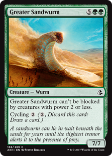
So, Greater Sandwurm.
Within the style guide for Magic's world of Amonkhet, there was a sandwurm that I believe was designed by Victor Adame Minguez, who was a member of the concept team that built the world. I was asked to paint such a sandwurm, but bigger. Much bigger. The wurm would be rising up above the horizon as it plowed through a band of mummies shuffling through the desert.
I'm not going to lie, I looked forward to this assignment with relish do to a variety of art nerd reasons. It wasn't the wurm itself, nor the world it inhabited. It was that I had a clear vision of the lighting in the piece and was looking forward to the challenge of getting it right.
As I've discussed before, my work tends to go pretty dark value-wise as I paint it. I don't exactly spot blacks in the dark areas or anything, but a lot of times shadow areas of my work get dark enough to seem that way. The result is that I feel that a lot of my work lacks the degree of luminosity that I'd like it to have, and I wanted to see if I could do something different with this piece. That the wurm was white and the desert was brightly lit was a big help, I just had to find a way to restrain myself from diving too deep into the darker end of my palette too quickly.
Approaching the piece, I had a clear picture in my mind that I was pretty passionate about. I had a definite idea of the composition and moment I wanted to convey, I had a clear idea of the color and value structure, and what narrative there was to convey fell easily into all of it. I was pretty eager, so I dove into Photoshop and knocked out this sketch:
 |
| ©Wizards of the Coast |
When asked to paint a giant sandwurm rising up from the horizon, it's kind of impossible to avoid a Dune vibe. Rather than try and fight it, I feel like it's just better to embrace it, instead. I doubt that I'll ever be on the list of aritsts someone asks to illustrate that classic, but I enjoyed the chance to reference the world of Arrakis while I could.
Unfortunately, when painting a sandwurm rising from the horizon, it's also kind of difficult to not paint a giant phallus. And that, as was pointed out to me by a fellow illustrator, is exactly what I'd done with the above sketch. That's not necessarily a huge issue, mind you, after all there's plenty of stuff we see every day that is phallic. In this case, however, it felt blatant enough that it could be mistaken for being intentional (which it wasn't), and that's not something that Wizards would want to deal with. More importantly, my fellow illustrator felt that the wurm's pose was a bit dull and I kind of agreed, so I revisited the sketch.
 |
| ©Wizards of the Coast |
Though I think the revised pose had a positive impact on the piece, there's a real part of me that prefers the original version—dull, phallic (or both) or not. I feel like the the image is more balanced and the composition appeals to my love of starkness. Plus, the pose insinuates scale and weight in a way that second version just doesn't. Lastly, it also nods more firmly to the aforementioned Dune vibe (but that bit's not exactly within the parameters of the assignment or Wizards' needs).
That being said, the folks at Wizards liked the sketch and I went on to the final.
 |
| ©Wizards of the Coast |
The finished piece is oil on hardboard and measures sixteen inches wide by twelve inches tall. It was art directed by Mark Winters.
Looking at the piece a little over a year after I painted it, the question of balance still nags at me. After revising the sketch, I kept moving the wurm within the piece further to the left only to end up putting it back in its original position. I did this probably a dozen times, and will all that pushing and pulling, I never really found a final placement that made me completely happy. Obviously, I settled on a placement at the time, but I'll never be one hundred percent certain that it was the correct call. Right now, I feel like I should have moved it further left, tomorrow I might feel like it's fine where it is. When I see it framed, it'll probably cause the debate to begin anew, but we'll have to see.
So yeah, there's something that nags at me on this one, but I can't say I dislike the painting, either. In fact, there's a lot I'm really happy with. I didn't quite nail the degree of luminosity I was hoping to achieve, but I got much closer than I expected to. Additionally, I like the limited color palette and I enjoy a lot of the details throughout—especially the mummies, the blowing sand, and the landscape beyond. I'd call it a win.