Wednesday, January 12, 2011

Reference, Part 6

Okay, so another example.  For the piece, "Duress," I used a single photograph.  First I did the sketch.  Again, part pencil and part digital due to some changes that were made to the piece.

©Wizards of the Coast

Then the reference:

©Amy Belledin

So, the first thing you'll notice is that I'm not a female.  And not an elf, for that matter.  Though I did take some shots of my wife in a similar pose, I really wasn't happy with the result, and I ended up using this one of me.  As the drawing was pretty well settled, I didn't need to worry about any kind of feminization (something I've done plenty of times before).  This reference was more about light mapping and value structure.

As such, I went ahead and did a quick digital value study to iron out a few questions I had about the piece.

©Wizards of the Coast

Having settled a few questions I had, I moved forward with the painting, seen below.

©Wizards of the Coast

The first thing I want to point out is the placement of highlights on the elf's skin.  These are pretty much stolen directly from the reference photo.  I pushed the contrast where I felt it necessary and generally just tried to sell it all as well as I could.

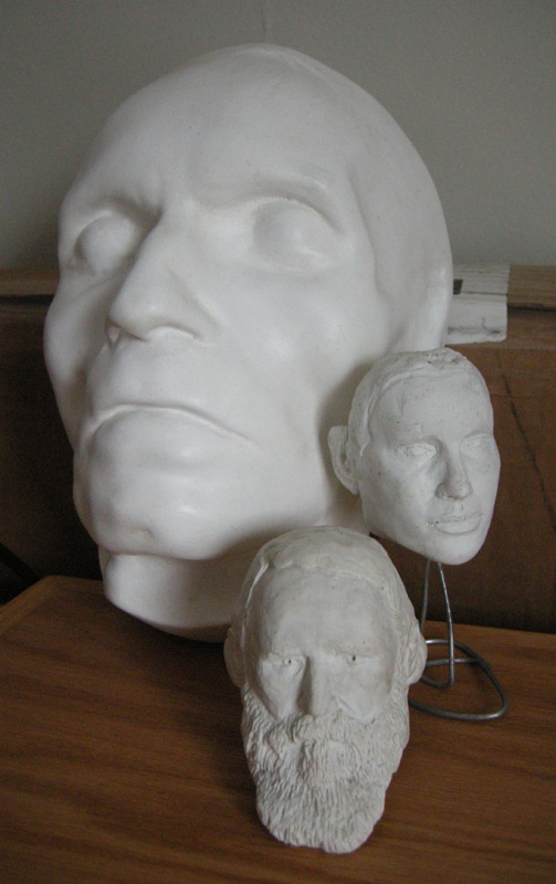
The shadows on her face from the needles were arrived at quite simply.  I took my deathmask of Beethoven (seen here), lit it the same way, then held a pen at the same place and at the same angle as each needle in the piece.  This gave me the general size and direction of each shadow, which I then glazed directly onto the painting.  Using the same pen, I figured out the direction and degree of highlights on the various needles in space.

One of the things you may notice is that there really should be to some extent shadows of the webbed visceral all over her face and head.  Initially, in the value study I tried to account for it, but the piece felt a little too busy, and I figured it was better to ignore reality in order to keep her expression and the overall image as clear as possible.  It was going to be reduced for use on a playing card after all, and it's pretty likely that those shadows would have become a real mess.

Just as an aside, in case you're wondering, the piece was oil and measured 11"x8" on a piece of illustration board that measured 13"x10".  It resides in a private collection.

Tuesday, January 11, 2011

Reference, Part 5

So, in order to combat the generalizations of aspects of the previous entries, I'm going to give a few specific examples of paintings and the reference used for them.  Well, what I can give you, anyway.

I'll start out with the painting "Perimeter Captain".

Typically, I'll do at least some thumbnail drawings to figure out a given pose and composition.  Sometimes I'll go for the finished sketch if I'm confident enough in the direction I'm taking.  In pretty much every case, however, I do drawings before I shoot reference.  This doesn't mean that I won't explore other options with the camera, but I always pick a direction and start shooting the reference with the intention of fleshing out that initial direction.

So, here's my sketch.  It's part pencil, part digital, and awful sketchy.  But, for better or worse, this is where I started.

©Wizards of the Coast

Despite its sketchiness, it's still pretty clear which way I'm headed and so I set up the lights how I wanted them, posed, then had my wife snap the shots.  Here's my main bit of reference.

©Amy Belledin

Pretty straightforward, so far.  But, I'm sure you'll notice a few things.  First, I'm not black.  Second, I'm not wearing anything that's even close to what is indicated in the sketch.  What's the deal?

This is where supplemental reference comes in.  I knew at this point what the general lighting scenario was and I also knew what the general color palette was going to be, so I first started looking for images of dark complected men in similar lighting situations, and specifically for those with blue or purple highlights in their flesh tones.

Now, what the main figure was wearing was based primarily on aspects of a styleguide that I was being asked to follow.  Styleguides are a whole animal unto themselves, but the short story on them is that they are created by companies (in this case by Wizards of the Coast) to give the artists working for them a clue on what things are supposed to look like for a given project.  The styleguide contained specific armor and clothing designs that I riffed on and then backed up with some images of armor from various books I own, and various photos I've taken.

In the interest of not getting any kind of cease and desist letter, I won't actually post the supplemental images.  I can tell you that outside of the books on my shelf, my main sources for the images I used were Getty Images and National Geographic Stock.  The images obtained from there were solely for the purposes of getting the fleshtones somewhere in the ballpark of where they should be.

It should be made clear, however, that the vast majority of the main figure was informed by the above photograph.  Everything from the placement of highlights on the skin, to where the light would be hitting different planes of the armor and clothing.  Any solidity the finished figure has is due mainly to this one picture and my ability to bend it to my will.

As for the overall environment (or lack thereof), it was mainly inspired by the likes of Maxfield Parish and N. C. Wyeth.  Both of these illustrators loom large in my childhood and are among my biggest influences, and I often like to give them a nod or two whenever possible.

Finally, the fellows in the foreground.  This was a rarity.  No reference.  Perhaps you can tell.  Perhaps you can't.  The way I figured it, they weren't important.  I wanted to keep them generalized and I didn't want to be too precious about them.  They were informed by lots of drawing and lots of reference taken over the years.  I really don't have any other explanation.

So, here's the piece in its final form.  For better or worse.

©Wizards of the Coast

Monday, January 10, 2011

Reference, Part 4

Props.

There are folks who have a prop closet, or something of the like.  Contained therein are usually any variety of things like costumes, guns, swords, skeletons, armor, etc.  Such props can be quite useful when trying to paint something with a great deal of specificity.

So what do I have?  Not a whole lot, actually.  Sure, I've got a sword and a couple of flint-lock pistol replicas.  I have an entire replica Union uniform from the American Civil War from a previous life when I used to reenact.  I've got various hats that I've collected, an old M1 army helmet, and a number of other costume bits and bobs, but nothing of the ilk that would make other illustrators jealous.  Still, I employ the various props I've collected as effectively as I can to add a degree or two of authenticity to things I've portrayed.

What about the rest?  Well, I fill in the blanks as best I can.

The first thing I do if possible is build a model or replica of a given prop if I think it necessary.  These can be cut and glued from cardboard, wire, or even sculpted from clay.  I've built replica shields, swords, and armor using all kinds of stuff that regularly ends up in the recycling pile.

Other times, I'll try and dig up something that does a fair job of replicating aspects of the object I'm trying to depict.  For example, if my character has a metal staff that's highly reflective, I might use a vacuum cleaner's chrome-plated pipe to stand in for a metal staff, so I get a good idea of what might reflect where.

Simple enough, right?

The key is to find things that will give you the information you need.  If it's about how light falls on a given shape, then maybe you need to build something and fill in any blanks with reference taken from books or the internet.  If it's about how it reflects or appears under specific lighting conditions, then perhaps you'll need to hunt one down if it exists, and shoot pictures of it yourself.  It's all about figuring out the most important things you need to nail and then finding a way to get the information you need to make that happen.

Environments.

First off, one of the greatest resources known to illustrators nowadays is the internet.  There are thousands of images of environments from which to draw.  Finding images of cathedral interiors, stables, or the cold of space are pretty easy to stumble across — especially since things like Google Images and Flickr came along.  Plus, finding specific places is pretty easy, as well.  Still, you shouldn't rule out other resources like your local library, which often times can be even more useful as you can find entire books about a specific place you're trying to depict.

Now, for those of you who have access to the type of environs you're trying to depict, there's really little you need to worry about.  Otherwise, it's all about piecing together what you can and creatively presenting things in a way that people will buy into.  Vague, I know.  But, it's really all I've got.

Look, thing is, if you're tech savvy, then maybe you're the kind of person who can actually create a digital 3-D model that you can turn and rotate and view from any angle.  Maybe that's how you figure stuff out.  Maybe you do something like James Gurney might and build a model of your environs from scratch and then inform it with all kinds of reference to make it all the more believable.  Maybe you're like a lot of folks and you just figure out a specific image you want to base things off of then riff on it and bend it to your needs.

I, myself, am not a big environment guy...apparently.  Looking over the work I have on my site and have sitting around in my flat files, it's clear that I'm not into the elaborate mosaics, or wall paper.  I don't do a whole lot of really heavily detailed landscapes or interiors.  Part of that has to do with my sensibilities as an artist or illustrator.  Part of that has to do with the needs of the assignments I work on.  Nevertheless, I have thousands and thousands of photographs that I've taken and collected over the years of environments.  I go on vacation, I take photos.  While other folks are looking to take photos of each other in front of landmarks, I'm muttering under my breath, waiting for the tourists to move on so I can get a clear shot with fewer people in the way.  My wife and I have gone on entire vacations without once photographing one another or being photographed together.  (Romantic, I know, but it's something we've always done).  Without some of these photos, there are pieces that would have fallen apart and would not be something I show folks today.

Like with props, and all other bits of reference, dealing with environments is all about understanding what you need and then finding a way to cobble those things together.  Again, not everyone uses reference the same way, and not every piece requires the same amount of or the same dependency on reference.  As such, you'll develop your own ways and methods to get what you need not only in general, but on a case by case basis.

Then, once you have it, it's all about figuring out what to do with it.

Friday, January 7, 2011

Reference, Part 3

If ever you've been told that you need to shoot photo reference during a critique or interview, there's a pretty high probability that the person telling you this was thinking mainly about your figurative work.  As such, I will talk about that first.

A great deal of the photographic reference I shoot is figurative.  For me, it's all about reinforcing the drawings with more information so as to be sure things are in proportion, are reasonably anatomically accurate, and have a solidity to them that adds to their believability.  To do this, I shoot people... Let me rephrase that.  I take photographs of people.

Again, real revolutionary stuff.

So, who are these people I take pictures of?  Mainly I take photos of my wife, or she takes photos of me.  Or, I'll use the handy dandy timer on the camera and take pictures of myself.  I've also been known to grab some friends and photograph them, and on occasion have even hired a model or two.

No matter who you're photographing, the important thing is that you have someone who is somewhat aware of their bodies, how to position them, and can follow your directions.  This is one of the reasons I use myself as a model so often.  I know what I'm trying to convey.  I know what the pose should be and how it should look in a given space because I've already drawn it.  So, I set up my lights, strike a pose and hopefully get the shot.  I'm usually pretty close.

When working with someone else, it's all about clarity of direction.  I usually start out by telling the model about the scene I'm trying to convey.  What's the mood?  What's the person they're portraying doing?  Next, I show them the drawing I've done.  I mention the salient points of the drawing and the pose for them to consider and answer any questions they have.  Then, if necessary, I strike the pose myself.  Some folks get it after seeing the drawing.  Others need to see it for themselves in order to replicate it.  After they've struck the pose, I'll try and fine tune it as necessary with verbal instruction and snap away.

One of the more difficult things about this process is that some poses can be painful or near impossible to hold at length.  The way I deal with this is to be prepared, have everything set up, and take tons of photos just to be sure.  I have the model hold the pose as long as they can or repeat the action as many times as need be until I've gotten what I need.

Sometimes it's necessary for the model not to pose, but rather act something out — be it a simple run or a swing of a sword.  In these cases, I shoot a version where they're posing still in the position I'm looking for, then have them act the entire motion out and photograph as much as possible.  There's a lot that happens with the body in motion that you miss when someone is standing still, and that tends to inform any movement you're trying to convey.  What you may end up with in these cases may not be the crisp photos you require, but there might at least be an inherent gesture that you otherwise may not have gotten.  It's worth going the extra mile.

Beethoven's death mask* and a couple of sculpts I did that got mangled in the move.
Fun fact: take a look at Beethoven's death mask, then look at N.C. Wyeth's pirate paintings.  Yeah.  They're mostly portraits of a dead Beethoven.


Aside from living, breathing human beings, I also take photos of sculpted heads, action figures, and a collection of deathmasks I happen to have to augment my figures.  On top of these assets, I will look up additional reference online if necessary.  If I'm portraying a 50 year old man, I look up 50 year old men.  If I'm portraying someone running, I look up people running.  Every little tidbit of information you add will boost your confidence in tackling a painting, and is therefore worth collecting.

At the end of the day, for the most part, some reference is better than no reference.  Even if said reference only minimally informs the piece, it's still done its job.

Next: props and environments.

Thursday, January 6, 2011

Reference, Part 2

Up front I’m going to put this out there: while there are a lot of illustrators who use professional grade lighting, I am not one of them.  If you’re interested in that type of thing, I can give you their names or you can easily find some excellent resources on the subject out there in the ether.  I’m going to focus on what I use.

So.  Lighting.

Simply put, I can’t afford good lighting.  As such, I use one of two light sources.  First, there’s the sun.

The sun is awesome.  So awesome, in fact, that the Earth rotates around it.  Unless you believe otherwise…in which case I wish you good luck with that.  The best part about the sun is that it’s free, which makes the sun even more awesome.  If I have a piece that is sunlit and I can time getting reference together with a sunny day, I shoot my reference outside.  Pretty revolutionary, I know.  If not, I will take my reference indoors using the tools listed below and supplement those photographs with other photos taken outdoors on other occasions.  If I need a cloudy environment, I shoot reference when it’s cloudy.  Again, not reinventing the wheel.

If, the sun is unavailable, or I need something a bit more specialized, I then use other tools to get the job done.  If it’s an indoor environment and I can simulate the lighting setup in the image with household lamps, then I do it.  I take the shots and I move on.

If it’s even more specialized than that, I call in the troops.  And by troops I mean, standard, hardware store, clamp lights with basic aluminum reflector bowls.


One of two reactions just happened.  Your jaw either hit the floor over how stupid I am, or your mind was totally blown.  Well, I guess it’s possible that you just shrugged your shoulders, uttered, “meh”, and hit the “back” button on your browser.  So, I guess that brings us to three possible reactions.

No matter what you thought upon seeing the stone-age tools I employ to light things, it is the simple truth.  These things are remarkably versatile, too.  If I need more than one light source, I use two (usually with two different wattage bulbs in order to establish a primary or secondary light source).  If I need added fill light, I’ll put on a second one or turn on a tabletop lamp to do the job.  If I need a torch, I take the reflector bowl off of one and hold it by its clamp.  If I need colored lights, I use colored bulbs.  And, if I need to soften the light, I’ll put a piece of paper over the front of the bowl.  I love these things.  I use them to do a great deal of my reference, and I apologize for nothing.

The important takeaway of this, however, is to have a light source at all.  If you’re going to bother taking reference, bother lighting it, too.  Trust me, it’ll be WAY better if you use lighting of some kind.  Lighting can create mood, it can highlight important things, it can help define the world you’re creating.  Light is the actual means through which the forms are being defined.  If the lighting on a given object feels right, it makes it that much more believable.

And so I light my reference.  With lamps I got for $7 a pop in a hardware store on Myrtle Avenue in Brooklyn, New York.  If I ever graduate to professional lighting, I’ll tell you all about it.  But right now, how I use reference currently, these tools work pretty well for me.

Wednesday, January 5, 2011

Reference, Part 1

Today, I'd like to start talking about reference.  How I take it and how I use it.  Though I can't tell you how to use photographic reference in your own work, it's entirely possible that you'll pick something up from how I do things, all the same.  Or, you may find humor at how naive and stupid I am.  Either way, I'll begin by talking about equipment.

First, the camera.

In the dark ages, before the enlightened time of digital photography, there was this stuff called film.  While it was pretty awesome, it had a very limiting factor in that there were only so many shots per role and you had to be sure you got what you needed before taking your photographs in for developing.  Oh yeah — developing.  You actually had to go some place to have your pictures developed which took at least an hour of your life away.  No instant gratification with film, no sir!  If by chance you failed to get exactly what you wanted with the film, you had to rinse and repeat as necessary.  It wasn't cheap and was very irritating at times.  All the same, I liked having those pictures in hand, and kind of miss using my trusty Pentax K1000.

If that option didn't suit you, the next best thing was a Polaroid camera.  I had one of these, too.  As there was no negative, each photograph was it's own little original.  They were terrible looking, but if you needed your reference quick and dirty, this was the way to go.  Of course, this cost a fair bit of money, too.  Each shot cost you at least a dollar and you could blow through shots pretty quickly.  The upside, however, was that you didn't have to go somewhere to have the images developed.  It only took a few minutes for each shot to appear out of the gloom.

Then there's the issue of storing everything which I won't even get into.  Suffice it to say that I have boxes of reference that I hope to some day digitize and throw out.  Won't that be fun?

In short, digital photography might be the best thing that's ever happened to photographic reference.  You can see the image immediately after pushing the button, you are limited only by how much storage space you have, and there are no developing costs.  If, like many out there, you work off of a computer screen rather than printing your photos out, you save even more.  Kind of crazy, really.

Oh yeah...so my cameras.  I have a Nikon Coolpix point and shoot camera that I sometimes use.  Alternately, I will use my Nikon D200 SLR.  Why I use one over the other varies.  If I need more control over the settings and more detail, I grab the D200.  If it's quick and dirty, the Coolpix will suffice.  Otherwise, it might be because one is charged and the other is not.  Real professional, I know.

Anyway, if you're just starting out and don't have a lot of money, look online, do a little research, read some reviews, and find a cheap, reliable point and shoot for the job.  The point and shoots being made today have superior resolution to my SLR and take some pretty amazing pictures.  Eventually, though, you might want to consider saving up for an SLR or at least a camera that can give you raw files. 

What's so important about raw files?  Well, raw files are about the closest thing you'll ever get to having a negative in digital photography.  Just as you could in film photography, you can pull a lot of data from and manipulate the raw image's colors and values before having it compressed into a jpeg or tiff or some other format.  While you can certainly manipulate compressed images quite effectively in Photoshop, manipulating the raw files can give you much better results.

Now, note that I said that you should "consider" a camera that can give you raw files.  This is because not everyone uses reference the same way.  Some people paint exactly what they have in their reference photos.  Others do not.  Raw files can help you get more out of your photographs if you fall into that first category.  I, myself, fall more into the latter category.  While I shoot reference to get certain things right, repainting what I already have a photo of really doesn't interest me.  Even so, I still will manipulate the raw files from time to time.  It all depends on the demands of the project.

No matter what kind of camera you have or end up with, it is worthless if you don't know how to use it.  Even "simple" point and shoot cameras have hundreds of settings nowadays and can be tweaked ad nauseam.  Try everything.  You don't have to print it out, just see what each option does.  The more you understand what your camera is capable of, the better your results will be.

So, there you go.  Not everything you need to know, but all I'm qualified to give you.


Tomorrow: lights.

Tuesday, January 4, 2011

Frequently Asked Questions 4

Will you draw on my play mat?

Once again, I will start out by explaining to the uninitiated what this entails.  One of the interesting things about collectible card games is the market of peripheral items that exist to support them.  Everything from card boxes to store the cards in, to individual protective card sleeves can be purchased in a wide variety.  Another item that can be found are play mats, which are kind of like mouse pads (something that is almost an anachronism itself) on steroids.  They usually measure somewhere in the neighborhood of 14"x24" and come in a wide variety of colors.  Some even have images printed on them.  I suppose their purpose is to prevent the cards from getting scuffed on a given surface.  Either that or their purpose is solely to get signed and drawn upon.  I really couldn't say.

The short answer to this question is under certain circumstances, yes.  The circumstances are these: I must be at a convention or Magic event, present at my table, and have enough time to complete the task as requested.  Oh yeah, and it's helpful if you have money.

I know, I know.  I charge?  How can this be?!  Outrageous!

Before you grab your pitchfork and light a torch let me explain.  The fact is, the surfaces of play mats are less than desirable.  In fact, they're awful.  I have never drawn on a surface that is so destructive to the drawing tools themselves.  There have been instances where, while drawing, a play mat has destroyed a brand new Sharpie in a single go.  Now, I'm not talking about running out of ink.  No, no, no.  That's not such a big deal — it's to be expected with any given pen over time.  I'm talking about having the pen's tip shredded to the point where the ink contained in the pen no longer flows, and thus never has a chance to run out.  The result of this is that I blow through pens on play mats right quick, and getting through a drawing can be pretty frustrating.

Second, there is a question of time.  It takes me quite a while to do these things, and many of the requests can be painstaking at best.  For example, a common request I've had is to reproduce a given image I did as a Magic painting on a play mat, which can be quite tedious.  I'm not complaining, I'm just stating a fact.  The moment you have another image to live up to, things tend to take longer and the exactness required is increased significantly (provided you're attempting to do the original image any justice).

If the demands on my time are great, I will just go through the arrangements of the deal with the person requesting the drawing and set the mat aside to be worked on when I have some free time, and to be picked up at a later point.  The downside to this is that I may end up with no free time, or have so many play mat requests that I am forced to draw all night in my hotel room, after hours.  I can assure you that this is less than the pinnacle of fun — especially when there are a whole host of other illustrators present at said event who I want desperately to hang around with.

So, yeah, if you should stroll over to my table at a convention or Magic tournament or some such, I'll likely draw on your play mat if we can agree on all the particulars.  However, should I turn down your request for a play mat drawing, know that it is for a good reason.  It may be that I don't have the time, it may be that I have a wrist cramp (something that's been happening more frequently to me as I've gotten older), or maybe it's just because I'm not in the mood.  No matter what the reason, look at it this way: if I turn you down, I'm saving you from a mediocre final result.  If I don't have time, it'll be rushed and crappy.  If I'm in pain, it'll be ugly and crappy.  If I'm not in the mood, it'll be just plain crappy.  And in the end, who wants that?