Thursday, June 7, 2012

Brindle Shoat

This one's an oddity. An oddity for two reasons, I guess. The first reason is that it's just a critter. Doesn't feel like a Magic painting in some way. It's just a... piglet? Boarlet? Shoat, apparently. Simple little guy running out being all aggressive and whatnot. Fairly straightforward.

The second reason this is an oddity, is that the piece didn't come to me through the usual channels. As some reading this may know, the art director for Magic is Jeremy Jarvis. Usually, he's the guy that sends the art order, makes the comments, and brings the pain. But on this set, he got a little backup, and for me, it was the best backup ever and came in the form of Dawn Murin. In fact, it didn't just come in her form, it was Dawn Murin.

Some of you may know the name. Others may not, but Dawn is easily one of my favorite art directors ever. It was Dawn Murin that let me into the Wizards of the Coast gates, which allowed me to survive as a full-time, freelance illustrator. You see, Dawn used to be the art director for Dungeons and Dragons, a game and a product that I hold pretty close to my heart. It's work I no longer get and certainly miss, but I feel fortunate to have gotten to do a stint working on the game at all, and even more so for the time I got to work with Dawn. She's an awesome person, a lot of fun to be around, and an artist's art director — something the world could use a lot more of.

Anyway, Dawn eventually moved on from DnD to art direct a bunch of stuff that my work just wasn't right for, so we hadn't worked together in years. I try and make a point of catching up with her every time I'm in Seattle, but we don't see each other very often. Then, suddenly, one day she shoots me an email wondering if I'd like to do a Magic piece for her. I didn't hesitate.

At the time, I had no idea what the piece was for. Turns out that it was for Planechase 2, and it was a piece that was about as free of drama as they come.

Essentially, I was being asked to do a young version of a Brindle Boar. The key was that it had to feel dangerous. In order to accomplish this, I decided the little guy needed to be charging and whipped this sketch up:

©Wizards of the Coast

The sketch was approved as is, and I went to finish. The finish looks like this:

©Wizards of the Coast

It's oil on paper on hardboard and measures 12"x9".

It's a simple piece and was pretty fun to work on. It was also a nice break from the horror and darkness that I'd been painting at the time. While I like doing that other stuff, it's nice to to step back from it a bit periodically. Especially to paint a pig. 'Cause...you know...pig.

Anyway, here's the card in all it's glory:


You'll note that Dawn pumped the contrast up a bit. She checked with me first to make sure I wasn't offended. She's good like that, and that kind of thing rarely bothers me. The client's gotta be happy, and the fact that the work was already done for me was pretty sweet.

Unfortunately, I suspect that it'll be another long while before Dawn and I have a chance to work together again. In all reality, it may never happen at all. But boy do I appreciate that I got to revisit, in some way, the early years of my career with one of the people who made it possible.

Tuesday, June 5, 2012

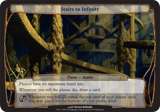
Stairs To Infinity

Here's the story behind the land piece I did for the recently released Planechase 2 set for Magic: the Gathering.

Typically, I'm a guy who avoids architecture like the plague. Painting straight lines is torture for me as I don't have the steadiest of hands. On the occasions I have done work with lots of buildings and such, it's been a constant and painstaking series of brushstrokes that are inevitably wiped away with a rag, only to be repainted anew and likely removed yet again. So, when I got the following description in the old inbox, my heart kind of sank.
ART DESCRIPTION:
Color: None -- represents a location within a plane
Location: see below
Action: We're looking for an Escher-like composition here, similar to his Relativity or Concave/Convex. In this planar location, a zigzagging set of stone stairs seems to lead nowhere and is mirrored horizontally, so that what happens on the top side seems to have a loose equivalency on the inverted bottom side. Ideally the scene is mostly architecture but includes some small figures and incidental actions.
Focus: the paradoxical stairs that lead into each other
Mood: Dizzying and surreal
My first instinct was to really latch on to the mood statement: dizzying and surreal. I thought it'd be cool to look down into a deep, cavernous hole with staircases winding this way and that. The problem with this idea, it turns out, is that the moment you're looking down you only see the tops of the various staircases (or bottoms as the case may be). This more precarious perspective would eliminate any chance of a clear representation of the world being two-sided. Sure, you could have folks peering over the edge and looking back up at you, but the potential issues of readability after reduction were enough to make me abandon the whole idea.

After being defeated in my initial attempts, I reread the description again, this time with the idea of layering staircases in various positions, different directions, and opposing perspectives so that you'd see the sides of some, the tops of others, etc. But what caught my attention in the description was the specificity of the top and bottom aspect of things. I wasn't sure, but I felt there might be a mechanical aspect to what the card does that was driving that idea. Balling up 10 different points of view would destroy the notion of a strict top and a bottom to the world, so I abandoned that effort, as well.

My next step was to go ahead and look at the Escher pieces noted in the art order. Under normal circumstances, I would have taken this step much earlier on, but I'm pretty familiar with the pieces in question and I wanted to see if I could solve the various problems in the piece first, then come back to the Escher pieces and sort of check my work. Since the situation didn't come together quite as I'd hoped, I now picked over the Escher pieces in hopes that I would find something — anything — that would get me off the ground.

It didn't help.

Finally, I just asked myself this question: what does the architecture in this plane actually look like? If I could figure that out, maybe I could begin to build a piece around the aesthetic. So I began drawing. After a while, I started to come up with some stuff that I thought could actually work. I began layering things, and flipping the sketch over periodically to make sure it worked in both directions. Finally, I arrived at this:

©Wizards of the Coast

I'm not going to lie. It's not one of my prettier sketches, but it got my point across. I imagine that this plane (or this portion of the plane) is completely hewn from rock. The architecture is largely monolithic, broken up only by vast spaces where stair cases flow from one "building" to another.  The facades are sculpted to a point, but dissolve into natural formations from time to time. Shafts of light filter in here and there, and I would suspect that there are places in the Stairs to Infinity that are receive some light all day and night as the sun rotates clear around the thing, infiltrating gaps along the way from every angle. Or something.

Anyway, I got approval to move forward on the painting with only a request that I make sure there were clear figures on the bottom of the world, not just the top. Seemed simple enough, so I put out my palette and went to work. Here's how it came out:

©Wizards of the Coast

The piece is 16" x 12" and is the usual oil on paper on hardboard.

What would have helped me quite a bit is if I could render things in 3-D. It would have saved me a lot of grief to have completely designed this piece on the computer so that I didn't have to do so much math in my head. But I don't know any pertinent programs that would have helped. As a result, there are almost certainly some horrendous perspective errors. The best I could do was a few cardboard and clay models of a few chunks of the piece, but their accuracy was limited. Still, I'm not entirely unhappy with how the thing came out. I just accept that there are flaws.

That being said, there's an odd thing about the piece. When describing it to someone the other day, I made note that the reproduction was less than accurate. I made the claim that the color was far more intense and that it was very much a play between orange and blue. After taking a look at it this morning, I'm pretty disappointed in my memory. The image above is as accurate as I can make it, and the cards weren't too far off. At least the couple I've seen so far (I didn't get my own copies as it's a promo card and thus I don't get any, myself).

Anyway, when I submitted the piece to Wizards of the Coast, I let them know that they were free to publish it either as I presented it or upside-down — whichever worked better with the card boarder.  They went with my original orientation, and it was printed thusly:


And here's a link to download a wallpaper of the thing: link.

Planechase cards are a lot of fun. They're twice as large as a normal Magic card, and on top of this fact, the art is full-frame. Add to this that they're landscapes and you've certainly got my interest. The two pieces I've gotten to do for the set have certainly been a lot of fun, and I'm not going to lie, I'm hoping for a Planechase 3.

Wednesday, May 23, 2012

The Weight of Mid-World

Folks who've visited my website in the last week or saw me at IlluxCon last year will recognize this piece. It won't be new to those who saw me at Spectrum Live, either. The rest of you, however, will be seeing this for the first time. While it's intended as a Dark Tower piece, it's not a quick read as one. You know what? It'll be easier if I just walk you through it.

So, the piece was born as a quick sketch I knocked out last October. I wanted to do something that was different from my usual work and I was leaning toward Stephen King's Dark Tower series as inspiration. I kept thinking of the young Roland, burdened with more knowledge about the workings of his world than a boy his age should have to bear. I also thought about what he was doomed to become: a bringer of death. I chose to tie these two ideas together using a halo.  But not the variety of halos that we're used to today — that ring of gold floating atop a person's head like a crown. No, I was thinking more along the lines of how halos were often depicted in medieval altarpieces and paintings — the more graphic, less dimensional circle of gold lief behind a person's head.

But gold lief seemed all wrong to me.  If Roland had such a halo, I think it would certainly be black. And so, with his head tilted back, his preacher's hat became that halo. The sketches of that image looked like this:


The smaller version was the initial one. I saw the composition as I wanted to present it pretty immediately.  The larger version was an attempt to flesh out a few things, but it became pretty clear that the smaller one was really all I needed. Anyway, I projected the smaller sketch onto a stretched canvas that I had laying around, shot my reference, and started to paint.

Just a quick note before moving on. While I did project the sketch, I didn't duplicate it lovingly or accurately. Anytime I transfer a sketch or drawing, I do so primarily for placement only. It's an attempt to keep consistent the composition of the piece from sketch to finish. Details are going to change — they always do — but the placement of the larger shapes is always important to me. Other folks have different feelings on the matter, with some finding the projection or transferring of a sketch to be either extremely necessary or wholly evil. Given that I generally am using paint to rewrite the wrongs of a given sketch to begin with, I tend not to worry about such things.

Anyway, I painted furiously and finished the piece in time to show it at IlluxCon. But, after the show, I saw a photograph of my booth and immediately I began to see a ton of problems. The curious thing about this is that I'd used a lot of tricks when putting the piece together. I did the mirror trick and looked at it backwards. I'd turned it upside-down. I'd even taken photos of it in process (which I can't find now and suspect were erased accidentally). These various things somehow didn't clue me into the issues, which were mostly proportion related. It's possible, however, that I saw them all along, but a portion of my brain kept them compartmentalized in order to get the piece done in time for IlluxCon. I honestly don't know.

Long story short, I didn't ever get a good image of the piece in that state. After IlluxCon, I packed the piece up and we moved. In preparation for Spectrum Live, however, I dragged it back out and made an attempt to knock it back into shape. Last week, I finally got a decent scan, put the piece on my website, and put it up at the show.  And here it is now:

Monday, May 14, 2012

Narstad Scrapper

So here it is, the last image I did for the world of Innistrad, and it's a weird one. How so? It involves a strange subject, an odd design, and a different palette for me. But before I get into that, let's take a look at the art order first:
ART DESCRIPTION:
Color: None (Artifact creature)
Location: Outside an alchemist's shack
Action: Show a walking, attacking creature made from wood, leather, brass -- and weapons. It's an alchemist's guardian, built from scraps around the laboratory, designed to keep intruders out. Maybe its arms are melee weapons (like those on pg. 46 of the "Shake" styleguide). Instead of a traditional head it has a glass jar set into its chest, inside which is somebody's formaldehyde-preserved head (to give it a slightly creepy, Gothic horror vibe). See pg. 71 for examples of alchemist's inventions -- now turn that style into something that can walk and attack.
Focus: The alchemist's minion
Mood: An awkward-looking contraption, but it'll crack you a good one if you get too close.
Examples of the melee weapons mentioned can be seen throughout the Innistrad block (link). For the most part, they're very true to the original designs — many of which were drawn by Steve Prescott. Steve was also responsible for most of the alchemist invention designs mentioned in the description, however, the various artists who'd extrapolated upon those designs in their illustrations had done so in ways that I personally had no clue about, not having seen the fruits of their efforts until recently. So, while I based my designs on those in the styleguide just as they had, I was generally in the dark as to whether or not my designs felt consistent with what they had done. I just had to trust that the art director would nudge me in the right direction if I was too far off.

To be sure, looking at the description, it's a strange one. I was basically being asked to create a magic robot made of mostly organic materials that was being powered by a decrepit head in a jar. Mechanical devises and robots designs are territory I'm very uncomfortable with because my own sensibilities are rarely in keeping with what folks are typically looking for. Still, I had to figure out where to start and where to take the piece, and after rereading the description many times, my mind began to drift toward tractor shows I'd been dragged to as a kid.

What's a tractor show? Think car show, but with tractors. All makes and models, some as small as modern riding mowers, some as large as trains.  At these shows, the ones that created the biggest impression on me were the ancient, steam-powered tractors that had all sorts of belt-driven attachments for doing things like splitting logs and such. They were noisy, dirty, ghastly affairs that, while often times enormous, had engines that contained lots of negative space and were clunky to say the least. Many were ugly machines that clearly had been built solely with function in mind or were from a time before form was even taken into consideration.

With Steve's designs and the weird parade of tractors crawling through my mind, I began to knock out a design for this thing, all the while trying to figure out how it might function. To what does this chain connect? How was this arm driven? Where should this belt attach? After much fumbling, I came up with this sketch:

©Wizards of the Coast
To call the machine strange is fair. To call it ugly is, too. While it wouldn't work mechanically, it looks like it might to some extent, and given that it's Magic, you have to assume there's some ethereal force at work, as well. Either way, it's an odd looking thing, and while it has clear connections to the designs that Steve put together, I was really uncertain just how well it meshed with the set as a whole. Happily, I was reassured by the the art director. "Heh," was all he added to the automated approval email. From there it was off to paint.

Before I get to the finish, let me take a moment to comment on the odd (for me) palette. As I've said before, I don't typically do color studies. This piece was no exception. What's weird, though, is that I drifted toward a palette that was dominated by colors I typically think of as supporting players rather than stars. While I can't exactly account for why this came together as it did, I'm happy that I went along for the ride as I did, as I gained a new appreciation for a oft forgotten portion of my palette in the process.

©Wizards of the Coast
The original is oil on paper on hardboard and measures 12" x 9".  And here it is as a card:


Narstad Scrapper just feels off to me. Not bad, just off.  It felt odd while I designed it, odd while I worked on it, and even now feels like a weird blip in my work to me. Even odder is that of all the pieces I submitted to Spectrum 19, this is what was accepted. This isn't a complaint, mind you, I actually find it fascinating that the judges saw merit in this piece — merit enough to put it into the book. Would I have chosen this piece over others I've done over the last year and submitted for consideration? Probably not, but I'm tickled that this piece made the cut, all the same. If nothing else, this piece is pure gut. It's a shot from the hip. And its a nice little oddity that will likely hold a place in my flat files for years to come.

As an aside, this piece, along with many others will be on display this coming Friday, Saturday and Sunday (May 18, 19, and 20, 2012) at the Spectrum Fantastic Art Live exhibition in Kansas City, Missouri. You'll find me and my work in booth 604. If you're in the area or are planning to attend, by all means come by and chat me up if you're inclined to do so. If nothing else, it'll be an awesome show to behold. Until I return, I will likely maintain radio silence on this blog, but if I have the time to put up a blurb or two, I'll try to do so.

Friday, May 11, 2012

Searchlight Geist

Searchlight Geist was the third piece commissioned along with Fervent Cathar and Defang. Like Defang, this was another piece that just came together for me. Unlike Defang, however, there were no special memories that fueled this piece. Instead, I was packing a bit of inside information. But let's not get ahead of ourselves. We'll take a look at the description first.
ART DESCRIPTION:
Color: Black creature
Location: Foggy sky, perhaps over a swampy graveyard
Action: Show a spirit that is floating through the night sky (see "Shake" styleguide pg. 78-84 for geist reference). It has no face, and "carries" a grim-looking iron lantern (maybe it just hangs from a chain, or is attached by wisps of ghost-stuff). Inside the glass of the lantern is a ghostly, glowing skull-face.
Focus: The geist
Mood: Creepy, haunting
As I've mentioned before, I worked on the team that designed the visuals for the world of Innistrad (something about which I promise I will elaborate upon real soon in my Innistrad wrap up). I worked on a variety of things for the world, primarily the architecture, some landscape stuff, wardrobe, a few creatures, etc. Up to this point, I'd only gotten to actually illustrate one creature that I'd helped create, the Frankenstein inspired undead creature in Geralf's Mindcrusher. Finally, with this piece, one of the last I would work on for the Innistrad block, I got to do a finished illustration of something else I'd worked on: a ghost or spirit, which in the world of Innistrad are called "geists."

Armed with the bit of confidence in the fact that I knew what I was doing (or at least thought I did), I strove forward with pencil and stylus in hand to create the following sketch:

©Wizards of the Coast
It's a pretty straightforward description of a pretty straightforward image that resulted in a pretty straightforward sketch. This one was all about nailing the tone, mood, and a certain sense of light. Considering that the light source was right there in the description, the only thing I had to do was get what was in my head down on paper. The fine folks at Wizards dug what eventually ended up on that paper and approved the image for painting.

©Wizards of the Coast
The piece is oil on paper on hardboard and measures 12"x9".

As you can see, it's a lot darker than the sketch indicated. This happened pretty organically and I'm happy it did because it really pushes home the ominous nature of the thing, and also makes that skull lamp sing. Color-wise, I knew I wanted to stick with blues, greens and purples. It was a piece that just kind of called out for a cool palette to me, and indeed the only hints of warmth are in the decaying fabric of the geist's form.

Anyway, here's what it looked like in card form:


And here's a link to a page where you can download the image as a desktop for your computer, iPhone, iPad, or even your Facebook cover: link. If you're not interested in any of those things but are a painting goober like myself who likes to see brushstrokes and such up close and personal, then I urge you to go ahead and check those images out anyway because my lack of skill is laid bare for all to see.

To be honest, this is the kind of piece I like. Not necessarily the subject matter or the color palette or any such thing. I'm talking about the total lack of drama. It was a piece tossed in my direction that I knew what to do with immediately and then went through to finish without calling much attention to itself. Any time a piece comes together this smoothly I feel pretty lucky. Of course, looking at the three pieces I was assigned, that only one of the three gave me any real difficulty is kind of a miracle. This might not be the best piece I've ever done, it might not even be great, but I do have a quite a fondness for it. I like trying to inject beauty into horrible things, and sometimes I get lucky when it actually works. I think this might be one of those times.

Thursday, May 10, 2012

Defang

Defang was quite the opposite scenario from Fervent Cathar, which I wrote about yesterday. It was assigned and painted concurrently with that piece, but it was one I had very few doubts about and one that I attacked with some degree of confidence. Here's the art order I received:
ART DESCRIPTION:
Color: White spell
Location: Village setting
Action: Show a vampire that's been taken prisoner by two human soldiers (see "Shake" styleguide pg. 58-64 for devil reference). The vampire's arms are bound so that it can't claw anyone. Also, its lips are pulled back in a sneer-- and we see that its big canine fangs have been removed. The vampire shuffles along in bondage, resigned to its fate. (We don't have to see much of the human guards in-frame; just show enough to tell the story of the vampire's imprisonment... just body language should be enough to sell it)
Focus: The neutered vampire
Mood: A dangerous evil that's been rendered harmless. 
Looking back it's interesting that they didn't actually want to show the teeth being pulled. Also interesting is the fact that I didn't work up that alternative, nor did it occur to me at the time to do so. Considering how the piece came out, I don't think I could have made the piece quite as iconic had I depicted that scenario, anyway. What I imagined instead, was this:

©Wizards of the Coast
Here's our vampire in irons, being muscled through a dark space, lamps hanging directly above, motes of dust whirling in the shafts of light.

I'm not sure why, but I immediately associated the space the vampire finds himself in with the bowels of my grandmother's barn, a space I was never officially allowed in. I remember seeing it once or twice, each time accompanied by my father. I remember it was cool and dark, the light unable to reach the entirety of the room and describe it fully, leaving pockets of mystery throughout. I'm not sure, but I think the space was intended for cows or some other livestock, and it was subdivided into stalls. At least I think it was. Truth is, I kind of like the fact that it's still a mystery to me. That part of the barn evokes much more than memory and I'm happy to keep the blank spaces in place. The one thing I do clearly remember about it was the smell. Decaying wood, rotting hay, rust, mildew, with just a hint of leather and oil. That coupled with the blood is what I imagine the vampire is smelling as he's guided to his final destination.

It was also due to this weird association that I designed the hand restraints the way I did. They're inspired by a straightjacket, a dog muzzle, and horse tack. A leather harness which fastens at the waste and has shoulder straps that cross at the back is put on the victim. Though I didn't depict them, I'd imagine this is all reinforced with groin straps, as well. Attached to this harness are leather straps that buckle repeatedly around the arms all the way down to the wrists where wrought iron cages riveted into the leather work keep the hands from opening fully. These cages are then locked to iron loops bolted or riveted to the harness at the chest, thus restricting the victim's arms to a position most associated with someone laid to rest in a coffin (at least that's what I was trying to suggest).

You know, I put a disturbing amount of thought into that...

Anyway, back to the sketch. I turned the above sketch in and got some notes back. There was a concern that the lack of teeth wouldn't read well when reduced to card size. This was a very valid concern.  So, I cropped in and reworked it a bit. Here's the second version:

©Wizards of the Coast
Cropping in eliminated the escorts, so I put their hands on the vampire's shoulders instead of around his arms. Also, because of the concerns with readability, I got rid of the vampire's tongue. I was worried that it would visually clutter the mouth and make it that much more difficult to discern what was going on. I resubmitted with this sketch and it was approved with one final note from the art director in which he urged me not to be afraid to mess the vampire's mouth up even further — maybe a few broken teeth or something. I told him I'd consider it and went to paint.

©Wizards of the Coast
So here we have the final, it's oil on paper on hardboard, and measures 12"x9".

I set out with two things in mind when I began painting this piece: I wanted there to be sympathy for the vampire, and I wanted the shock of red to be the only bright color in the piece. I'm not sure whether I accomplished the first, but I managed to restrict myself color-wise to pull off the second. I imagine how much sympathy the viewer feels likely is connected to how they feel about vampires in the first place.

Astute viewers will note that I ignored the notes that the art director, Jeremy Jarvis, gave me. The four front teeth are still intact. The truth is that I mulled his suggestion over in my mind the entire time I worked on the piece and decided that I'd paint it as I'd sketched it the first place, then mangle the mouth from there. But when I reached that point, I found that I couldn't actually bring myself to do it. The piece was disturbing enough, I didn't want to make it even more so. Still, I knew that the image as it was wouldn't be enough for someone who's seen just about every horror film ever made and can give you the plot summary of every one of them. So, I decided to create two other mouths digitally, so that Wizards had three to choose from. In Photoshop, I painted one with broken teeth, then another with no teeth. Here's what they looked like:

©Wizards of the Coast
Now, I've looked at a lot of disturbing stuff on the internet in order to find reference for Magic paintings. Some of the stuff I had to look at to achieve this piece proved to be truly cringe-worthy, and likely cemented my place on some sort of watch list being kept by some agency somewhere or another. I'd say it's worth it, but that's just me. I suspect that Jarvis would agree. He went with the broken teeth.

Wednesday, May 9, 2012

Fervent Cathar

Here's the first in the new batch of pieces from Magic: the Gathering's most recent expansion set, Avacyn Restored, and the last set of the Innistrad block, which I helped concept for. I'll go ahead and start with the art order:

ART DESCRIPTION:
Color: Red creature
Location: Mountainside under gloomy skies
Action: Show a knight like the one on pg. 145 of the "Roll" styleguide. He rears back on his chestnut warhorse, waving his sword, looking serious, fierce, and heroic. Perhaps a bit of sunlight graces him, breaking through the overcast sky. Other soldiers (male and female) on horseback ride down the mountainside after him.
Focus: The horseback knight
Mood: All would follow him into battle.

There were two things straight away that were potential issues. First, the horse and rider can't both be rearing and riding down the mountainside as the description insinuates. It's got to be one or the other.  I explored both and decided on running. It was more proactive and thus more interesting to me.

Second, a more importantly, there was a horse. I mean at all. Forget what's it's doing, I had to paint a horse, which is something I very rarely get called upon to paint. I have a difficult time drawing horses and this was further complicated, it turns out, by the fact that the horse and rider in question were to be running downhill. Why is this a problem? Simple: racing a horse downhill is generally considered cruel as horses are often injured and can even die as a result. Indeed the only downhill horse race that I'm aware of, the Omak Suicide Race, is constantly protested for this very reason. As such, what little video footage and photography of such activities is usually pretty bad and semi-useless for the purposes of reference. One gets the feeling that there's a conscious effort to keep it off the internet.

So that's really informative and all, but why's it important? Simple: horses running across flat ground don't move the same way as they do when running downhill. The weight distribution is completely different as are the various muscle bulges. Given that I'm not completely comfortable with drawing horses (and I'm not exactly comfortable riding them either since my last experience involved an old nag trying to throw me while on a cliff-side trail which would have resulted in a hundred foot drop), and given that I'm not quite as knowledgeable of horse anatomy as I probably should be, I really could have used solid reference in order to truly sell the downhill charge.

Still, I cobbled together what reference I could, supplemented it with photos of horses running across flat ground, and took a shot at it. Okay, several shots at it. After many discarded attempts, here's what I came up with:

©Wizards of the Coast
Straight away, you'll notice it's a digital sketch. Fully digital. This is due to the fact that I was erasing so much and had had so many false starts, that I got fed up and turned to a medium which allowed for erasing without the threat of tearing paper, and the ability to cut and paste at will. The horse is dodgy at best, but It's still clear what I'm going for and where it's headed. Believe it or not, it was approved as is and I went to the finish.

©Wizards of the Coast
It's oil on paper on hard board and measures 14" x 11", and is called Fervent Cathar.

Much of painting was done on the fly with this one. I was constantly editing and reediting the background, whose landscape you'll note changed quite a bit from the original sketch. Something else that clearly changed was the horse, much of which was repainted no fewer than three times.

This piece was a problem piece. It was commissioned with two others and was the first piece I started and the last one I finished. Unfortunately, the problems were all my own doing. I had failed to nail the drawing up front and spent the entirety of the piece trying to recover from that. I spent the vast majority of the working duration solving problems when I should have been polishing, and were I to do it all over again I'd spend a lot more time up front in order to save myself the later frustration.

Whether or not it's a good piece I can't say. What feelings I have for it are tainted by the difficulties involved in its creation. I'm pretty sure I've done worse, and there are some qualities I actually dig the heck out of. For one, I got to paint something with fairly limited color (which I'm usually discouraged from doing, but enjoy whenever I get the chance). Two, I'm quite pleased with the sense of light and how it reflects off the armor. Lastly, I'm pretty happy with the background players, who manage to insinuate far more than they describe. Beyond that, I see only its faults, a plague which I think all artists are doomed to suffer from.

Still, I wrestled with the piece and managed to finish it. It wasn't a total train wreck, and there were no complaints from the client (at least not publicly). But, the end result of the piece was that it solidified my decision to start showing my circle of artistic confidants sketches rather than finishes. Plus it got me thinking more about the beginning of a piece again, which is never a bad thing. Many pieces are doomed by the lack of effort on the front end, and this one could have been among them.