Wednesday, March 28, 2018

The First Eruption

This assignment was an easy one to wrap my head around, but difficult to execute on several levels. The challenge: paint a tapestry depicting the Ghitu people's creation story of their home continent of Shiv. The Ghitu and Shiv are parts of classic Magic history and are names most Magic fans will likely recognize. If you happen to be one who is less than initiated in Magic's lore however, the short version is that the Ghitu believe that an egg of stone hatched and a yolk of flame erupted, becoming the continent of Shiv. Somehow, this tapestry needed to depict that pivotal event.

The first challenge was that this image was not going to show a tapestry in its context. In other words, the art would not show the wall upon which the tapestry was hanging, nor would it show a loom or any such clue as to what we were looking at. Having such additional elements would be useful and would likely make selling the tapestry that much easier. But for the purposes of the card, it was necessary to show the tapestry by itself. This meant trying to figure out how to make the tapestry read as a tapestry in some other way. I chose to do this through texture.

Depicting the image on a tapestry is the easy part. The hard part is making it clear that the image one is looking at is a tapestry (vs. a painting vs. a print). That means figuring out how to depict the medium itself, which is woven fabric. I did a lot of research. I looked at a LOT of images of tapestries. Most importantly, I looked at a lot of close-ups of tapestries. In doing this, it became evident to me that recreating some semblance of the weave I saw on many of those close-ups was the key. All I had to do was figure out how to articulate that weave with oil paint.

Why paint? Well, it's what I use. I confess, however, that I thought long and hard about doing this piece digitally, since I knew that superimposing a weave onto an image in Photoshop would be a piece of cake. In fact, doing that would have taken mere moments whereas my solution took several days. But as much as I knew I could save time, I rather liked the idea of the challenge in doing it all with traditional media. Plus, I thought it worth the gamble that someone would want to buy the finished product.

Anyway, after some experimentation on a piece of gessoed cardboard, I decided how I was going to go about painting the piece. This involved filling in the basic fields of color within the design, then adding very thin, parallel lines in a darker value, and finishing each strip with dabbed highlights indicating individual fabric strands. It was going to be tedious, but I thought the result was a good compromise between the appoximation of a weave and a painterly finish.  Next came the issue of figuring out how to depict the Ghitu legend itself.

Deciding on the design of the tapestry was less straightforward than I'd expected. I knew that the image needed to contain an egg (or egg shape) breaking open, a volcano erupting, and a couple of dragons. The image also needed to be somewhat graphic in order to be in keeping with a woven tapestry. All that was left was to answer three key questions:

1) How literal should the depiction of the creation story should the image be?

The solution to this was to create a bit of variety, so I did four different sketches depicting the origin story in different ways. For some, the breaking egg was very literal, for others, it was shown in other ways. In general, though, I kept the elements required to tell the story very clear and pretty literal. I didn't see a need to get too fancy or obtuse.

2) What kind of stylization (if any) would there be in depicting the image?

The art order provided for the assignment suggested that I look at the aesthetic of Persian rugs as a starting point. Instantly, however, I noticed a real problem with that. Persian rugs are typiclaly extremely elaborate and decorative. While that's cool at life-size, shrunken to card size the designs became a liability and a bit of a visual mess. I decided to go with something more simple and graphic. If that direction were deemed too simplistic, I could easily start to find ways to make the image more decorative. However, I strongly suspected that because of the many elements needed for the composition, even a graphic treatment had the potential to feel pretty busy at card-size. So, I went with a graphic treatment throughout that had a degree of simplification and stylization upon which I could add slightly more decorative elements.

3) What would the color palette be?

The color palette ended up being the simplest part. In the world guide for the set were very clear color cues for Ghitu costuming. I took those and ran with them and attempted to keep the entire tapestry limited to those colors, but in a broader range of values. It was little paint by number, but it worked.

The four sketches I drew up were done in Photoshop. My hope was that the folks at Wizards would like one of the designs as is, but I was also prepared to mix and match elements as necessary. So, I kept each element on a separate layer within each document thus giving the folks at Wizards options (after all, this was everyone's first time doing something like this). Once done, I crossed my fingers and submitted the images.

©Wizards of the Coast

To my surprise, they liked elements of all the sketches, but favored one in particular (the one above marked "A"). I ended up doing some additional tweaks and submitted a final version. Then it was time to paint.

I knew painting this piece was going to be tedious and draining. So, I made things a bit easier for myself and created a colorized sketch that I printed out and pasted down to my surface. The colors weren't exact, but it was basically like having the piece blocked in. Still, I ended up blocking everything in with oil paint in the correct color palette. Once that was done, I moved on to painting the details and instantly made a stupid mistake.

©Wizards of the Coast

As stated above, my shortcut for depicting the tapestry's weave was largely built around parallel lines. I could have included these in my printed sketch for ease, but I decided early on that imperfections were necessary to further sell the weave, and there's no better way to add imperfections in parallel lines than doing them freehand. No big deal, really.

Now, one would think that maybe I'd start painting these parallel lines along one of the edges of the piece and then slowly work my way across the entire painting. That certainly would make sense, but it's not how I chose to do it. Instead, I started in the middle. And no, I didn't start with vertical lines that went from the very top to the very bottom. I just started an isolated set of parallel lines within the yellow section of the volcano's eruption. I had no real clue whether the lines I painted were parallel to the sides of the piece, since I didn't even do tick marks or anything like that. I just went for it without a clue. It took two days of work before I realized I should make sure the work thus far was square.

Fortunately for me, the starting point was off parallel but such a small amount that it was unnoticeable and required no changes. Still, I can't really explain what I was thinking besides the fact that I simply wasn't. It was a dumb move that happened to work out. If you ever have to do one of these things yourself (or are crazy enough to want to try it for "fun"), then I highly suggest you don't do what I did.

Anyway, once I'd established that the line segments I'd painted were square (enough) I decided to paint all of the parallel lines for the entire piece. Now, these lines were quite close to one another and are about one sixteenth to three thirty-seconds of an inch away from one another. It was tedious work to say the least. Once done, I turned to filling in the areas between the lines and then finished off the areas with highlights.

Here's a shot mid-process:


Throughout, the painting was methodical and taxing. My movement was restricted and was mostly from the wrist and fingers. The result was severe hand cramps and occasional hand spasms. It was probably the least fun I've ever had painting in my entire life, and I've been painting regularly since I was nine years old. The pain ended up cutting many days short, which prolonged the process (and the discomfort). Eventually, though, I finished the piece, scanned it, retouched it, and handed it in.


©Wizards of the Coast

Above is the painting as I handed it in. The finished piece is oil on paper on hardboard and measures seven and three-quarters inches wide by eighteen inches tall. It was art directed by Mark Winters. The piece did receive one final tweak after I submitted it to Wizards in that I added my initials and the date to it. As it was, adding my signature undermined the illusion of the tapestry, but some form of it is now on the final piece.

Here are some closeups for your perusal:


Basically the only two brushes I used for the entire thing.
The small round brush in front was basically ruined in the process. 

There are some very important realities that I had to face with this painting. First is that there is a real limit to the amount of detail that would to appear at card-size. In fact, most of the work I did will not be visible at all. It's entirely possible that one will get a hint of the indicated weave at card size, but it's pretty unlikely. So why bother? Well, the image will likely be used for promotional purposes and show up in a much larger format. With those kinds of things, the detail I poured into the piece will be much more apparent, not to mention important. That alone makes the whole thing worthwhile.

The second reality is that despite the amount of effort and time the finished painting represents, the result is something that I can never use in my portfolio. Why? Well, it's stylistically a total anomaly, as is the execution. The piece simply doesn't fit in with the rest of my work and it doesn't represent a direction I wish to go. Is that a bad thing? Not at all. The challenge of the assignment was interesting and forced me to grapple with a lot of questions regarding my process. I actually had to think about a piece in an entirely different way and couldn't just paint from the hip. That was a valuable exercise. Additionally, this assignment was the first time in a long while where I really questioned whether it was worth painting in oils, and in the end it reaffirmed that aspect of my work.

Style-wise, it was an escape and a chance to play in a space I normally wouldn't have gone into. Can I see revisiting the graphic nature in some way? Sure. Much of my college work contained a mix of graphic and realistic elements, and I can see experimenting with that again. The results (provided they're worth a damn) would likely not produce imagery appropriate for Magic, mind you. But there's always my personal work (though even then I'm not so sure). But yeah, it was a valuable experience in that way as well.

Still, I would not fully paint a tapestry again if I was asked to do another one. Instead, I would paint the image in oils and do the tapestry texture in Photoshop. Mostly that decision is built around how vivid my memory is of the pain and swelling in my wrist this piece caused, but part of it is that I genuinely don't see the point of doing it again. I've done it already and didn't really enjoy it enough to dive back into it. But then, I change my mind constantly, so one never knows.

All that being said, there'd be a part of me that would be pushing to just learn how to actually weave and go that route, instead.


Friday, March 2, 2018

Moment of Triumph, Moment of Craving

Moment of Triumph and Moment of Craving are two pieces commissioned in consecutive art waves, were art directed by two different people, and were two completely different experiences. The first, Moment of Triumph, went so smoothly that writing about it (and reading about it) is kind of dull. That piece went like this:

Art order: depict a female vampire wielding a sword while  riding a giant, white horse in armor as it rears up. In the background there's a spire of the hidden golden city visible and sunlight glints dramatically off the sword's blade. All of the elements mentioned (including the landscape and the flora surrounding the horse and rider) had specific concept art that I was to draw from.

I took the elements provided, arranged them and handed in this sketch:

©Wizards of the Coast

The only note on the sketch that I received was that the light glinting off the sword wasn't dramatic enough. More than a fair criticism and something easily remedied. With that I was given the green light to move forward to the final art.

Here is that art:

©Wizards of the Coast

The finished piece is oil on hardboard, measures sixteen inches wide by twelve inches tall and was art directed by Cynthia Sheppard.

One will note that there is a major value shift from sketch to final. The finished piece got dark. WAY dark. I don't have a ton of explanation for that beyond the fact that I started with the focal points and established by value range and then proceeded to paint out from there. I knew the piece had gotten dark, but I was really happy with the stuff I'd painted to that point and felt that the added darkness added punch to the highlights. So I rolled with it.

Also, it's important to note that the above is an image of the painting as it currently stands. When I painted it, I did the glint on the sword digitally so I could add degrees of glint in layers so that the AD could add as much or as little as she wanted. I then painted the piece to match what she chose to do.

And that was it. No real issues and probably the only horse I've ever painted that I'm not secretly ashamed of. All in all it was a win.

Then Moment of Craving came along.

Moment of Craving is meant to depict the same vampire in the same location having succumbed to bloodlust. She needed to be closer to the picture plane, possibly coming right at the viewer.

The fact that it was meant to be mostly the same allowed me to start with a black and white image of the first painting and then do the sketch on top of it. More than a bit of a cheat, but it helped keep things very consistent.

Here's how that sketch came out:

©Wizards of the Coast

I decided to capitalize on the birds I'd put in the background of the first piece as a story-telling device. In this version there are no birds, only feathers floating through the air, a red rivulet of blood dripping from the vampire's mouth. I toyed with the idea of having a dead bird in her hand, but I decided that went a bit too far and was likely something I might have to remove either because that visual would conflict with a card mechanic in some way or may just have pushed the envelope. Plus, no dead bird is more subtle, and I like subtlety.

Also of note was how excited I was to be painting the motif on the vampire's pauldron (shoulder armor) that depicted the oppression of man. It's clearer in the finished painting, but there are a line of humans being crushed. You can see them below, their heads bowed, holding the slab above their heads. This motif (which I think Tyler Jacobson might have originally touched on) was something that I ran with a bit when trying my hand at a vampire ship. I don't know how frequently that motif ended up being used throughout the set, but I liked getting to incorporate it in my own piece.

Anyway, the only requested changes to the sketch were that the helmet felt small (which it did) and that the darkness under her eyes was...well, too dark.

Again, this was all easy to adjust and so I moved forward from there.

©Wizards of the Coast

The finished piece is also oil on hardboard, measures sixteen inches wide by twelve inches tall and was art directed by Dawn Murin.

I present this as though it was a piece of cake and a non-issue but the reality is that I had to revise this piece twice. More specifically, I had to paint the vampire's face three times in total. The image above is where the painting ended up, but even that differs from what Wizards ended up using. Allow me to illustrate with all three versions lined up in a row:


The face on the left (marked "First") was what I initially painted. It is a grey-faced vampire that is mostly lacking color. The issue Wizards had with this version were that the vampire was lacking color in hers face and they requested a repaint. I will not lie, I took issue with this. Why? A couple reasons, actually.

First off, there's the issue with my degree of familiarity. I was on the second of two concept pushes that helped develop the world of Ixalan. I remember very clearly the excitement surrounding the aesthetic in the concept art for the vampires, a degree of which was tied to the overall lack of color in their aesthetic (outside of the gold armor, of course). So that memory was vivid in my head when painting this piece. The provided world guide supported that memory as the pages addressing the vampires showed them with pale, gray-white skin and black hair — even in color images. That lack of color wasn't a bug, it was a feature. So, I interpreted the stuff I saw and delivered something that I felt was well within model.

The thing is, I was not privy to decisions made subsequent to the concept push I was in, nor was I privy to how the vampires had evolved in the previous waves of assigned artwork. It turns out they ended up having a bit more color in their skin tones than the world guide indicated (whether this was through independent decisions made by the artists, conscious choices by the art directors, or a combination of the two is yet another thing I am not privy to). So, my vampire ended up being off-model despite adhering pretty strictly to the concept art in the provided world guide.

So back to the easel I went.

A day or so later, I sent in a version of the piece with the face seen at center (marked above as "Revised"). I erred on the side of too much color as I figured they could always desaturate the skin tones to their liking. And that's exactly what they did. Dawn kindly sent along a jpeg of her completed version for my approval (which they really don't need, but it was awful nice to have my input considered). This led to one last trip back to the easel to square it with what would eventually be printed on the card (this version is marked above as "Final").

High drama this is not. But it is a part of the job and is the kind of thing that can be a real hiccup in one's schedule, though this instance was not nearly as bad as other clients I've had, nor what other illustrators have seen. Point is, the client was happy and I had to jump through more hoops than usual to get there. Admittedly, there was also a lot more swearing behind the scenes than usual as changes can sometimes be frustrating. But the change wasn't pointless, and the frustration proved to be well worth it as I feel that the piece was improved by it all.


Final note: keen eyes will see that the images on the card ended up being far redder than the images shown above. This is primarily due to a lighting issue I had when color correcting the finished paintings. I replaced a lightbulb in the room I usually do my color correct in and it changed the way the paintings looked to me. Only after seeing them in good light (it rained most of the time I was painting these) did I realize how inaccurate the images were. So, I recalibrated the images to match the paintings. The above images most closely match what the finished works look like.


Friday, August 18, 2017

Scavenger Grounds

For the collectors, players, and fans of Magic: the Gathering, months separate the release of one set from the next. For the artists, that separation simply doesn't exist. And for me the sets all tend to flow together. As soon as have I handed in one assignment, the next rolls in and the two assignments can be sets—or literally be worlds—apart. As a result I can sometimes have a difficulty remembering which card is from what set, and this difficulty is exacerbated by the addition of code names, temp card names, and finally the real names of both the sets and the cards upon release. It's a lot to keep straight.

Anyway, immediately after coming off of the Greater Sandwurm assignment I was again asked to revisit the subject of the Amonkhet sandwurms, but this time in a very different context. For this new piece I was asked to show a wind-blown, black sand desert with bones strewn about, the centerpiece of which would be the skeleton of the sandwurm in question.

While the wurm itself was depicted in the styleguide Wizards provided, the wurm's gross anatomy was not. So, figuring out exactly how to design a sandwurm's skeleton was the difficult part. While a "worm" is an invertebrate, and thus has no backbone, a "wurm" is a different thing altogether. Classically, the creature called a "wurm" is a just a dragon, but Magic typically has pushed its "wurms" in much more of a "worm" direction. So, I split the difference and started by looking at snake skeletons.

While a snake skeletons were a good place to start, they don't quite fit the design of the Amonkhet wurm, which is far flatter and has the vague appearance of being segmented. What to do, then? Make stuff up. Sure, I looked at a lot of different creatures in an attempt at making informed decisions, but truthfully the solution was largely just playing around with shapes until I found something that was satisfying and felt like it might actually fit inside the wurms as they were depicted in the styleguide.

©Wizards of the Coast

Were I to design the thing all over again, I think I'd go a different route and maybe rely more on snake anatomy and find away to flatten it out believably. Instead, I got hung up on the idea of them being segmented and tried to find a way to sell that. As it was, the fine folks at Wizards approved the piece and I was off to the races.

©Wizards of the Coast

The finished painting is oil on hardboard and measures eighteen inches wide by fourteen inches tall. It was art directed by Cynthia Sheppard.

In terms of painting the piece, it was among the easier pieces I've ever had to paint. There was very limited color, so it felt more like a value study than a full-fledged painting. The work went smoothly and I'm pretty happy with the results. Sure, I'd make some different choices were I to do it again, and sure there's some stuff that I had to fudge to make it work, but I think I managed to get what I wanted out of the piece in terms of mood and atmosphere. Most importantly, this was a fun piece to work on. Seriously. This one was a win.


Thursday, July 20, 2017

Greater Sandwurm

This post is overdue, but it has a bit of crossover with the next post, so it's kind of worth having pushed it back to be in closer proximity to talking about Scavenger Grounds.

Anyway....

So, Greater Sandwurm.

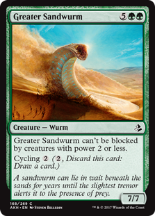
Within the style guide for Magic's world of Amonkhet, there was a sandwurm that I believe was designed by Victor Adame Minguez, who was a member of the concept team that built the world. I was asked to paint such a sandwurm, but bigger. Much bigger. The wurm would be rising up above the horizon as it plowed through a band of mummies shuffling through the desert.

I'm not going to lie, I looked forward to this assignment with relish do to a variety of art nerd reasons. It wasn't the wurm itself, nor the world it inhabited. It was that I had a clear vision of the lighting in the piece and was looking forward to the challenge of getting it right.

As I've discussed before, my work tends to go pretty dark value-wise as I paint it. I don't exactly spot blacks in the dark areas or anything, but a lot of times shadow areas of my work get dark enough to seem that way. The result is that I feel that a lot of my work lacks the degree of luminosity that I'd like it to have, and I wanted to see if I could do something different with this piece. That the wurm was white and the desert was brightly lit was a big help, I just had to find a way to restrain myself from diving too deep into the darker end of my palette too quickly.

Approaching the piece, I had a clear picture in my mind that I was pretty passionate about. I had a definite idea of the composition and moment I wanted to convey, I had a clear idea of the color and value structure, and what narrative there was to convey fell easily into all of it.  I was pretty eager, so I dove into Photoshop and knocked out this sketch:

©Wizards of the Coast

When asked to paint a giant sandwurm rising up from the horizon, it's kind of impossible to avoid a Dune vibe. Rather than try and fight it, I feel like it's just better to embrace it, instead. I doubt that I'll ever be on the list of aritsts someone asks to illustrate that classic, but I enjoyed the chance to reference the world of Arrakis while I could.

Unfortunately, when painting a sandwurm rising from the horizon, it's also kind of difficult to not paint a giant phallus. And that, as was pointed out to me by a fellow illustrator, is exactly what I'd done with the above sketch. That's not necessarily a huge issue, mind you, after all there's plenty of stuff we see every day that is phallic. In this case, however, it felt blatant enough that it could be mistaken for being intentional (which it wasn't), and that's not something that Wizards would want to deal with. More importantly, my fellow illustrator felt that the wurm's pose was a bit dull and I kind of agreed, so I revisited the sketch.

©Wizards of the Coast

Though I think the revised pose had a positive impact on the piece, there's a real part of me that prefers the original version—dull, phallic (or both) or not. I feel like the the image is more balanced and the composition appeals to my love of starkness. Plus, the pose insinuates scale and weight in a way that second version just doesn't. Lastly, it also nods more firmly to the aforementioned Dune vibe (but that bit's not exactly within the parameters of the assignment or Wizards' needs).

That being said, the folks at Wizards liked the sketch and I went on to the final.

©Wizards of the Coast

The finished piece is oil on hardboard and measures sixteen inches wide by twelve inches tall. It was art directed by Mark Winters.

Looking at the piece a little over a year after I painted it, the question of balance still nags at me. After revising the sketch, I kept moving the wurm within the piece further to the left only to end up putting it back in its original position. I did this probably a dozen times, and will all that pushing and pulling, I never really found a final placement that made me completely happy. Obviously, I settled on a placement at the time, but I'll never be one hundred percent certain that it was the correct call. Right now, I feel like I should have moved it further left, tomorrow I might feel like it's fine where it is. When I see it framed, it'll probably cause the debate to begin anew, but we'll have to see.

So yeah, there's something that nags at me on this one, but I can't say I dislike the painting, either. In fact, there's a lot I'm really happy with. I didn't quite nail the degree of luminosity I was hoping to achieve, but I got much closer than I expected to. Additionally, I like the limited color palette and I enjoy a lot of the details throughout—especially the mummies, the blowing sand, and the landscape beyond. I'd call it a win.


Wednesday, May 10, 2017

Amonkhet Swamp

Basic lands tend to be pretty simple, straightforward processes for me. There aren't characters to live up to, there very rarely are strict designs to imitate, and rarer still is a ton of back and forth between me and the fine folks at Wizards. The swamp I did for Amonkhet kept that streak going.

The art description asked for a desert swamp. A spring or trickling stream perhaps creating a marshy area in the desert with some scrubby plant life scattered about. The sunlight would bet weak as well, so this wasn't going to be a cheery landscape conjuring thoughts of fertility. All of this sounded just fine to me.

There are folks who will ponder the apparent oxymoron that is a desert swamp. While most of our mental images of deserts are sand-covered, hot and dry, this actually doesn't define the biome. Deserts are just places where very little rain falls, and a lack of rain doesn't mean there isn't any water present. Deciding how much of that water existed and how it interacted with the land was going to be the hardest thing to decide.

I tried the idea of a bubbling spring, but it somehow had too much life to it. The swamp I was being asked to depict wasn't meant to have evoke the idea vitality, so an active spring felt at odds with the goal. Instead, I decided that a very shallow stream from an unknown origin might be better. I put that stream in a bit of a gully to add the impression that at some point there may have been substantial water moving the land, but no longer. What remained was not much deeper than the stones it washed over and was as much a mud pit as it was a body of water.

Here's how the sketch came out:

©Wizards of the Coast

Two oddities in this sketch are that it is in color and also includes some painted-over and manipulated photo elements. Both are a rarity for me. If I colorize a sketch, it's typically only after I've gotten approval, when I spend a bit of time puzzling out some color choices before committing to paint. This time I felt that the color was necessary for clarity since a lot of the mud and water lacked separation in black and white. I think there are three colors used in total.

The photo elements are admittedly a bit lazy. I could have articulated all the dried grass, mud and stony shallows myself, but it would have taken more time than I wanted to spend, frankly. I knew I'd be painting the entire thing from scratch and articulating all that detail as I worked on the final piece. The idea of having to do it twice wasn't something I wanted to get into at the time. I don't think I've included photographic elements in a sketch since this piece, however. Nothing against using photos, but it doesn't feel like a particularly organic part of my process.

Anyway, the fine folks at Wizards gave it the go ahead and I took it to paint. Here's how the finished piece came out:

©Wizards of the Coast

The finished painting is oil on gessoed hardboard and measures eighteen inches wide by fourteen inches tall. It was art directed by Mark Winters.

Basic land images like this may be beautiful, but in general they lack any real hook or deep problem solving. Because of this, I kind of feel like they're out of place in the broader body of my illustration work, and so I don't typically include them in my portfolio. These landscapes fall into a weird category. I like them and think they represent good examples of the quality of my work, but at the same time they don't feel quite like they're a good representation of what my work is actually all about. All of that would make a lot more sense if I could rightly point out what exactly my work is actually all about.

So then why not include this piece, my basic forest (link), or any of my Theros lands (forest, plains, island, swamp, mountain) in my portfolio? Maybe it's a fear of becoming pigeonholed as "the landscape guy," maybe it's the feeling in my gut that they're somehow a whole different genre, or maybe it's because those images fail to tell any kind of story. There are plenty of pieces in my portfolio, however, that contradict some or all of the potential reasons listed above. Plenty of that work tells no real story of substance, the inclusion of the architectural landscapes disproves a blanket prejudice, and based on the assignments I get there is no real danger of my becoming just a landscape guy. I think what it all boils down to is that the landscape pieces in question simply don't feel like fantasy and I am (mostly) a fantasy illustrator. While none of the landscapes I've painted actually exist, they feel very much like they could. They seem equally grounded in our world as the worlds they represent. Part of that is due to the assignment and the rest is due to my sensibilities. Either way, the end results feel set apart somehow.

Despite not seeing them as straight-up fantasy, boy are they a lot of fun to paint. That bit is paramount. Doing lands of any type—even if they contain architecture—are among my favorite assignments. Seriously. They're criminally fun. And I have truly been spoiled by the opportunities I've gotten to work on land art over the years. Even better, for the most part I've really liked how my lands have come out and the Amonkhet Swamp feels like a tick in the win column. Here's hoping the opportunities continue.


Tuesday, April 25, 2017

Black Lotus

The vast majority of the work I do has no baggage attached to it. Most of the images I create are for things that have never existed before and so there's little to nothing to live up to. On the occasions where this wasn't true and I have re-illustrated things that have had previous iterations, the stakes simply weren't that high. Being asked to paint a new image of Black Lotus is a whole other thing. Black Lotus is big. Really big. There's very little else that comes close to it in terms of notoriety in the world of Magic: the Gathering. There were only 1,100 copies of the original card ever printed and individual cards have sold for more than $27,000 a piece. This is the kind of thing that some people steal for and others use as an investment. It's a totally different level than I am used to.

To an extent, all of that is largely irrelevant to me and this assignment. This painting wasn't for a new printing of a Black Lotus card and so wasn't going to be for anything that vast playerbase could ever use. The original Black Lotus artist, Christopher Rush, will likely be the only person to ever have seen his version in physical print form. The only other artist to have painted a version, Chris Rahn, at least had his image utilized in Magic: the Gathering Online. My version was going to be a prize painting—a one-off—to be given to a tournament winner at the Eternal Weekend event in Pittsburgh, Pennsylvania this coming October.

By "prize painting" I mean just that, a painting that is a prize. It's like a two dimensional trophy. I've painted one of these before (link), so I knew the drill upon getting the assignment. For the most part, such paintings are new illustrations of rare, out of print (and sometimes game-breaking) Magic cards. These paintings tend to be set into a large, printed card border and framed. It's like one of those giant novelty checks one sees when someone wins a golf tournament or the Publisher's Clearinghouse Sweepstakes, only there's an actual painting inside it and unlike its novelty counterparts is actually worth something.

But despite this being a one-off, it's still an important piece that would make for a pretty valuable prize and would make me a small part of the Black Lotus' history. Just another assignment, right? I'm not going to lie. I felt the weight of it.

Usually, I'd include my art description at this point. But now's as good a time as any to explain that I won't be doing that any longer. Instead, I'll be giving a summation of what was in the assignment, rather than quoting it directly. Before anyone jumps to any conclusions, this is not due to a mandate from Wizards. I've not been silenced in any way. I'm making this choice because someone actually wrote the art descriptions and they deserve credit, but it's credit that I don't know how to give. Wizards employs writers who toil away at hundreds and hundreds of art descriptions a year. Then the written descriptions get edited and tweaked both by other writers and even the art directors before they pass them along to us. Who is responsible for what is simply something I don't know and it feels weird quoting someone else's work without giving proper credit. As it is, I edit the descriptions to varying degrees in order to summarize or remove references to things that aren't ready for public consumption, so fumbling through translations of sorts is only a small next step. I hope you all understand.

Anyway, in the art description I was asked to paint the black lotus in water. Wizards wanted the lotus to have metallic leaves and stems. I was asked to include some natural lotuses as well, so as to offset the black lotus and its unnatural state. And that's about it. What they were looking for was pretty clear.

After absorbing the description and its various parts, the first thing I did was start looking for pictures of lotuses and collecting them. The second thing I did was start reading more about lotuses only to find out that most of the images I'd collected were of waterlilies and not lotuses (the two major points of difference being: 1) that waterlily leaves float on the water's surface and lotus leaves tend to be above the water; and 2) that lotus flowers have a different structure in their center than waterlilies do that includes a seedpod). So back to looking for pictures of actual lotuses this time. Once I'd gotten enough of those, I started pondering the metal leaves. For this, I grabbed some wire and aluminum foil. I sculpted leaves out of the foil, taped them to wire and stuck them in the ground in my backyard so they were facing lots of greenery, then photographed them with the appropriate light. Additionally, I dug out a Christmas ornament we own that is a silver maple leave and photographed it in the same setting.

Reference in hand, I started thumbnail sketching.

Based on the timing of the assignment, I knew this was going to be the last painting I'd work on of 2016. Both because of that fact and the weight of what I was being asked to do, I wanted to really knock it out of the park. Given that my wife had to work through the holidays, I decided I had some time to experiment and try some different things in the process of making the painting. Of late, I've gotten into the habit of doing my sketches digitally, but I've always really loved Dave Palumbo's painted sketches. I wanted to give that a try, and so I did.

©Wizards of the Coast

I painted two different sketches. Both of these are oil on hardboard and each measures seven inches wide by five inches tall. While the second sketch doesn't deliver on the assignment's concept, I thought I'd give them an alternate take. Additionally, I went into the first sketch digitally to offer up a couple other options for a total of four.

©Wizards of the Coast

Option "A" was pretty much what they'd asked for in the art description. Option "D" was my alternate take. Option "B" was along the same lines as the art description but with a small tweak. Since the art wouldn't be printed as a card, I really didn't need to worry quite as much about the image being readable at card size. There was opportunity for a more subtle take. I thought it might be interesting to restrict the metal in the leaves to only the leaf veins and stems, leaving the rest of the leaf to the normal, green, organic variety. Finally, option "C" was inspired by a Christmas ornament I rediscovered when digging for the aforementioned silver leaf to photograph for reference. Option "C" keeps the black lotus leaves metal, but gives them a green hue. In all versions, I decided to make the lotus' stamens, stigmas, and seedpod metal as well, limiting the only organic aspects of the lotus to the the black petals themselves.

The fine folks at Wizards decided to stick with option A.

Before committing to the finished painting I looked at the calendar and realized I had the time to experiment with my process even further. I decided to try a color study. While I've never really painted a traditional oil color study before, I have been doing digital color studies on an increasing basis. Since I'd already painted two sketches, I figured it was worth trying my hand at a painted color study, as well.

©Wizards of the Coast

The study is also oil on hardboard and measures ten inches wide by eight inches tall.

The study allowed me to work a few kinks out that I hadn't completely resolved. It also gave me something pretty developed to show my peers in order to get some solid feedback before moving on to the finish. The feedback was quite useful (thanks to all of you who put their two cents in), and I implemented most of the suggested changes to the color study, choosing to hold off on the remaining changes until I began painting the final painting.

Speaking of the finish, here's how that came out:

©Wizards of the Coast

The finished piece was completed in early 2017, is oil on hardboard and measures eighteen inches wide by thirteen inches tall. The entire process was art directed by Cynthia Sheppard.

Between preliminaries and the finish, I made some changes to the metal leaves both in placement and scale. Additionally, I subtly changed the metal leaves' surfaces. In the preliminaries I treating them as basically smooth but shifted their appearance to better imitate the subtle bumps and ripples found in actual lotus leaves. Outside of that, the finished painting was just a more polished version of the image that was a tad more consistent with the reference I had.

Whether any of the process experimentation was valuable remains to be seen. On some level I learned a lot and I went into the finished piece with a higher degree of confidence. On the other hand, I felt like the painted studies had removed any experimentation I might otherwise do in the painting of the finished piece. In short, painted the final piece felt rather rote. Whether I paint sketches in the future or do any painted color studies seems somewhat unlikely for the vast majority of my commercial work. Even for my personal work I feel like so many developed preliminaries would undermine much of the spontaneity I quite enjoy. All that being said, I still think it was worth trying and I was glad that I had the time to do it.

In the end, the result is what it is. I'm rather happy with it, but there will always be folks who feel that there is only one true Black Lotus painting, that being the original by Christopher Rush. Then there will be those who look at Chris Rahn's take on the subject done for Magic Online as the more definitive. I have no control over such things and it's hard to argue with the various points of view. It's like trying to argue with someone over which cast of Saturday Night Live was definitively the best if you even believe there is such a thing in the first place. Point is, folks will either dig mine or not.

Regardless of fans' and collectors' feelings, I'm now weirdly part of Magic history in a way that I didn't ever expect to be. I mean, I've contributed a fair bit between my concept art and the many paintings I've done, but the Black Lotus is singular among fans and collectors of Magic: the Gathering. And whether I like it or not, the Black Lotus painting I've done will be equally singular in my body of work.

Still, this job did offer up a unique event that I will remember for a long time to come. Once it was done, I drove the finished painting down to Renton, Washington and delivered it by hand to a very eager art director. I felt bad since I was interrupting her lunch, but I have rarely felt the degree of appreciation and excitement professionally as when she took the painting into possession. That was a good day.

Thursday, January 26, 2017

Aethertide Whale

Some assignments require a lot of problem solving and a ton of revision. Other assignments simply don't. Aethertide Whale is definitely one of the latter, which makes it extremely difficult to write about. As much as I like to explain my decision-making and my thought processes, pieces like this don't really have a lot that bears in-depth analysis. Most of the decisions were made for me. While that may sound like a complaint, it isn't. It's just another facet of the job.

It's probably best to backtrack and start with the art description:

Art Description:Setting: KALADESH
Color: Blue creature

Location: The aether-swirled sky of Kaladesh (for aether reference, see p. 21 in the World Guide)

Action: Show a gigantic flying sky leviathan like the one on p. 128B (note the scale). In this shot, it swims through a small fleet of whaling airships (see p. 105C and D for ship profiles) that scatter to avoid getting smashed. The ships are tiny by comparison. All around are swirls of aether currents. 

Focus: the sky leviathan

Mood: a creature completely in its element

Upon getting the assignment, I must confess that I was immediately taken back to my comic collecting days in the mid-nineties. Among the various titles I collected was Sam Kieth's, The Maxx, a comic which on at least one occasion featured flying whales—"air whales" if I recall. While I'm sure there are instances of implied or blatant flying whales in fiction before that comic series, flying whales will always remind me of that series. Well, that series and the whale from The Hitchhiker's Guide to the Galaxy.

Anyway...

Normally, when writing posts I remove references to World Guide page numbers in the descriptions whenever possible as they lack context. Since I can't show the pages and the designs upon which I base the illustrations, I feel that leaving such references in is a bit of tease. In this case I'm making an exception so as to be clear about what an assignment like this actually requires.

So, taking a second look at the description, we see that the aesthetic for the setting is indicated by images in the World Guide. There were several concept pieces from which to draw inspiration both on that specific page and in several other places throughout the guide and it was clear what they needed. As for the creature, that design too was pretty well established. The description was pointing to a full-color concept design that I stuck fairly close to. The ships were a bit less fleshed out and were just silhouettes on the page. As they were silhouettes, they contained no detail, just the broad strokes of how they should be shaped. There were, however, other ships in the World Guide from which to glean information. There was a little extrapolating to be done, but it mostly entailed looking at the other ships from the World Guide and applying design elements from those to mine all while retaining the overall shapes indicated by the aforementioned silhouettes.

With most of the elements figured out for me, my job was to take them and assemble them in a manner consistent with both the letter of the description as well as the spirit of the description. There was a bit of trial and error to make the image work, but in the end my responsibility was just to compose all of the things, toy with the scale, etc. In the end, I came up with this:

©Wizards of the Coast

When building a digital document like this, I typically keep the various elements on separate layers so that I can move them around, hide them, and resize them as much as I need to. In this case, each ship represents a different layer, and the swirling aether (seen as the white streaks) is on three separate layers depending on where it is in space. The front of the whale is on one layer and the tail is on another. Once I've locked down a composition, I'll typically wait until the following morning to send the sketch off to the client so as to be sure the image still works for me. If not, I tweak it as necessary and then send it on its way.

Wizards gave me the green light with one requested change going forward: the Art Director asked that I change the shape of the lower jaw a bit. Super minor and easily done. I took it to paint and here's how it came out:

©Wizards of the Coast

The finished piece is oil on gessoed hardboard, measures fourteen inches wide by eleven inches tall and was Art Directed by Mark Winters.

Despite being represented by white streaks in the sketch, the aether in Kaladesh is meant to be sort of an aqua color. As I painted the piece, I found that I was having difficulty keeping that color as vibrant as I wanted it to be. The aether tended to disappear into the sky and so I pushed it lighter in color to add more contrast, which only weakened the vibrancy of the intended aqua hue. Keeping the color of the aether was important to me, and so my best option turned out to be pushing the sky in a darker direction in order to allow the teal streaks to pop. Beyond that, there really weren't any struggles of note post sketch.

Jobs like this can sometimes be easier than others which require a lot of problem solving. I mean, there was relatively little for me to think about in this particular case, so what's not to like? However, sometimes these kinds of jobs can be far more difficult than others. After all, they are based upon pre-existing designs and frankly some designs are a heck of a lot easier to implement than others. Some designs or aesthetics don't mesh well with a given artist's sensibilities. Some designs are just plain difficult. And living up to the most difficult designs can be a huge headache and represent far more hours of toil to bring to fruition than something created from whole cloth. So in a way, they represent a problem solving as well. It's just a very different kind.

Fortunately, this time around it was just a whale, some ships, and some swirling aether. It's hard to complain about any of that.