Monday, January 31, 2011

The Many Covers of Badass, Part 1

The cover for the book, Badass, came out of the blue.  I was originally contacted by the author to do a few interior black and white pieces, and somehow that got me the cover painting.  Or the interior paintings I handed in got me the cover painting.  I don't know.  Either way, I got the cover.

So, the art director called me and we hammered out the details.  With everything explained, I went to work.  The first sketch was terrible enough that I really don't feel good about posting it.  Suffice it to say that there were three historical figures in the piece and that they were stagnantly placed and the whole thing was boring.

They didn't like it. 

So, they asked for changes.  They wanted it to be cooler and they reduced the number of figures to two, but added a tank and a biplane.  They also changed which historical figures I'd be using.  I gave it another go and the result was less stagnant to be sure, but was so poorly composed as to make me cringe.

They still didn't like it and I don't blame them.

At this point, I felt a little nervous.  I could almost smell the disappointment on their end and I was really worried that I might lose this opportunity if I didn't make a big leap next go around.  But as luck would have it, the situation got worse.

Around this time, HarperCollins (along with just about every major publishing company), was being forced to adjust to a weaker economy.  The publishing bubble had burst and the imprint that the book was intended to be published under folded.  As I'm just a lowly illustrator, I was not kept in the loop.  I heard nothing for a month, and was fairly certain that any chance I might have had was now gone.

Apparently, Badass was safe.  There was just a bit of wrangling necessary to figure out where it should be published, and what its time line should be.  And so, after several weeks of silence, I got an email from a brand new art director, with a brand new book design, and some brand new changes for the cover.  I'm not sure whether or not I might ever have been in danger of losing the job, but I treated this clean slate as a second chance and swung as hard as I could.

Now, I'm not sure how common it is, but the art director provided me with the book's design before I'd even done the revised sketch.  The book, overall, was very deliberately designed and they wanted me to fit my three figures into the space provided — a space with a very specific size and shape thanks to the placement of the the title and the author's name.  The disadvantage was that I didn't have quite as much free rein as I might otherwise have had.  The advantage, however, was that I now had a digital file of the precise layout of the book.  I could incorporate that into the sketch and make absolute certain that my piece would fit in the space provided.

Early on, I decided to do my sketches digitally knowing that they might change one or more of the figures (something that clearly turned out to be true).  By keeping each figure on a separate layer, I could easily eliminate one while keeping the other two intact.  This decision also allowed me to play with the proportions of each figure in relation to the others and fine tune my sketch with ease. 

The new changes included eliminating the tank and biplane, but keeping one of the historical figures from the previous version, though upping the total number of figures back to three.  So, I sketched away, going for something that might begin to fit the book's name and design.  Here's what it looked like:

Pretty pathetic, I know.

The art director took the sketch and popped it into the design and pitched it to the highers up.  Apparently they liked it enough to give it the green light and I moved on to paint.


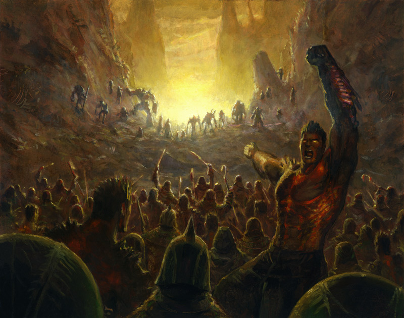
As you can see, it got a lot better after I shot reference and did my thing.  It was approved and after some digital manipulation went on to become the cover for Badass, by Ben Thompson.

I submitted the piece last year for Spectrum 17, and sent it in with a bunch of other pieces that I'd done for Magic which I was sure would have a better chance.  To my surprise, this is the piece that made it into Spectrum while the Magic pieces failed to make the cut.  Funny how things happen.  You can never predict what will end up tickling the fancy of any given group of people.  Had it been a different group of people I wonder if they might not have gone a different way.  But then, the dynamics of groups during the judging of competitions is a whole other topic.

So, you may be wondering why this post is called "The Many Covers of Badass."  "Many" implies more than one.  Indeed you are astute and correct.  It would come to pass that HarperCollins saw fit to publish a second Badass book, and also saw fit to keep the creative team in place.  Once again I'd be doing a few interiors, as well as the cover.  Once again, I'd be working with the same art director.  Once again, I'd be making changes.  But this time, I ran the gauntlet and lived to tell about it.

Friday, January 28, 2011

On Spinning My Wheels

Some days things just don't seem to run smoothly.  Some days it takes twice as long to get things done.  And, some days everything I paint will end up being wiped.

So what do I do when this happens?

The first thing I do is walk away.  Not permanently — just long enough to clear my head.  Trying to force things isn't going to make it better and will likely add to the building frustration.  So, I find something else to do.  Even if it's for five minutes.  When things get really bad, I go for a walk outside (weather permitting).  Otherwise, I'll zone out and watch a half hour of television or do a few sudoku puzzles.  For me, it's all about switching focus, changing gears, and leaving the irritation behind long enough collect myself.

After I've managed to relax a bit, I may do any number of things.  If the job isn't pressing, I'll start working on another piece.  At any given time, I usually have more than one piece cooking.  It might be for the same client, a different client, or for myself.  Either way, they all need to get done, and work is work.

If the problem piece is pressing, then I will try working on a different area of the painting than that which was giving me grief to begin with.  Working on an area that requires less precision is often a good way of getting back into the piece, and will often buy you a little time to start mentally addressing the problem areas you still have to face.

Should this option not be possible, and the problem areas are all that are left to complete, then I turn to my bookshelf for inspiration.  I'll dig through the many tomes on other artists and look for similar pieces, subject matter, lighting scenarios — whatever.  I look for something that can help me with the specific problem I am facing.  Anything that provides hope or inspiration is gathered then displayed around my easel.  I look at how things were addressed by others, and see if I can't apply at least a little of their solutions into my own.

If all else fails, I will do something as simple as turn the piece on its side.  Often times my frustrations are exacerbated by the specificity of what I'm painting, when what I should be doing is breaking down shapes.  Turning a piece 90 or 180 degrees can help that mental shift take place.  In this case, it's all about attempting to change the context of the things I'm trying to depict.  I'll still end up righting the piece and finishing it up in its proper orientation, but I'll have hopefully managed to get a lot of things down in the meantime.

A lot of work I get done in a day is based on rhythm and momentum.  If things start well, they usually continue to go well throughout the day.  If at any point I trip over my own feet, or fail to get into the proper work groove, it can be pretty frustrating to say the least.  The things listed above are all ways I attempt to reset the entire process and salvage what time I have left in the day. 

More often than not, one of these things will succeed, but not always.  Sometimes even the things listed above don't help.  Some days it's clear that trying to paint really will be an exercise in frustration that will accomplish little more than wasting my time.  There are times when it really is best to leave it for the day and come back the next with a full tank of gas and a fresh perspective.

Thursday, January 27, 2011

New Work: Fuel For the Cause

©Wizards of the Coast

Fuel For the Cause, oil on paper on masonite, 12"x9".

The piece is supposed to show a phyrexianized vedalken spellcaster absorbing a spell from another, unseen spellcaster.  Admittedly that's a pretty big mouthful of made-up words there.  Suffice it to say that the vedalkens are a race of blue-skinned humanoids who, on the plane of Mirrodin, have four arms.  In Magic's current storyline, Mirrodin is being besieged by a phyrexian plague, which I guess is some sort of biotic/metallic mutation that permanently changes the nature and appearance of its hosts, the landscape, and the entire world.  This particular vedalken has been affected by the phyrexian plague, hence his current appearance.  They usually look like this.

Anyway, showing a guy absorbing a spell rather than casting one can be hard to pull off.  It's all about gesture.  I tried to go for something that felt like our little vedalken friend was open and receiving.  The open palms were a big part of that.  I tried to back the gesture up by having the pink of the spell invading the little glowing nodules all over the vedalken's body that normally glow blue.  Still, without seeing the other spellcaster, it's difficult to get the full story.

Another big challenge for me on this piece was the vedalken's design.  The original designs were done by Wayne Reynolds, who I love to pieces but hate having to emulate.  Don't get me wrong, I love a good challenge, but for some reason every time I have to base things off of Wayne's designs, things go horribly awry and sketches take far longer than they typically might.  This was no different.  I wish I could tell you what it is about Wayne's sensibilities and shapes that I have such a hard time translating, but I have no idea.  Either way, it's become a consistent hurdle for me that I'm determined to one day get past.

Overall, I'm fairly happy with how this painting turned out.  The ambiguity of whether the spell is being cast or absorbed outside of the context of the card isn't a major problem to me.  It allows for the viewer to read into it a bit more than they otherwise might, which I always think is a good thing.  I want people to be engaged or invested in some level or another.  Not sure if they will bother, but I gave it a shot on this one.

Anyway, off to shovel some more!

Wednesday, January 26, 2011

New Work: Rally the Forces

©Wizards of the Coast

Rally the Forces, oil on illustration board, 10"x8".

I was pretty reluctant to show this piece, but I've already spent plenty of time embarrassing myself in previous posts, so why stop now?

This is another piece on illustration board, and it's a piece I also felt should be small (for some reason), though in retrospect it so clearly should have been MUCH larger.  It's a battle scene for the love of Pete!  What was I thinking?!

Still, it is what it is and I will address it so.  Admittedly, this piece has some major issues.  Mostly some noticeably bad drawing here and there.  Part of the reason for this is that I likely didn't shoot quite enough reference.  Another reason is that the piece was too darned small.  Even my smallest brush was incapable of getting certain things across because it was just too big for the job.  So, there are some shortcomings that might otherwise not have been there if I'd just scaled it up.  At least that's what I keep telling myself, anyway.  I'd like to say that the job was too much for me, but I think this may be a case where I didn't completely rise to the occasion and the result was something that only managed to get 80% of the way there...if that.

At the same time, this is still nowhere near my worst Magic painting.  That honor still goes to Maelstrom Nexus.  While fans may feel differently, I can assure everyone reading this that that piece failed on almost every level and was flawed from the ground up by my inability to come up with a good visual concept in the first place.  But that's just my opinion.

On the bright side, I think the piece reduced well.  Plus, the art director seemed pleased enough, and Wizards of the Coast ended up using the piece in several promotional bits including this video (link here).  So it can't be all bad, right?

Side note: this piece was also done with Liquin.  I remember getting pretty frustrated by its tendency to gum up — particularly while working on the figure in the foreground, right who is looking at the viewer.  There are only two other Magic paintings that were done using Liquin aside from this piece that I have yet to show.  I'll toss one of these your way tomorrow.  The other was not published with the most recent Magic set despite being commissioned for it.  Whether or not it will be a part of the next set is unknown to me.  Outside of that there was a book cover that I painted around the same time using Liquin, which I will tell the tale of in the near future, but I need to let some dust settle first.

Tuesday, January 25, 2011

New Work: Ichor Wellspring

©Wizards of the Coast

Ichor Wellspring, oil on illustration board, roughly 9"x7".

This piece depicts the black phyrexian ichor bubbling up on the plains of Mirrodin.  Or something.

Some notes about this piece:

The first thing you may notice is that this is on illustration board.  The reason for this is that I just didn't feel that the image called for a particularly large painting.  As it was going to be smaller, I didn't need the toughness of the hardboard or masonite.  After all, smaller work tends not to warp as severely.  So, I ended up using some of the illustration board that I had left over instead.  Worked out nicely.

This is one of those pieces where I basically painted exactly what was in the description.  Don't get me wrong, I tried to gussy it up some.  I tried to make the ichor a little more interesting.  Maybe give it some personality.  I handed in a sketch with the ichor forming these domes with finger-like projections.  It was rejected.  They really just wanted bubbling ichor.  So, back to the drawing board I went and this is what they approved.

The rippled surface was all mine.  I wanted it to be a little bit more interesting than featureless black bubbles.  Looking at it now, it's clear that the movie Sphere was somewhere in the back of my head, though I don't think I've seen that movie since it first came out.

The choice of the yellow/white and blue suns showing with the red sun indicated in reflection were my decisions, as well.  Given the simple, straightforward subject matter I wanted to challenge myself and I did so with color.  One of the more difficult color shifts for me has always been yellow to blue, and vice versa.  I figured this was the perfect opportunity to really go for it and see what I could manage.

At the end of the day, I think the color worked out fine, and the hardest part of the piece turned out to be the hexagonal grid.  In the few areas it was less difficult, it still proved to be obscenely time consuming.  Personally, I wouldn't recommend it.

Finally, this and the other piece I worked up at the same time (which I can't yet show you), were the last two pieces I ever painted using Liquin as my chosen medium.  While it did it's job for the many years I used it, I had become a little irritated with how gummy it gets over the course of a day's painting.  I ran out of the stuff after these two pieces, and decided to try something different altogether.  I mixed my own medium which is based on that of other painters I know.  It consists of one part linseed oil, on part Turpenoid, and a couple drops of cobalt dryer.  Needless to say, I liked it and I continue to use this new medium.

So, there it is.  A tiny Magic painting of goo.

Monday, January 24, 2011

Creator and Destroyer

A few years back, my folks moved out of the house I grew up in and moved into a smaller place.  Well, I guess it's smaller.  It certainly has a lot less storage space.  I know this because they called me up to come pick get my stuff, as they weren't interested in cluttering up their new home with it.  I can't argue with them.  It's their house, and I was in my 30's — it seemed only right that I become responsible for my old toys, comic books, and artwork.

I arrived at my parents' new home to find all of my stuff gathered into a single pile — a pile that was far larger than our rental car could accommodate.  On top of not having enough room in the car, I also lived in an apartment in New York.  This meant that even if I had gotten it home, I still wouldn't have had room to store all of it.  I needed to do a bit of editing.

Mind you, the better part of this pile was my artwork.  Some framed, some not.  Elementary work, high school work, and college work.  There were some sculptures in there, old sketchbooks, etchings...it was a pretty diverse and sizable collection.  Too sizable.

So, equipped with a utility knife and some garbage bags, I began to destroy work.

--Record scratch--

I did what, now?  Destroy work?  Seriously?

Yes, seriously.  But not everything.  Don't get too upset.  And before you ask why, I'll tell you.

First, I don't have the kind of space necessary to store every last bit of art I've ever done.  Even now that I have a whole house to deal with, I still don't want to clutter it up.  I've lived in tight, cramped quarters for much of my adult life, and I really didn't enjoy it.  Bumping into all manor of old work because my studio is too cluttered is not something that interests me. 

Second, since 1994, I have moved eight times.  Dragging all that stuff around gets old quick.  Seriously.  I used to have several large, leather folios full of work that I couldn't have listed the contents of without looking.  Same goes for several drawers in my flat files.

Third, a lot of the work just so happens to be atrociously bad.  Don't get me wrong, I'm not throwing out elementary school drawings because they aren't any good.  I try and judge each piece on it's own merits and in its own context.  Still, there's a lot of work that I've done that I'd rather not have floating out there and I just don't see the point in keeping it.  As any illustrator will tell you, not every piece is a portfolio piece, and sometimes there are pieces that are worse than that.  Why keep them?

Fourth, sometimes something gets damaged.  When this happens, I always run a cost/benefit analysis on it.  How much work is it going to take to fix this, and is it worth putting in that effort?  If the answer to the second part of that question is no, then the piece has to go.

Finally, some work I do is purely exercise.  What do I need to keep newsprint pads full of figure drawings for?  They're not archival and are likely to disintegrate in my own lifetime, anyway.  Some pieces from college are just color problems or simple geometric patterns — seriously?  We want to keep this?  Plus, there's always experimental stuff that just didn't work out.  Why bother with it?

To me, having work I don't like or want in my house is like storing corpses there.  It's creepy and it stinks.  I guess that in some respects the destruction of work is like letting go of certain aspects of my past.  While I won't forget them, I don't exactly need to keep them around.  However, I also understand that this type of things isn't for everyone.

I know lots of folks who keep just about everything they do.  I know folks who even pay for storage to put it all in.  I would never criticize or judge them.  They do things their way, I do things mine.  Simple as that.  I suppose that if I had infinite space I might keep everything, too.

Nevertheless, there I sat in my parents' den slashing canvasses, smashing sculptures, and tearing drawings apart.  I kept what I liked or what represented something important in the evolution in my work or had a strong memory associated with it.   I gave away whatever someone expressed interest in.  The rest ended up in a couple of garbage cans in Pennsylvania.  I was able to fit everything that remained in the car, and when I got home, it fit snugly into what little space I had to spare.

After hearing of this, a buddy of mine asked, "If you destroy everything, what are they going to put in the book of your life?"  He was half-joking, but there was a serious question in there.  I told him that it was highly unlikely that anyone would ever write such a book.  I'm not that interesting.  But, even if someone did misjudge the demand for a book about me and commit to such a project, I'd like to have a say in what work went in those pages.  Destroying the work that I do is the only way I can be sure they make the right decisions.

Now, I can't say that I'm completely detached from the work I destroy (after all, each piece represents hours and days of my life).  In fact, I do experience regret, but not in the way you might expect.  I do not regret the act itself, but the failures that lead to it.

Saturday, January 22, 2011

A Follow Up To Snow and Under Paintings

In response to yesterday's post about under painting, Scott Brundage wrote:

"Why not some watercolor for your underpaintings? :)

"Have you found that one method or another lends itself to any particular subject matter? Like, does a digital background help out a metallic armor piece or acrylic for a textural landscape. Maybe just one for simple and another for complex?

"I'm playin with my first couple steps as well. I always feel I did x, y and z, only to completely obliterate x by the time I'm ready to paint."

Excellent questions there, Scott.

First, I know you're only joking about the watercolor under paintings, but I'll address it anyway.  The answer is simple: I don't do water color under paintings because they'll be completely destroyed as I work on top of them.  The whole point for me is for them to survive the initial stages of the painting.  Plus, I'm not too sure how the gum arabic in watercolor would affect the oils.  I'm no chemist, but it seems to me that throwing something like that into the mix could potentially muck up the works somehow.

Second, regarding the different under painting techniques lending themselves to different subject matter, I must confess that you pointed something out about my under paintings that I hadn't realized.  The vast majority of my digital under paintings were for pieces that contained a lot of finely detailed and sleek metallic subjects.  It would appear that I instinctively moved toward that solution once, then repeated the process due to the success I had the first time around.  The digital under paintings do allow for a bit more precision with a good deal of speed, giving me the opportunity to address more issues and iron out more kinks.

When faced with landscapes, I've typically done quicker and dirtier under paintings with acrylic or oils.  Also, when there tends to be just a single, main figure in things, my under paintings also tend to be in acrylic or oils and just ask quick and dirty as these pieces are often all about the silhouette and therefore require less precision.

So, I guess my process does, in part, depend upon the subject matter I'm working with.  Weird.

Lastly, regarding the destruction of the under painting, it happens.  What people do for under paintings varies wildly.  I know folks who don't even bother with them but start putting paint down immediately on the white surface.  I know folks who just do a ground color to kill the white and then go for the finish immediately.  I know folks who do fully fleshed out, tonal under paintings that could almost be finishes unto themselves.

How much of the under painting survives also varies wildly.  I'd wager that most folks end up covering their under paintings for the most part.  However, I own paintings from other artists where the under painting is allowed to show through for much of the finish with nothing but a glaze over top of it, and in one case half the painting IS the under painting.

For me, the under painting is just about beginning the implementation of the value structure of the piece.  It's a foundation layer upon which everything else is built.  Thus, it is destined to be buried beneath the rest of the paint.  Of course, sometimes I only get as far as a ground color.  And then it's all about going for the painting immediately.

I've said it before, and I'll say it again: my own process is consistently inconsistent.  I don't like things to be formulaic.  Each piece is a puzzle that I put together without instructions, and all puzzles are not created equal.

Friday, January 21, 2011

Snow and Underpaintings

So far this winter it seems like there's been significant enough snowfall to shovel once a week here in Newton.  It is currently snowing again, and I will be out shoveling in just an hour or two.  As I understand it, the snowfall this year has already surpassed the average amounts per year, and there are still two months to go.  Sounds like I might be complaining, but in all reality, I don't mind it.

Shoveling gets me out of the house (which doesn't happen very often being a freelancer, and all), and it's free exercise.  Plus, I've always liked winter and the virtual monochromatic landscape.  As far as I'm concerned, I'll take a really cold winter over an unbearably hot summer every time.  You can always put on another layer of clothes to keep you warm, but can only take so many items of clothing off to keep cool before they arrest you!

Aside from shoveling, I'll be doing some basic under paintings on a couple of pieces today.  My under paintings are an inconsistent part of my process, and something I'll likely continue to mess with.  I've posted digital under paintings I've done in the past.  They work out nicely, and I'll probably start doing them again soon.  Sometimes I do my under paintings in oils.  These also tend to work out fairly well, but the added drying time can be an issue.  So, the alternative is to do them in acrylic...which is what I'll be doing today.

Despite the fact that I used to work with acrylics a lot in my college years, I have a difficult time with them today.  They're just not as workable as oils and the acrylic paint can build up quickly, which can cause a rough surface that is really difficult to deal with.  Nevertheless, I still use them for my under paintings on occasion because I have a ton of acrylic paint that I'm trying to use up and also because they dry quickly.  Because of this, I work very fast, keeping paper towels close at all times to wipe into fields of color creating texture or highlights, and knock in a simple three value deal (dark, middle, and light).  I slap the paint down as quickly as I can, and try to keep the drawing visible where necessary.  The result is usually less defined than either my oil or digital under paintings tend to be.  Still, the most important thing is accomplished: the white space is killed.

Anyway, I'm going to quickly go deal with one of these pieces before it stops snowing.  With a little luck, I can get it done then take a break to shovel some snow.  Once done with that, I guess I'll be right back to under painting.  By the time I've finished working on the second piece, it'll likely be beer 'o clock.

Thursday, January 20, 2011

Spectrum and Surface Prep

A lot of paperwork, snow shoveling, and non-illustration things have been eating my time of late.  While not doing a lot of painting, I'm winding up to the next couple pieces, which means a bit of surface prep.  What that means for me is taking a piece of 90 pound, hot press watercolor paper, and printing a sketch on it.  Then I wet the paper and, using acrylic matte medium, paste the paper to a piece of masonite or hardboard.  Next, I use a brayer to push out the excess matte medium, and let it dry.  This is followed by 3 coats of matte medium over the sketch's surface, letting it dry completely between each layer.  Finally, after the last coat is dry, I use a fine sandpaper to smooth the surface and finish it off with an even finer Scotch-Brite pad.  All in all, total prep time can take the better part of a day, depending on how warm it is in the house, as drying time can be greatly affected.

I learned to do this from both Donato and Todd Lockwood's descriptions on their respective websites.  I'm sure I do little things here and there differently, but the overall effect is the same.  I'm not sure where they learned it, but it's been my preferred way of doing things for a few years now.  The end result is a nice, relatively smooth surface with little or no texture that I find to be easy to work on.  But that's just me.  And I guess Todd and Donato.  And everyone else I know who does something similar.

The smoothness is important to me because I have grown to dislike the texture of canvas for some reason.  While I've painted on canvas many, many times in the past, I've always found the texture to be a bit distracting under certain circumstances.  Admittedly, I'm a little weird and particular about things, but I feel it's important to really like the surface you work on, no matter what it is.  If you hate it, you'll be working against it the entire time, which makes for a terrible experience.

Anyway, the good news is that the prep process is not all that labor intensive.  The bad news is that I can never really get into a good working rhythm doing something on the side because I'm constantly having to stop and turn my attention to the painting surfaces to slap a coat of matte medium down or some such.  So, surface prep days are often less than productive for me outside of the surface prep itself.  Such is life, I suppose.

On a completely unrelated note, there are eight days until Spectrum entries are due.  If you're even remotely considering submitting something, I highly recommend it.  As far as things like this go, it's pretty inexpensive, and the cost of submission is a write-off, so there's that.  If you get in, it can be a nice ego boost.  I'm not saying that getting in will solve all of life's problems (in fact it won't), but like the lottery, you have to enter something to even have a chance to begin with.

A shorter entry today, I know.  Probably a blessing for everyone's tired eyes.  If there happens to be something you're curious about, or a question you want answered, feel free to post something in the space below.  There's an excellent chance that someone reading this will have a question that I won't think of on my own.

Well, I'm off to slap some matte medium down...

Tuesday, January 18, 2011

Thoughts On An Overheard Critique

A good friend and fellow illustrator told me about a critique he overheard, and there are a few things that I'd like to comment on.  The critique was between two guys who work digitally and for the purposes of this entry, we'll call the guy giving the critique, Bob, and call the guy getting the critique, Stan.

So, Bob's sitting at his table at a convention and Stan walks up to him.  They have a conversation that mostly consists of shop talk and invariably leads to Stan asking Bob to take a look at his portfolio.  Stan whips his book out like there's no tomorrow and Bob takes a few minutes to peruse the work and let it make some impressions.  Finally, Bob starts his critique as Stan listens intently.  During the critique, Bob explains to Stan that there is a certain sameness to the various substances in his work.  Trees feel like they are made of the same stuff as rocks.  Flesh feels no different from metal, which looks as though it could just as easily be fabric.

Stan looks worried, but Bob offers up a suggestion.  Since Stan works digitally, Bob tells him that he should just take pictures of metal and add them as a separate layer over any metal objects he might be trying to depict.  He suggests taking photos of rock and working that in as a layer under his mountains and cliffs.  In short, Bob is suggesting that Stan add texture where there is none and begin to differentiate the various substances he is trying to portray.

Sounds simple enough, right?  Well, it's this advice that I want to talk about, and I somehow think that no matter what I write, I'll be digging a hole.  But continue to write, I shall.

I will state at this point that I am not anti-digital.  I believe that a good image is a good image, whether scrawled in the blood of virgins with the tip of a vampire steak, or cobbled together with ones and zeros by robots on the verge of sentience.  I will look at anything once and if it's a good image, I'll likely look at it at least twice, but I'm not going to hold the medium against the artist.  After all, there are people who still use an airbrush, and I don't hold that against them!

The practice of using layers of texture to liven the digital surface is a pretty common practice, and it's one that I completely understand.  Digital painting, on its own, has the potential to be cold and a little too clean, which can turn a viewer off.  To add the necessary texture that the viewer's brain expects to see, layers of grit from various sources are often employed.  Some might call this a shortcut, or go as far as to call it cheating.  Whatever.  It is what it is.  I can add texture almost as fast in oils buy employing all kinds of tricks and no one labels it as harshly.  I really don't see the difference.

So, I hope I've made in clear that I don't take issue with the use of texture layers in digital work (thought I must say that I prefer it when folks create their own texture).  However, it just might be possible that Bob's advice to Stan wasn't the soundest.  To me, lack of differentiation in substances is more of a fundamentals issue — an issue of drawing and painting.  Adding the textures to help make trees feel like trees and metal feel like metal is fine and all, but it doesn't change the fact that Stan wasn't able to do it with his drawing and painting.  Suggesting that adding textures will solve his problem is a crutch when what Stan really might need is to learn how to walk.

For my money, the best digital work out there is still primarily fueled by the fundamentals of drawing and painting.  If you took their computers away, the artists who do this great work could still produce some amazing art.  While I understand the desire to speed things up and cut as many shorts as possible, fundamentals are still essential — and I believe that being able to make clear the "treeness" of a tree and the "rockness" of a rock is all part of that.  Perhaps this is where Stan's work is falling short, and it is entirely probable that if Stan took the time to really get his drawing and painting down, he might not need these specific texture layers, or at the very least have developed the sensibilities to employ them more deftly.

Texture layers are not inherently bad.  Brushes specifically designed to create leaves on trees, or links in chain mail aren't inherently bad.  Step and repeat isn't inherently bad.  But, knowing how and when to use these features is the challenge, and I think true understanding of the how and when comes from a good foundation (and a healthy breakfast — seriously, I'm starting to sound like someone's Mom).

So was Bob wrong for suggesting what he did?  Maybe.  Maybe not.  I think Bob gave Stan the only advice he knew how to give, or perhaps the advice he felt was kindest.  It is really difficult to look an aspiring artist in the eye and tell them that they need to beef up their drawing skills.  No one wants to do that, and it would be hard to hold that against Bob if that's what he was doing.  It might have been prudent for Bob to have suggested more than one avenue for Stan to explore, but that's just my take on things.

Of course, at the end of the day, all of this is rendered completely moot if Stan's true desire was to have a more collage-like feel to his work.  If that was the case, then I guess I've completely wasted everyone's time, and you should probably go about your business.

Monday, January 17, 2011

Reference: Final Thoughts

Something I've noticed is that there are a lot of aspiring illustrators who want to work realistically, yet are reluctant to use reference.  I'm not entirely sure where this reluctance comes from.  Maybe it's that they feel it's cheating or find their work a little stagnant when they have used reference in the past.  Perhaps, for some, it's just more work than they want to do.  I don't know.  What I find ironic about this is that if you were to ask many of these same folks to name five working illustrators whose work they really dig, there'd be more than one on that list that uses reference.  I'd wager to say that at least three out of five on that list do.

Reference is one of those things where if you need to use it and don't, it is very obvious.  Conversely, it's also obvious when you are too dependent on reference.  To be sure, there are many potential traps, but learning to take reference and use it properly is something that each of us must figure out.  While there are fundamentals that are universal to all reference, there are still aspects that each of us will mold to our own needs.  How we take the reference, how we light it, and how we apply it once we've got it will undoubtedly be rather unique to each artist in some way, shape or form.  After all, the images you collect will go through a filter that is unlike any other filter.  That being your brain.  How you perceive what you see, how you manipulate it, and how you resolve certain issues will be your own.

Personally, my own reference use varies.  Some jobs require a lot, some require a little.  And, because of my use of reference over the many years I've been painting, I can say without a doubt that my reliance upon it has been reduced.  Reference breeds confidence — not just on the piece it was initially used for, but also in the long run.  I've learned to fib everything from folds in fabric, to faces, to clouds and landscapes, to weird lighting scenarios just based on things I saw years ago and mentally cataloged for later use.  In the long run, you may be able to begin doing certain things without reference.  Over time, you may become a better visual liar.

After all, isn't that what it's about?  Not only do we want to get it right, but we want it to be believable in some way.  Sure, it still looks like a painting of something.  But don't we all want that something to be bought into by the viewer?  I know I do.

One more bit food for thought.  This is "Transcendent Master":

©Wizards of the Coast

What reference did I use?  Believe it or not, none.  Arguably, it's one of the best pieces I did in all of 2009, and I never looked at a single image to put it together.  Sure, there'll be those of you who inevitably say that you can totally tell, or on the other hand will call me a liar.  That's cool.  But, I'm telling the truth.

However, while I didn't use reference on this painting, it would not have been possible without the years of sweat equity I put into reference before sitting down to paint it.  It is informed by every thing I've photographed — heck, everything I've ever seen

So, give it a try.  Have someone pose for you.  Take a picture or two.  Make the effort.  If you already do, then maybe something I've said in this series has helped you a bit.  Maybe not.  Either way, I thank you for reading.

Friday, January 14, 2011

Reference, Part 8

Okay, so I'm going to give one more example today and then do a bit of a wrap-up tomorrow.  It's been a fun run on this subject, but I don't want it to get too stale.  I'll likely revisit the subject of reference from time to time in the future (after all, who doesn't like a peek behind the curtain?), but I think it's time to move on.

With that in mind, here's how "Lighthouse Chronologist" came together.

First the sketch.

©Wizards of the Coast

This was one of the rare sketches that just kind of flowed out of the pencil.  For me, it's rare, and I was really quite happy with how it all came together.  It's also worth noting that this is one of the cleanest sketches I've ever done for any piece, ever.

So, I knew it was going to be a night scene with a distant fire, and I tried a couple different lighting scenarios for my reference, ending up with this:

©Amy Belledin

I'm not sure if I went out that night and had that shirt on or put it on for the piece, but it's a personal favorite of mine.  I kind of have a collection of less than attractive shirts.  But that's a different story altogether...

Anyway, you can see that the pose is off, as is the perspective.  This is because I was shooting mostly for lighting.  I wanted to make sure that my drawing wasn't too far off proportionately, and needed to see where shadows might fall in the moonlight, which I was simulating with a single lamp from overhead.

In addition to this reference, I had some reference of stone parapets (to get the rough stone quality down), some reference of rocky shorelines, and some reference of distant fires at night.  These, again, were pulled from books and the interwebs.  Handy thing, the interwebs.

Still, with all the collected imagery, I was a little unsure of the piece's value structure.  I'd never really done a night painting before and didn't want to dig too deep a hole, so I whipped up this value study:

©Wizards of the Coast

Undoubtedly you are cringing at the poor quality of the value study, and I am too.  There's almost no differentiation in value between the main figure and the background.  Still, it was a mental start for me that allowed be to be a bit more relaxed about the piece.  The result was this:

©Wizards of the Coast

There are a couple things that nag me about the end result, but mostly this: I adhered quite rigidly to my initial sketch, and in retrospect I wonder if the more open pose I struck while posing in the reference wouldn't have been better.  In this case, instead of falling in love with the reference and adhering too closely to it, I fell in love with the drawing and perhaps fell into the same trap.  I just really dug the drawing and the fact that it was so effortless.  Sigh.

The piece was oil on paper on hardboard.  It measures 14"x11" and is in the private collection of Chris Rahn (provided he didn't sell it on ebay).  Despite my uncertainty, I'm pretty happy with it and am still kind of surprised it worked out as well as it did.

Thursday, January 13, 2011

Reference, Part 7

To switch things up a bit, here's a piece without a person in it.  It was a painting for Magic called "Scepter of Insight".  It's a fancy metallic scepter.  Pretty simple.

So, first I designed the scepter in my sketchbook then created the sketch below.

©Wizards of the Coast

Okay, I lied.  There kind of is a person.  Or rather their shadow.  An implied person.  But it's just a shadow, and I left it at that.

Anyway, this another one that I knew what I wanted to do with lighting-wise, so I went ahead, and grabbed a few things that had similar properties and shot them as seen below.

A snazzy bowl that my cousin gave us for our wedding turned upside down.

The chrome pip of our vacuum cleaner.

A Christmas tree ornament.

All of these things reflect their surroundings to about the same extent and I needed a collection of different shaped objects to flesh out exactly what might reflect where.  I then applied the information gathered to the staff as accurately as I possibly could.

I also ended up using the cloth pretty heavily.  I didn't anticipate it being so wrinkly, but I really dug the contrast it created with the sleek staff.

The result is below.

©Wizards of the Coast

As with all of these examples, for me, there never really is just a single, all-encompassing bit of photo reference used for any given piece.  My personality is such that repainting the things I already have photos of would bore be to death and would likely result in some equally boring paintings.  I like doing the mental gymnastics of combining things and making them work to the best of my ability while painting.  It's all about making the process fun for myself.  Sometimes this works out really, really well.  Sometimes it just doesn't.  Here, I think it did.

Wednesday, January 12, 2011

Reference, Part 6

Okay, so another example.  For the piece, "Duress," I used a single photograph.  First I did the sketch.  Again, part pencil and part digital due to some changes that were made to the piece.

©Wizards of the Coast

Then the reference:

©Amy Belledin

So, the first thing you'll notice is that I'm not a female.  And not an elf, for that matter.  Though I did take some shots of my wife in a similar pose, I really wasn't happy with the result, and I ended up using this one of me.  As the drawing was pretty well settled, I didn't need to worry about any kind of feminization (something I've done plenty of times before).  This reference was more about light mapping and value structure.

As such, I went ahead and did a quick digital value study to iron out a few questions I had about the piece.

©Wizards of the Coast

Having settled a few questions I had, I moved forward with the painting, seen below.

©Wizards of the Coast

The first thing I want to point out is the placement of highlights on the elf's skin.  These are pretty much stolen directly from the reference photo.  I pushed the contrast where I felt it necessary and generally just tried to sell it all as well as I could.

The shadows on her face from the needles were arrived at quite simply.  I took my deathmask of Beethoven (seen here), lit it the same way, then held a pen at the same place and at the same angle as each needle in the piece.  This gave me the general size and direction of each shadow, which I then glazed directly onto the painting.  Using the same pen, I figured out the direction and degree of highlights on the various needles in space.

One of the things you may notice is that there really should be to some extent shadows of the webbed visceral all over her face and head.  Initially, in the value study I tried to account for it, but the piece felt a little too busy, and I figured it was better to ignore reality in order to keep her expression and the overall image as clear as possible.  It was going to be reduced for use on a playing card after all, and it's pretty likely that those shadows would have become a real mess.

Just as an aside, in case you're wondering, the piece was oil and measured 11"x8" on a piece of illustration board that measured 13"x10".  It resides in a private collection.

Tuesday, January 11, 2011

Reference, Part 5

So, in order to combat the generalizations of aspects of the previous entries, I'm going to give a few specific examples of paintings and the reference used for them.  Well, what I can give you, anyway.

I'll start out with the painting "Perimeter Captain".

Typically, I'll do at least some thumbnail drawings to figure out a given pose and composition.  Sometimes I'll go for the finished sketch if I'm confident enough in the direction I'm taking.  In pretty much every case, however, I do drawings before I shoot reference.  This doesn't mean that I won't explore other options with the camera, but I always pick a direction and start shooting the reference with the intention of fleshing out that initial direction.

So, here's my sketch.  It's part pencil, part digital, and awful sketchy.  But, for better or worse, this is where I started.

©Wizards of the Coast

Despite its sketchiness, it's still pretty clear which way I'm headed and so I set up the lights how I wanted them, posed, then had my wife snap the shots.  Here's my main bit of reference.

©Amy Belledin

Pretty straightforward, so far.  But, I'm sure you'll notice a few things.  First, I'm not black.  Second, I'm not wearing anything that's even close to what is indicated in the sketch.  What's the deal?

This is where supplemental reference comes in.  I knew at this point what the general lighting scenario was and I also knew what the general color palette was going to be, so I first started looking for images of dark complected men in similar lighting situations, and specifically for those with blue or purple highlights in their flesh tones.

Now, what the main figure was wearing was based primarily on aspects of a styleguide that I was being asked to follow.  Styleguides are a whole animal unto themselves, but the short story on them is that they are created by companies (in this case by Wizards of the Coast) to give the artists working for them a clue on what things are supposed to look like for a given project.  The styleguide contained specific armor and clothing designs that I riffed on and then backed up with some images of armor from various books I own, and various photos I've taken.

In the interest of not getting any kind of cease and desist letter, I won't actually post the supplemental images.  I can tell you that outside of the books on my shelf, my main sources for the images I used were Getty Images and National Geographic Stock.  The images obtained from there were solely for the purposes of getting the fleshtones somewhere in the ballpark of where they should be.

It should be made clear, however, that the vast majority of the main figure was informed by the above photograph.  Everything from the placement of highlights on the skin, to where the light would be hitting different planes of the armor and clothing.  Any solidity the finished figure has is due mainly to this one picture and my ability to bend it to my will.

As for the overall environment (or lack thereof), it was mainly inspired by the likes of Maxfield Parish and N. C. Wyeth.  Both of these illustrators loom large in my childhood and are among my biggest influences, and I often like to give them a nod or two whenever possible.

Finally, the fellows in the foreground.  This was a rarity.  No reference.  Perhaps you can tell.  Perhaps you can't.  The way I figured it, they weren't important.  I wanted to keep them generalized and I didn't want to be too precious about them.  They were informed by lots of drawing and lots of reference taken over the years.  I really don't have any other explanation.

So, here's the piece in its final form.  For better or worse.

©Wizards of the Coast

Monday, January 10, 2011

Reference, Part 4

Props.

There are folks who have a prop closet, or something of the like.  Contained therein are usually any variety of things like costumes, guns, swords, skeletons, armor, etc.  Such props can be quite useful when trying to paint something with a great deal of specificity.

So what do I have?  Not a whole lot, actually.  Sure, I've got a sword and a couple of flint-lock pistol replicas.  I have an entire replica Union uniform from the American Civil War from a previous life when I used to reenact.  I've got various hats that I've collected, an old M1 army helmet, and a number of other costume bits and bobs, but nothing of the ilk that would make other illustrators jealous.  Still, I employ the various props I've collected as effectively as I can to add a degree or two of authenticity to things I've portrayed.

What about the rest?  Well, I fill in the blanks as best I can.

The first thing I do if possible is build a model or replica of a given prop if I think it necessary.  These can be cut and glued from cardboard, wire, or even sculpted from clay.  I've built replica shields, swords, and armor using all kinds of stuff that regularly ends up in the recycling pile.

Other times, I'll try and dig up something that does a fair job of replicating aspects of the object I'm trying to depict.  For example, if my character has a metal staff that's highly reflective, I might use a vacuum cleaner's chrome-plated pipe to stand in for a metal staff, so I get a good idea of what might reflect where.

Simple enough, right?

The key is to find things that will give you the information you need.  If it's about how light falls on a given shape, then maybe you need to build something and fill in any blanks with reference taken from books or the internet.  If it's about how it reflects or appears under specific lighting conditions, then perhaps you'll need to hunt one down if it exists, and shoot pictures of it yourself.  It's all about figuring out the most important things you need to nail and then finding a way to get the information you need to make that happen.

Environments.

First off, one of the greatest resources known to illustrators nowadays is the internet.  There are thousands of images of environments from which to draw.  Finding images of cathedral interiors, stables, or the cold of space are pretty easy to stumble across — especially since things like Google Images and Flickr came along.  Plus, finding specific places is pretty easy, as well.  Still, you shouldn't rule out other resources like your local library, which often times can be even more useful as you can find entire books about a specific place you're trying to depict.

Now, for those of you who have access to the type of environs you're trying to depict, there's really little you need to worry about.  Otherwise, it's all about piecing together what you can and creatively presenting things in a way that people will buy into.  Vague, I know.  But, it's really all I've got.

Look, thing is, if you're tech savvy, then maybe you're the kind of person who can actually create a digital 3-D model that you can turn and rotate and view from any angle.  Maybe that's how you figure stuff out.  Maybe you do something like James Gurney might and build a model of your environs from scratch and then inform it with all kinds of reference to make it all the more believable.  Maybe you're like a lot of folks and you just figure out a specific image you want to base things off of then riff on it and bend it to your needs.

I, myself, am not a big environment guy...apparently.  Looking over the work I have on my site and have sitting around in my flat files, it's clear that I'm not into the elaborate mosaics, or wall paper.  I don't do a whole lot of really heavily detailed landscapes or interiors.  Part of that has to do with my sensibilities as an artist or illustrator.  Part of that has to do with the needs of the assignments I work on.  Nevertheless, I have thousands and thousands of photographs that I've taken and collected over the years of environments.  I go on vacation, I take photos.  While other folks are looking to take photos of each other in front of landmarks, I'm muttering under my breath, waiting for the tourists to move on so I can get a clear shot with fewer people in the way.  My wife and I have gone on entire vacations without once photographing one another or being photographed together.  (Romantic, I know, but it's something we've always done).  Without some of these photos, there are pieces that would have fallen apart and would not be something I show folks today.

Like with props, and all other bits of reference, dealing with environments is all about understanding what you need and then finding a way to cobble those things together.  Again, not everyone uses reference the same way, and not every piece requires the same amount of or the same dependency on reference.  As such, you'll develop your own ways and methods to get what you need not only in general, but on a case by case basis.

Then, once you have it, it's all about figuring out what to do with it.

Friday, January 7, 2011

Reference, Part 3

If ever you've been told that you need to shoot photo reference during a critique or interview, there's a pretty high probability that the person telling you this was thinking mainly about your figurative work.  As such, I will talk about that first.

A great deal of the photographic reference I shoot is figurative.  For me, it's all about reinforcing the drawings with more information so as to be sure things are in proportion, are reasonably anatomically accurate, and have a solidity to them that adds to their believability.  To do this, I shoot people... Let me rephrase that.  I take photographs of people.

Again, real revolutionary stuff.

So, who are these people I take pictures of?  Mainly I take photos of my wife, or she takes photos of me.  Or, I'll use the handy dandy timer on the camera and take pictures of myself.  I've also been known to grab some friends and photograph them, and on occasion have even hired a model or two.

No matter who you're photographing, the important thing is that you have someone who is somewhat aware of their bodies, how to position them, and can follow your directions.  This is one of the reasons I use myself as a model so often.  I know what I'm trying to convey.  I know what the pose should be and how it should look in a given space because I've already drawn it.  So, I set up my lights, strike a pose and hopefully get the shot.  I'm usually pretty close.

When working with someone else, it's all about clarity of direction.  I usually start out by telling the model about the scene I'm trying to convey.  What's the mood?  What's the person they're portraying doing?  Next, I show them the drawing I've done.  I mention the salient points of the drawing and the pose for them to consider and answer any questions they have.  Then, if necessary, I strike the pose myself.  Some folks get it after seeing the drawing.  Others need to see it for themselves in order to replicate it.  After they've struck the pose, I'll try and fine tune it as necessary with verbal instruction and snap away.

One of the more difficult things about this process is that some poses can be painful or near impossible to hold at length.  The way I deal with this is to be prepared, have everything set up, and take tons of photos just to be sure.  I have the model hold the pose as long as they can or repeat the action as many times as need be until I've gotten what I need.

Sometimes it's necessary for the model not to pose, but rather act something out — be it a simple run or a swing of a sword.  In these cases, I shoot a version where they're posing still in the position I'm looking for, then have them act the entire motion out and photograph as much as possible.  There's a lot that happens with the body in motion that you miss when someone is standing still, and that tends to inform any movement you're trying to convey.  What you may end up with in these cases may not be the crisp photos you require, but there might at least be an inherent gesture that you otherwise may not have gotten.  It's worth going the extra mile.

Beethoven's death mask* and a couple of sculpts I did that got mangled in the move.
Fun fact: take a look at Beethoven's death mask, then look at N.C. Wyeth's pirate paintings.  Yeah.  They're mostly portraits of a dead Beethoven.


Aside from living, breathing human beings, I also take photos of sculpted heads, action figures, and a collection of deathmasks I happen to have to augment my figures.  On top of these assets, I will look up additional reference online if necessary.  If I'm portraying a 50 year old man, I look up 50 year old men.  If I'm portraying someone running, I look up people running.  Every little tidbit of information you add will boost your confidence in tackling a painting, and is therefore worth collecting.

At the end of the day, for the most part, some reference is better than no reference.  Even if said reference only minimally informs the piece, it's still done its job.

Next: props and environments.

Thursday, January 6, 2011

Reference, Part 2

Up front I’m going to put this out there: while there are a lot of illustrators who use professional grade lighting, I am not one of them.  If you’re interested in that type of thing, I can give you their names or you can easily find some excellent resources on the subject out there in the ether.  I’m going to focus on what I use.

So.  Lighting.

Simply put, I can’t afford good lighting.  As such, I use one of two light sources.  First, there’s the sun.

The sun is awesome.  So awesome, in fact, that the Earth rotates around it.  Unless you believe otherwise…in which case I wish you good luck with that.  The best part about the sun is that it’s free, which makes the sun even more awesome.  If I have a piece that is sunlit and I can time getting reference together with a sunny day, I shoot my reference outside.  Pretty revolutionary, I know.  If not, I will take my reference indoors using the tools listed below and supplement those photographs with other photos taken outdoors on other occasions.  If I need a cloudy environment, I shoot reference when it’s cloudy.  Again, not reinventing the wheel.

If, the sun is unavailable, or I need something a bit more specialized, I then use other tools to get the job done.  If it’s an indoor environment and I can simulate the lighting setup in the image with household lamps, then I do it.  I take the shots and I move on.

If it’s even more specialized than that, I call in the troops.  And by troops I mean, standard, hardware store, clamp lights with basic aluminum reflector bowls.


One of two reactions just happened.  Your jaw either hit the floor over how stupid I am, or your mind was totally blown.  Well, I guess it’s possible that you just shrugged your shoulders, uttered, “meh”, and hit the “back” button on your browser.  So, I guess that brings us to three possible reactions.

No matter what you thought upon seeing the stone-age tools I employ to light things, it is the simple truth.  These things are remarkably versatile, too.  If I need more than one light source, I use two (usually with two different wattage bulbs in order to establish a primary or secondary light source).  If I need added fill light, I’ll put on a second one or turn on a tabletop lamp to do the job.  If I need a torch, I take the reflector bowl off of one and hold it by its clamp.  If I need colored lights, I use colored bulbs.  And, if I need to soften the light, I’ll put a piece of paper over the front of the bowl.  I love these things.  I use them to do a great deal of my reference, and I apologize for nothing.

The important takeaway of this, however, is to have a light source at all.  If you’re going to bother taking reference, bother lighting it, too.  Trust me, it’ll be WAY better if you use lighting of some kind.  Lighting can create mood, it can highlight important things, it can help define the world you’re creating.  Light is the actual means through which the forms are being defined.  If the lighting on a given object feels right, it makes it that much more believable.

And so I light my reference.  With lamps I got for $7 a pop in a hardware store on Myrtle Avenue in Brooklyn, New York.  If I ever graduate to professional lighting, I’ll tell you all about it.  But right now, how I use reference currently, these tools work pretty well for me.

Wednesday, January 5, 2011

Reference, Part 1

Today, I'd like to start talking about reference.  How I take it and how I use it.  Though I can't tell you how to use photographic reference in your own work, it's entirely possible that you'll pick something up from how I do things, all the same.  Or, you may find humor at how naive and stupid I am.  Either way, I'll begin by talking about equipment.

First, the camera.

In the dark ages, before the enlightened time of digital photography, there was this stuff called film.  While it was pretty awesome, it had a very limiting factor in that there were only so many shots per role and you had to be sure you got what you needed before taking your photographs in for developing.  Oh yeah — developing.  You actually had to go some place to have your pictures developed which took at least an hour of your life away.  No instant gratification with film, no sir!  If by chance you failed to get exactly what you wanted with the film, you had to rinse and repeat as necessary.  It wasn't cheap and was very irritating at times.  All the same, I liked having those pictures in hand, and kind of miss using my trusty Pentax K1000.

If that option didn't suit you, the next best thing was a Polaroid camera.  I had one of these, too.  As there was no negative, each photograph was it's own little original.  They were terrible looking, but if you needed your reference quick and dirty, this was the way to go.  Of course, this cost a fair bit of money, too.  Each shot cost you at least a dollar and you could blow through shots pretty quickly.  The upside, however, was that you didn't have to go somewhere to have the images developed.  It only took a few minutes for each shot to appear out of the gloom.

Then there's the issue of storing everything which I won't even get into.  Suffice it to say that I have boxes of reference that I hope to some day digitize and throw out.  Won't that be fun?

In short, digital photography might be the best thing that's ever happened to photographic reference.  You can see the image immediately after pushing the button, you are limited only by how much storage space you have, and there are no developing costs.  If, like many out there, you work off of a computer screen rather than printing your photos out, you save even more.  Kind of crazy, really.

Oh yeah...so my cameras.  I have a Nikon Coolpix point and shoot camera that I sometimes use.  Alternately, I will use my Nikon D200 SLR.  Why I use one over the other varies.  If I need more control over the settings and more detail, I grab the D200.  If it's quick and dirty, the Coolpix will suffice.  Otherwise, it might be because one is charged and the other is not.  Real professional, I know.

Anyway, if you're just starting out and don't have a lot of money, look online, do a little research, read some reviews, and find a cheap, reliable point and shoot for the job.  The point and shoots being made today have superior resolution to my SLR and take some pretty amazing pictures.  Eventually, though, you might want to consider saving up for an SLR or at least a camera that can give you raw files. 

What's so important about raw files?  Well, raw files are about the closest thing you'll ever get to having a negative in digital photography.  Just as you could in film photography, you can pull a lot of data from and manipulate the raw image's colors and values before having it compressed into a jpeg or tiff or some other format.  While you can certainly manipulate compressed images quite effectively in Photoshop, manipulating the raw files can give you much better results.

Now, note that I said that you should "consider" a camera that can give you raw files.  This is because not everyone uses reference the same way.  Some people paint exactly what they have in their reference photos.  Others do not.  Raw files can help you get more out of your photographs if you fall into that first category.  I, myself, fall more into the latter category.  While I shoot reference to get certain things right, repainting what I already have a photo of really doesn't interest me.  Even so, I still will manipulate the raw files from time to time.  It all depends on the demands of the project.

No matter what kind of camera you have or end up with, it is worthless if you don't know how to use it.  Even "simple" point and shoot cameras have hundreds of settings nowadays and can be tweaked ad nauseam.  Try everything.  You don't have to print it out, just see what each option does.  The more you understand what your camera is capable of, the better your results will be.

So, there you go.  Not everything you need to know, but all I'm qualified to give you.


Tomorrow: lights.

Tuesday, January 4, 2011

Frequently Asked Questions 4

Will you draw on my play mat?

Once again, I will start out by explaining to the uninitiated what this entails.  One of the interesting things about collectible card games is the market of peripheral items that exist to support them.  Everything from card boxes to store the cards in, to individual protective card sleeves can be purchased in a wide variety.  Another item that can be found are play mats, which are kind of like mouse pads (something that is almost an anachronism itself) on steroids.  They usually measure somewhere in the neighborhood of 14"x24" and come in a wide variety of colors.  Some even have images printed on them.  I suppose their purpose is to prevent the cards from getting scuffed on a given surface.  Either that or their purpose is solely to get signed and drawn upon.  I really couldn't say.

The short answer to this question is under certain circumstances, yes.  The circumstances are these: I must be at a convention or Magic event, present at my table, and have enough time to complete the task as requested.  Oh yeah, and it's helpful if you have money.

I know, I know.  I charge?  How can this be?!  Outrageous!

Before you grab your pitchfork and light a torch let me explain.  The fact is, the surfaces of play mats are less than desirable.  In fact, they're awful.  I have never drawn on a surface that is so destructive to the drawing tools themselves.  There have been instances where, while drawing, a play mat has destroyed a brand new Sharpie in a single go.  Now, I'm not talking about running out of ink.  No, no, no.  That's not such a big deal — it's to be expected with any given pen over time.  I'm talking about having the pen's tip shredded to the point where the ink contained in the pen no longer flows, and thus never has a chance to run out.  The result of this is that I blow through pens on play mats right quick, and getting through a drawing can be pretty frustrating.

Second, there is a question of time.  It takes me quite a while to do these things, and many of the requests can be painstaking at best.  For example, a common request I've had is to reproduce a given image I did as a Magic painting on a play mat, which can be quite tedious.  I'm not complaining, I'm just stating a fact.  The moment you have another image to live up to, things tend to take longer and the exactness required is increased significantly (provided you're attempting to do the original image any justice).

If the demands on my time are great, I will just go through the arrangements of the deal with the person requesting the drawing and set the mat aside to be worked on when I have some free time, and to be picked up at a later point.  The downside to this is that I may end up with no free time, or have so many play mat requests that I am forced to draw all night in my hotel room, after hours.  I can assure you that this is less than the pinnacle of fun — especially when there are a whole host of other illustrators present at said event who I want desperately to hang around with.

So, yeah, if you should stroll over to my table at a convention or Magic tournament or some such, I'll likely draw on your play mat if we can agree on all the particulars.  However, should I turn down your request for a play mat drawing, know that it is for a good reason.  It may be that I don't have the time, it may be that I have a wrist cramp (something that's been happening more frequently to me as I've gotten older), or maybe it's just because I'm not in the mood.  No matter what the reason, look at it this way: if I turn you down, I'm saving you from a mediocre final result.  If I don't have time, it'll be rushed and crappy.  If I'm in pain, it'll be ugly and crappy.  If I'm not in the mood, it'll be just plain crappy.  And in the end, who wants that?