Wednesday, February 29, 2012

Valentine: Day 12

A dozen days into the festivities, I found myself at the very end.  My major decisions had all been made and it was time to cover what ground remained.  The laundry list looked like this:

1. The birds.  They were just vaguely blocked in and needed to be finalized.
2. The background.  I needed to decide on the intensity of those colors once and for all.
3. The weeds.  One more pass to solidify them.
4. The sword.  It needed another look in order to make sure I didn't lose the edge against the busyness of the worm.

One by one, I checked the items off.


I have an annoying habit of actually resting my hand on the painting's surface from time to time.  When I work on canvas, I do this rarely as the give of the fabric reminds me not to, but the firm surface of paper on hardboard allows my often absent mind to have its way.  I know that maul sticks exist for this purpose, and on larger pieces I use one, but I've always found them to be too unwieldy for smaller work.  So, I've kind of just accepted that it's going to happen, and all I can do is mitigate the damage done.  In order to do this, and because I'm left-handed, I often work from right to left whenever possible.  And so, the birds were completed in keeping with that as you can see in the progress shot below.


I continued in this fashion until I reached the sword.  At that point, I went ahead and dealt with the blade as necessary then returned to painting the birds.  In order to break up the monotony, of painting bird after bird, I did some more work on the weeds.  Once I'd managed to burn through that, I dutifully went back to painting birds until there were none left to paint.

At this point, I walked away from the piece.  I needed a bit of a breather and wanted to train my eyes on something else for a little while in order to come back to the painting with a fresher eye.  I watched a bit of television while doing thumbnail sketches for another job and pretended Valentine didn't exist for a stretch.  When I finally came back to the painting, I looked it over and quickly decided to gamble a bit with the sky color and boost its vibrancy.  I went with a glaze that consisted primarily of Indian Yellow and Magenta, with the thinking that if I didn't like it I could simply wipe it off.  Turns out I liked it, so it got to stay.


I photographed the piece, and emailed it to my cabal of illustrators to get their impressions.  I had the luxury of one more day and wanted their feedback.  I already had Amy's.  She felt the ill-advised bird in the upper left hand corner was... well, ill-advised.  You'll note when seeing the final that it is no longer there.  Happily, the other critiques came quickly thereafter and were either minor enough to address or ignore as necessary.  I agreed with all of the nits my friends chose to pick but only had time to address a few of them effectively given the issues of drying and the proximity of the deadline.  That's when I wrote yesterday's post.  And while the fifteen minutes of work I suggested it would take to complete the painting turned out to take a half hour, it was still completed and Valentine currently drying quietly in the corner.

As soon as the piece is scanned, color corrected, etc., I'll have it up here.  In the meantime, I'm going to get back to my scribbling.

Tuesday, February 28, 2012

Valentine: Days 10 and 11

Three days of silence.  Days, believe it or not, that were pretty full of work.  Hence the silence.  One can always tell how under the gun I am by how communicative I happen to be, and how unshaven I've become.  The closer to the end of a job, the more slovenly my appearance becomes.  An obsession with completing the job begins to well up within me, and a chant begins inside my head that has been known to escape my lips: I can't wait until this job is done.

Mind you, it's not the kind of obsession I grew up around — my mother, a consummate cleaner and champion of order, used to follow me around with the vacuum cleaner, and was more than ready to wipe down every doorknob and light switch I touched in my travels.  She could not rest until everything was cleaned to her satisfaction.  As there were three children in the house, as well as three cats, and a dog who occasionally found himself inside (much to his chagrin), my mother did not rest often.

No, it's not an all consuming obsession.  I suppose it's more of a mild preoccupation that repeatedly bubbles up to the surface.  With the end of the job in sight, a sense that it's time to move on takes hold and quickly evolves into anticipation for the next project.

And so, over the weekend, I toiled away at the piece in an effort to put it to bed.  Though I wasn't completely successful, I got it to within easy striking distance and am now but fifteen minute's worth of work from it's completion.


Day 10 found me tightening the worm a bit more, while darkening the overall value and killing the blue of the maw a bit.  I did another pass on the background and did some more work on the snow being plowed.  I also began to flip-flop on whether or not I wanted to keep the edge of the snowbank Valentine is leaning into all the way to the edge of the painting.  Day 9's post shows the edge disappearing, and I brought it back on Day 10.  I ended up thinking it was better on Day 9.


Day 10 wrapped up with me realizing that I had once again avoided making some major decisions.  How much of the worm's interior structure should I show?  How detailed should the worm's surface be?  The best way to answer these things was to fuss around with the piece in Photoshop.  I decided to take that task on the next morning.

Day 11 began with me sitting down at the computer to do some digital painting.  As I was about to plug in my tablet, I received an email from another illustrator about the piece.  Attached to the email was a digital paint over he'd done that addressed the very issues I was about to tackle.

Now, over the years, I have been reticent to show my work to my peers in progress or even to get crits from them after the fact.  I drifted in and out of several small clutches of illustrators with whom I shared my work, and always felt an unease about it.  I think the root of the problem was self-esteem related.  While I was brutally honest during critiques in college, and could take as good as I gave, there was a security blanket there in that it was okay to fail.  There were no real repercussions to falling short at something.  You just did better the next time.

After becoming a professional, I became more guarded.  For whatever reason, failure was something I began to fear.  I didn't like the idea that the lesser pieces were out there for all to see, and the last thing I wanted was to have one of my peers point them out to me.  In retrospect, I can see how I got to that thinking, but the fallacy of it is pretty obvious.  While there are some out there who will gloat about the work that came up short, for the most part my fellow illustrators were more than willing to help me.  And so, over the last year things have changed.  I have found a group of folks who I respect and trust and have somehow managed to keep pretty tight with them.  There was never some dramatic moment where we sat down around a table writing up bylaws and making formal declarations.  We just started consulting one another.  I'm not sure if it's made my work better or not but it's a pretty awesome security blanket, and the fact that one of them took it upon themselves to do a digital paint over on the Valentine piece for my benefit makes it clear how fortunate I am.


Paint over in hand, I began to systematically finish the painting.  I added the vaguest indication of the worm's throat, began to give form to the worm's skin, and added some saliva for good measure.  I made another pass on the sword, threw in some additional rocks, and finally started painting in the weeds poking through the snow.  The plowed snow, too, got another pass, all of the final steps became clear.  I just needed to commit and do them.


A note about the photographs.  Despite my attempts to color correct them, they've consistently skewed the painting's palette.  The blues all appear much grayer than in real life.  Part of this is to do with the light in the room, and part of this is to do with how I've got the camera set.  I suspect that once the piece is scanned it will be a bit of a surprise to some of you.  Or not.

I think I've got one more post left about the process, and then should have the finished piece for you all shortly thereafter.  In the meantime, I'm going to put the last 15 minutes into this thing, then get on to the next project.

Friday, February 24, 2012

Valentine: Day 9

The second maquette I built for the worm was less elaborate.  The first one was a thing of beauty.  Oh, you should have seen it.  Articulated teeth, nice texture.  It was almost perfect.  But then it got crushed before I could photograph it.  Brings a tear to my eye.  The second?  Well, it's nothing special.  It was quicker and dirtier, and done in frustration.  Nevertheless, it had all the things necessary for me to move forward on the worm with more confidence.  Let's take a look, shall we?


The worm's design is based on the drawings inside the comic.  If you want to take a look at those, I highly recommend you flip through the comic (the worm is probably best seen in #5).  There are a couple really nice drawings from several different angles and I did my best to be in keeping with that design.  I then placed it in the same location around the same time of day as the reference of me in costume, and got about the same light as a result.

While I agree it's kind of an artistic travesty, the maquette does help inform me of where light falls.  I know how much light gets to the right side of the jaw.  I know how much light the underside of the upper lip gets.  I even get an idea of how much light passes down the back of the throat.  For my purposes, the planes are fairly well defined, and I have an idea of the structure and shapes I need to start bringing into the painting.

Now, maquettes are something I spoke briefly about in a series of posts I wrote a while back about reference.  I even included a picture of a few others I've sculpted.  They're not always brilliant, they're not always beautiful, and they're almost always supplemented with photo reference.  While this seems like a lot to wrap your head around, to me it's always better to have too much information than not enough.  You can always ignore what you don't need.

For the most part, my maquettes are usually constructed using Sculpy, paper, cardboard, and tape.  Sometimes a little hot glue if I'm feeling saucy.  Rare is it that I end up baking the maquettes to harden them, as I prefer to be able to scrap them and build new ones as necessary.  Some I've kept over the years.  Others I immediately flattened upon the jobs completion.  But whatever their lifespan, I've found them to be really useful for certain things.  Sometimes they're good for architecture, sometimes for bizarre creatures, and sometimes they're good for really nailing a character's likeness (something that is particularly useful if you have to depict said character more than once).  The point is, even a weak sculpture like this worm, lit properly, provides more information than nothing, and it can really help the believability of a piece, as well as the illusion of three-dimensionality.


So, worm maquette built, lit and photographed, I proceeded to take on the biggest blank space in the piece.  Finally, structure and form were added to the worm.  It's only a first pass, but it's finally taking shape.  There are certainly concerns.  I don't buy the blue of the worm's shadows, for example.  I don't buy its value structure.  I'm also thinking I need to skew the worm's angle more than I have.  It feels like it's gotten more upright.  Still, the addition of real structure to the piece is beginning to give it a more finished feel.


Anyway, it's about time for me to climb back into the old painting chair and commence the day's work.  With a little luck, the worm will progress nicely, and I'll be able to push a few other things further along.  Perhaps I'll begin throwing in the weeds sticking out of the snow in the foreground or some such.  We shall see.

Thursday, February 23, 2012

Valentine: Day 8

Another day, another pass over the piece.  Once more, I've gone back into the background, I've done another pass over the figure and fiddled with some details, I've blocked the sword in and begun to add some rocks in the foreground, and, I've gone ahead and made the correction suggested by Daarken, which I mentioned yesterday.


The change to the sword arm was a bit tricky.  As soon as I added a more solidified blade, and that line cut across the arm so sharply, the problem called attention to itself immediately.  I pushed the forearm this way and that in order to keep the upper arm from feeling too long.  I'd get it to the point where it felt about right, only to realize that I'd made the upper arm too short, then I'd revisit it only to over correct and make it feel too long again.  Eventually, I think I managed it (though I'm sure Daarken will speak up if he disagrees).

For some reason, I decided on pine tree silhouettes in the background.  I have since rejected this idea as I think leafless deciduous trees are clearly the way to go as they are far more stark and moody.  It doesn't hurt that it's also in keeping with what is depicted within the story itself.  So, those will need to change.


Still present is the color in the sky.  In fact, I've added to it and I think I'm warming to its presence, but I still feel that the worm may impact the final decision.  Speaking of the worm, the mushy, complete lack of definition has now reached critical mass.  The maquette needs to be completed (for the second time — the first one having been crushed by the weight of the board it was stuck to after falling off the table), and photographed.

Leaving such a large element of the composition so undefined for so long is something I don't recommend and is probably a mistake on my part.  Waiting to paint until I'd gathered ALL of my necessary reference would definitely have cut down on the painting time and would have been far more efficient.  Typically, I would have done a lot more preparation on the front end, and I really have no excuse or explanation as to why I've dealt with this painting in such a piecemeal way.  The only upside seems to be that I have more steps and thus more blog posts to show for it.  To be sure, with 11 paintings due over the next five weeks, my efficiency is about to skyrocket.


Despite being really close to completion, I've noticed a detail on the figure that I will need to correct: the bands on the portion of the fur-lined jacket to our right should not be stretched taught, but rather be flapping freely as they are what is secured around the buttons in order to close the jacket.  A very minor thing — especially given the bigger problems I'm facing with the structureless background worm — but something I can easily correct and will do so.

To be sure, the worm is the key to moving forward, and that is what I will concentrate on.  The sword and the ravens need another pass, which likely won't happen until the worm is done.  The more distant background elements need another pass as well, but again — worm first!  Outside of that, a few foreground elements remain to be added, the snow being plowed needs some additional definition, and then I get to do one of my favorite parts of any painting: push and pull.  Push elements back as necessary with a glaze or two; pull elements forward by increasing contrast, popping highlights, etc.  These are the finishing touches, and they'll be here before I know it.

But I'm getting ahead of myself.  First: the worm.

Wednesday, February 22, 2012

Valentine: Day 7

Chiseling away at the uniform has been pretty interesting and a bit time consuming, but it's finally coming to a close.  Since I started working in the fantasy genre, I've seen all manor of uniforms and outfits represented in the various worlds I've gotten to play in, and it's pretty rare that they are more outlandish than some of those actually worn by real people throughout history.  Truth be told, this particular uniform is pretty tame.  While there's a lot going on in it, there's still some that I've not included.  Take the hat for example, which is tall, resembles a bucket with a brim, and features a fair bit of ornamentation, a puffball, and a very tall plume.  The uniform feels on some level like it would be quite at home in many fantasy worlds out there.  It's familiar, yet somehow alien.  At the very least, it's a far cry from anything we see today... Well, anything we see today outside of Fashion Week.

I can't say that I'm too upset that the hat's inclusion wasn't requested, as the challenge of pulling it off might be beyond my skills.  But hats are hard in general.  Unless it's a fedora.  Everyone looks cool in a fedora.  Someone really ought to bring those back...

Okay, back to the painting.


I've made some clear progress on the uniform, done some tweaks on the face and head as per the author's notes, blocked in the hands, and started figuring out the sword.  Also new to the scene are the ravens, and believe it or not I've done another quick pass on the background.

The color in the far background is something I added for the heck of it.  I wanted to see if it would work, and if it added anything to the piece.  It was inspired by the sky I saw one morning last week as I drove my wife to the train station.  There was a shocking slash of pink that was extremely finite and graphic due to a storm front passing over.  I'm still not completely sold on it in the painting, but I don't think it's a bad way to go.  I like the color it adds to the piece, but I'm a little afraid that it kills the mood.  I'll toy with it a bit more, but will likely not make up my mind until the worm is closer to completion.

Adding things to a piece or subtracting them is something I'll often do.  I like experimenting a bit as i go.  The key to doing this successfully is to make sure that the elements being toyed with serve the piece as a whole and do not cause the piece to veer too far from the sketch approved by the client.  It's also extremely important to not be too married to the experimentation.  While these whims may pay off big, they can just as easily blow up in my face, and I have to be honest with myself about that.  For, just as a surgeon may have to amputate a leg to save a person, I might be forced to paint over or wipe away those elements I've been fiddling with.

In the case of this painting, I am tossing color around primarily to keep the piece from feeling to bland.  Despite all the color in the snow, the uniform, and what will eventually be the worm, there's a part of my brain that worries that the piece as a whole is getting too dull.  Personally, I like extremely limited color palettes, and were there no commercial aspect to this piece my instincts would drive it to a point that would make Saving Private Ryan's palette look like that of the Wizard of Oz.  While there are times I get to let those instincts run wild, a book cover is not really the appropriate place for that.  A series of gray and brown smears doesn't exactly jump off the shelf, and is hardly appropriate for Valentine.  And so, I'll be experimenting with the piece on some level until the very end.  All the while, I'll be striving to achieve a point where the color and tonal aspects of the piece are in balance with the overall intended mood, and are in keeping with the book itself and the client's wishes.


Yesterday, Daarken was nice enough to give me a quick crit on the image.  He pointed something out that I happened to be working on at the time, which is that the upper part of the sword arm feels a bit long.  What you should see is how I've changed things.  But, you won't until tomorrow.  As I write this, I'm a day ahead of what I'm posting.  Due to the likelihood that I will get nothing accomplished tomorrow, I figured I'd pad the posts by a day so as to maintain a regular schedule of things.  Come Friday, I will be in sync with my actual progress.

Tomorrow, I'll be giving another update on the piece and will be adding my thoughts and any other bits of cheese as necessary.  Friday, I'll chat a bit about maquettes and show you the one I did for this piece.  It's really not special, I assure you, but it's part of the process so I guess it's worth mentioning.  Hopefully you will see the payoff for making the maquette, and with a little luck, the piece will quickly come to a close over the weekend (though it's likely I'll skip the weekend posts so as to give myself some extra time to do things like my taxes and such).

For now, I'm off to paint.

Tuesday, February 21, 2012

Valentine: Day 6

Here's yesterday's checklist:

1. Start dealing with the whole of the piece.
2. Correct the anatomical issues in the hip area.
3. Start finishing up that uniform.
4. Have Valentine visit a head shrinker.

Yup.  I think I've dealt with the lot.  Not that there isn't room for improvement on any of them, but I think we're on our way.


After the Day 4 post, I received an email from the author with some notes on the piece.  I know what some of you reading this might be thinking.  Uh oh.  Yeah, I left myself open for that.  I'm doing this series of posts as I'm working, before the job is due.  That means the client is free to pick all kinds of nits.  But like I said, I knew what I was doing, which means that I deserve what I get.  That being said,  the notes were very helpful, and I really don't take issue with any of it.  They're not the kind of thing that require a complete overhaul, and I'll be incorporating them as best I can as I progress.

To be sure, notes from the client aren't the only danger when doing this kind of thing.  Exposing your process is a little like ruining the magic.  For some, the finished project being born from the ether is what's important.  Finding out how something came to be can take the luster off of that.  Also, you can open yourself up to criticism of your process in general.  There might be some step you take that someone may disagree with or may know a shortcut for.  Talking about the "how" of it all invariably opens you up to the various "why's".  Why aren't you covering more ground each day?  Why did you paint that thing that color?  Why aren't you treating the piece more wholistically?  These may be valid criticisms, but they can throw you off your game in the middle of things if you don't know how to take them.

I think the important thing to keep in mind is that your process is just that: yours.  I think it's the quirks of how we go about things that can help define our work sometimes.  For example, I paint a lot on dry paint.  I know that other people reject such a thing because they are hardcore about only painting wet on wet.  But my process works for me.  It's part of the reason my work looks the way it does.  Painting wet on wet is part of the reason their work looks the way it does.  Is one better than the other?  Is one more valid?  I don't really know.  But I see it this way: we each do what we have to do to get the job done.  Still, all that being said, it's equally important to be open to new ideas and ways of working.  It can change your world for the better.


Okay, so where do we stand?  What's next?

I'm going to try and get the figure a little closer to finish, do another pass on the background, and block in the crows.  They're an important part of the composition and value structure, so the sooner they appear the better, I think.  I think I'll also need to supplement my reference again to help with the snow being plowed by the worm in the background, and am considering doing a quick and dirty maquette of the worm itself to make sure the lighting plan for it in my head is accurate and to correct that plan if it is not.

Now, off to work with me!

Monday, February 20, 2012

Valentine: Day 5

To be sure, the pace of this job is slower than I usually work.  I know it's moving along at a crawl and like I said, I'm juggling a bunch of other things right now.  I've got  ten black and white pieces to finish, a job I really can't say much about, and a personal piece I've been doing legwork on in order to have if for Spectrum Live, in May.  Add to this the fact that I'm still dealing with the residual affects of the move (buying carpets, laying said carpets down, rearranging furniture, spending time addressing the mice in the walls, etc.), and you've got a very distracted Steve.  This week will see another major distraction as Amy and I will spend a day signing the piles of paperwork it will take to finally get rid of our old apartment in Queens.  It's bittersweet, it takes me away from my work, but it's also very necessary.

Between then and now, I should be able to make some pretty serious progress on the piece, and hopefully it'll be interesting to you all.


"So," you might ask yourself, "what's changed?"

Good question.  There have been a few subtle changes made to the face, the coat is getting a bit closer to completion, and I've started to decide on the layout of some of the various details of the uniform.  What I haven't done somehow seems to be more important.


Though I've added some additional tone to the background, I have not done anything more substantial than that.  I'm still not addressing the piece as a whole, and Valentine has nothing to relate to in the real world.  In my head, I have a plan, but it's not one that's easily typed out.

Still feeling a bit dodgy, the hip area has yet to be corrected.  I have, however, had additional reference taken to help solidify that issue and will endeavor to hammer out the issues I'm having.

Finally, I still feel like the head is a bit too large for the body.  I think it requires only a slight fix, but it's certainly something that I feel needs doing.


So, the checklist for today is as follows:

1. Start dealing with the whole of the piece.
2. Correct the anatomical issues in the hip area.
3. Start finishing up that uniform.
4. Have Valentine visit a head shrinker.

I think that about covers things.  Checklist in hand, I shall now get to work.

Friday, February 17, 2012

Valentine: Day 4

The progress between days three and four once again seems pretty minor.  I've done a bit more work on the face, though it's admittedly very subtle, and I've begun work on the uniform.  Overall, I'm trying to keep the uniform's hues intact, but skew them a bit cooler to keep with my overall planned palette.

The jacket's color presents an interesting challenge.  Wool fabric of the type such uniforms were made absorbs a great deal of light, so even the lightest highlights tend to look rather dark.  Keeping the jacket reading as green and keeping the darks from going to black too quickly is proving to be an interesting challenge.  One final pass should get me there, but we'll see.

The jacket will be lined with fur and there's a bit of a debate going on in my mind as to what color to make that fur.  Depending on the reference, it is depicted as either black or a medium brown.  I've looked up lieutenant uniforms for other Hussar units to see if I could find something more definitive, and it looks like more information points towards black than anything else.  I'll deal with that tomorrow and will for now leave the lined cuffs, collar, etc. unfinished.

The red pants are a also proving to be a bit of a challenge.  In fact, the color red in general has always been something that I've struggled with.  My issues primarily revolve around the colors of highlights and shadows.  I always find cool highlights on red objects to ring oddly false, even when they're accurate, and this case is no different.  I'm also struggling with how intense I want the pants to be.  In real life, they'd be very brilliant.  That is, of course, if they were new.  With this piece, we're dealing with a soldier who is struggling through a Russian winter.  I'm guessing they're not quite pristine.  But that's beside the point.  More important than all of that is what best serves the piece.  I'm going to have to keep aware of whether or not the red becomes distracting.  It think I could push it a bit brighter, as it's easier to kill it later on than bring the purer red back.


It's at this point that I start becoming a bit concerned with anatomical issues like the fact that the head feels a little big for the body and that the hip area feels a little wonky somehow.  Neither of these issues are too difficult to fix, but it wasn't until I started to solidify the figure in any real way that they became noticeable.  I've never been entirely sure why this has always been the case for me, but my brain tends to overlook some issues when it comes to sketches.  Issues that turn around and become problems once the finish is underway.  I'm thinking some additional drawing and perhaps another reference shot or two will help me remedy some of the issues.  This time, perhaps, the reference will be done without a jacket so as to allow the hip area to be more visible.

It's also at this point that I begin to come to the realization that I'm not entirely comfortable with how much Valentine is just floating in the ether.  He's not relating to a whole lot right now, because he's the only thing present.  I'm going to have to start dropping real tones into the piece soon, and start addressing the background in some meaningful way.

Today I will do another pass on the face, and begin to bring the uniform home, then I'll begin blocking in some background tones...or something.

As an aside, I've been on a podcast kick of late.  Thus far, this piece has been painted while listening to the Smartest Man in the World with Greg Proops, the Nerdist Podcast with Chris Hardwick, and the WTF Podcast with Marc Maron.  Curiously, I've found a lot of issues and stories that have been shared by the comedians on these shows to be similar to ones I've heard from illustrators.  It's kind of weird actually.  The really nice thing is that while I am, in fact, alone in my studio, in another sense I'm really not.

Until next time...

Thursday, February 16, 2012

Valentine: Day 3

So really quickly, I'm going to show you what some of the home brew reference looks like.  These shots were taken by my wife on our porch.  I went with this location for a couple of reasons.  First, it's open and we have a lot of room to move around.  Second, the light was from the right direction and was diffused to about the degree I was going for.  It was overcast outside and given that I'm doing a snow scene, I thought that to be appropriate.  I suspect that in the future, I'll be shooting quite a bit of reference in this space.  It seemed to work out rather nicely.

©Amy Belledin
©Amy Belledin
These are just a couple of several dozen shots taken (thank goodness for digital photography as doing this with film would be cost prohibitive).  The number of photos taken can vary greatly from piece to piece and is usually related to how many figures are involved or how difficult it is to hold a given pose.  This one turned out to be pretty difficult, and so no single image represents the pose in its entirety.  To deal with situations where this is the case, some illustrators will use Photoshop to create a Frankensteined master image comprised of all the various parts that make up the finished pose.  The left arm from this picture, the torso and right arm from that one, the head from a third, and so on.  This technique is especially helpful when dealing with poses that are physically impossible, but look cool.  While I completely see this technique as valuable, I don't actually use it myself.  Instead, I rename the various photographs with appropriate titles indicating their respective value and switch between them as necessary.  Admittedly, this technique is a little less efficient, but I enjoy the mental math of it all and I find that it helps keep the process interesting.

So, as far as the props and costume go, I am wearing a replica of a Union Army private's uniform from the American Civil War.  While this is not authentic to the Napoleonic era, it is a lot closer than jeans and a t-shirt.  At the very least, the uniform is made of wool, and thus will drape similarly to the Hussar uniform.  Additionally, in order to replicate the various elements on the Hussar uniform, I used copious amounts of masking tape.  Absolutely not authentic at all, but it does provide me good reference points to keep things feeling natural.  For a sash, I used a winter scarf and am ignoring the excess which hangs down in the back.  As you can see, I'm leaning on a stool, and holding a dowel.  Originally I was weilding a sword, but being as athletically disinclined as I am, it proved too awkward and heavy for holding the pose for any prolonged period of time.  Valentine, I am clearly not.  If I had an assistant, or a powerful fan, the jacket would be blowing about appropriately.  As I have neither, I will just be forced to once again do some mental math.

Alright.  On to the painting.


Again, not tons of progress, but true to my word, I concentrated on the face.  I'm not sure I'm completely sold on it quite yet, but I think the majority of the ground work has been done.  The difficulty with this particular face has to do with the fact that I am trying to interpret comic line drawings and translate them with my own sensibilities.  In case no one has taken a look at the character, here's an example of what our hero looks like:


There's a decent amount of information to go with there.  I know he's got a strong chin, I know his general coloration and I can glean the overall shape of his face, cheek bone structure, etc.  So, it's my job to reinterpret that and bring it into my own visual language.  This is a challenge to say the least.

Were this a novel, and I was being asked to depict the main character for the cover, there'd be a little less legwork.  I mean, there isn't any art, just words.  I'd absorb the description as best I can, then try and depict it as accurately as possible.  If someone subsequently read the book and felt that I'd missed the mark, they could just brush it off as "that's not how I imagined them."  Here, I have something to live up to.  If I've missed the mark, someone can point to a given page or panel and say, "look, idiot!  Here is proof that you suck at this!" ...or something to that effect.

Adding to the challenge is that I've been asked to make him a bit more historically accurate for the cover (which requires changes in the hair, changes in the uniform, etc.), thus taking him further away from the pages of the book.  What I'm left with is an attempt to strike a balance between two Valentines.  I must figure out a way to reference what is in the book, but still adhere to the demands of the art order. 

To get a visage that accomplishes this, I started by ignoring my own face in the reference as much as possible.  I kept the lighting in mind and some of the coloration, but the structure needed to be thrown out.  I then started digging up additional reference of models and photos of my friends that were a lot closer to looking like Valentine.  I looked for people with strong chins and similar facial structures to the comic.  I took these various images, put all of them into my mental blender, start painting, and hoped for the best.  Admittedly, there are still elements in the face that feel a bit too similar to my own, but I've used the faces of a couple models and few friends pretty liberally (I'd prove this with photos, but none of them are mine to show).  I've had to do a bit of age regression, but I feel like it's pretty close to what I wanted it to be.  I think.

Anyway, up next for me is starting to work out the pose, the uniform, etc.  Then, I'll likely go on a background bender.  I'll be sweet.  You'll see.

Wednesday, February 15, 2012

Valentine: Day 2

As I've done in the past, I turned the sketch into a monochrome image (this one was blue), then printed it onto 90 lb. Arches watercolor paper using my trusty Epson Stylus Photo R1900.  I then paste this down onto a piece of Ampersand hardboard, which is a pretty hardy material that doesn't bow too much, if at all... unless you put your painting in the oven.  Then you find yourself in your father-in-law's basement gluing one by twos onto the back of the board to cradle the piece after the fact.  But I digress.

The board I chose is 16 x 20, which presents a slight problem given that the printer's capacity is only 13 inches wide.  How did I get around this?  Simple: I folded the paper back an inch and half on either side of the sheet to get it down to the correct width.  Believe it or not, the printer has no issues with this, and I've yet to have a paper jam.

Now, there are two drawbacks to folding the paper.  First, you don't get the entire sketch printed out, just the center 13 inches (or 12 and three quarters to be more precise).  This wasn't a problem for me as the meat of the sketch is straight down the center.  But, if that weren't the case, I could just fold the paper differently to print a different section of the sketch instead.  Additionally, if you've got a sketch that involves tonal regions, there will obviously be a pretty hard line where the tone cuts out.  I get around this by putting an acrylic wash down that matches the color as close as possible.  I'll do several layers if necessary, but there's usually no need to go too nuts as I paint pretty opaquely to begin with.

The second drawback is that the creases can become raised when the piece is pasted down.  How I deal with this is pretty straightforward.  After printing the sketch, I immediately unfold the sides.  I then take the sketch to a clean, flat surface and using a bone paper folder (or like substance), I try and force out as much of each crease as possible.  While it doesn't flatten the paper out perfectly, it does mitigate some of the issue.  After pasting the image down, the vertical lines will sometimes still be noticeable and the surface will be raised above the folds.  Given that I already coat the surface liberally with acrylic matte medium to begin with, I just do a couple more coats.  Then, after it's dry, I sand the surface down using increasingly fine grades of sandpaper, and ending with a Scotch-Brite pad to buff it out.  While sanding, I pay special attention to where the creases are, and have gotten to the point where I can usually make them relatively invisible.  Unfortunately, I'm never entirely sure just how visible they'll end up being until the final varnish is put on the painting.  All that shine brings serious attention to surface flaws.

Granted, what is listed above is not always how things go down.  Sometimes I go out and get my stuff printed large format without any creases.  It's just that this time I've got a lot going on, and because I've only lived here a month or so, I'm not quite sure yet where I'd go for that kind of thing.

Anyway, after I'm happy with the surface, I give it a final wipe with water and let it dry.  I don't touch the piece again until there isn't even so much as a hint of dampness.  Then I start painting.


I know what you're thinking: I hardly got anything done.  I blocked the figure in and that's it.  You're kind of right if that's what you're thinking — like I said before, I've got two other projects going on — but there actually is a fair bit of work done here.  The fact that the paint has dulled hides a lot of what I've been up to, but I assure you that the value structure has been hammered out.  Next time, I'll oil the piece up before shooting it.

Here's a larger shot of the figure:


So, why jump into the figure?  Do I always start that way?  No.  It's a weird answer, but I start on whatever interests me at the time.  Getting started on a piece is always the most difficult part for me, so I kind of need something fun to initiate things.  In this case, the figure is the most important element and I needed to make sure that I had his palette correct.  I also needed to start pushing him toward the photo reference, which I'll show tomorrow, as I'll have far less to talk about.

Anyway, that's where it stands.  Today I plan to focus primarily on the face and then work out from there.  So, I guess I should get to it...

Tuesday, February 14, 2012

Valentine... Day 1

I teased this about a year ago but then, as projects sometimes do, it was postponed.  Then, after clearing my schedule in preparation for the move, it reared its head again.  And now, I bring it to you.  The project in question is a cover painting for the print version of volume 1 of an online comic called Valentine, which was written by Alex de Campi and drawn by Christine Larsen.  You can read the comic here and check out the official website here.

Over the coming days, I'm going to post progress pictures right here on the blog and talk a bit about the process as I work on the painting.  I can't promise quality images, or even quality painting, but you should get some idea of how a piece — well, this piece — comes together.  But today, I'm going to go over a bit of the story behind the job and show you all some sketches.

This job came out of the blue for me, not unlike the Badass books.  Unlike the Badass books, the job happened because another artist was kind enough to give the writer, Alex de Campi, my name.  Now, it's been my personal experience that artists recommending other artists for jobs is a bit rare.  And while I've experienced it only once or twice, I know from the illustration grapevine that it does happen a fair bit.  Such a thing can be a risky proposition, to be sure. Should the artist being recommended drop the ball, both the recommended artist and the recommending artist look like jerks.  So, it usually happens between folks who can trust one another.  That is certainly the case on the occasions I've passed along names of other artists to art directors, and I think was the case here.

Anyway, I got the initial email from Alex, and I agreed to do the job.  After we batted around ideas, we settled on the primary elements that needed to be in the image: our hero, Valentine, snow, and a giant worm comprised of the corpses of fallen soldiers.  Valentine needed to be wielding a sword and his uniform needed to be accurate.  Now, given that the comic is set during the Napoleonic War, and given that Valentine is a member of the 7th Hussars, there was some pretty specific reference involved, much of which Alex was nice enough to provide.  I supplemented this reference via a couple books I have (I'm a bit of a war book junkie), and Google Images.  As I don't own the copyright to any of these images, and as I don't have the time to ask permission to use them, I'm not going to post this reference (I play by the rules, sue me).  What I will do is give you this link so you can check out the kind of thing I'm talking about if you're interested.  Finally, specific to the character was a period hairstyle which involved braids on either side of the head.  This is clear in a lot of the reference, and I'm almost positive is present on Keith Carradine in the underrated and under-watched Ridley Scott film, The Duelists.

So, I took all the comprised reference, ran with it, mixed in some ravens which appear repeatedly throughout the story and produced a couple of sketches for Alex's consideration:

In the top sketch, I wanted to have something that was more design and montage oriented (note the zombies in the lower right).  I wanted to give her something that was less a straightforward image.  I don't think I was entirely successful, but I do feel like there's something promising in the overall design, and I think with some tweaks, some back and forth with Alex, and a little more effort, I could have hammered out a sketch that worked.  But it turns out I didn't need to, because sketch number two existed.

The second sketch is a far more direct, straight to the jugular image.  It's Valentine, man of action, struggling against the elements as the worm bears down on him from behind, obscured by the snow.  The sword is obscenely long, but aside from that I think works pretty well and hits all the notes.  Alex seemed to agree and I was given the green light.

But that was a year ago.  And like I said, things happened.  Still, it all worked out, because here we are again.  The piece now sits on my easel, ready for paint.  Hopefully it'll come together nicely.

So, like I said, I'll be posting progress shots as I go.  I don't know that there will always be amazing amounts of work done on the job each day, as I'm currently working on two other projects, but there will certainly be a lot of ground covered at times, so be sure.  After all, this thing is due soon, so I guess I better get to it!

Thursday, February 9, 2012

Hinterland Hermit, Hinterland Scourge

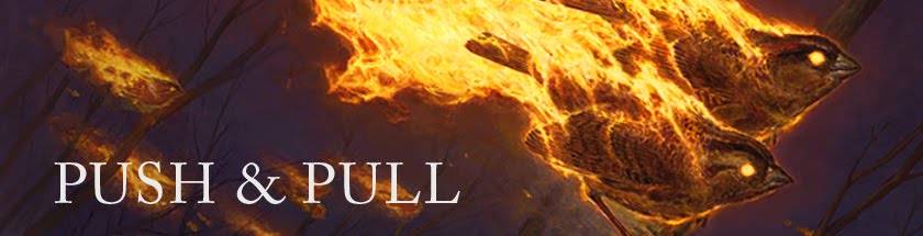
Like many of the other artists who worked on the Innistrad Magic block, I got the opportunity to paint a werewolf.  Also like many of those other artists, I got to do so for a double-sided card, which meant two pieces, a before and an after.  Man and... wolfman.

If I'm honest, I don't really have any insight into how the double-sided cards came about.  I only know that the idea was being batted around by Research and Development while I was at Wizards of the Coast working on the concept art.  Being a former player of the game, I was a little taken aback when I heard the idea mentioned, but I got the feeling that there were smarter people than I working on things and that any kinks would get ironed out.  Still, I was pretty curious to see the things come to fruition, and given that I still haven't gotten my hands on one, my curiosity hasn't been completely sated, but I know it's only a matter of time.

Anyway, on to the art...

For this particular assignment, I got the following descriptions:

ART ID: 139794    title: [Hinterland Scourge]
SIZE: 2 1/16" (52mm) wide X 1 1/2" (38mm) tall  

ART DESCRIPTION:
Color: Red creature
Location: In a mountain hamlet. There's a full moon in the sky.
Action: Show the older man from [Hinterland Hermit] transformed into a gray-furred werewolf. Show him lunging at the camera, bloody fangs bared. He's got torn cloth snagged on his claws and teeth from his previous kill. Maybe show the parish church in the background.
Focus: The werewolf
Mood: A predatory killer with no regrets or human emotion.
Notes: LINK to [Hinterland Hermit]
=====================================================

ART ID: 139796    title: [Hinterland Hermit]
SIZE: 2 1/16" (52mm) wide X 1 1/2" (38mm) tall   

ART DESCRIPTION:
Color: Red creature
Location: On the outskirts of a mountain hamlet at dusk 
Action: Show an older gray-haired man crouched beneath a pine tree watching something in the distance. He's the mountain-man type, a scary loner who avoids civilization. He's dressed in furs and leather with a gray beard and long gray hair. It's a full moon tonight, he knows he's a werewolf, and he's really hungry. See styleguide p. 50B for tone of clothing.
Focus: The man
Mood: An unseen killer waiting for the right moment to strike
Notes: LINK to [Hinterland Scourge]

Now, I had nothing to do with the werewolf designs.  That was all Steve Prescott with contributions from Daarken and Wizards' own Richard Whitters.  But, I had helped a fair bit with the human concepting; their wardrobe, architecture and whatnot.  Given that I had those things more in mind, I addressed the hermit first.

©Wizards of the Coast
In essence, I was going for exactly what the description above indicates: a man who observed civilization, yet avoided it.  I chose a moment where he's been startled while looking down upon the town.  It's a pretty straightforward, moody image and it was an instant sell as far as the folks at Wizards were concerned.  In fact, the only change requested was to partially obscure the moon with clouds.  Simple enough.

The werewolf was a different story altogether.  I really struggled with him.  I suspect that werewolves may not be in my wheelhouse, but I consider it a good thing that I was pushed in a direction that I'm not entirely comfortable with.  After many iterations, I finally settled on this:

©Wizards of the Coast
One of the advantages of having both images be on the same card is that there was no need to go over the top to tie the two images together.  By this I mean, I wasn't forced to basically paint the same piece twice with only the figure being different.  Indeed, I tried to keep the palettes similar and I tried to keep the moon placement about the same (though scale and emphasis did change), but I didn't feel like I had to slavishly reproduce the composition of the hermit piece.  Still, I did attempt to reference one in the other, and hopefully they do feel like they belong together, but I'm kind of okay with them feeling quite separate, as well.  Either way, the fine folks at Wizards seemed to be cool with my instincts as the only complaint was that the thumbs on the hands felt too human.  Steve Prescott had designed a really awesome hand for the werewolves that was more paw-like and I apparently hadn't gotten the memo.  So, the thumbs became more like wolf dewclaws, and I was good to go.

As you can see both sketches were digital.  While they started out in pencil, only the hermit has anything that resembles a decent drawing.  As is typical when I do digitally painted sketches, I turned them into monochrome images in Photoshop (I think they may have been violet), then pasted those images down onto the boards.  After that, I pulled out my brushes and went to town.  Here's how they ended up:

©Wizards of the Coast

©Wizards of the Coast
Both are oil on paper on hardboard and measure 14" x 11".

A story about the hermit piece:  As I painted the hermit's face, I noticed that he began to resemble artist Larry Elmore.  It occurred to me that it might be fun to turn the piece into a portrait of one of my childhood heroes, so I went with it.  The problem was that I found Mr. Elmore's face to be jarringly inconsistent with the vibe I was going for.  It was too soft, too kind.  So, in order to keep the piece pointed in the right direction, I was forced to abandon the idea and push the hermit back in the direction the sketch had indicated.  I wish I'd made it work somehow, but it was out of reach and I didn't want to sink the piece on the basis of a whim.

©Wizards of the Coast
Aside from not being able to make the portrait stick, I'm pretty happy with how the pieces turned out.  However, I oddly prefer the sketches to the finishes somehow.  Perhaps it's their rawness, perhaps it has to do with their mood, and perhaps it's to do with the fact that so many of the horror films I grew up with and dug most as a kid were black and white.  I don't know.  What I do know is that I feel like the paintings lost something that is present in the sketches, and I wish that that something had translated a bit better.

©Wizards of the Coast
That being said, upon revisiting these pieces to write this post, I'm still pleased with the Hinterland Hermit as well as the Hinterland Scourge which, as it turns out, is the one and only werewolf I've ever painted.

Wednesday, February 1, 2012

Geralf's Mind Crusher

In the long list of pieces that I will invariably be stuck with for the rest of my life, we can add Geralf's Mind Crusher.  What can I say about the piece?  Well, it started with the following description:

ART ID: 139875    title: [Maddening Zombie]

ART DESCRIPTION:
Color: Blue creature
Location: Your choice
Action: Show a huge zombie whose head and neck are covered with many eyes of different sizes and colors. It's at least seven feet tall with a stitched-up misshapen body and muscular limbs. Blue-aligned zombies are created by alchemists. They are stitched together parts from multiple corpses and stitches should be visible on its body.
Focus: The zombie
Mood: Just the sight of it induces madness

Simple enough, right?  So I went and did this sketch:

©Wizards of the Coast
I'm not sure what exactly I was thinking when it came to design.  I know that I dug the idea of a layered torso, which lead to the overlapping (and I assume extra) ribcage.  It's got the required stitches, and all those extra eyes make it clear that he's been manipulated in some way and is not just your average, wake-from-the-dead zombie.  This is one of those Frankenstein's monster undead types — alive because someone made it so.

Whether or not he's maddening, I can't say.  I suppose if you saw something like him in real life you might go a bit mad... at least temporarily.  But the bottom line is he was approved as is, and I painted him up thusly:

©Wizards of the Coast
As usual, he's oil on paper on hardboard and measures 12" x 9".

I wanted the piece to feel very noir-ish and wanted also to insinuate that the creature had been stumbled upon whilst creeping through the village one night.  So, I lit him in a way that gives the impression that there's a streetlamp or someone with a lantern just off to the right.  This light has caused the creature to begin emerging from his hiding spot, which means that given his final title, mind crushing is likely about to happen.

As far as other details, I made the stitches irritated and fresh.  Perhaps there's some infection going on there, as well.  In addition, I included some metallic pieces sticking out of his back, the visible parts of the armature I imagine helps keep him together, and also contains various tubes and hoses that deliver the necessary chemicals which keep him animated.

©Wizards of the Coast
If you reread the above paragraphs, you'll see that I've tried to inject some story into the piece.  I could have taken the description above in a hundred different directions.  It could have been a more menacing piece, or one that was more overtly terrifying.  I chose a story that made the most sense to me given the creature, the world, and the piece.  I like to think that the stories we try and tell are what makes each artist's images unique.  Sure, there are the obvious aesthetic differences, but beyond those are the tales we tell and the sensibilities of those tales.  What stories we tell do matter (the tonality needs to be consistent with the job, after all), but more important is that we try and tell stories to begin with.

It was the story of Innistrad, the world that this card set takes place in, that drove much of the design.  It was the context that helped shape things and bring the horror tropes into synch with one another.  While I intend to talk a lot more in depth about the experience of helping bring this world to life, I did want to touch on the monsters like the one above.  While I didn't really have a hand in fleshing out the straight-up brain-eating zombies, I did have a hand in the creation of these guys.  The blue zombies.  Those that had been manipulated and brought to life by alchemists.

What little insight I can provide is that I imagined them to be not unlike living sculptures.  I figured that they had metal armatures around which everything was based.  I did a bit of leg work on injection systems for alchemical liquids into the zombies, and the like.  I put some thought into how runes may play a part.  You know, the usual.  At the other end of the spectrum was Daarken, who (unconcerned with these things at first) began putting together a variety of silhouettes and overall designs.  Nothing either of us did excluded the work of the other, and I think, when combined, our efforts made for an interesting and rather open ended concept for other artists to follow.

The Frankenstein's monster inspired creatures weren't something I ended up pursuing to the end.  In fact, Daarken and Richard Whitters were largely responsible for their final look.  Still, this is one of the few pieces that I got to paint that depict a facet of the Innistrad world that I actually helped create.  It's also a really weird one, and like I said, is likely to be taking up space in my flat files for years to come.