First, the art description:
ART DESCRIPTION:
Setting: ZENDIKAR
Color: White creature
Location: A kor-style settlement
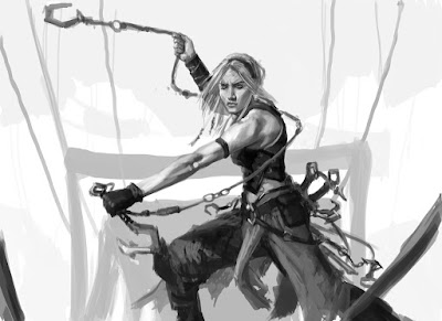
Action: A female kor soldier stands on a bridge in a kor settlement in a defensive posture. She's wielding one or more bladed weapons on ropes or chains, whirling them around menacingly.
Pretty simple and straightforward, really. So I put my sketch together and it came out thusly:
 |
| ©Wizards of the Coast |
I'd be lying if I said I wasn't a little excited by this sketch. I liked pretty much everything about it and I was really looking forward to getting to the painty bits. The fine folks at Wizards seemed to like it too, since it was approved as is. With that, I took it to paint.
 |
| ©Wizards of the Coast |
The finished piece is oil on paper on hardboard and measures sixteen inches wide by twelve inches tall.
This piece was painted concurrently with Faerie Miscreant in September of 2014. I can also tell you that I was marathoning Star Trek: The Next Generation at the time I painted this. These aren't important facts and in no way add insight into any of my decisions, but it's a reality of what I was up to at the time.
Looking at this piece and back at the sketch, I have a nagging curiosity of what the painting might have turned out like had I stuck more closely to the value-range indicated in the sketch. Would it have been more impactful? Would it have felt too stark? Is there a happy medium between that version and the one I ended up with? Obviously there's no way of knowing without actually repainting the piece, and were I to do it all again, I think I'd give the lighter background a go.
That being said, I'm not unhappy with the result and I don't consider it a tragic failure of a painting. Every once in a while, though, a piece comes along that leads me to wonder a bit about the direction I took within the process. In doing this I probably second guess myself too much, but I find the time spent reconsidering my work quite valuable in terms of the lessons I take into future projects. A lot of folks have commented that I sound as though I hate everything I do. This isn't true, actually. I'm quite proud of my work as a whole. It's just that I know what my work looks and feels like when I'm firing on all cylinders and I worry when it's not. These pieces represent me after all, and I dislike the feeling that I could have done better.
Anyway, here's how the piece looks in card-form:


No comments:
Post a Comment
I welcome all comments, questions, and discussion so long as you keep it civil.