Monday, January 31, 2011

The Many Covers of Badass, Part 1

The cover for the book, Badass, came out of the blue.  I was originally contacted by the author to do a few interior black and white pieces, and somehow that got me the cover painting.  Or the interior paintings I handed in got me the cover painting.  I don't know.  Either way, I got the cover.

So, the art director called me and we hammered out the details.  With everything explained, I went to work.  The first sketch was terrible enough that I really don't feel good about posting it.  Suffice it to say that there were three historical figures in the piece and that they were stagnantly placed and the whole thing was boring.

They didn't like it. 

So, they asked for changes.  They wanted it to be cooler and they reduced the number of figures to two, but added a tank and a biplane.  They also changed which historical figures I'd be using.  I gave it another go and the result was less stagnant to be sure, but was so poorly composed as to make me cringe.

They still didn't like it and I don't blame them.

At this point, I felt a little nervous.  I could almost smell the disappointment on their end and I was really worried that I might lose this opportunity if I didn't make a big leap next go around.  But as luck would have it, the situation got worse.

Around this time, HarperCollins (along with just about every major publishing company), was being forced to adjust to a weaker economy.  The publishing bubble had burst and the imprint that the book was intended to be published under folded.  As I'm just a lowly illustrator, I was not kept in the loop.  I heard nothing for a month, and was fairly certain that any chance I might have had was now gone.

Apparently, Badass was safe.  There was just a bit of wrangling necessary to figure out where it should be published, and what its time line should be.  And so, after several weeks of silence, I got an email from a brand new art director, with a brand new book design, and some brand new changes for the cover.  I'm not sure whether or not I might ever have been in danger of losing the job, but I treated this clean slate as a second chance and swung as hard as I could.

Now, I'm not sure how common it is, but the art director provided me with the book's design before I'd even done the revised sketch.  The book, overall, was very deliberately designed and they wanted me to fit my three figures into the space provided — a space with a very specific size and shape thanks to the placement of the the title and the author's name.  The disadvantage was that I didn't have quite as much free rein as I might otherwise have had.  The advantage, however, was that I now had a digital file of the precise layout of the book.  I could incorporate that into the sketch and make absolute certain that my piece would fit in the space provided.

Early on, I decided to do my sketches digitally knowing that they might change one or more of the figures (something that clearly turned out to be true).  By keeping each figure on a separate layer, I could easily eliminate one while keeping the other two intact.  This decision also allowed me to play with the proportions of each figure in relation to the others and fine tune my sketch with ease. 

The new changes included eliminating the tank and biplane, but keeping one of the historical figures from the previous version, though upping the total number of figures back to three.  So, I sketched away, going for something that might begin to fit the book's name and design.  Here's what it looked like:

Pretty pathetic, I know.

The art director took the sketch and popped it into the design and pitched it to the highers up.  Apparently they liked it enough to give it the green light and I moved on to paint.


As you can see, it got a lot better after I shot reference and did my thing.  It was approved and after some digital manipulation went on to become the cover for Badass, by Ben Thompson.

I submitted the piece last year for Spectrum 17, and sent it in with a bunch of other pieces that I'd done for Magic which I was sure would have a better chance.  To my surprise, this is the piece that made it into Spectrum while the Magic pieces failed to make the cut.  Funny how things happen.  You can never predict what will end up tickling the fancy of any given group of people.  Had it been a different group of people I wonder if they might not have gone a different way.  But then, the dynamics of groups during the judging of competitions is a whole other topic.

So, you may be wondering why this post is called "The Many Covers of Badass."  "Many" implies more than one.  Indeed you are astute and correct.  It would come to pass that HarperCollins saw fit to publish a second Badass book, and also saw fit to keep the creative team in place.  Once again I'd be doing a few interiors, as well as the cover.  Once again, I'd be working with the same art director.  Once again, I'd be making changes.  But this time, I ran the gauntlet and lived to tell about it.

Friday, January 28, 2011

On Spinning My Wheels

Some days things just don't seem to run smoothly.  Some days it takes twice as long to get things done.  And, some days everything I paint will end up being wiped.

So what do I do when this happens?

The first thing I do is walk away.  Not permanently — just long enough to clear my head.  Trying to force things isn't going to make it better and will likely add to the building frustration.  So, I find something else to do.  Even if it's for five minutes.  When things get really bad, I go for a walk outside (weather permitting).  Otherwise, I'll zone out and watch a half hour of television or do a few sudoku puzzles.  For me, it's all about switching focus, changing gears, and leaving the irritation behind long enough collect myself.

After I've managed to relax a bit, I may do any number of things.  If the job isn't pressing, I'll start working on another piece.  At any given time, I usually have more than one piece cooking.  It might be for the same client, a different client, or for myself.  Either way, they all need to get done, and work is work.

If the problem piece is pressing, then I will try working on a different area of the painting than that which was giving me grief to begin with.  Working on an area that requires less precision is often a good way of getting back into the piece, and will often buy you a little time to start mentally addressing the problem areas you still have to face.

Should this option not be possible, and the problem areas are all that are left to complete, then I turn to my bookshelf for inspiration.  I'll dig through the many tomes on other artists and look for similar pieces, subject matter, lighting scenarios — whatever.  I look for something that can help me with the specific problem I am facing.  Anything that provides hope or inspiration is gathered then displayed around my easel.  I look at how things were addressed by others, and see if I can't apply at least a little of their solutions into my own.

If all else fails, I will do something as simple as turn the piece on its side.  Often times my frustrations are exacerbated by the specificity of what I'm painting, when what I should be doing is breaking down shapes.  Turning a piece 90 or 180 degrees can help that mental shift take place.  In this case, it's all about attempting to change the context of the things I'm trying to depict.  I'll still end up righting the piece and finishing it up in its proper orientation, but I'll have hopefully managed to get a lot of things down in the meantime.

A lot of work I get done in a day is based on rhythm and momentum.  If things start well, they usually continue to go well throughout the day.  If at any point I trip over my own feet, or fail to get into the proper work groove, it can be pretty frustrating to say the least.  The things listed above are all ways I attempt to reset the entire process and salvage what time I have left in the day. 

More often than not, one of these things will succeed, but not always.  Sometimes even the things listed above don't help.  Some days it's clear that trying to paint really will be an exercise in frustration that will accomplish little more than wasting my time.  There are times when it really is best to leave it for the day and come back the next with a full tank of gas and a fresh perspective.

Thursday, January 27, 2011

New Work: Fuel For the Cause

©Wizards of the Coast

Fuel For the Cause, oil on paper on masonite, 12"x9".

The piece is supposed to show a phyrexianized vedalken spellcaster absorbing a spell from another, unseen spellcaster.  Admittedly that's a pretty big mouthful of made-up words there.  Suffice it to say that the vedalkens are a race of blue-skinned humanoids who, on the plane of Mirrodin, have four arms.  In Magic's current storyline, Mirrodin is being besieged by a phyrexian plague, which I guess is some sort of biotic/metallic mutation that permanently changes the nature and appearance of its hosts, the landscape, and the entire world.  This particular vedalken has been affected by the phyrexian plague, hence his current appearance.  They usually look like this.

Anyway, showing a guy absorbing a spell rather than casting one can be hard to pull off.  It's all about gesture.  I tried to go for something that felt like our little vedalken friend was open and receiving.  The open palms were a big part of that.  I tried to back the gesture up by having the pink of the spell invading the little glowing nodules all over the vedalken's body that normally glow blue.  Still, without seeing the other spellcaster, it's difficult to get the full story.

Another big challenge for me on this piece was the vedalken's design.  The original designs were done by Wayne Reynolds, who I love to pieces but hate having to emulate.  Don't get me wrong, I love a good challenge, but for some reason every time I have to base things off of Wayne's designs, things go horribly awry and sketches take far longer than they typically might.  This was no different.  I wish I could tell you what it is about Wayne's sensibilities and shapes that I have such a hard time translating, but I have no idea.  Either way, it's become a consistent hurdle for me that I'm determined to one day get past.

Overall, I'm fairly happy with how this painting turned out.  The ambiguity of whether the spell is being cast or absorbed outside of the context of the card isn't a major problem to me.  It allows for the viewer to read into it a bit more than they otherwise might, which I always think is a good thing.  I want people to be engaged or invested in some level or another.  Not sure if they will bother, but I gave it a shot on this one.

Anyway, off to shovel some more!

Wednesday, January 26, 2011

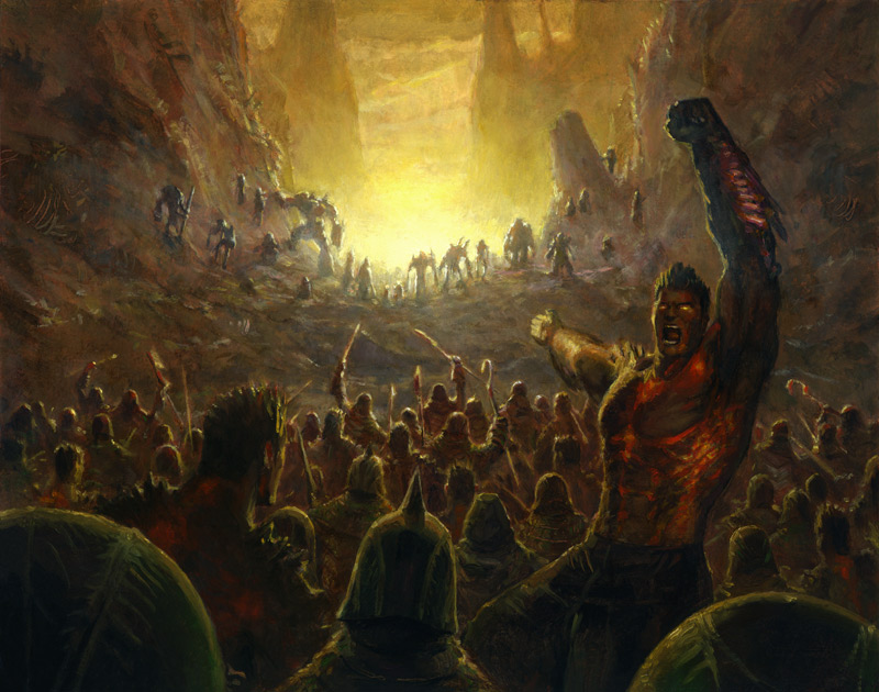
New Work: Rally the Forces

©Wizards of the Coast

Rally the Forces, oil on illustration board, 10"x8".

I was pretty reluctant to show this piece, but I've already spent plenty of time embarrassing myself in previous posts, so why stop now?

This is another piece on illustration board, and it's a piece I also felt should be small (for some reason), though in retrospect it so clearly should have been MUCH larger.  It's a battle scene for the love of Pete!  What was I thinking?!

Still, it is what it is and I will address it so.  Admittedly, this piece has some major issues.  Mostly some noticeably bad drawing here and there.  Part of the reason for this is that I likely didn't shoot quite enough reference.  Another reason is that the piece was too darned small.  Even my smallest brush was incapable of getting certain things across because it was just too big for the job.  So, there are some shortcomings that might otherwise not have been there if I'd just scaled it up.  At least that's what I keep telling myself, anyway.  I'd like to say that the job was too much for me, but I think this may be a case where I didn't completely rise to the occasion and the result was something that only managed to get 80% of the way there...if that.

At the same time, this is still nowhere near my worst Magic painting.  That honor still goes to Maelstrom Nexus.  While fans may feel differently, I can assure everyone reading this that that piece failed on almost every level and was flawed from the ground up by my inability to come up with a good visual concept in the first place.  But that's just my opinion.

On the bright side, I think the piece reduced well.  Plus, the art director seemed pleased enough, and Wizards of the Coast ended up using the piece in several promotional bits including this video (link here).  So it can't be all bad, right?

Side note: this piece was also done with Liquin.  I remember getting pretty frustrated by its tendency to gum up — particularly while working on the figure in the foreground, right who is looking at the viewer.  There are only two other Magic paintings that were done using Liquin aside from this piece that I have yet to show.  I'll toss one of these your way tomorrow.  The other was not published with the most recent Magic set despite being commissioned for it.  Whether or not it will be a part of the next set is unknown to me.  Outside of that there was a book cover that I painted around the same time using Liquin, which I will tell the tale of in the near future, but I need to let some dust settle first.

Tuesday, January 25, 2011

New Work: Ichor Wellspring

©Wizards of the Coast

Ichor Wellspring, oil on illustration board, roughly 9"x7".

This piece depicts the black phyrexian ichor bubbling up on the plains of Mirrodin.  Or something.

Some notes about this piece:

The first thing you may notice is that this is on illustration board.  The reason for this is that I just didn't feel that the image called for a particularly large painting.  As it was going to be smaller, I didn't need the toughness of the hardboard or masonite.  After all, smaller work tends not to warp as severely.  So, I ended up using some of the illustration board that I had left over instead.  Worked out nicely.

This is one of those pieces where I basically painted exactly what was in the description.  Don't get me wrong, I tried to gussy it up some.  I tried to make the ichor a little more interesting.  Maybe give it some personality.  I handed in a sketch with the ichor forming these domes with finger-like projections.  It was rejected.  They really just wanted bubbling ichor.  So, back to the drawing board I went and this is what they approved.

The rippled surface was all mine.  I wanted it to be a little bit more interesting than featureless black bubbles.  Looking at it now, it's clear that the movie Sphere was somewhere in the back of my head, though I don't think I've seen that movie since it first came out.

The choice of the yellow/white and blue suns showing with the red sun indicated in reflection were my decisions, as well.  Given the simple, straightforward subject matter I wanted to challenge myself and I did so with color.  One of the more difficult color shifts for me has always been yellow to blue, and vice versa.  I figured this was the perfect opportunity to really go for it and see what I could manage.

At the end of the day, I think the color worked out fine, and the hardest part of the piece turned out to be the hexagonal grid.  In the few areas it was less difficult, it still proved to be obscenely time consuming.  Personally, I wouldn't recommend it.

Finally, this and the other piece I worked up at the same time (which I can't yet show you), were the last two pieces I ever painted using Liquin as my chosen medium.  While it did it's job for the many years I used it, I had become a little irritated with how gummy it gets over the course of a day's painting.  I ran out of the stuff after these two pieces, and decided to try something different altogether.  I mixed my own medium which is based on that of other painters I know.  It consists of one part linseed oil, on part Turpenoid, and a couple drops of cobalt dryer.  Needless to say, I liked it and I continue to use this new medium.

So, there it is.  A tiny Magic painting of goo.

Monday, January 24, 2011

Creator and Destroyer

A few years back, my folks moved out of the house I grew up in and moved into a smaller place.  Well, I guess it's smaller.  It certainly has a lot less storage space.  I know this because they called me up to come pick get my stuff, as they weren't interested in cluttering up their new home with it.  I can't argue with them.  It's their house, and I was in my 30's — it seemed only right that I become responsible for my old toys, comic books, and artwork.

I arrived at my parents' new home to find all of my stuff gathered into a single pile — a pile that was far larger than our rental car could accommodate.  On top of not having enough room in the car, I also lived in an apartment in New York.  This meant that even if I had gotten it home, I still wouldn't have had room to store all of it.  I needed to do a bit of editing.

Mind you, the better part of this pile was my artwork.  Some framed, some not.  Elementary work, high school work, and college work.  There were some sculptures in there, old sketchbooks, etchings...it was a pretty diverse and sizable collection.  Too sizable.

So, equipped with a utility knife and some garbage bags, I began to destroy work.

--Record scratch--

I did what, now?  Destroy work?  Seriously?

Yes, seriously.  But not everything.  Don't get too upset.  And before you ask why, I'll tell you.

First, I don't have the kind of space necessary to store every last bit of art I've ever done.  Even now that I have a whole house to deal with, I still don't want to clutter it up.  I've lived in tight, cramped quarters for much of my adult life, and I really didn't enjoy it.  Bumping into all manor of old work because my studio is too cluttered is not something that interests me. 

Second, since 1994, I have moved eight times.  Dragging all that stuff around gets old quick.  Seriously.  I used to have several large, leather folios full of work that I couldn't have listed the contents of without looking.  Same goes for several drawers in my flat files.

Third, a lot of the work just so happens to be atrociously bad.  Don't get me wrong, I'm not throwing out elementary school drawings because they aren't any good.  I try and judge each piece on it's own merits and in its own context.  Still, there's a lot of work that I've done that I'd rather not have floating out there and I just don't see the point in keeping it.  As any illustrator will tell you, not every piece is a portfolio piece, and sometimes there are pieces that are worse than that.  Why keep them?

Fourth, sometimes something gets damaged.  When this happens, I always run a cost/benefit analysis on it.  How much work is it going to take to fix this, and is it worth putting in that effort?  If the answer to the second part of that question is no, then the piece has to go.

Finally, some work I do is purely exercise.  What do I need to keep newsprint pads full of figure drawings for?  They're not archival and are likely to disintegrate in my own lifetime, anyway.  Some pieces from college are just color problems or simple geometric patterns — seriously?  We want to keep this?  Plus, there's always experimental stuff that just didn't work out.  Why bother with it?

To me, having work I don't like or want in my house is like storing corpses there.  It's creepy and it stinks.  I guess that in some respects the destruction of work is like letting go of certain aspects of my past.  While I won't forget them, I don't exactly need to keep them around.  However, I also understand that this type of things isn't for everyone.

I know lots of folks who keep just about everything they do.  I know folks who even pay for storage to put it all in.  I would never criticize or judge them.  They do things their way, I do things mine.  Simple as that.  I suppose that if I had infinite space I might keep everything, too.

Nevertheless, there I sat in my parents' den slashing canvasses, smashing sculptures, and tearing drawings apart.  I kept what I liked or what represented something important in the evolution in my work or had a strong memory associated with it.   I gave away whatever someone expressed interest in.  The rest ended up in a couple of garbage cans in Pennsylvania.  I was able to fit everything that remained in the car, and when I got home, it fit snugly into what little space I had to spare.

After hearing of this, a buddy of mine asked, "If you destroy everything, what are they going to put in the book of your life?"  He was half-joking, but there was a serious question in there.  I told him that it was highly unlikely that anyone would ever write such a book.  I'm not that interesting.  But, even if someone did misjudge the demand for a book about me and commit to such a project, I'd like to have a say in what work went in those pages.  Destroying the work that I do is the only way I can be sure they make the right decisions.

Now, I can't say that I'm completely detached from the work I destroy (after all, each piece represents hours and days of my life).  In fact, I do experience regret, but not in the way you might expect.  I do not regret the act itself, but the failures that lead to it.

Saturday, January 22, 2011

A Follow Up To Snow and Under Paintings

In response to yesterday's post about under painting, Scott Brundage wrote:

"Why not some watercolor for your underpaintings? :)

"Have you found that one method or another lends itself to any particular subject matter? Like, does a digital background help out a metallic armor piece or acrylic for a textural landscape. Maybe just one for simple and another for complex?

"I'm playin with my first couple steps as well. I always feel I did x, y and z, only to completely obliterate x by the time I'm ready to paint."

Excellent questions there, Scott.

First, I know you're only joking about the watercolor under paintings, but I'll address it anyway.  The answer is simple: I don't do water color under paintings because they'll be completely destroyed as I work on top of them.  The whole point for me is for them to survive the initial stages of the painting.  Plus, I'm not too sure how the gum arabic in watercolor would affect the oils.  I'm no chemist, but it seems to me that throwing something like that into the mix could potentially muck up the works somehow.

Second, regarding the different under painting techniques lending themselves to different subject matter, I must confess that you pointed something out about my under paintings that I hadn't realized.  The vast majority of my digital under paintings were for pieces that contained a lot of finely detailed and sleek metallic subjects.  It would appear that I instinctively moved toward that solution once, then repeated the process due to the success I had the first time around.  The digital under paintings do allow for a bit more precision with a good deal of speed, giving me the opportunity to address more issues and iron out more kinks.

When faced with landscapes, I've typically done quicker and dirtier under paintings with acrylic or oils.  Also, when there tends to be just a single, main figure in things, my under paintings also tend to be in acrylic or oils and just ask quick and dirty as these pieces are often all about the silhouette and therefore require less precision.

So, I guess my process does, in part, depend upon the subject matter I'm working with.  Weird.

Lastly, regarding the destruction of the under painting, it happens.  What people do for under paintings varies wildly.  I know folks who don't even bother with them but start putting paint down immediately on the white surface.  I know folks who just do a ground color to kill the white and then go for the finish immediately.  I know folks who do fully fleshed out, tonal under paintings that could almost be finishes unto themselves.

How much of the under painting survives also varies wildly.  I'd wager that most folks end up covering their under paintings for the most part.  However, I own paintings from other artists where the under painting is allowed to show through for much of the finish with nothing but a glaze over top of it, and in one case half the painting IS the under painting.

For me, the under painting is just about beginning the implementation of the value structure of the piece.  It's a foundation layer upon which everything else is built.  Thus, it is destined to be buried beneath the rest of the paint.  Of course, sometimes I only get as far as a ground color.  And then it's all about going for the painting immediately.

I've said it before, and I'll say it again: my own process is consistently inconsistent.  I don't like things to be formulaic.  Each piece is a puzzle that I put together without instructions, and all puzzles are not created equal.