Tuesday, December 15, 2015

Lantern Scout

There's been a lot going on in the house and I've been delinquent in posting as frequently and on as a diverse a group of topics as I'd like. Instead all I've been able to muster is a smattering of closer looks at Magic pieces. But even in this I've fallen short since the piece I'm about to write about came out in September.

So, Lantern Scout. Yeah. Not a lot of controversy, not a hugely difficult process, and not a lot of issues along the way. In fact, it was about as straightforward as things go. As always, it began with an art order:
ART DESCRIPTION:
Setting: ZENDIKAR
Color: White creature
Location: Guul Draz
Action: Show us a female human scout moving through a murky geyser field in Guul Draz. She has a short sword in one hand and a glowing hedron-lantern in the other, lighting her way through the swamp. Behind her, we can make out the shapes of two other humans following her light--perhaps only indistinctly through the steam of Guul Draz.
Focus: The scout with the lantern.
Mood: She's a light shining in the darkness.
Edited from the above are specific page numbers from the styleguide that included specific reference for the scout's clothing, as well as the landscape of Guul Draz. If I'm honest, descriptions such as this that require me to take something from one part of the styleguide and place it in an environment found in another part of the styleguide can be a bit boring. After all, there's little ownership and a bit less creativity, as well. In this case, however, I was fortunate in that all the styleguide reference was vague enough to allow a great deal of extrapolation. Even if it hadn't, the image they were looking for is the kind of thing I really enjoy painting, so off the bat I started in a good place and was looking forward to digging in.

As luck would have it, the same day I got my assignment, I had a model over for an unrelated project. At the tail end of our session, however, I took the opportunity to take a bunch of shots of her holding a lamp to try and nail down the scene for the painting that lay ahead. This was the opposite of how things typically go, mind you, since I normally do at least a thumbnail sketch before committing to shooting reference. But taking the photos felt worthwhile—especially if they prevented me from having to paint myself yet again.

Model: Éowyn Rose

Not surprisingly, I could have used the game plan that a sketch would have provided. As I explored the scene in sketch form, it became clear to me that the photos I shot with the model would end up being less helpful than I'd hoped, and so I lit the scene and struck a pose and then used my maul stick to pull the trigger on the Photo Booth App (ahhh, technology).

Model: Paintermonkey

The end result was sort of a melding of both bits of reference along with a bunch more stuff thrown in (thank you Google Images). Anyway, this is the sketch that resulted:

©Wizards of the Coast

And here is the finished piece:

©Wizards of the Coast

The painting is eighteen inches wide by fourteen inches tall and is the usual oil on paper on hardboard.

While I stated above that the creation of this piece was pretty straightforward, there was one thing that did cause a bit of a hiccup. While painting the piece, I failed to step back often enough and take the piece in from afar. The result of this negligence was that the scout's proportions became slightly off. As soon as I digitized the piece and was able to reduce it at will in Photoshop, it became quite obvious. So I ended up tweaking things in Photoshop before submitting the piece. After that, I spent an additional day working on the painting to get it to match the digital file. Mind you, the necessary tweaking wasn't a big deal, but I admit that I was a little irritated with myself because I knew better. Or thought I did.

Still, aside from that small, last-minute issue, the piece was about as straightforward as I could make it and it ended up being one of my favorite pieces I painted in 2014. If nothing else, I managed to nail the mood I was going for, and I was quite pleased with the more limited palette I went with to get there.

So yeah, another one that I don't hate. What is happening to me?


Thursday, November 19, 2015

Great Oak Guardian

This painting was done in 2010—October of 2010, to be more precise. In fact, it was painted concurrently with Kiki-Jiki, Mirror Breaker but it ended up not being published. And so it sat in a drawer both literally and figuratively.

Originally, I believe it was meant to be alternate art for something in the Magic 2012 core set. Due to a clerical error that attached the wrong proportions to the art description, however, it ended up being a horizontal piece instead of a vertical one as intended. Given that the art director was busy helping usher into existence somewhere around 150 other pieces of art at the time, the error went unnoticed until the finished painting was handed in. Unfortunately, being the wrong proportion rendered the painting unusable and so it was put into the Magic art slush pile—a pile that at one point I jokingly suggested Wizards of the Coast finally print as the next "Un" set and call the whole thing "Unpublished."

This is not that common an occurrence. However, it's not exactly rare, either. Over the years, many pieces of art have ended up in Magic's slush pile. Way back when everything was done traditionally and one sent their art into Wizards, I remember even getting to sift through the art being stored in their flat files for future use (yes, they kept the art until it was published even if it took years, but I think this has ceased to be their practice and is largely moot due to the fact that most people—even those of us who work traditionally—send in digital files). This isn't even the first time some of my work has been set aside. Rampant Growth and Tome Scour were both painted quite a long time before they finally saw print, and I still have one more piece that has yet to see publication.

Whatever the case may be, this little tree guy was done a few years back and Wizards finally found a place to put him in the Commander 2015 set. His name (apparently) is Great Oak Guardian, and I'd be lying if I said I wasn't happy to have him out there.

Normally, I'd have the original art order ready to go and give you all the usual bullet points of the process, but I don't have a lot to give you five years after the fact. The best I can do is tell you that I have a vague recollection of the piece needing to be a treant-type creature slinging a boulder. So I drew this:

©Wizards of the Coast

I don't remember getting any feedback beyond approval, and so I took it to paint.

©Wizards of the Coast

The finished piece is oil on paper on hardboard and measures twelve inches wide by nine inches tall.

Right off the bat I will confess to regretting not painting this thing larger. I really wish I'd done it at least fourteen by eleven. But I didn't. So I just have to get over that. That being said, I really do like the piece. I remember feeling pretty good about the whole assignment in general as both with this piece and with Kiki-Jiki, I'd accomplished what I'd set out to do. In general, I feel like I got a lot of things right. I like the light, the color and the gesture. To boot, the fact that I don't cringe over something I did five years ago feels like a win.

So yeah. I like something I did. Weird, right?


Monday, October 5, 2015

Kor Bladewhirl

Over my tenure of working for Magic: The Gathering, I've gotten to work on a fair number of settings. I've been surprised, frankly, to get a chance to revisit a couple of these exotic locales. Thanks to the new "Battle for  Zendikar" expansion set, I got to revisit (big surprise) Zendikar. Anyway, I present you with this little post about the first of two pieces I did for for the set. This one is called Kor Bladewhirl.

First, the art description:
ART DESCRIPTION:
Setting: ZENDIKAR
Color: White creature
Location: A kor-style settlement
Action: A female kor soldier stands on a bridge in a kor settlement in a defensive posture. She's wielding one or more bladed weapons on ropes or chains, whirling them around menacingly.
Pretty simple and straightforward, really. So I put my sketch together and it came out thusly:

©Wizards of the Coast

I'd be lying if I said I wasn't a little excited by this sketch. I liked pretty much everything about it and I was really looking forward to getting to the painty bits. The fine folks at Wizards seemed to like it too, since it was approved as is. With that, I took it to paint.

©Wizards of the Coast

The finished piece is oil on paper on hardboard and measures sixteen inches wide by twelve inches tall.

This piece was painted concurrently with Faerie Miscreant in September of 2014. I can also tell you that I was marathoning Star Trek: The Next Generation at the time I painted this. These aren't important facts and in no way add insight into any of my decisions, but it's a reality of what I was up to at the time.

Looking at this piece and back at the sketch, I have a nagging curiosity of what the painting might have turned out like had I stuck more closely to the value-range indicated in the sketch. Would it have been more impactful? Would it have felt too stark? Is there a happy medium between that version and the one I ended up with? Obviously there's no way of knowing without actually repainting the piece, and were I to do it all again, I think I'd give the lighter background a go.

That being said, I'm not unhappy with the result and I don't consider it a tragic failure of a painting. Every once in a while, though, a piece comes along that leads me to wonder a bit about the direction I took within the process. In doing this I probably second guess myself too much, but I find the time spent reconsidering my work quite valuable in terms of the lessons I take into future projects. A lot of folks have commented that I sound as though I hate everything I do. This isn't true, actually. I'm quite proud of my work as a whole. It's just that I know what my work looks and feels like when I'm firing on all cylinders and I worry when it's not. These pieces represent me after all, and I dislike the feeling that I could have done better.

Anyway, here's how the piece looks in card-form:


Tuesday, July 7, 2015

Faerie Miscreant

A while back, over many consecutive years, I had a booth at GenCon's art show. As is often the case at such conventions, after hours was spent commiserating with my fellow artists at a bar. Though time and adult beverage have eroded the identities of the parties involved, I once had a conversation with one or two art buddies in which we pondered a single image that would resonate with the crowd at the con and draw the attention we so desired. I somehow latched onto the idea that doing a really kick-ass faerie painting would be the way to go. Kick-ass in both execution and spirit, this mythical faerie painting would bring the crowds and lead me to fortune and glory. 'Cause, you know, that's how that works.

Of course, all of that was said in jest and under the influence. I'm pretty sure I've never been stupid enough to believe any of that. Still, the idea of the kick-ass faerie painting has never completely gone away.

Weirdly, faeries are among the fantasy tropes I just haven't had much chance to dig into professionally. In fact, Knacksaw Clique is the only faerie painting I've ever done. But I'm not sure that there's a whole lot of deep interest within me, either. After all, I could have made the kick-ass faerie painting a reality a hundred times over by now. One never knows, however. My career isn't over yet. (Right? ... Anyone?... Hello?)

Cut to me getting an art order for a second faerie painting.
ART DESCRIPTION:
SET ON RAVNICA
Color: Blue creature (unguilded)
Location: Interior of an Azorious lawmage's office
Action: Show a Ravnica faerie stealthily cutting a page from a book she is standing in. Perhaps she is only removing part of the page. In the background, we see the desk of an Azorius lawmage. It is crowded with scrolls and other books. Perhaps we can see the arm of the lawmage who sits at the desk, unaware of the faerie.
Fun stuff, really. In fact, quite whimsical—something that I don't often get a chance to do. Believe it or not, I relished this change of pace and got to it.

Typically, even if my sketch ends up being digital, there is some pencil mileage that goes on to flesh out composition and design choices. I don't recall whether it was because I was pressed for time or because all my pencils were broken, but this one had very little graphite actually dedicated to it. At least, I've been unable to find any sketch (but my studio is kind of a mess right now).

Point is, it was pretty much a fully digital sketch:

©Wizards of the Coast

Kind of a rough sketch, but it's clear what's going on. You've got your faerie and your lawmage in the background, some books and important papers. You know, the usual. As I recall, there were no requested changes so I took it straight to paint from there.

©Wizards of the Coast

The final painting is fourteen inches wide by eleven inches tall and is the usual oil on paper on hardboard.

There were probably some of you pondering whether or not there'd be any writing in the books and how I would address it. Well there is writing, and it was done very carefully. It's all oil, done by hand, and boy am I not in a hurry to do more of it! Don't get me wrong, it actually came together well, but I can't say it was the most fun I ever had painting.

By no means is this a perfect piece for me (if I had my druthers, I'd have pulled the camera back a good distance so that the faerie was less a focal point and part of a larger scene with a lot more books and scrolls and such, but card art demands certain clarity), nor is it the mythical kick-ass faerie painting. But I like it. The wings of the faerie in particular are something of which I'm quite proud. Unfortunately, I have been unable to do the wings any justice through photographic means, so they don't quite make as strong an impression on the screen, so you're just going to have to trust me there.

Plus, I had fun painting this thing, too. A lot of fun. Criminal amounts of fun. And I think to an extent that might come through.

I'm not going to lie, I kinda look forward to getting another faerie assignment at some point. Or maybe I just need to faerie up and make the mythical piece an actual one.


Friday, June 26, 2015

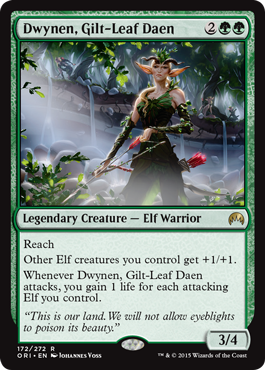
Dwynen, Gilt-Leaf Daen

Last summer, I was hit with a couple of medical issues that made getting work done complicated and sometimes quite painful. Like a lot of folks, when I'm in pain I find that my temper can be short and my patience nigh non-existent. It's entirely possible that I shouldn't have taken on what little work I did. That being said, I'm positive that sitting around wallowing in my discomfort would have been a far worse idea.

Enter the assignment for Dwynen, Gilt-Leaf Daen:
ART DESCRIPTION:

SET ON LORWYN
Color: Green and Black creature
Location: Lorwyn forest (daylight)
Action: This is a legendary female elf, Dwynen. Lorwyn elves are vain and haughty. That should be her attitude.

This is a tight shot of Dwynen  from the chest up. Her head is turned, and she has her bow at full draw. She holds her bow in her right hand, and draws with her left (see reference) She is aiming at some off-camera prey.

Lorwyn elves have very lithe silhouettes. we want to keep their exaggerated proportions, but have this executed in a more realistic style than original Lorwyn art.
Focus: Dywnen the hunter
Mood: a hunter at work
Attached to the description was the original version of Dwynen by Johannes Voss.

So off the bat, I was left with relatively little input on this piece. All the key decisions about Dwynen had already been made and pretty much everything about her had been designed. I was left only to create a new portrait of her.

Looking at the original art and the description, I fired off an email for clarification on how the suggested realism was to be employed. See, I worked on the original Lorwyn sets and had a good feel for what elves looked like in that world. They had exaggerated wasp-waists, thin limbs, swarthy skin and brown hair. Their broad noses and dark eyes gave them an almost sinister air. This new elf was pale complected and blonde and to an extent her features felt normalized. Were these changes the employment of the realism mentioned in the description? Or was Dwynen just a pail anomaly among the elves and the realism part was more addressing my choice of lighting and paint handling?

If I'm perfectly honest, I was not particularly keen on some of the choices made. If I was to do a Lorwyn elf, I wanted a chance to really nail them in the way they'd always been depicted (dark and perhaps a bit dangerous). But alas, my feelings don't really enter into it. In the end, my job isn't really about liking the decisions made by other people. My job is to take those decisions (whatever they may be) and present them in as cool a way as possible. And so after getting a reply back from the fine folks at Wizards explaining the reasoning for Dwynen's appearance and requesting that no significant tweaks be made, I did my best to set aside my prejudice and began plotting to deliver Dwynen in the best way I could.

I went to the drawing board and after several thumbnails, knocked out a quick and dirty pencil sketch and cleaned it up with some even quicker and dirtier Photoshop values tossed on top.

©Wizards of the Coast

Off the bat, one might notice that her right arm is a bit too long. Keener eyes will notice that I tried to push some the facial proportions a bit closer to the original Lorwyn elf designs. It's still not quite as severe as I might have gone, but I tried to keep in in the neighborhood of something that I could believably pull off in paint.

This was given the green light. I fixed the long arm and took it to paint.

©Wizards of the Coast

The finished painting is oil on paper on hardboard and measures fourteen inches wide by eleven inches tall.

This piece evolved significantly as I painted. Originally, this was a bright painting. The background was blown out by sunlight and was comprised mostly of washed-out greens and yellows. But that version seemed to clash with my mood at the time. Mid-stream, I shot a photo of the piece, took into into Photoshop and explored a couple alternate directions. Making the entire piece darker felt like the way to go and so I reworked the piece to match the digital file. In essence, I took the darkness inherent to the original Lorwyn elf design, and injected it into Dwynen's environs instead.

My memory of working on the piece is full of feelings of dissatisfaction. In fact, I remember hating everything about it. But I think I hated everything at the time given how much pain and discomfort I was experiencing. At the moment, I can tell you that I quite like aspects of the finished piece. There's definitely stuff I'd change, but that's hardly anything new. I've never been a particularly good judge of my own work.

Any complaints aside, there is one aspect of this piece that I truly love: I got to dip my toes back into the world of Lorwyn. I suspect that this will be my last time doing so, and it's a prospect that saddens me. While I did work on two other sets prior to Lorwyn, it is in that world of elves and kithkin that I truly cut my teeth in Magic and fell in love with working on the game. I loved every minute exploring that storybook world and it was nice to create a glimpse back in time, a portal to the past not only for fans, but for myself. But then, who knows? It's impossible to say where Magic will take us.

Friday, May 29, 2015

Inferno's Rest

Sometimes I paint things that are not for Magic:the Gathering. This is one of those times.

Regular readers of the blog may recall the piece I did for Microvisions last year that was quite similar to this one. I was pretty proud of how that piece turned out and I was fortunate enough to receive a good deal of encouragement from various folks who got a chance to see it. One person in particular who gave me a big old ego boost was Greg Manchess, who aside from dumping a heaping pile of kind words over my head suggested that I might want to explore the subject a bit further and see where it takes me. So, I went ahead and did just that.

While the original Microvision has inspired a much more ambitious piece, progress is slow. In fact, I haven't really begun. This is due to the sheer amount of research required to get it right, not to mention the challenge of finding time to get any of said research done between assignments and various life events. However, one of the largest time sucks of my personal life—the search for a permanent abode—has recently come to an end and so I will be digging into things more deeply as soon as my assignments permit. Once the remaining dust settles, I'll be taking some more time off in an attempt to pull this bigger piece together (and hopefully a couple others in the process).

Big deal. Talking about something that doesn't yet exist is basically wasting your time, so I guess it would be prudent to shift focus to the piece that actually is done.

In the early stages of contemplating the upcoming piece, I went ahead and took another crack at the birds in a larger, slightly more ambitious way. This time around, there is one bird of each sex for a grand total of two (not to mention the various others sprinkled in the background). While one or both of the birds may still evolve a bit as I continue to explore them, I think they're pretty close to their finished design. At the very least, I doubt that their plumage will get much more decorative as it turns out that I'm rather fond of the juxtaposition between the mundane looking birds and the flames they emit. But you never know.

Anyway, here's the painting:


The finished piece is oil on gessoed hardboard and measures eighteen inches wide by ten inches tall. It's title is Inferno's Rest.

Monday, May 11, 2015

Concepting Dragons of Tarkir

A few short weeks after doing the concepting for "Fate Reforged," the team reassembled to take on "Dragons of Tarkir." Returning were Sam Burley, Mark Winters and myself, but this time Mike "Daarken" Lim was also on hand to add his talents. With the extra artist in the mix, we would spend the next three weeks rebuilding the world of Tarkir anew. This time we explored an alternate "present" created when the dragon extinction that resulted in the world seen in "Khans of Tarkir" was prevented, and dragons not only survived but went on to rule the clans. Or something.

Once again, we'd be redesigning the world completely. However, there were a few key differences. Obviously the progression of time was a factor, but so too was man's relationship to dragons. Whereas in "Fate Reforged," dragons and humans were in conflict, by the time "Dragons of Tarkir" takes place, dragons rule the clans and so everything about each culture must reflect that. For example, where once architecture was designed to defend against or elude dragons, now it had to welcome them.

On top of this, there was still a bit of clean up to do on "Fate Reforged." A few things remained to be designed and a few others just needed a bit of spit and polish. In short, there were quite a few boxes to check off, so once again I tried my best to hit the ground running and see what I might come up with.

As with the previous concept push, my first successes were with the Temur clan, which now would be known as Atarka. I honestly don't know what it was about that clan, but they made a lot of sense to me and it was awful nice to have early successes to build on.

One of the early images that came together showing the general themes found in Atarka clothing.
Lots of leather bands into which patches of fur and bunches of grass can be tucked. Most weapons would be created with or contain some elements of obsidian.
Perhaps some folks would further camouflage their silhouettes with packed snow on top of the grass and fur that adorned their armor.

After getting a foothold on the Atarka clan, I went on to do a bit of work on the Silumgar tribe.

I ended up getting to paint a few of these in my second portrait of Silumgar.
A fat executioner. This was criminally fun.

I also did some work on the Ojutai architecture.

The buildings were originally red and white, but that changed after I'd completed it. So I got to complete it again.

Then I took a crack at solidifying the goblin design which was slightly tweaked from previous versions due to an idea tossed out that the continued existence of dragons might have caused temperatures to increase. I don't know if that really became a thing, but the goblins obviously made it in, so...

Atarka goblins. In my head they had darker skin than ended up in the card art. I liked the idea of the dark skin with white fur.
Kolaghan goblins. A bit less furry than in previous iterations. Stupid fun to work on.

I also took a crack at doing some lesser dragons from a couple of different clans.

One of the Atarka brood with an alternate head. Never got to finish this one.
One of the Silumgar brood that actually evolved from an abandoned design of Silumgar himself.

Along the way, I quickly knocked out an image depicting Dromoka's breath weapon.

Of course only a couple months later, I'd see a similar gag used for Smaug in the Hobbit movie. Sigh.

Lastly, I addressed a couple of the big dragons. To begin with, I had to clean up the version of Silumgar that I was unable to complete during the "Fate Reforged" push.

This would later be colorized by Sam Burley and then I went back into it and tweaked it a bit. He contributed a couple of cool ideas that got shot down, which is kind of a bummer. But that's the way these things go sometimes.

Then I did an older version of Atarka.

Another one that Sam Burley ended up colorizing for me.
It was a lot of fun showing her from a different perspective. Such a pretty smile.

Lastly, I took on the younger Silumgar.

This one was all me — even the color.
Another close-up. Too much fun.

Unfortunately, I didn't get through this gig without interruption. I had a low-grade fever off and on for the first couple weeks of the push that eventually brought with it a sore-throat. When my throat began to swell shut, off to the hospital I went. Before I knew it, I was full of steroids and morphine and on my way to recovery, but I lost a couple days along the way (and probably produced a bit less on the more feverish days). Happily, to the surprise of my cohorts, I returned before it was all over and helped bring the push home.

Obviously, I wish I hadn't gotten sick, as I'd like to have contributed even more. But such is life. As it stands, I'm pretty happy with what I did contribute and Wizards seemed pretty content, as well. Either way, it will never cease to amaze me where other artists take these starting points when they go to make the actual card art. I'm always blown away by how my fellow artists bring the concepts to life, and I doubt that wonder will ever go away.