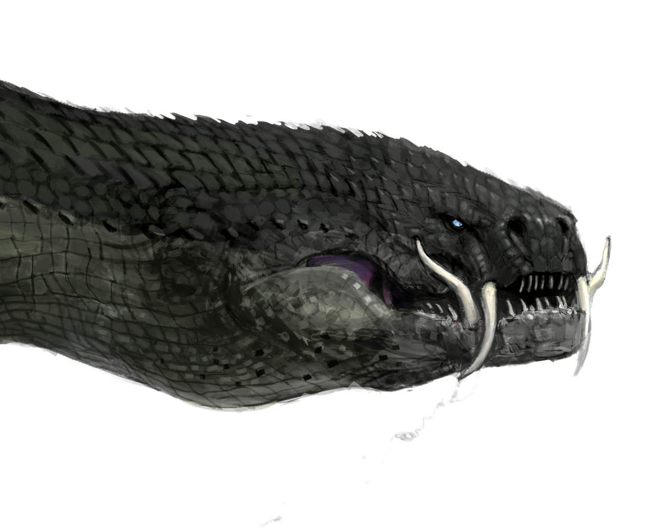
Sometimes I paint things that are not for Magic:the Gathering. This is one of those times.
Regular readers of the blog may recall the piece I did for Microvisions last year that was quite similar to this one. I was pretty proud of how that piece turned out and I was fortunate enough to receive a good deal of encouragement from various folks who got a chance to see it. One person in particular who gave me a big old ego boost was Greg Manchess, who aside from dumping a heaping pile of kind words over my head suggested that I might want to explore the subject a bit further and see where it takes me. So, I went ahead and did just that.
While the original Microvision has inspired a much more ambitious piece, progress is slow. In fact, I haven't really begun. This is due to the sheer amount of research required to get it right, not to mention the challenge of finding time to get any of said research done between assignments and various life events. However, one of the largest time sucks of my personal life—the search for a permanent abode—has recently come to an end and so I will be digging into things more deeply as soon as my assignments permit. Once the remaining dust settles, I'll be taking some more time off in an attempt to pull this bigger piece together (and hopefully a couple others in the process).
Big deal. Talking about something that doesn't yet exist is basically wasting your time, so I guess it would be prudent to shift focus to the piece that actually is done.
In the early stages of contemplating the upcoming piece, I went ahead and took another crack at the birds in a larger, slightly more ambitious way. This time around, there is one bird of each sex for a grand total of two (not to mention the various others sprinkled in the background). While one or both of the birds may still evolve a bit as I continue to explore them, I think they're pretty close to their finished design. At the very least, I doubt that their plumage will get much more decorative as it turns out that I'm rather fond of the juxtaposition between the mundane looking birds and the flames they emit. But you never know.
Anyway, here's the painting:
The finished piece is oil on gessoed hardboard and measures eighteen inches wide by ten inches tall. It's title is Inferno's Rest.
Friday, May 29, 2015
Monday, May 11, 2015
Concepting Dragons of Tarkir
A few short weeks after doing the concepting for "Fate Reforged," the team reassembled to take on "Dragons of Tarkir." Returning were Sam Burley, Mark Winters and myself, but this time Mike "Daarken" Lim was also on hand to add his talents. With the extra artist in the mix, we would spend the next three weeks rebuilding the world of Tarkir anew. This time we explored an alternate "present" created when the dragon extinction that resulted in the world seen in "Khans of Tarkir" was prevented, and dragons not only survived but went on to rule the clans. Or something.
Once again, we'd be redesigning the world completely. However, there were a few key differences. Obviously the progression of time was a factor, but so too was man's relationship to dragons. Whereas in "Fate Reforged," dragons and humans were in conflict, by the time "Dragons of Tarkir" takes place, dragons rule the clans and so everything about each culture must reflect that. For example, where once architecture was designed to defend against or elude dragons, now it had to welcome them.
On top of this, there was still a bit of clean up to do on "Fate Reforged." A few things remained to be designed and a few others just needed a bit of spit and polish. In short, there were quite a few boxes to check off, so once again I tried my best to hit the ground running and see what I might come up with.
As with the previous concept push, my first successes were with the Temur clan, which now would be known as Atarka. I honestly don't know what it was about that clan, but they made a lot of sense to me and it was awful nice to have early successes to build on.
After getting a foothold on the Atarka clan, I went on to do a bit of work on the Silumgar tribe.
I also did some work on the Ojutai architecture.
Then I took a crack at solidifying the goblin design which was slightly tweaked from previous versions due to an idea tossed out that the continued existence of dragons might have caused temperatures to increase. I don't know if that really became a thing, but the goblins obviously made it in, so...
I also took a crack at doing some lesser dragons from a couple of different clans.
Along the way, I quickly knocked out an image depicting Dromoka's breath weapon.
Lastly, I addressed a couple of the big dragons. To begin with, I had to clean up the version of Silumgar that I was unable to complete during the "Fate Reforged" push.
Then I did an older version of Atarka.
Lastly, I took on the younger Silumgar.
Unfortunately, I didn't get through this gig without interruption. I had a low-grade fever off and on for the first couple weeks of the push that eventually brought with it a sore-throat. When my throat began to swell shut, off to the hospital I went. Before I knew it, I was full of steroids and morphine and on my way to recovery, but I lost a couple days along the way (and probably produced a bit less on the more feverish days). Happily, to the surprise of my cohorts, I returned before it was all over and helped bring the push home.
Obviously, I wish I hadn't gotten sick, as I'd like to have contributed even more. But such is life. As it stands, I'm pretty happy with what I did contribute and Wizards seemed pretty content, as well. Either way, it will never cease to amaze me where other artists take these starting points when they go to make the actual card art. I'm always blown away by how my fellow artists bring the concepts to life, and I doubt that wonder will ever go away.
Once again, we'd be redesigning the world completely. However, there were a few key differences. Obviously the progression of time was a factor, but so too was man's relationship to dragons. Whereas in "Fate Reforged," dragons and humans were in conflict, by the time "Dragons of Tarkir" takes place, dragons rule the clans and so everything about each culture must reflect that. For example, where once architecture was designed to defend against or elude dragons, now it had to welcome them.
On top of this, there was still a bit of clean up to do on "Fate Reforged." A few things remained to be designed and a few others just needed a bit of spit and polish. In short, there were quite a few boxes to check off, so once again I tried my best to hit the ground running and see what I might come up with.
As with the previous concept push, my first successes were with the Temur clan, which now would be known as Atarka. I honestly don't know what it was about that clan, but they made a lot of sense to me and it was awful nice to have early successes to build on.
![]() |
| One of the early images that came together showing the general themes found in Atarka clothing. |
![]() |
| Lots of leather bands into which patches of fur and bunches of grass can be tucked. Most weapons would be created with or contain some elements of obsidian. |
![]() |
| Perhaps some folks would further camouflage their silhouettes with packed snow on top of the grass and fur that adorned their armor. |
After getting a foothold on the Atarka clan, I went on to do a bit of work on the Silumgar tribe.
![]() |
| I ended up getting to paint a few of these in my second portrait of Silumgar. |
![]() | |
| A fat executioner. This was criminally fun. |
I also did some work on the Ojutai architecture.
![]() |
| The buildings were originally red and white, but that changed after I'd completed it. So I got to complete it again. |
Then I took a crack at solidifying the goblin design which was slightly tweaked from previous versions due to an idea tossed out that the continued existence of dragons might have caused temperatures to increase. I don't know if that really became a thing, but the goblins obviously made it in, so...
![]() |
| Atarka goblins. In my head they had darker skin than ended up in the card art. I liked the idea of the dark skin with white fur. |
![]() |
| Kolaghan goblins. A bit less furry than in previous iterations. Stupid fun to work on. |
I also took a crack at doing some lesser dragons from a couple of different clans.
![]() |
| One of the Atarka brood with an alternate head. Never got to finish this one. |
![]() |
| One of the Silumgar brood that actually evolved from an abandoned design of Silumgar himself. |
Along the way, I quickly knocked out an image depicting Dromoka's breath weapon.
![]() |
| Of course only a couple months later, I'd see a similar gag used for Smaug in the Hobbit movie. Sigh. |
Lastly, I addressed a couple of the big dragons. To begin with, I had to clean up the version of Silumgar that I was unable to complete during the "Fate Reforged" push.
Then I did an older version of Atarka.
![]() |
| Another one that Sam Burley ended up colorizing for me. |
![]() |
| It was a lot of fun showing her from a different perspective. Such a pretty smile. |
Lastly, I took on the younger Silumgar.
![]() |
| This one was all me — even the color. |
![]() |
| Another close-up. Too much fun. |
Unfortunately, I didn't get through this gig without interruption. I had a low-grade fever off and on for the first couple weeks of the push that eventually brought with it a sore-throat. When my throat began to swell shut, off to the hospital I went. Before I knew it, I was full of steroids and morphine and on my way to recovery, but I lost a couple days along the way (and probably produced a bit less on the more feverish days). Happily, to the surprise of my cohorts, I returned before it was all over and helped bring the push home.
Obviously, I wish I hadn't gotten sick, as I'd like to have contributed even more. But such is life. As it stands, I'm pretty happy with what I did contribute and Wizards seemed pretty content, as well. Either way, it will never cease to amaze me where other artists take these starting points when they go to make the actual card art. I'm always blown away by how my fellow artists bring the concepts to life, and I doubt that wonder will ever go away.
Tuesday, April 21, 2015
Concepting Fate Reforged
I was not involved in the concept push that created the initial world of
Tarkir, so I had no real idea of what I was getting into when I showed
up to help design "Fate Reforged." In fact, all I'd really heard was that
various Asian cultures had a pretty big influence and that there might
be dragons involved. Beyond that I knew only that the schedule called
for an abbreviated push of two weeks (normally there are three), and
that there would only be two other artists on the job, Sam Burley and
Mark Winters.
Rather than write out some prolonged explanation of how events unfolded, I'm going to just give the gist of things and then throw some art at you. Suffice it to say that in August of 2013, the three of us were sequestered in a room at Wizards of the Coast to help build the styleguide for "Fate Reforged." We were tasked to take the world that was designed for the "Khans of Tarkir" set and roll it back 1000 years. This meant redesigning armor, weapons, architecture, and even landscapes for five different cultures. These redesigns were not only to convey the passage of time but also to adapt each culture to deal with an enemy that simply does not exist in Tarkir's "present" timeline: dragons. On top of this, we were to design the various dragons themselves.
The amount of ground we had to cover was pretty vast and our timeline was compressed so I hit the ground running as best I could. The first couple of days only yielded a lot of half-finished thoughts on the Temur clan's overhaul. This included some poorly photo-bashed landscapes and a bunch of clothing and armor designs. Eventually, however, most of these eventually bore fruit and were my first (and arguably greatest) successes in bringing things together.
Once I had a handle on where Temur was headed, I took a shot at cracking the Abzan clan. I was attempting to build on Mark Winters' successes and also add variety into the mix.
Lastly, I dabbled a bit in trying to push Mardu into the past.
Looking at this smattering of drawings, you'd be right in saying that there's not a lot here. Admittedly, there are a few things I failed to copy for my own records (which is irritating), and there's also a fair bit that just ended up not being viable concepts. Since I've been asked politely to show only the stuff that got used, a lot of things are going to have to remain under wraps.
But I'm not finished. I still have to show you the dragons — the last bits I was able to contribute, which were among the most important and easily the most fun.
Silumgar would not be completed for another month, when we convened again to design the world of Dragons of Tarkir. But that's another post.
Overall we came a bit short of delivering everything we needed to accomplish in the time allotted us. We managed to get most of it done, but there were still some things that needed to be hashed out and finalized (as evidenced by the half-baked Silumgar above). Fortunately, when we piled back into the room a few short weeks later, we had three weeks and an additional man to help us hammer it all home.
Rather than write out some prolonged explanation of how events unfolded, I'm going to just give the gist of things and then throw some art at you. Suffice it to say that in August of 2013, the three of us were sequestered in a room at Wizards of the Coast to help build the styleguide for "Fate Reforged." We were tasked to take the world that was designed for the "Khans of Tarkir" set and roll it back 1000 years. This meant redesigning armor, weapons, architecture, and even landscapes for five different cultures. These redesigns were not only to convey the passage of time but also to adapt each culture to deal with an enemy that simply does not exist in Tarkir's "present" timeline: dragons. On top of this, we were to design the various dragons themselves.
The amount of ground we had to cover was pretty vast and our timeline was compressed so I hit the ground running as best I could. The first couple of days only yielded a lot of half-finished thoughts on the Temur clan's overhaul. This included some poorly photo-bashed landscapes and a bunch of clothing and armor designs. Eventually, however, most of these eventually bore fruit and were my first (and arguably greatest) successes in bringing things together.
![]() |
| Part pencil, part digital, drawings like this helped hammer down the motifs that would be end up throughout Temur clothing. |
![]() |
| This was my first go around on a color version of these guys. I kept the color palette in sync with their more "modern" counterparts. |
![]() |
| An alternate color study with tweaked proportions. |
![]() |
| An additional armor variation. |
![]() |
| Temur crevasse dwelling. |
Once I had a handle on where Temur was headed, I took a shot at cracking the Abzan clan. I was attempting to build on Mark Winters' successes and also add variety into the mix.
![]() |
| Quick and dirty pencil drawing with some digital darks laid in. |
Lastly, I dabbled a bit in trying to push Mardu into the past.
![]() |
| Nice, thick plates of metal brought them one step closet to being human tanks. |
![]() |
| My shot at a ready made tent that can be dragged behind horses or pack animals in a pinch. |
![]() |
| A city of such tents that is definitely the ugliest thing I did during my two weeks. |
But I'm not finished. I still have to show you the dragons — the last bits I was able to contribute, which were among the most important and easily the most fun.
![]() |
| Atarka. This was a criminal amount of fun. |
![]() |
| Here's a close-up of the head without the indicators of the molten bits. |
![]() |
| Silumgar. Or the dragon that would eventually become him. |
Silumgar would not be completed for another month, when we convened again to design the world of Dragons of Tarkir. But that's another post.
Overall we came a bit short of delivering everything we needed to accomplish in the time allotted us. We managed to get most of it done, but there were still some things that needed to be hashed out and finalized (as evidenced by the half-baked Silumgar above). Fortunately, when we piled back into the room a few short weeks later, we had three weeks and an additional man to help us hammer it all home.
Tuesday, March 17, 2015
Dragonlord Silumgar
Rather than just re-post verbatim my contribution to the Original Magic Art website's blog on the creation of Dragonlord Silumgar, I decided to add a running commentary. If you'd like to read it without the additional notes, please feel free to check the post out as it was first published over there: link. Otherwise, read on. Or skip to the pictures. It's entirely up to you.
Take it away, me:
Though Dragonlord Silumgar makes his appearance in "Dragons of Tarkir," his creation came about in August of 2013 while I was working on the concept art team that hammered out the visuals for Fate Reforged. (Also involved on the concept art team were Mark Winters and Sam Burley — both of whom have since been brought on as full-time members of Magic's creative team.)
While there was a lot of fine tuning involved, one thing remained consistent: he was always a big, fat dragon. (Though Silumgar's weight did fluctuate a tad during development, and I believe he ended up being a little heavier than I initially conceived him.)
Only later while working on the concept art team for "Dragons of Tarkir" was it made clear to me that the more grotesque version of Silumgar would be the “after” image and was therefore asked to retcon his more svelte “before” form. (I was always a little worried that he'd end up feeling a little generic as a thinner dragon, but it was clear that the transition was necessary to help hammer home the passage of time between the two sets.)
When I was given the assignment to paint Silumgar, the Drifting Death, it was under the condition that I agree to paint him again in his older form. After much arm-twisting (or rather none), I relented.
If memory serves, the art order was simple: Wizards was looking for an image of Tarkir’s Jabba the Hutt (This is one of the rare times that I seem to have deleted my art order, and I can't recall if there was an explicit reference to Jabba or if it was heavily implied. The reference itself might actually be something that I retained from one of the conversations we had with Magic's creative team during his design.)
They wanted to see Silumgar atop an elaborate platform that was visually inspired by the throne of Tasigur, the Golden Fang. He would be bloated and drooling, surrounded by his vast wealth and decorated with lavish jewelry. So clearly there was to be a touch of Smaug in there, as well.
I quickly went to work collecting reference of sunning lizards and lounging cats (not to mention piles of gold treasure). I was looking for a pose that gave the beast a bit of an old Hollywood mafia don vibe — stately and perhaps a bit refined, but still dangerous. So maybe Don Corleone visually, with the a bit of Tony Soprano thrown in. Or something. (Thinking this way can be hit and miss as my frames of reference don't always translate, and the audience is bound to make connections that make more sense to them. Truthfully, though, what I really wished I could have referenced was Hedonismbot from Futurama, but I reigned myself in to prevent things from getting too ridiculous.)
Point being that the attitude was going to be the major selling point and his gesture was going to be key to that. In the end, despite the fact that his design is more influenced by lizards and snakes, his pose became much more lion-like.
Anyway, the sketch ended up looking like this:
The thing about this piece is that in many respects it was the companion piece to the original Silumgar illustration. (Well, it was in my head, anyway.) The difficult thing was to find ways of tying them together visually. However, I didn’t necessarily want to slavishly follow a path that would have me rehashing a lot about the first piece. In the end, I went about linking the two more through palette choices than anything, but it was something that nagged at me early on (and still does).
Anyway, Wizards liked what they saw and gave me the go ahead, and so I took it to paint. (By "liked what they saw," naturally I mean that I got a generic-looking email with the art identification number, followed by a colon and then the word "approved" in all caps.)
When painting a piece, I wish I could tell you that I have a set formula. I know a lot of folks that work their way from background to foreground, while others work up the entire piece more holistically. Personally, I've done both (and various other methods throughout my career), but I’m not disciplined enough to have one set way of working. (Some pieces feel like they require specific approaches, and that keeps things interesting to me. It's also a bit dangerous as sometimes I dig a hole that I have to get myself out of and deadlines don't move just because I'm in way over my head. So, my nights and weekends can often be victims of my attempts to try something new.)
Mostly, each morning I start with whatever I feel like working on. (This is mostly because starting my work day is typically the biggest hurdle of the day. Fighting past the low motivation or fear of failure that causes my procrastination must be done, however. Happily, once I'm past this hump, I'll paint until I'm exhausted. Weirdly this has not changed even after more than fifteen years as an illustrator. I've just gotten a lot better and tricking myself into beginning the work day.) In this case, I started with Silumgar himself and circled out from there. That’s not to say that I neglected everything else each day, mind you. I spent a quite a bit of time blocking other stuff in, but Silumgar was the focus and the selling point, so he got the most attention until I felt I’d gotten him right. The rest fell into place around him (except the piles of gold which was a day of entranced tedium).
The result ended up looking like this:
The finished painting is oil on gessoed harboard and measures eighteen inches wide by fourteen inches tall.
When I designed Silumgar in 2013, someone else on the design team mentioned that perhaps he should be wearing jewelry. Very quickly, I knocked in a some bracelets and a necklace made of skulls and the dangling body of one of his victims. This choice was largely based on what I thought would amuse Magic Art Director Jeremy Jarvis. (I've known him a long time and he's forced me to watch a lot of bad horror movies. And also some good ones. But mostly bad ones.)
It turned out that I was right and the necklace stayed in.
At the time, the remains dangling from the beast’s neck were not meant to be anyone in particular. He was naught but a placeholder. Eventually, however, it was agreed that perhaps this would be a good opportunity to make a nod to Tasigur, and so it was that the poor fellow ended up becoming the adornment in question. (If Silumgar is Jabba, Tasigur is the darkest spin on slave Leia that ever was.)
Sadly, Dragonlord Silumgar would be the last image I painted in the world of Tarkir.
Having been fortunate enough to be part of several concept pushes for Magic, I feel some degree of attachment to those worlds I helped create. This attachment sits outside of the usual love/hate that many of my fellow illustrators have for various blocks (just ask any illustrator that got to play in the world of Mirrodin, for example, and you’ll get wildly divergent opinions (personally, I loved it)). Seeing the pieces others create based on things I had a hand in designing is extremely special and I love seeing the world unfold in a more fully realized form (Especially when my fellow artists extrapolate from the original designs and manage to improve on them, which results in awe at the better design combined with a weird sense self-loathing for failing to have thought of any of it myself.)
I don’t know about anyone else, but I could easily have done another set’s worth of images in this world. I’d love to have gotten a chance to visit with the clans I helped design yet never got a chance to illustrate. (Though I confess that I had more opportunities to paint things I helped design this go around than during Innistrad.) But as the world of Magic turns, it was time to move on. One never knows, however. (Seriously, don't bug me, I don't know.) There may be an opportunity down the road. For now, I just have to be content with diving into the next world.
Take it away, me:
Though Dragonlord Silumgar makes his appearance in "Dragons of Tarkir," his creation came about in August of 2013 while I was working on the concept art team that hammered out the visuals for Fate Reforged. (Also involved on the concept art team were Mark Winters and Sam Burley — both of whom have since been brought on as full-time members of Magic's creative team.)
While there was a lot of fine tuning involved, one thing remained consistent: he was always a big, fat dragon. (Though Silumgar's weight did fluctuate a tad during development, and I believe he ended up being a little heavier than I initially conceived him.)
Only later while working on the concept art team for "Dragons of Tarkir" was it made clear to me that the more grotesque version of Silumgar would be the “after” image and was therefore asked to retcon his more svelte “before” form. (I was always a little worried that he'd end up feeling a little generic as a thinner dragon, but it was clear that the transition was necessary to help hammer home the passage of time between the two sets.)
When I was given the assignment to paint Silumgar, the Drifting Death, it was under the condition that I agree to paint him again in his older form. After much arm-twisting (or rather none), I relented.
If memory serves, the art order was simple: Wizards was looking for an image of Tarkir’s Jabba the Hutt (This is one of the rare times that I seem to have deleted my art order, and I can't recall if there was an explicit reference to Jabba or if it was heavily implied. The reference itself might actually be something that I retained from one of the conversations we had with Magic's creative team during his design.)
They wanted to see Silumgar atop an elaborate platform that was visually inspired by the throne of Tasigur, the Golden Fang. He would be bloated and drooling, surrounded by his vast wealth and decorated with lavish jewelry. So clearly there was to be a touch of Smaug in there, as well.
I quickly went to work collecting reference of sunning lizards and lounging cats (not to mention piles of gold treasure). I was looking for a pose that gave the beast a bit of an old Hollywood mafia don vibe — stately and perhaps a bit refined, but still dangerous. So maybe Don Corleone visually, with the a bit of Tony Soprano thrown in. Or something. (Thinking this way can be hit and miss as my frames of reference don't always translate, and the audience is bound to make connections that make more sense to them. Truthfully, though, what I really wished I could have referenced was Hedonismbot from Futurama, but I reigned myself in to prevent things from getting too ridiculous.)
Point being that the attitude was going to be the major selling point and his gesture was going to be key to that. In the end, despite the fact that his design is more influenced by lizards and snakes, his pose became much more lion-like.
Anyway, the sketch ended up looking like this:
![]() |
| ©Wizards of the Coast |
The thing about this piece is that in many respects it was the companion piece to the original Silumgar illustration. (Well, it was in my head, anyway.) The difficult thing was to find ways of tying them together visually. However, I didn’t necessarily want to slavishly follow a path that would have me rehashing a lot about the first piece. In the end, I went about linking the two more through palette choices than anything, but it was something that nagged at me early on (and still does).
Anyway, Wizards liked what they saw and gave me the go ahead, and so I took it to paint. (By "liked what they saw," naturally I mean that I got a generic-looking email with the art identification number, followed by a colon and then the word "approved" in all caps.)
When painting a piece, I wish I could tell you that I have a set formula. I know a lot of folks that work their way from background to foreground, while others work up the entire piece more holistically. Personally, I've done both (and various other methods throughout my career), but I’m not disciplined enough to have one set way of working. (Some pieces feel like they require specific approaches, and that keeps things interesting to me. It's also a bit dangerous as sometimes I dig a hole that I have to get myself out of and deadlines don't move just because I'm in way over my head. So, my nights and weekends can often be victims of my attempts to try something new.)
Mostly, each morning I start with whatever I feel like working on. (This is mostly because starting my work day is typically the biggest hurdle of the day. Fighting past the low motivation or fear of failure that causes my procrastination must be done, however. Happily, once I'm past this hump, I'll paint until I'm exhausted. Weirdly this has not changed even after more than fifteen years as an illustrator. I've just gotten a lot better and tricking myself into beginning the work day.) In this case, I started with Silumgar himself and circled out from there. That’s not to say that I neglected everything else each day, mind you. I spent a quite a bit of time blocking other stuff in, but Silumgar was the focus and the selling point, so he got the most attention until I felt I’d gotten him right. The rest fell into place around him (except the piles of gold which was a day of entranced tedium).
The result ended up looking like this:
![]() |
| ©Wizards of the Coast |
The finished painting is oil on gessoed harboard and measures eighteen inches wide by fourteen inches tall.
When I designed Silumgar in 2013, someone else on the design team mentioned that perhaps he should be wearing jewelry. Very quickly, I knocked in a some bracelets and a necklace made of skulls and the dangling body of one of his victims. This choice was largely based on what I thought would amuse Magic Art Director Jeremy Jarvis. (I've known him a long time and he's forced me to watch a lot of bad horror movies. And also some good ones. But mostly bad ones.)
It turned out that I was right and the necklace stayed in.
At the time, the remains dangling from the beast’s neck were not meant to be anyone in particular. He was naught but a placeholder. Eventually, however, it was agreed that perhaps this would be a good opportunity to make a nod to Tasigur, and so it was that the poor fellow ended up becoming the adornment in question. (If Silumgar is Jabba, Tasigur is the darkest spin on slave Leia that ever was.)
Sadly, Dragonlord Silumgar would be the last image I painted in the world of Tarkir.
Having been fortunate enough to be part of several concept pushes for Magic, I feel some degree of attachment to those worlds I helped create. This attachment sits outside of the usual love/hate that many of my fellow illustrators have for various blocks (just ask any illustrator that got to play in the world of Mirrodin, for example, and you’ll get wildly divergent opinions (personally, I loved it)). Seeing the pieces others create based on things I had a hand in designing is extremely special and I love seeing the world unfold in a more fully realized form (Especially when my fellow artists extrapolate from the original designs and manage to improve on them, which results in awe at the better design combined with a weird sense self-loathing for failing to have thought of any of it myself.)
I don’t know about anyone else, but I could easily have done another set’s worth of images in this world. I’d love to have gotten a chance to visit with the clans I helped design yet never got a chance to illustrate. (Though I confess that I had more opportunities to paint things I helped design this go around than during Innistrad.) But as the world of Magic turns, it was time to move on. One never knows, however. (Seriously, don't bug me, I don't know.) There may be an opportunity down the road. For now, I just have to be content with diving into the next world.
Monday, January 26, 2015
Monk Token
The third and final piece I did for the Fate Reforged expansion set for Magic: the Gathering, was a first for me: a piece of art for a token. I can now check that box off. Such an assignment is about as straightforward as they come. Most tokens, after all, consist of a single figure or creature in the middle of the composition.
Here was the art order:
This preliminary was completely digital and I considered very seriously seeing it through to a fully realized digital finish while waiting for feedback from the fine folks at Wizards. But then I remembered how much I like to paint traditionally and started prepping my surface as soon as I had the green light to move forward.
The finished piece is oil on paper on hardboard and measures twelve inches by twelve inches.
Honestly, this was a pretty quick piece. The sketch pretty well articulated where I was going with the painting and since I painted directly on top of a digital print of said sketch, there was very little left to figure out. Aside from the face redesign, the process felt a bit like paint by number. Or something.
Anyway, here it is in card form:
Here was the art order:
ART DESCRIPTION: TOKEN WITH TEXTYup, pretty much a monk in the middle of the picture. The result was this sketch:
Setting: FATE REFORGED
Clan: Jeskai
Color: White creature
Location: A Jeskai martial arts school in a Jeskai fortress similar to one of the ones on pp. 206-208 of the Fate Reforged worldguide.
Action: Show one of the student monks in this Jeskai fortress. The student is a young, bald female, about 15-18 years old. She has a straight staff and stands, ready battle. (she is costumed similar to the monk on p. 204C of Fate Reforged worldguide)
![]() |
| ©Wizards of the Coast |
This preliminary was completely digital and I considered very seriously seeing it through to a fully realized digital finish while waiting for feedback from the fine folks at Wizards. But then I remembered how much I like to paint traditionally and started prepping my surface as soon as I had the green light to move forward.
![]() |
| ©Wizards of the Coast |
The finished piece is oil on paper on hardboard and measures twelve inches by twelve inches.
Honestly, this was a pretty quick piece. The sketch pretty well articulated where I was going with the painting and since I painted directly on top of a digital print of said sketch, there was very little left to figure out. Aside from the face redesign, the process felt a bit like paint by number. Or something.
Anyway, here it is in card form:
Friday, January 16, 2015
Citadel Siege
This was, without a doubt, the most complicated piece I've ever done for Magic: the Gathering. While not conceptually challenging, this assignment presented a visual balancing act that lead to more crumpled paper and discarded digital layers than any image I'd done for the game to that point. What was so difficult? Let's take a look at the art order and discuss it.
The big deal is that there is a lot in this description to articulate, a ton of stuff to reference, and all of it has to fit within the dimensions of the card art and be readable when the image is shrunk down to its 2.103 inch x 1.543 inch printed size. Believe it or not, this was no small task.
Looking closely at the vast majority of Magic images, one can see a fairly clear trend. A large portion of images contain at most two or three figures (or creatures), and those figures (or creatures) often retain a very clear silhouette. Indeed, the figure/ground relationship has traditionally been pretty important to Magic paintings as a whole. While a figure needn't always be something that can literally be cut out of the background intact, it does have to be easily discernible. Having a figure that visually pops off of its background (either through a high level of contrast or a difference in color, or via some other means) is typically a very good way to retain legibility when an image is reduced. The more complicated the image becomes, the less likely that image will retain that legibility when at printed scale. There just aren't printer dots small enough to articulate it all.
As a result of this very basic need, epic battle scenes are a rarity in Magic images. They're not wholly absent, mind you, but they're not exactly regularly featured. While I'm not entirely sure whether the rarity of such assignments is due to Wizards' understanding of how muddy the results can be, or if they're just sympathetic to the amount of work this kind of thing can entail is beyond me. All I knew was that I was pretty intimidated going in.
To be clear, were this a battle scene completely composed of humans and human-sized creatures, I kind of feel that things might have gone a bit smoother. If all of the fighting parties were roughly the same size, I likely would have selected a few central figures to focus on and then insinuated a lot of the rest. These central figures could have occupied a large enough portion of the composition to keep them readable. On the other hand, having a bunch of humans fighting a dragon whose body is roughly the size of a school bus immediately forced me to push the camera back from where I might otherwise have placed it in order to show enough of the dragon for it to clearly read not just as a dragon, but the specific dragon it was meant to be. The result of pulling the camera back was that humans became smaller and smaller and the task of keeping the action clear became a little less straightforward. I did a number of thumbnails and scanned them into Photoshop to see if I could make any of them work. One by one, I shrunk them down to see if I could still determine what was going on in them. The results were primarily mush and I was forced to restart the process more times than I'd like to admit.
However, after several frustrating days of trying to approach the problem from a variety of angles and failing miserably, I scribbled this:
It probably appears to nothing more than complete gibberish to most looking at it, but trust me when I tell you that there's a dragon in there and a bunch of guys fighting him, along with a magic user, an explosion, and a some architecture. As horrible as the image is, it actually contained most of the elements that would eventually end up in the completed painting.
In order to address the smaller figures, I decided to layer them in groups and back-light them in order to get high contrast silhouettes for maximum readability. While there would end up being no stand-out human individuals, at least the troops had a fighting chance of still looking like troops at the smaller scale.
Anyway, I scanned and digitally painted over the above sketch and got this far:
Not my finest moment of digital painting, but you can see where I was headed. Sort of. Unsure of myself, I sent the image both to the art director, as well as a couple of my fellow illustrators for fresh sets of eyes and to see if I was headed down a usable path.
The criticisms that resulted were these: 1) the main dragon was not big enough; 2) Wizards wanted me to give the dragon's breath weapon a go; 3) the dragons felt a little crowded together; 4) the location felt a little nebulous; 5) could there maybe be more dragons?
All valid points. I took all that in and made another, tighter pass.
This is still a very bad sketch. But it was an attempt to address the notes listed above. I likely would have done another pass on it, but I showed it to the AD again at this stage to make sure I was on the right track. To my astonishment, the reply I got was an approval.
At this point in the process, I did not like this piece. But I had the green light and needed to move forward. The clock was ticking and so I set to work trying to salvage the piece. Here's how it ended up:
The finished painting is oil on paper on hardboard and measures eighteen inches wide by fourteen inches tall.
After handing it in, I was asked to make a small tweak to the piece, which I handled digitally. The dragon's breath is meant to be intense light rather than focused flame and it was felt that I needed to push things a bit more to make that clear. So fifteen minutes of Photoshop later and I had the issue corrected. I ended up reworking the painting a bit to incorporate those same changes, but that happened weeks later.
Along the way, I didn't have a whole lot of confidence in my ability to make this one work. When writing back and forth with the art director and discussing the states of my various sketches, she gleaned that I was less than enthusiastic and asked me point blank if this is a piece I'd like to give back. After a moment's consideration, I answered no. I knew this piece was going to be a challenging slog because it's not the type of thing I typically do. On some level, however, I knew that that was precisely why I needed to see it through.
This painting has a lot of hours in it. I worked and reworked large areas and grew pretty frustrated with my stupid, stupid fingers. And, unfortunately, I ran out of time. I could have invested a LOT more time on this piece than my deadline would allow for. But I ended up being happy with more than I originally expected to, so in my book it's a win.
I'm a little unsure of whether or not I'll ever be assigned something with this much going on in it for Magic ever again. I'm sure there will be card art not unlike it in the future, I just doubt they'll call on me to do it. But, I surprise myself a little when I say that I wouldn't say no, and I'm starting to wonder what more complex personal work might look like, as well.
ART DESCRIPTION:"So," you might say, "it's a battle scene. What's the big deal?"
Setting: FATE REFORGED
Color: White spell
Location: Abzan territory. The ancient capitol city fortress of the Abzan - similar to pp. 196-199 Fate Reforged - it should look solid, impressive but show signs of dragon attacks - scorching, claw marks, etc.
Action: Show the dragon Dromoka (p.234 Fate Reforged worldguide) attacking the fortress city of the Abzan along with some of his breed (p.235 Fate Reforged worldguide). Dromoka could be attacking the ramparts of the fortress with his claws, or crushing some hapless Abzan guards, or breathing a blast of searing white light at the fort or some soldiers - up to you. Dromoka should be noticably larger (his body is about the size of a school bus) and more badass than his breed dragons.
Some Abzan mages are shooting blasts of swirling sand magic at some of the lesser dragons, scouring their wings and tearing their hide. The outcome of this battle is far from predictable.
Focus: The battle between clans and dragons.
Mood: Epic scale. A brutal war in the desert - steel and magic versus dragons!
The big deal is that there is a lot in this description to articulate, a ton of stuff to reference, and all of it has to fit within the dimensions of the card art and be readable when the image is shrunk down to its 2.103 inch x 1.543 inch printed size. Believe it or not, this was no small task.
Looking closely at the vast majority of Magic images, one can see a fairly clear trend. A large portion of images contain at most two or three figures (or creatures), and those figures (or creatures) often retain a very clear silhouette. Indeed, the figure/ground relationship has traditionally been pretty important to Magic paintings as a whole. While a figure needn't always be something that can literally be cut out of the background intact, it does have to be easily discernible. Having a figure that visually pops off of its background (either through a high level of contrast or a difference in color, or via some other means) is typically a very good way to retain legibility when an image is reduced. The more complicated the image becomes, the less likely that image will retain that legibility when at printed scale. There just aren't printer dots small enough to articulate it all.
As a result of this very basic need, epic battle scenes are a rarity in Magic images. They're not wholly absent, mind you, but they're not exactly regularly featured. While I'm not entirely sure whether the rarity of such assignments is due to Wizards' understanding of how muddy the results can be, or if they're just sympathetic to the amount of work this kind of thing can entail is beyond me. All I knew was that I was pretty intimidated going in.
To be clear, were this a battle scene completely composed of humans and human-sized creatures, I kind of feel that things might have gone a bit smoother. If all of the fighting parties were roughly the same size, I likely would have selected a few central figures to focus on and then insinuated a lot of the rest. These central figures could have occupied a large enough portion of the composition to keep them readable. On the other hand, having a bunch of humans fighting a dragon whose body is roughly the size of a school bus immediately forced me to push the camera back from where I might otherwise have placed it in order to show enough of the dragon for it to clearly read not just as a dragon, but the specific dragon it was meant to be. The result of pulling the camera back was that humans became smaller and smaller and the task of keeping the action clear became a little less straightforward. I did a number of thumbnails and scanned them into Photoshop to see if I could make any of them work. One by one, I shrunk them down to see if I could still determine what was going on in them. The results were primarily mush and I was forced to restart the process more times than I'd like to admit.
However, after several frustrating days of trying to approach the problem from a variety of angles and failing miserably, I scribbled this:
It probably appears to nothing more than complete gibberish to most looking at it, but trust me when I tell you that there's a dragon in there and a bunch of guys fighting him, along with a magic user, an explosion, and a some architecture. As horrible as the image is, it actually contained most of the elements that would eventually end up in the completed painting.
In order to address the smaller figures, I decided to layer them in groups and back-light them in order to get high contrast silhouettes for maximum readability. While there would end up being no stand-out human individuals, at least the troops had a fighting chance of still looking like troops at the smaller scale.
Anyway, I scanned and digitally painted over the above sketch and got this far:
Not my finest moment of digital painting, but you can see where I was headed. Sort of. Unsure of myself, I sent the image both to the art director, as well as a couple of my fellow illustrators for fresh sets of eyes and to see if I was headed down a usable path.
The criticisms that resulted were these: 1) the main dragon was not big enough; 2) Wizards wanted me to give the dragon's breath weapon a go; 3) the dragons felt a little crowded together; 4) the location felt a little nebulous; 5) could there maybe be more dragons?
All valid points. I took all that in and made another, tighter pass.
This is still a very bad sketch. But it was an attempt to address the notes listed above. I likely would have done another pass on it, but I showed it to the AD again at this stage to make sure I was on the right track. To my astonishment, the reply I got was an approval.
![]() |
| ©Wizards of the Coast |
The finished painting is oil on paper on hardboard and measures eighteen inches wide by fourteen inches tall.
After handing it in, I was asked to make a small tweak to the piece, which I handled digitally. The dragon's breath is meant to be intense light rather than focused flame and it was felt that I needed to push things a bit more to make that clear. So fifteen minutes of Photoshop later and I had the issue corrected. I ended up reworking the painting a bit to incorporate those same changes, but that happened weeks later.
Along the way, I didn't have a whole lot of confidence in my ability to make this one work. When writing back and forth with the art director and discussing the states of my various sketches, she gleaned that I was less than enthusiastic and asked me point blank if this is a piece I'd like to give back. After a moment's consideration, I answered no. I knew this piece was going to be a challenging slog because it's not the type of thing I typically do. On some level, however, I knew that that was precisely why I needed to see it through.
This painting has a lot of hours in it. I worked and reworked large areas and grew pretty frustrated with my stupid, stupid fingers. And, unfortunately, I ran out of time. I could have invested a LOT more time on this piece than my deadline would allow for. But I ended up being happy with more than I originally expected to, so in my book it's a win.
I'm a little unsure of whether or not I'll ever be assigned something with this much going on in it for Magic ever again. I'm sure there will be card art not unlike it in the future, I just doubt they'll call on me to do it. But, I surprise myself a little when I say that I wouldn't say no, and I'm starting to wonder what more complex personal work might look like, as well.
Friday, January 9, 2015
Silumgar, the Drifting Death
There's a bit of a background to this piece that is worth talking about, but is something I'm not going to get into just yet. Suffice it to say that I was part of a two week concepting stint that helped design the look of Fate Reforged, the second expansion set of Magic: the Gathering's Khans of Tarkir expansion block. The designs of the dragons were a part of that gig, and I admit that I had a some input along the way.
At the end of the concepting push, I was asked whether there was anything in particular I'd like to paint when it came time to do the actual card art. I'm not the kind of guy who likes to ask for anything, so I kept my request general. I simply stated that it would be nice if I got to see something that I'd created to its natural conclusion. In essence, I wanted to paint something I'd actually designed — something that did not happen when I'd helped build the world of Innistrad. The response I got was a simple okay, and the world moved on.
What I expected to be assigned as a result of that request was some cool paintings of one or two of the clans I'd reworked for the world. Maybe some cool architecture or something. Yeah. Not so much. Instead, I got assigned Silumgar. One of the main dragons featured in the set.
Like a lot of my sketches nowadays, I started with a pencil drawing but quickly abandoned it in favor of a digital value study. Honestly, the speed of laying down the values in broad strokes is something I really like a lot. It allows me to more easily keep up with what's in my head and allows me to get to iterations that I'm satisfied with more directly. Or something. The short version is that sketching can be painstaking at times and in the past I've actually gotten burned out on a piece before I even went to paint. Planning is important, sure. But for me, there's such a thing as planning too much.
Anyway, the above sketch was quickly approved and I was laying out my palette before I knew it.
The finished painting is oil on gessoed hardboard and measures eighteen inches wide by fourteen inches tall.
The sharper eyed of you will notice some difference between the sketch and the painting. These include (but are not limited to a change in the landscape below and a shift in values around the dragon's head. Neither of these changes required approval and both were done on the fly. The altered landscape is simply due to the fact that I realized mid-painting that the landscape as it originally was designed failed to echo actual landscapes of Tarkir. I wasn't exactly sure why I had ignored such a thing, but I rectified it pretty quickly after realizing how off I was.
The value shift was simply about pulling the eye to where it needed to be most. After painting the horizon to mirror the sketch, I quickly realized that my eye lingered anywhere but the dragon's face. I kind of wanted the viewer to linger there a bit, so I wiped what I'd done and made the adjustment.
Strangely, despite being sucked into the world of fantasy art, I'd only ever painted one or two dragons before this piece. Truthfully, it's a subject I'd actively avoided for a while. Why? Well, as far as tropes go, I don't know that I have a whole lot to add and it's one I'm not particularly interested in. For me, dragons are a bit tired. For others, it's something that remains endlessly exciting. I wish I had such enthusiasm. Obviously, I can't fault anyone for liking what they like, but if I'm sitting down to paint something for myself, dragons are pretty low on the list of subjects I want to visit and explore. So, it remains a little weird to me that I was asked to paint this guy.
That being said, I'm very happy to have gotten the opportunity. There is value in being pushed to do something that one might otherwise not be inclined to do. Eating vegetables for example, or trying on a pair of skinny jeans (which it turns out is not a good look for me). In this case, it was a paid gig, sure, but that didn't mean that I was going to enjoy it at all. Surprisingly, however, I had quite a good time working on the piece and it's one that I'm rather pleased with.
Still, don't expect me to release a series of dragon paintings anytime soon.
At the end of the concepting push, I was asked whether there was anything in particular I'd like to paint when it came time to do the actual card art. I'm not the kind of guy who likes to ask for anything, so I kept my request general. I simply stated that it would be nice if I got to see something that I'd created to its natural conclusion. In essence, I wanted to paint something I'd actually designed — something that did not happen when I'd helped build the world of Innistrad. The response I got was a simple okay, and the world moved on.
What I expected to be assigned as a result of that request was some cool paintings of one or two of the clans I'd reworked for the world. Maybe some cool architecture or something. Yeah. Not so much. Instead, I got assigned Silumgar. One of the main dragons featured in the set.
ART DESCRIPTION:Seems pretty clear. I knew what the dragon looked like and I went to work.
Setting: FATE REFORGED KHANAR
Color: Blue Black Legendary creature
Location: In the sky over Sultai jungle. p.222-225 Fate Reforged worldguide.
Action: Show the epic movie poster shot of the dragon tyrant flying over his domain (see p. 240 Fate Reforged worldguide). Put the camera in the air with the dragon - helicopter to helicopter. The dragon is flying toward us, greenish gas trails from his mouth as he flies.
In the far background we can see a purplish-blue storm brewing in the sky.
Focus: The dragon
![]() |
| ©Wizards of the Coast |
Like a lot of my sketches nowadays, I started with a pencil drawing but quickly abandoned it in favor of a digital value study. Honestly, the speed of laying down the values in broad strokes is something I really like a lot. It allows me to more easily keep up with what's in my head and allows me to get to iterations that I'm satisfied with more directly. Or something. The short version is that sketching can be painstaking at times and in the past I've actually gotten burned out on a piece before I even went to paint. Planning is important, sure. But for me, there's such a thing as planning too much.
Anyway, the above sketch was quickly approved and I was laying out my palette before I knew it.
![]() |
| ©Wizards of the Coast |
The finished painting is oil on gessoed hardboard and measures eighteen inches wide by fourteen inches tall.
The sharper eyed of you will notice some difference between the sketch and the painting. These include (but are not limited to a change in the landscape below and a shift in values around the dragon's head. Neither of these changes required approval and both were done on the fly. The altered landscape is simply due to the fact that I realized mid-painting that the landscape as it originally was designed failed to echo actual landscapes of Tarkir. I wasn't exactly sure why I had ignored such a thing, but I rectified it pretty quickly after realizing how off I was.
The value shift was simply about pulling the eye to where it needed to be most. After painting the horizon to mirror the sketch, I quickly realized that my eye lingered anywhere but the dragon's face. I kind of wanted the viewer to linger there a bit, so I wiped what I'd done and made the adjustment.
Strangely, despite being sucked into the world of fantasy art, I'd only ever painted one or two dragons before this piece. Truthfully, it's a subject I'd actively avoided for a while. Why? Well, as far as tropes go, I don't know that I have a whole lot to add and it's one I'm not particularly interested in. For me, dragons are a bit tired. For others, it's something that remains endlessly exciting. I wish I had such enthusiasm. Obviously, I can't fault anyone for liking what they like, but if I'm sitting down to paint something for myself, dragons are pretty low on the list of subjects I want to visit and explore. So, it remains a little weird to me that I was asked to paint this guy.
That being said, I'm very happy to have gotten the opportunity. There is value in being pushed to do something that one might otherwise not be inclined to do. Eating vegetables for example, or trying on a pair of skinny jeans (which it turns out is not a good look for me). In this case, it was a paid gig, sure, but that didn't mean that I was going to enjoy it at all. Surprisingly, however, I had quite a good time working on the piece and it's one that I'm rather pleased with.
Still, don't expect me to release a series of dragon paintings anytime soon.
Subscribe to:
Posts (Atom)