Monday, September 29, 2014

Sagu Archer

The second of four pieces I contributed to the Khans of Tarkir expansion set to Magic: the Gathering is Sagu Archer. Of the images I created, this was easily the most straightforward assignment of the lot.

As usual, I start with the art order:
ART ID: 156520    title: [Naga Ambush Archer]
ART DESCRIPTION:
Setting: KHANAR
Clan: Sultai
Color: Green creature
Location: Sultai jungle area
Action: Show a male naga perched up in one of the trees of the steamy jungle. He has his bow out, and he already has an arrow nocked and drawn, aiming upward at some unseen thing in the sky.
Focus: The naga archer
Mood: Lurking, waiting for his moment to snipe something out of the air.
For the uninitiated, a naga in this context is one of a race of snake people. Designs for these snake people were found in the style guide and I went to work. After a bunch of thumbnail sketches, I settled on the gag of the naga archer being wrapped around a branch to stabilize itself as it aims up through the canopy at a target. This also gave me a pretty dynamic and angular pose.

The result of my efforts was this sketch:

©Wizards of the Coast

The fine folks at Wizards seemed to like this sketch as is and gave me the go ahead to commence with the finished painting. Here is that painting:

©Wizards of the Coast

The painting is the usual oil on paper on hardboard and measures 14 inches wide by 11 inches tall.

As I painted, I found that I had to knock back the coils of the naga's tail to keep focus where it belonged. There was something about the repetitive highlights along the coils that seemed to pull the eye away from where I wanted to go. So, I ended up glazing that area back to keep the face and arms more important in the overall visual hierarchy. The downside is that the fun gag of the coils became harder to see. The upside is that the focus became clearer. It's a shame that I couldn't find a way to highlight bother equally well, but at the end of the day it seemed best to cut off the arm to save the patient.

Outside of that, things went smoothly. There were no major rehashes, problem, or any controversy to speak of. There was an assignment, I created an image that I hope did a decent job of fulfilling that assignment, and then it got approved. Simple as that. I wish they all went as smoothly.

Monday, September 15, 2014

Ankle Shanker

For the first time since Innistrad, I had a pretty good idea what was coming with the latest Magic: the Gathering expansion set. However, my knowledge was not due to being a member the Khans of Tarkir concept team. Rather, I was involved a bit later in the process and helped flesh out some things well after the world had been established (something I'll be expounding upon at a later date). As a result, I got to see the Khans style guide before it had been fully completed and gained a pretty intimate understanding of this new world along the way.

My first assignment in Tarkir was for two paintings. The first I'm going to talk about is (as the title suggests) Ankle Shanker.

It's a rare thing that I get asked to paint goblins. I'm not sure whether this is due to a belief that my talents are better served elsewhere or that they are a subject I'm not particularly interested in. Given that I don't have a complete understanding of how the variety of pieces in a given set are actually assigned to the various artists involved, I can't rightly or intelligently comment on the first point. The second point, however, is entirely incorrect. I like goblins and I like painting them even more. So I was pretty excited when I was asked to depict a Tarkir goblin.

Here's the assignment itself:
ART ID: 156597    title: [Ankle Shanker]
ART DESCRIPTION:
Clan: Mardu
Color: Black, red, and white creature
Location: Scrubby steppe
Action: This is a female goblin warrior of the Mardu Horde. She is famed for her speed and ferocity on the battlefield. Show her charging toward us on foot, dripping saliva as she roars, brandishing a sharp-bladed Mardu sword. Perhaps she wears a torn Mardu banner as a scarf/cape.
Focus: The Mardu goblin warrior
Mood: What she lacks in size she makes up for in viciousness. It will probably be a bit funny given her proportions, but she takes battle (and herself) very seriously, so probably best if you play it straight here.
For me, a notable aspect about this assignment was the specific request for a female goblin. I have no idea whether or not this has been asked of anyone before in Magic (I'm sure it has), but this was certainly a first for me. Looking at the style guide, the sex of the goblin designs were not explicitly stated, but I went out on a limb and guessed that they were all male. The issue then became how to feminize the goblin and figure out how far to take that feminization.

Instinctively, I felt that I shouldn't push very far at all. The last thing I wanted to do was add hips and lipstick. Instead, I felt I should start by removing some of the hair and slightly softening some of the features. The eyes got a bit larger and rounder, the lips a bit plumper. And that was about all I did.

The result was this sketch:

©Wizards of the Coast

Fortunately, the folks at Wizards seemed to dig the direction I was headed and gave the go ahead to proceed. Here's how the painting that resulted came out:

©Wizards of the Coast

The painting is the usual oil on paper on hardboard and measures 14 inches wide by 11 inches tall.

Despite my attempts, I think our little goblin friend still reads as pretty masculine. Not the end of the world, but I think another pass might have helped indicate a slightly more female vibe. But it's still entirely possible that if one were to see this goblin next to her hairier male counterparts perhaps her sex might be a bit more obvious. Or not. Either way, I gave it the old college try.

Aside from the issue of sex, I think maybe I could have shifted the legs to exaggerate the pose more. Action shots are not really my strong suit and I sometimes fall short of really nailing motion. I think that is a bit of an issue in this piece, but I also don't think the pose criminally stiff. The whole thing might have benefited from another pass during the sketch phase to see if I could really make her fly. But that didn't happen and so here we are.

When the card came out, I discovered that my image was used only for the Intro Pack version of the card. Zoltan Boros did the art for the standar card found more commonly in card packs everywhere. I can't say as I have much of an opinion either way on that move by Wizards. The truth is, whenever there are multiple illustrations done for a single card, it always polarizes the audience to a certain extent and one will hear folks preferring one image over another. It's only natural. We like what we like.


A blatant disadvantage of having my art only on the Intro Pack version of the card is that it's likely that the vast majority of folks playing will not associate my art with the card itself. To an extent, this affects how iconic the image ends up being. But, the upside is that my version appears in this cool package and I'll get one or two of those for my collection. So there's that.


Regardless of what I would change and how folks out there will feel about it, I rather like my Ankle Shanker illustration. It was fun to lose myself in painting its angry little face and flowing ginger hair, its busted armor plates and little red cloths. When I tell folks that it's criminally fun to do what I do for a living, this is the stuff I'm talking about. This truly is a dream job at times and I hope I never have to wake up.

Sunday, August 31, 2014

Frequently Asked Questions 12

Why are your prints so expensive?

Those aren't prints. They're original oil paintings.

Wait, you work in oils? I thought you worked digitally.

Nope. Oils.

But I thought you had to work digitally to work on Magic.

"Could you rephrase that in the form of a question? After all, this is 'Frequently Asked Questions.'"

Oh! Okay. Ahem.

Do you have to work digitally to work on Magic: the Gathering?

Why thanks for asking that question, good sir and/or madame. Allow me to address it in some sort of official blog-type capacity:

It is my belief that artists hoping to get work doing art for Magic can work in any medium. Okay, well, maybe not cast bronze or wrought iron. Let's say any 2-dimensional medium that can be reproduced well. Watercolor? Yup. Oils? Absolutely. Acrylic? You bet. Pastel? Why not? A mixture of several types of media? If it meets the criteria of reproducing well, then yes.

Obviously digital art isn't a problem. Just look at the virtual who's who of digital artists who either currently work or have worked on Magic in the past. There are some amazing folks who've produced some absolutely gorgeous work. But the digital medium itself wasn't why they managed to get their foot in the door. It was the quality of their work. It's my belief that if any of them had done equally good work in a traditional medium, they'd have met with equal success.

So, if getting an opportunity to work on Magic is your goal, then I suggest the following: stop worrying about the medium and do good work.

Seriously. That's it.

Okay, that's not entirely it. I confess that there is some specificity lacking in that statement. I should say, rather, that you should do good work that's appropriate for Magic: the Gathering. This means that it should be fairly realistic and in the fantasy genre. Stylization is not out of bounds, but the end result should still be a fairly realistic take on an imaginary world.

Now, I could elaborate on the best way to go about accomplishing realistic fantasy work, but that would be a little off topic and redundant to hundreds of posts scattered throughout the internet and a bunch of really good books available at bookstores everywhere and perhaps even at your local library. There are more free and low-cost resources out there for you to consume than ever before and I encourage you to seek them out.

However, if the part about making work appropriate for Magic is where you're falling short then I urge you to really look at recent Magic work and figure out what is lacking in your work that is present in the Magic art before you. Is it a matter of design? A matter of readability at reduced scale? A lack of a decent figure/ground relationship? I could go on, but going into depth about what makes a good Magic image would likely take longer than the entirety of this entry and therefore warrants its own article. The short version, though, is that if you put your work next to the work of that which gets printed currently on Magic cards, it should feel at home.

All in all, the most important thing is quality. Medium, I assure you, is not the determining factor. How do I know this? Well, for one, the current lead art director for Magic is a water color artist. Water color, I'm sure you're aware, is a traditional medium. I find it extremely unlikely that such a person would discriminate against his fellow paint pushers.

But why listen to my conjecture? Why don't we look at some facts to back up my claim? With each new Magic set, there are typically one or two new artists brought into the fold. Off the top of my head, here are three new additions to Magic's roster that work traditionally: Lindsay Look, Mike Sass and Scott Murphy. All three use real, live, brushes (some of which even have real hair in 'em) and paint that comes in tubes (some of which is highly toxic and should not be spread on toast and taken internally). And they're not even the only three. So clearly, traditionally produced illustration is not dead in Magic. But I have to confess that it sometimes feels rare.

Of course, this is due mainly to the fact that illustrators who work solely traditionally are rare (at least when compared to the numbers of folks who work digitally). It's becoming less and less common to see folks leaving art school with a portfolio that is completely full of traditional work. Obviously that increasing infrequency is reflected in the ranks of Magic's current artist roster. But like I said, the medium really doesn't end up mattering. 

Look, I have no doubt that there are companies out there that require artists to work digitally. Magic just happens not to be one of them. And I don't think that will change anytime soon. So if you're looking to work for Magic, feel free to rock whatever medium it takes for you to do your best work.

Wednesday, July 9, 2014

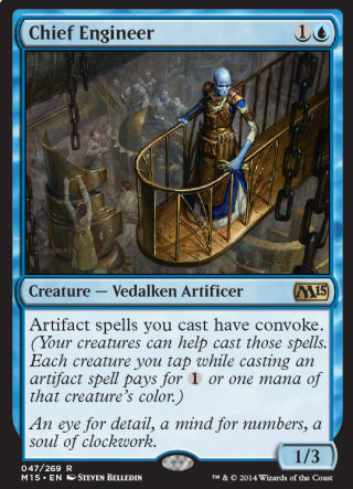
Chief Engineer

In great contrast to the restrictions put upon me during Avarice Amulet, the painting of Chief Engineer was surprisingly lacking in guidelines and strife. Chief Engineer also happens to be one of those weird hallmark pieces — not because of anything to do with the piece itself, but rather to do with the goings on around its creation. This piece was the first assignment I accepted after learning that Amy and I would be moving to Seattle from New Jersey, and it would be a rare painting done on the road.

Here's the art order I got in early June of 2013:
title: [Chief Engineer]
SKETCH DUE: 6/24/2013 12:00:00 AM    ART DUE: 7/19/2013 12:00:00 AM

ART DESCRIPTION:
NOT PART OF ANY SPECIFIC SETTING
Color: Blue creature
Location: Inside a artificer's assembly line.
Action: Show us a male vedalken artificer who is up on a walkway overseeing a group of laborers below. The vedalken's costuming could have all kinds of unique fittings and attachments that give him a feel of "master mechanic". The laborers are human and they are creating strange machines. [The trick here will be to keep it feeling fantasy and not sci-fi.]
Focus: The vedalken overseer.
Mood: "I demand perfection."
With the description in hand, I set to sketching immediately. I knew that we'd be needing to make the trip to Seattle in only a matter of a few short weeks, but at the time I wasn't exactly sure when. My goal was to have the sketch approved, my surface prepared, the sketch transferred and the underpainting completed before heading out. Of course, that all depended on whether or not I could put together a sketch that earned approval.

It seemed to me that I was given a pretty big gift here. The fact that the piece was not a part of a particular set was awesome, as it allowed me to make a lot of stuff up. Plus, there was a vedalken involved, and it turns out after painting Grand Architect that I rather like painting those lanky blue-skinned folks. This was definitely my kind of piece. The only hiccup, in fact, was waiting an extra day to find out whether this particular vedalken was of the two-armed or four-armed variety (this varies depending on the world we're talking about as they appear in many different iterations). After being assured that we needed just two arms (a bit of a bummer as a four-armed engineer would have been kind of awesome), I knocked out this sketch:

©Wizards of the Coast

Luckily, this sketch was given the go ahead and I managed to do exactly what I hoped. Before getting on a plane to Seattle, I got the piece put together and the underpainting finished. My art supplies were being shipped across country and I'd be good to go once my feet hit on the ground.

Unfortunately, due to the needs of making a smooth transition, this was not a piece I got back to for a couple weeks. Upon our arrival in Seattle, our first priority was to find a place to live, and this is something that took an unexpectedly long time. It was a much longer slog than expected and we began to get dangerously close to Amy's start date at her new job, which would have complicated apartment hunting beyond measure.

Fortunately, only a few short days before that deadline, we found a place to rent and settled our schedule for the remainder of July and the beginning of August (something that required a trip back to New Jersey to settle our affairs and pack our belongings up, a trip back to Seattle, and more temporary housing while we waited for our boxes to arrive at our new flat). With the dust beginning to settle, Amy began her new job on Monday, July 8th. And that was the first day I finally got to work on this guy.

©Wizards of the Coast

This piece is the usual oil on paper on hardboard and measures 12 inches wide by 9 inches tall.

For the most part, this piece was painted in a basement apartment on Queen Anne Hill in Seattle. Aside from my art supplies, I brought some lighting, a tabletop easel, and an old sheet to use as a drop cloth. It was nothing like the space I was accustomed to working in, but it ended up being pretty comfy. And once the painting was finished, I drove it down to Wizards of the Coast and handed it in in person — the first time I'd ever done that in my entire career.

This is another piece that falls under the category of something I'm not unhappy with. There are a few tweaks I might make to fix a thing or two, but overall I'm quite pleased with it. Honestly, I was extremely fortunate that it come together as well as it did under the circumstances. I was surprisingly free of stress throughout, and managed to just buckle down and get everything done.

Still, even if I didn't like the piece, I'd likely still have a soft spot for it. After all, it coincided with a pretty big shift in my life, so I guess it's fair to say that it's pretty special to me.


Monday, June 30, 2014

Sketch of Wayne

Since moving to Seattle just over a year ago, I've had the privilege of working in-house several times alongside a virtual who's who of talent. I'm pretty sure that I was more valuable most days as a color commentator than an actual contributor of creative content, but I think I did end up adding some fairly positive things to the mix along the way. While I wish I could talk about some or all of what I was working on, I'm afraid it's going to have to wait. But I think it's safe to share this one little sketch.

On my last day in-house, after running out of steam drawing things that don't exist, I turned my gaze instead to things that do. Sketching away before me were several other artists and I decided to quickly knock out a drawing of the closest one. Honestly, I wish I'd thought to do this earlier as I'd likely have drawn everyone present at the time, and should I get the opportunity again I'll definitely do just that. For now, I'll just have to be happy with this one, incomplete little doodle of Mr. Wayne Reynolds hard at work on his own last drawing.

Friday, June 27, 2014

Avarice Amulet

This one has a bit of a strange story. It was the kind of piece that caused trouble from sketch to finish. Not because the piece itself was difficult, mind you, but because there was a highly specific thing that the Art Director was going for. Much of the conflict stemmed from my initial unwillingness to acquiesce to the AD's needs, and that unwillingness is part of a greater turmoil that I am experiencing across the board on my job. But I shouldn't get too far ahead of myself.

Let's start with the piece in question.

Avarice Amulet started with a phone call. This almost never happens and I'm not entirely sure why it did this time around. Perhaps it was due to the fact that I would need to paint this piece while trying to get settled in my new home of Seattle. Perhaps it was because the AD knew that I'd be illustrating in-house for a couple weeks and wasn't sure if I'd be interested in taking on even more work. Whatever the case, there was a phone call.

During this phone call, I learned that there was something special in store for the Magic 2015 core set. Apparently the fine folks at Wizards asked a wide variety of specific personalities throughout the gaming genre to design Magic cards, and like all Magic cards these would need artwork. I was asked to provide artwork for one of these cards.

I said yes and the assignment was emailed to me.

The job was to illustrate a card designed by the folks at Penny Arcade. More specifically, this was to be an image inspired by a recurring item throughout Penny Arcade's history, the Pac-Man watch — the gag being that the watch in question is highly coveted and has driven the characters in Penny Arcade to murder one another for it. Repeatedly.

Okay so far. Nothing too out of the ordinary. Except for a quickly drawn image done by the Art Director that was attached at the bottom of the email which gave me the exact solution for the assignment. I've thought long and hard about whether to include a recreation of that sketch, but in the end I rejected the idea for reasons to be explained later. Suffice it to say that it had a cracked, gold amulet being held by a bloody hand.

Now, relying on images to complete Magic assignments is nothing new. Each world the game explores comes with a styleguide, which is essentially just a book of reference materials designed to bring a visual unity to each of those worlds. But this little drawing was a pretty rare occurrence. Essentially, this was a "do it like this, but better" scenario. And it took me a while to recognize that.

So, I set that image aside and got to work trying to do my own take on things. Given that I was holed up in temporary housing with nothing better to do, I knocked out a couple sketches for the piece.

©Wizards of the Coast

©Wizards of the Coast

It would probably help to explain that the reason that this amulet doesn't look overtly like Pac-Man is simply because Wizards didn't have the rights to use Pac-Man. The important part was to invoke the idea of Pac-Man — and a watch for that matter. But it obviously needed to be different enough to not cause any legal problems.

So, aside from a vague notion of what the actual amulet looked like, these sketches were not based on the original little drawing provided to me. Sure, they contained all of the required elements of the piece, but I was attempting to make the piece my own. I was groping for that combination of the piece they need and the painting I want to paint.

Neither of these sketches was to be the solution, however. Unfortunately for me, I was pushing the image too far away from the AD's sketch.  It really did need to be a riff on that exact image.

Back to the drawing board.

©Wizards of the coast

If I couldn't change the image, I thought, then perhaps I could mess with the design of the amulet. So, here I have the Pac-Man pointing upward about to consume a power pellet (which I figured would be a pearl) and I thought it'd be cool to include balls in the chain representing the normal dots that seem to comprise much of Pac-Man's diet.

This didn't get by, either. Too much like Pac-Man. I totally understood. No need to get sued. Perhaps I could do something different. But no. The AD really did need the amulet on the sketch.

And so I did this:

©Wizards of the Coast

While this was accepted, there were two requested changes. First, the ghost motif at the 12:00, 3:00, 6:00 and 9:00 positions was too overtly ghosty. Second, the "mouth" of the Pac-Man part was still too open and still felt a little too much like the actual Pac-Man. Okay, makes sense. We're being conservative here. Avoiding a lawsuit would be swell.

With the changes in mind, I painted the thing.

©Wizards of the Coast

The painting is the usual oil on paper on hardboard and measures 14 inches wide by 11 inches tall.

The end result is basically a painted version of the sketch done by the Art Director. So, posting that image at the start of this article would effectively have been redundant. In fact, the only things I added were a maze motif to the edge of the amulet, and the lapus ghosts at the clock's quarters. I also decided that large diamonds would be used to fill out the remaining hours of the "watch" and would represent the power pellets from the Pac-Man game. Missing is the large diamond/power pellet at the 8:00 position where the crack/mouth lies. The gag is that Pac-Man has eaten this power pellet and in keeping with Pac-Man's mechanics, this is why the ghosts are blue.

Yup, the weird video game nerd details that about 1% of the viewers might have noticed is about all I really contributed to the piece creatively. And I guess the smokey texture in the background.

Yeah.

You might correctly have guessed that I have mixed feelings about this piece. On the one hand, given my schedule at the time and the fact that I was busy trying to unpack my life in very new surroundings, I needed the a piece that was pretty simple, and this was anything but a complicated piece to paint. But looking at it, I feel like the least creative person in the world. There is very little in it that I feel is mine.

Truth be told, I should have let it be an easier piece than it was. But I didn't want to settle for that. I wanted to make my version of this image and not just be a pair of hands. If I had my way, I'd have painted the second sketch — the one with lots of hands jostling for ownership. Not a huge change, but one that would have made it a cooler image (at least in my opinion). At the very least, there'd be more of a story to that version (not to mention more for me to sink my teeth into artistically), and in some ways would be more in keeping with the source material.

But getting to make all of the creative decisions isn't always the job. Sometimes, it's about giving the client exactly what they're asking for. Sometimes it's about suppressing your own needs and desires to get the assignment done. And sometimes it's about working on something that you know could be better but needs to be what it needs to be. Not exactly sexy, but that's part of the deal.

Anyway, I leave you with the Avarice Amulet in card form for you to contemplate.

Monday, May 19, 2014

MicroVisions Part 3

With the first and second MicroVisions pieces under my belt, I finally got to concentrate on the third and final painting. Like the second, I began it with some sort of idea. This idea, however, was a bit larger than the piece I would be painting. Still, I figured that this was a chance to put together a study or proof of concept.

Once again, I returned to the well of small birds. But rather than pair a small bird with a fantasy trope, I decided to set this little bird on fire. Not a horrifying, consumptive fire, mind you, but a fire emanating from within. So, kind of a miniature phoenix...but not really.

Anyway, I started with a palette of burnt sienna, raw umber, burnt umber, cadmium yellow medium, cadmium red medium, titanium white, and payne's gray. I worked the piece up to a certain point and suddenly began to question whether or not I was happy with the color scheme. It was feeling a little monochromatic. So, I took a quick photo of it, brought it into Photoshop and created two alternatives for myself. I then showed the two options to my wife for her input.


Amy chose the more colorful option, and I'm happy she did. Though the piece didn't end up nearly as saturated, I think adding the cooler colors was the right way to go.


Since being asked in February to participate in MicroVisions, my plan was always to paint multiple pieces and let the organizers decide which one they'd like. Once I'd completed this one, however, I knew full well it would be the one they chose. Still, I emailed the options and awaited their decision. Not surprisingly, this was the piece I ended up shipping out to the Society of Illustrators for the show.

The really great part about this piece is that it confirmed for me that a larger, more involved painting involving a similar subject was absolutely worthwhile. Whether it will cause me to kick to the side the large work that I seem to have stalled on has yet to be seen, but I feel like this one's got momentum and may be the next thing I set to once I've completed my current slate of commissions. Either way, it's something I'll be keeping everyone posted on. I suspect that it will be a fun and challenging painting.

That I was invited to participate in MicroVisions this year is a little mind-blowing to me. Given the caliber of artists in previous years and the quality of work produced, I honestly didn't feel worthy. But I'm very grateful to have been included, and I'm happy with the work that I got out of it.

But really, that's not the important part.

After all, this show is actually about raising money for a student scholarship fund. This piece and the others in the show are to be auctioned off and that auction went live today (May 19, 2014). Hopefully, it goes well.

If you're still interested in seeing the works in person, they are still on display at the Society of Illustrators in New York City and will remain so through May the 24th. If you're interested in seeing all of the works online, they can be found here: link. And, of course, if you're interested in bidding on the pieces, the ebay auction can be found here: link.