Friday, November 22, 2013

Swamp of Theros

So we come to the last of our Theros lands. With the Plains, Forest, Mountains and Island covered, we at last reach the Swamp... which is the painting I'm least partial to. But that's as harsh as I'm going to be about the thing.

Looking at the five pieces, the Theros Swamp sticks out like a sore thumb. Gone are the blue sky and vivid green plant life. No golden fields to speak of, either. Just smoke and steam and all the things that live amidst the acidic boiling water of geysers and volcanic pools. With the thick plumes bellowing forth from the ground and wisps of vapor rising from the water's surface, the swamp is easily the most atmospheric of the land types. And not that subtle shift of blue-gray that comes with atmospheric perspective, either. I'm talking the thick, choking kind that obscures things that are right in front of you and makes it hard to breathe. Cool as all get out and fun to paint, for sure. But this obscuration resulted in my having to abandon an idea I had for the entire set of lands that might have made them much more of a matching set.

The big idea in question (for what it's worth) was to have hints of one of the other lands just barely visible somewhere within the composition of each painting.  For example, in the background of the plains, I wanted to clearly reference the mountain piece in the far-off mountains at right. In the mountain piece, I was hoping to include the forest piece in miniature amidst the tiny trees at the base of the rock faces. Perhaps the plains might have been visible in the far-off bits of the mainland in the background of the island piece.

You get the idea.

Now, obviously these references couldn't be explicit. I didn't want to give anyone the impression that these were dual lands — a totally different type of land that I'm not going to bother explaining, so you'll just have to trust that explicitly focusing on two types of land in one piece could be an issue. In order to keep their subtlety (not to mention because of issues of varying scale) such references would likely have been too small to read clearly in their card form. But for a 24" x 18" painting? Such a thing might have tied them together nicely. Alas, it was not to be.

What sank the idea? Well, the smoke and steam inherent to the swamp presented two problems. First, vapors that would need to be included in the swamp's composition would certainly blot out any reference I might have made to another land type in its background (the only place within the composition that I really could have feasibly put it). Second, all that atmospheric stuff shoehorned into one of the other pieces might have called too much attention to itself, thus removing the subtlety I was looking to achieve.

Still, I did spend a couple days exploring different ways of doing things. I changed the composition of the swamp around to try and accommodate the references, and I tried swapping around the references I intended to make to see if I could make different ones work. Over time, however, it became clear that I was just cramming this big idea into something that didn't need it and would likely remain unnoticed anyway. Plus, I was losing time. And so this big idea of mine ended up being dropped altogether, and (along with the temples and animals to help sell scale) it became the third thing you don't see in these paintings. Truth be told, I think the pieces are better for it.

Anyway, here is the sketch that I did in all its terribleness:
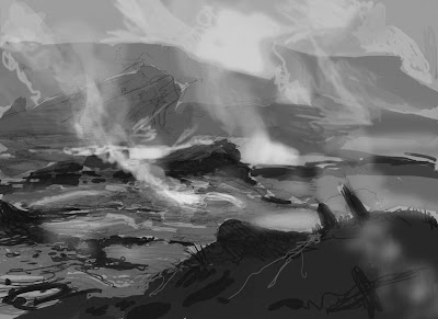
©Wizards of the Coast

Believe it or not, that got approved and so I painted it thusly:

© Wizards of the Coast

Like those before it, this piece too is oil on paper on hardboard and measures 24" wide by 18" tall.

If ever there was a piece that I've done for Magic that fully reflected my feeling at the time, this would be it. As I painted this piece, I was still feeling pretty down on my work. Not as badly as I did before, but I was hating the results of my days' efforts. And I was tired of feeling that way.

What made it worse was that I finished this piece in a barn surrounded by other painters working on their own pieces. People like Darren Bader, David Polumbo, Randy Gallegos, Greg Manchess, Dan Dos Santos, Lars Grant-West, Jordu Schell, Boris Vallejo, Julie Bell, Michael Whelan, Chris Moeller, Tony Palumbo, Scott Brundage, and Winona Nelson. If there was a hierarchy, I was bringing up the rear and I knew it. Something needed to change and I began finally to realize that I was the only person who had the power to change it.

When I finally got home, finished painting in hand, Amy and I began at last to address the malaise that we both felt. We had no idea where that discussion would lead, but we knew it needed to be somewhere other than where we were then — both mentally and physically. We decided that we wanted to leave the New York area and finally made the decision to start exploring our options. A list was formed of places we might want to move to. Number one on the list? Seattle.

This swamp was the last piece of a project that I only now realize was the beginning of a huge change in our lives. It's pretty weird and amazing where things have gone since. Where we have gone since. And it's an even weirder thing to be able to look at some of my work and still be unhappy with it, but use that unhappiness as motivation to do better on the next one.

Tuesday, November 19, 2013

Island of Theros

With three pieces down (Plains, Forest, and Mountains), there were just two remaining: Island and Swamp. Which was next? Read the title.

There's really not a lot of controversy or weirdness to speak of during the making of this piece. It was a pretty straightforward creation. There was the request for a painting of an island. I did a sketch of an island. Then I painted that sketch. With all of the major decisions about the set of pieces made by this point, it was a strangely simple procedure. I had three paintings done, after all, and if I didn't know what I was doing at this point then shame on me.

Like I said, I did the sketch. Here's that sketch:

©Wizards of the Coast

Once again, I think it's pretty clear where I was headed with this one. Wizards agreed and gave me a thumbs up to proceed. And so I put a lot of blue on my palette and went to work. Here's how it came out:

©Wizards of the Coast

Like the previous paintings, it's oil on paper on hardboard and measures 24" wide by 18" tall.

A keen eye might notice that there are some very slight proportion changes made between sketch and finish. There are also shifts in the placement of the pillars of stone in the foreground. These changes were mostly attempts to manipulate the scale of the pillared structure in the foreground, and an attempt to destroy the regularity of the spacing of the pillars themselves. My attempts yielded varying degrees of success.

When I say I put a lot of blue on my palette, I wasn't joking. Clearly, this piece required a lot of blue paint — it's close to monochromatic, after all. But obviously it's not quite monocrhome. Once completed, however, I found that both my camera and scanner had a great deal of difficulty distinguishing between the various shades of blue. The result was FAR more monochromatic than what you see above. The areas of rich, blue-green registered as flat, Crayola blue. After many attempts at correcting the color in Photoshop, I decided that it was best just to send the thing in to the fine folks at Wizards and see if they could do a better job. Judging from the result, I think their imaging department nailed it.

A common question I get about my work is whether I send my stuff in to Wizards or digitize it myself. For the past couple years, I've been doing the digitization myself. But Wizards remains one of the few companies I've worked with that still accepts paintings and has a whole department dedicated to digitizing them, color-correcting them, and getting them ready for press. I'd say that most of the work I've ever done for Wizards has passed through that department and I've been pretty amazed by the results.

That being said, until recently, it wasn't quite so easy to get the files that resulted from their efforts. So, I'd often have to go through the trouble of digitizing my work for myself after the paintings were returned to me. It was the only way to ensure that I could include paintings in my portfolio, on my website, or offer them as prints in a timely manner. Since I was already doing it myself and getting good results, eventually it just became easier to hand in digital files instead of paintings and get all that work done up front.

Before this piece, it had been a couple years since I last shipped a painting to Wizards. Since this painting, I've submitted only one additional piece. That piece was done in temporary housing during our relocation from one coast to another. As I had no scanner, Wizards imaging team was there to bail me out.

One day, I am sure there will be no imaging department at Wizards. At least not like they have at present. For now, I'm sure glad the Wizards imaging department is around to bail me out when my own skills and equipment fall woefully shy of getting the job done well.


Friday, November 15, 2013

Mountains of Theros

So, with the Plains and Forest under my belt, I next moved onto the Mountains of Theros. This was one I was looking forward to digging into, weirdly. So I actually had a good deal of fun with it.

For those of you who don't follow Magic at all, it might be worth noting that Theros, the plane that I was asked to depict in the landscapes I've been talking about, is heavily inspired by ancient Greece. As such, the environments have nods (to a greater or lesser extent) to the relevant geography. So, everything from the rock formations to the color of the water to the plant life have used real locations as a jumping-off point.

While that might help explain some of the look and feel of what is present in the paintings, I shall now take a moment to talk about a couple things that aren't present. The first is an element around which I centered several of the compositions initially, but then was forced to remove all traces. That thing is architecture. Looking through the styleguide, many of the landscape concept paintings include little temples dotting the countryside. I was rather hoping to include these elements both as obvious focal points and a means of selling the scale. Mind you, these little buildings would not have been hugely prominent in the amount of square inches they occupied within each painting, but they at least could have helped hammer home the vastness that I was hoping to make clear.

Alas, it was not meant to be as I was asked not to include any architecture at all. I'm sure that the reason for this is varied, but I suspect that one of the bigger reasons for not including any buildings was the desire to have a striking visual contrast between the last Magic plane visited (Ravnica, a plane that is just one giant city), and this new one. Admittedly, though, that's pure speculation on my part, so take it with heaping spoonfuls of salt. Still, it's a point of difference that I think makes a lot of sense.

Of course, there is a degree of irony that I'm talking about missing architecture at the start of one of the two pieces that never actually included any (the second being the Swamp). Nevertheless, there is still something missing on the Mountain painting, so the topic's still relevant. Since I was asked not to include the temples, I then thought it might be nice to use tiny animals in the pieces as an alternate way to sell scale. The Plains, Forest, and Mountains all might have contained some grazing animals perhaps, the Island might have included nesting birds. After proposing this idea, however, I was politely discouraged from adding these things, as well. And so I finally excluded everything but the necessary plant life, rock formations, and water from all of my sketches before turning them in.

This is what the sketch for the mountain looked like:

©Wizards of the Coast

Like the others before it, this sketch was approved and I moved on to paint. Here is the finished version:

©Wizards of the Coast

It's oil on paper on hardboard and measures 24" wide by 18" tall.

When painting art for cards that represent a single color in Magic, I often will lay down a ground color of the appropriate hue after preparing my surfaces. In this case, being a mountain, a red underpainting was the way to go. While that ground color is largely covered with opaque paint, the overall palette of the piece managed to retain a certain red cast. The greens of the grass have a lot of red in them, as do the grays and browns of the mountains. Even the sky retained a hazy red glow just above the horizon. It's subtle, but I think it helps the piece keep the right flavor for the game. Or at least, I hope so.

While the color felt liked it was working for me, I had a very difficult time with the level of detail. No matter how many cracks and stains I layered onto the the rock faces, the piece never felt like it had quite enough detail — especially when looking at the Plains for comparison. But, the days were flying by and I still had two more pieces to paint, so I eventually had to stop and move on.

Looking at it now, I'm pretty happy with it. A bit of time out of view amidst the stacks of paintings in my flat files was exactly what I needed to see the thing more clearly. It's always nice, to say good-bye to some of my work if only for a little while. It helps keep the obsessively self-critical part of my brain from completely taking over.


Tuesday, November 12, 2013

Forest of Theros

After completing the Plains of Theros, the next of the four remaining environments I decided to tackle was the Forest of Theros.

Painting a forest for Magic is hardly new to me. In fact, I attribute the opportunities I've had to paint the landscapes for the game to the basic forest I painted in 2008 for Magic's 2010 core set. That piece, at the time, became the Magic art director's favorite forest to that point, and while it may not continue to reign as such (I honestly don't know), I'd suspect it's still something for which he likely still has a soft spot. Given my apparent success with that forest, I figured there might be pretty high expectations on this one as well. No pressure, though.

That being said, there is a huge difference in the aesthetics of the two worlds in which the forests exist. The basic forest I painted five years ago feels very typical of something one might see in the northeast United States. Indeed, that was much of its inspiration. Theros, on the other hand, is anything but. The forests in this plane are more pockets of gigantic trees than expansive woodlands, and these giant trees are more inspired by olive and cypress than oak and maple. Clearly the approach needed to be different.

Compositionally, I built the entire piece around a single, giant olive tree surrounded by lots of cypresses. Well that's what my scribbles sort of indicated, anyway. I clarified that idea when I scanned said scribbles and digitally painted over them producing the sketch below.

©Wizards of the Coast

This sketch got the go ahead and I moved to paint.

©Wizards of the Coast

Once again, this is oil on paper on hardboard and measures 24" wide by 18" tall.

One of the advantages to loose sketches (like the one seen above) is that there's only so much I need to commit to. A big disadvantage, however, is that there's a lot to make up once I go to paint. When it comes to landscapes, though, that's actually not a huge problem for me. I was happy to let little accidents result in new ideas — which is basically how the waterfall came to pass.

As I painted the piece, one of the more difficult things to decide upon was the shape of the cypresses. In the sketch, they're pretty shaggy, but I found that as I painted them that way they suddenly felt rather small. When I made them a little bit more uniform, they began to feel a bit larger. And so they all ended up being a much "cleaner" shape.

The downside of that more uniform shape is that the trees started to become symbols of trees rather than actual, individual trees. They begin to lose some degree of character. While I tried to deftly walk the line, I wasn't too worried if the trees fell on the side of symbolic shapes rather than individual trees. I had built the whole piece around the large olive tree just right of center and the more generic-feeling cypresses trees with less character help the viewers' eyes dwell there.

Or something.

Anyway, when I turned this one in, I got a very rare compliment back from the Magic art director. It sounds weird to say that compliments from him are rare, but considering that at any given time the team at Magic is typically juggling around 300 pieces of art from 80-90 artists, it's no wonder that there's little time for pats on the back. Still, the fact that he said anything at all made it clear that of the five lands, he was most happy with this one. Maybe now I have more than one forest in his list of favorites.

Friday, November 8, 2013

The Plains of Theros

At last I will begin talking about the land paintings done for Magic: the Gathering's Theros set. Well, I will be writing about them, anyway. I'm not going to come over to each one of your houses and read all this aloud. You'll just have to be happy with the characters grouped into words that make up the sentences below.

Anyway, the job started in a pretty straightforward way — a little odd perhaps, but straightforward nonetheless. Instead of an email I got a phone call from the art director to find out if I'd be interested in doing five landscapes for the upcoming Theros set. These landscapes would be one of each type of the five basic land types in the game. In game parlance, these are called "basic lands." Mind you, I was being asked all this months before the artwork for the set was scheduled to be commissioned and without seeing any key art to get an idea of the flavor of what I might be getting myself into. So, obviously I said yes.

What I didn't quite understand was that I was meant to start on the pieces immediately and that I'd be getting a very unfinished version of the styleguide to base my images on. This meant I wasn't in the dark for very long, and that I was already running late.

Now, I'd give you the actual art order for the assignment, but it literally just consisted of a single word for each of the five paintings with the appropriate art identification number, due dates, etc. The five words combined read: Forest, Plains, Swamp, Islands, and Mountains. Not a whole lot to think about there, so I sat down on my couch and began to churn out sketches in front of the television. These I later scanned then digitally painted over them for the sake of clarity.

Since I want to deal with these one at a time, I'll give you the sketch of the first piece I painted, Theros Plains:

©Wizards of the Coast
Pretty clear what I was going for, I think. There's grass and some trees and some mountains in the distance. As promised, not super thinky but still fairly obvious as to my intentions. The important part is that the sketch was approved and I went to paint. Here's the completed piece:

©Wizards of the Coast
The painting is oil on paper on hardboard and measures 24" wide by 18" tall.

This was the first of the five pieces that I painted and while one may not expect it, there was a specific reason I started the project by working on the plains: I suspected that of the five pieces, the plains would take the longest of the lot. I wasn't wrong, either. The primary reason for the prolonged production time has to do with the fact that I've never found a stylization of grass that I've found particularly satisfying. This is not to say that I dislike how other people paint grass — I don't. It's just that I've never found a way to simplify grass in my own work that feels right and true to the things I've painted around it. Invariably, when I paint grass, more generalized brush strokes will look fine at first, but before long I find myself picking out individual grass blades. Once I start down that path, then it's basically hours and hours of tedium and frustration. This piece, was no different.

Another reason I started with the plains is that  I was a little concerned about the lack of a focal point within the piece. Whereas one can build a painting of a forest around the focal point of a single tree, or a build a mountain painting around the focal point of a single peak, there's not a whole lot to focus on with grass. Especially when there's a lot of it.

With this concern in mind, I decided that tackling this piece first would be best in case the lack of a focal point should prove to be a problem. At the end of the day, I'm not sure that it is a problem, but I'm also not sure it isn't. What I am certain of, however, is that this was the piece that I liked the least after handing everything in, but it is not my least favorite now that I'm looking at them over a year later. So there's that.

Like I said, the thing took a while to paint. After days and days of pouring man hours into this piece, I forced myself to stop working on it because I had four more just like it left to paint. It was folly to continue noodling the grass day after day and potentially shortchanging whatever the last piece in the chain might be. And so I moved on.

All in all, reduced and in card form, I'm quite pleased with the piece now. I think you'll all agree that I've painted much worse.


Tuesday, November 5, 2013

Wash Out

Just released on November 1st, was a new piece of art I did for a Magic card called Wash Out. The making of the piece turned out to be among the more difficult creative challenges I've had in the past couple years and was the first time in a long time that I really needed help finding a solution. It's possible that the frustration behind it might be more interesting than the end result itself, but I guess that's for you to decide.

Anyway, the issues began with the description:
Design a fantastical city, perhaps with a castle or keep or compound at its center. we see it from the side and maybe it sits on the edge of a shallow cliff. The city itself is vibrantly colored and in bright daylight, but in the center of the image something is happening... the forms distort and bleed and the color leeches away. as if someone took this colorful painting and splashed it with turpentine (that also removes the color). It can literally be an execution of this idea, the gray scale compromised portion of the image dripping and running down.
Honestly, this description looks like it should be a relatively easy thing to accomplish. Despite appearances, however, I had a hard time making the darned thing work — let alone making it interesting.

I knew from the start that I didn't want to take the solution offered me in the art order with turpentine. It felt too dependent on this being a painting rather than a cool image, and personally I'd much rather make (or try to make) a cool image. So, that left me with trying to depict the concept within confines of an actual scene. And that turned out to be less than easy for me.

You see, the main problem I was having with the description was that this kind of image would work best as a movie or a series of images. While that's all well and good, I get only one image to illustrate the idea and make it work. This means that I have to find that precise image — that single frame of film — that best shows what is happening, the progression of what is happening, and indicate the story behind it all (if there is one). While I'm no stranger to doing this kind of thing, this particular go around found me producing more crumpled paper than interesting depictions of the scene that provided any degree of clarity. I spent days and days sketching various iterations and ended up with little to show for it — at least nothing I wanted to actually paint. What made it worse was that I was running out of time.

The deadlines for Magic are a little strange. The artists who work on Magic are given both a sketch deadline and a finish deadline. While the finish deadline is meant to be absolute, there's quite a bit of play in the sketch deadline. One could, in theory, turn in a sketch just days before the finish is due as long as the finish is handed in on time (provided the sketch gets approval, of course). I'm fairly certain that this kind of behavior would be disconcerting to the art directors at Magic, but it's a viable hypothetical that I'm sure has actually played out in reality at least once over the course of Magic's long history.

Despite this flexibility in the sketch deadline, I typically turn my sketches in well before the due date in order to give myself as much time to paint as possible and also to allow for necessary sketch revisions should they be necessary. On this occasion, however, a sketch I liked just didn't come together for me in any timely manner. So, in frustration, I took to the email to ask for help from my close circle of illustration pals. I gave them the above description and discussed the issues I was having. I ended the email with a plea for some help.

Happily, my brothers in brush came through with some excellent suggestions that varied widely in their possible executions. I took theses suggestions into account, pondered them for a while and stole the idea I liked best. Here's the sketch that finally resulted:

©Wizards of the Coast
As you can see, the major differences between the art order and the resulting sketch are that I ended up putting the camera in the city rather than outside it, and I added a figure casting the spell in order to show causality and allow for a clear visual progression from color to gray in a more linear fashion. In the foreground, you can to see the beginnings of the spell's affects, and as you visually retrace the figure's steps, you can see the destruction becoming more pronounced.

I felt that while this was not a direct translation of the art order, it was close enough. As far as I was concerned, it still solved the problem and Wizards seemed to agree. After all, they approved the sketch. Here's how the painting came out:

©Wizards of the Coast
The piece is oil on paper on illustration board and measures 16" wide by 12" tall.

At this point, I'd like to say that I'm cool with the end result, but anyone who has ever read this blog should know that things with me just aren't that easy. Don't get me wrong — I don't hate the piece, but I also don't consider it a portfolio piece. Why? Well, I feel like there's one important way that this piece falls short:

The scale is all wrong.

To me, the figure casting the spell was key to the piece working, and in order to make that figure work at card size, I could make it only so small. In fact, you'll note that I reduced the figure's size between sketch and finish, pushing it about as small as it could reasonably go and still be readable as a figure. For my money, however, the figure should be even smaller and the city more vast in order to increase the scope and drama and to help drive home the devastation wrought by the spell itself.

The obvious solution would have been to change the composition and approach the piece another way, and perhaps I should have. I don't know. What I do know is that this is one occasion where my take on the material and the reproduction size were at odds. In fact, I think this might be the only occasion to this point. Still, I suppose it might have come out a lot worse...