Tuesday, December 31, 2013

2013. Briefly.

This past year has been a weird one for me, and it's been an excellent lesson on how drastically things can change in a very short period of time.

When I started 2013, I felt stuck and frustrated and a little overwhelmed, honestly. I was still hating most of what I was doing and saw little outside of the walls of my studio aside from the various hotels and convention centers for Magic events. Meanwhile, Amy was working longer days than seemed humanly possible with 100 hours per week being about average during the first few months.

By April, we'd settled on leaving the northeast to find a place we actually wanted to live. Amy quit her job and we began to actively explore our options.

Then boom. Seattle.

That the job offered to Amy came out of the blue, was in the place we were most interested in moving and was so well timed still freaks me out a little. I don't completely trust it. It was too easy. The fact that the physical relocation itself went so smoothly doesn't help either. But as the months have passed, I've begun to relax a bit. I am, after all, living in a place I actually like for the first time in years and have actively been attempting to take advantage of the fact.

Point is, I guess, that things got a whole lot better in 2013, though it didn't feel like it was going to be a noteworthy year at its start. In fact, it looked like it was going to be a bit of a downer. But a year (despite how it might feel) is a long time and a lot can happen.

All that being said, there are still issues with the work. The biggest thing I've learned this year is that the dissatisfaction I feel about my work is a very real thing and I think I'm beginning to fully understand the cause. I also think I'm beginning to understand the solution. While I love the challenges that my client work provides, I'm finding a lot of the work less fulfilling as time goes on. I certainly don't blame the clients — it's not their job to provide me with such things. No, I'm pretty sure that I need to find that kind of thing in my own work and in my own way. Unfortunately, I'm not really sure what my own way even is.

So, as this year has come to its end, I am asking a lot of big questions about my work. What do I want from my efforts? Where do I want the work to take me? What is the end game? I'm hopeful that answering these queries will give me a goal. And maybe help me form a plan to reach that goal. I am in desperate need of a point on the horizon to start moving toward.

2014 is just a flipped page on the calendar, but it feels bigger than that. Either way I'm ready for it and I'm itching to get started.

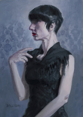
Here's the last piece of the year. It's 7" x 5" and is for the heck of it.

Friday, November 22, 2013

Swamp of Theros

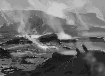
So we come to the last of our Theros lands. With the Plains, Forest, Mountains and Island covered, we at last reach the Swamp... which is the painting I'm least partial to. But that's as harsh as I'm going to be about the thing.

Looking at the five pieces, the Theros Swamp sticks out like a sore thumb. Gone are the blue sky and vivid green plant life. No golden fields to speak of, either. Just smoke and steam and all the things that live amidst the acidic boiling water of geysers and volcanic pools. With the thick plumes bellowing forth from the ground and wisps of vapor rising from the water's surface, the swamp is easily the most atmospheric of the land types. And not that subtle shift of blue-gray that comes with atmospheric perspective, either. I'm talking the thick, choking kind that obscures things that are right in front of you and makes it hard to breathe. Cool as all get out and fun to paint, for sure. But this obscuration resulted in my having to abandon an idea I had for the entire set of lands that might have made them much more of a matching set.

The big idea in question (for what it's worth) was to have hints of one of the other lands just barely visible somewhere within the composition of each painting.  For example, in the background of the plains, I wanted to clearly reference the mountain piece in the far-off mountains at right. In the mountain piece, I was hoping to include the forest piece in miniature amidst the tiny trees at the base of the rock faces. Perhaps the plains might have been visible in the far-off bits of the mainland in the background of the island piece.

You get the idea.

Now, obviously these references couldn't be explicit. I didn't want to give anyone the impression that these were dual lands — a totally different type of land that I'm not going to bother explaining, so you'll just have to trust that explicitly focusing on two types of land in one piece could be an issue. In order to keep their subtlety (not to mention because of issues of varying scale) such references would likely have been too small to read clearly in their card form. But for a 24" x 18" painting? Such a thing might have tied them together nicely. Alas, it was not to be.

What sank the idea? Well, the smoke and steam inherent to the swamp presented two problems. First, vapors that would need to be included in the swamp's composition would certainly blot out any reference I might have made to another land type in its background (the only place within the composition that I really could have feasibly put it). Second, all that atmospheric stuff shoehorned into one of the other pieces might have called too much attention to itself, thus removing the subtlety I was looking to achieve.

Still, I did spend a couple days exploring different ways of doing things. I changed the composition of the swamp around to try and accommodate the references, and I tried swapping around the references I intended to make to see if I could make different ones work. Over time, however, it became clear that I was just cramming this big idea into something that didn't need it and would likely remain unnoticed anyway. Plus, I was losing time. And so this big idea of mine ended up being dropped altogether, and (along with the temples and animals to help sell scale) it became the third thing you don't see in these paintings. Truth be told, I think the pieces are better for it.

Anyway, here is the sketch that I did in all its terribleness:

©Wizards of the Coast

Believe it or not, that got approved and so I painted it thusly:

© Wizards of the Coast

Like those before it, this piece too is oil on paper on hardboard and measures 24" wide by 18" tall.

If ever there was a piece that I've done for Magic that fully reflected my feeling at the time, this would be it. As I painted this piece, I was still feeling pretty down on my work. Not as badly as I did before, but I was hating the results of my days' efforts. And I was tired of feeling that way.

What made it worse was that I finished this piece in a barn surrounded by other painters working on their own pieces. People like Darren Bader, David Polumbo, Randy Gallegos, Greg Manchess, Dan Dos Santos, Lars Grant-West, Jordu Schell, Boris Vallejo, Julie Bell, Michael Whelan, Chris Moeller, Tony Palumbo, Scott Brundage, and Winona Nelson. If there was a hierarchy, I was bringing up the rear and I knew it. Something needed to change and I began finally to realize that I was the only person who had the power to change it.

When I finally got home, finished painting in hand, Amy and I began at last to address the malaise that we both felt. We had no idea where that discussion would lead, but we knew it needed to be somewhere other than where we were then — both mentally and physically. We decided that we wanted to leave the New York area and finally made the decision to start exploring our options. A list was formed of places we might want to move to. Number one on the list? Seattle.

This swamp was the last piece of a project that I only now realize was the beginning of a huge change in our lives. It's pretty weird and amazing where things have gone since. Where we have gone since. And it's an even weirder thing to be able to look at some of my work and still be unhappy with it, but use that unhappiness as motivation to do better on the next one.

Tuesday, November 19, 2013

Island of Theros

With three pieces down (Plains, Forest, and Mountains), there were just two remaining: Island and Swamp. Which was next? Read the title.

There's really not a lot of controversy or weirdness to speak of during the making of this piece. It was a pretty straightforward creation. There was the request for a painting of an island. I did a sketch of an island. Then I painted that sketch. With all of the major decisions about the set of pieces made by this point, it was a strangely simple procedure. I had three paintings done, after all, and if I didn't know what I was doing at this point then shame on me.

Like I said, I did the sketch. Here's that sketch:

©Wizards of the Coast

Once again, I think it's pretty clear where I was headed with this one. Wizards agreed and gave me a thumbs up to proceed. And so I put a lot of blue on my palette and went to work. Here's how it came out:

©Wizards of the Coast

Like the previous paintings, it's oil on paper on hardboard and measures 24" wide by 18" tall.

A keen eye might notice that there are some very slight proportion changes made between sketch and finish. There are also shifts in the placement of the pillars of stone in the foreground. These changes were mostly attempts to manipulate the scale of the pillared structure in the foreground, and an attempt to destroy the regularity of the spacing of the pillars themselves. My attempts yielded varying degrees of success.

When I say I put a lot of blue on my palette, I wasn't joking. Clearly, this piece required a lot of blue paint — it's close to monochromatic, after all. But obviously it's not quite monocrhome. Once completed, however, I found that both my camera and scanner had a great deal of difficulty distinguishing between the various shades of blue. The result was FAR more monochromatic than what you see above. The areas of rich, blue-green registered as flat, Crayola blue. After many attempts at correcting the color in Photoshop, I decided that it was best just to send the thing in to the fine folks at Wizards and see if they could do a better job. Judging from the result, I think their imaging department nailed it.

A common question I get about my work is whether I send my stuff in to Wizards or digitize it myself. For the past couple years, I've been doing the digitization myself. But Wizards remains one of the few companies I've worked with that still accepts paintings and has a whole department dedicated to digitizing them, color-correcting them, and getting them ready for press. I'd say that most of the work I've ever done for Wizards has passed through that department and I've been pretty amazed by the results.

That being said, until recently, it wasn't quite so easy to get the files that resulted from their efforts. So, I'd often have to go through the trouble of digitizing my work for myself after the paintings were returned to me. It was the only way to ensure that I could include paintings in my portfolio, on my website, or offer them as prints in a timely manner. Since I was already doing it myself and getting good results, eventually it just became easier to hand in digital files instead of paintings and get all that work done up front.

Before this piece, it had been a couple years since I last shipped a painting to Wizards. Since this painting, I've submitted only one additional piece. That piece was done in temporary housing during our relocation from one coast to another. As I had no scanner, Wizards imaging team was there to bail me out.

One day, I am sure there will be no imaging department at Wizards. At least not like they have at present. For now, I'm sure glad the Wizards imaging department is around to bail me out when my own skills and equipment fall woefully shy of getting the job done well.


Friday, November 15, 2013

Mountains of Theros

So, with the Plains and Forest under my belt, I next moved onto the Mountains of Theros. This was one I was looking forward to digging into, weirdly. So I actually had a good deal of fun with it.

For those of you who don't follow Magic at all, it might be worth noting that Theros, the plane that I was asked to depict in the landscapes I've been talking about, is heavily inspired by ancient Greece. As such, the environments have nods (to a greater or lesser extent) to the relevant geography. So, everything from the rock formations to the color of the water to the plant life have used real locations as a jumping-off point.

While that might help explain some of the look and feel of what is present in the paintings, I shall now take a moment to talk about a couple things that aren't present. The first is an element around which I centered several of the compositions initially, but then was forced to remove all traces. That thing is architecture. Looking through the styleguide, many of the landscape concept paintings include little temples dotting the countryside. I was rather hoping to include these elements both as obvious focal points and a means of selling the scale. Mind you, these little buildings would not have been hugely prominent in the amount of square inches they occupied within each painting, but they at least could have helped hammer home the vastness that I was hoping to make clear.

Alas, it was not meant to be as I was asked not to include any architecture at all. I'm sure that the reason for this is varied, but I suspect that one of the bigger reasons for not including any buildings was the desire to have a striking visual contrast between the last Magic plane visited (Ravnica, a plane that is just one giant city), and this new one. Admittedly, though, that's pure speculation on my part, so take it with heaping spoonfuls of salt. Still, it's a point of difference that I think makes a lot of sense.

Of course, there is a degree of irony that I'm talking about missing architecture at the start of one of the two pieces that never actually included any (the second being the Swamp). Nevertheless, there is still something missing on the Mountain painting, so the topic's still relevant. Since I was asked not to include the temples, I then thought it might be nice to use tiny animals in the pieces as an alternate way to sell scale. The Plains, Forest, and Mountains all might have contained some grazing animals perhaps, the Island might have included nesting birds. After proposing this idea, however, I was politely discouraged from adding these things, as well. And so I finally excluded everything but the necessary plant life, rock formations, and water from all of my sketches before turning them in.

This is what the sketch for the mountain looked like:

©Wizards of the Coast

Like the others before it, this sketch was approved and I moved on to paint. Here is the finished version:

©Wizards of the Coast

It's oil on paper on hardboard and measures 24" wide by 18" tall.

When painting art for cards that represent a single color in Magic, I often will lay down a ground color of the appropriate hue after preparing my surfaces. In this case, being a mountain, a red underpainting was the way to go. While that ground color is largely covered with opaque paint, the overall palette of the piece managed to retain a certain red cast. The greens of the grass have a lot of red in them, as do the grays and browns of the mountains. Even the sky retained a hazy red glow just above the horizon. It's subtle, but I think it helps the piece keep the right flavor for the game. Or at least, I hope so.

While the color felt liked it was working for me, I had a very difficult time with the level of detail. No matter how many cracks and stains I layered onto the the rock faces, the piece never felt like it had quite enough detail — especially when looking at the Plains for comparison. But, the days were flying by and I still had two more pieces to paint, so I eventually had to stop and move on.

Looking at it now, I'm pretty happy with it. A bit of time out of view amidst the stacks of paintings in my flat files was exactly what I needed to see the thing more clearly. It's always nice, to say good-bye to some of my work if only for a little while. It helps keep the obsessively self-critical part of my brain from completely taking over.


Tuesday, November 12, 2013

Forest of Theros

After completing the Plains of Theros, the next of the four remaining environments I decided to tackle was the Forest of Theros.

Painting a forest for Magic is hardly new to me. In fact, I attribute the opportunities I've had to paint the landscapes for the game to the basic forest I painted in 2008 for Magic's 2010 core set. That piece, at the time, became the Magic art director's favorite forest to that point, and while it may not continue to reign as such (I honestly don't know), I'd suspect it's still something for which he likely still has a soft spot. Given my apparent success with that forest, I figured there might be pretty high expectations on this one as well. No pressure, though.

That being said, there is a huge difference in the aesthetics of the two worlds in which the forests exist. The basic forest I painted five years ago feels very typical of something one might see in the northeast United States. Indeed, that was much of its inspiration. Theros, on the other hand, is anything but. The forests in this plane are more pockets of gigantic trees than expansive woodlands, and these giant trees are more inspired by olive and cypress than oak and maple. Clearly the approach needed to be different.

Compositionally, I built the entire piece around a single, giant olive tree surrounded by lots of cypresses. Well that's what my scribbles sort of indicated, anyway. I clarified that idea when I scanned said scribbles and digitally painted over them producing the sketch below.

©Wizards of the Coast

This sketch got the go ahead and I moved to paint.

©Wizards of the Coast

Once again, this is oil on paper on hardboard and measures 24" wide by 18" tall.

One of the advantages to loose sketches (like the one seen above) is that there's only so much I need to commit to. A big disadvantage, however, is that there's a lot to make up once I go to paint. When it comes to landscapes, though, that's actually not a huge problem for me. I was happy to let little accidents result in new ideas — which is basically how the waterfall came to pass.

As I painted the piece, one of the more difficult things to decide upon was the shape of the cypresses. In the sketch, they're pretty shaggy, but I found that as I painted them that way they suddenly felt rather small. When I made them a little bit more uniform, they began to feel a bit larger. And so they all ended up being a much "cleaner" shape.

The downside of that more uniform shape is that the trees started to become symbols of trees rather than actual, individual trees. They begin to lose some degree of character. While I tried to deftly walk the line, I wasn't too worried if the trees fell on the side of symbolic shapes rather than individual trees. I had built the whole piece around the large olive tree just right of center and the more generic-feeling cypresses trees with less character help the viewers' eyes dwell there.

Or something.

Anyway, when I turned this one in, I got a very rare compliment back from the Magic art director. It sounds weird to say that compliments from him are rare, but considering that at any given time the team at Magic is typically juggling around 300 pieces of art from 80-90 artists, it's no wonder that there's little time for pats on the back. Still, the fact that he said anything at all made it clear that of the five lands, he was most happy with this one. Maybe now I have more than one forest in his list of favorites.

Friday, November 8, 2013

The Plains of Theros

At last I will begin talking about the land paintings done for Magic: the Gathering's Theros set. Well, I will be writing about them, anyway. I'm not going to come over to each one of your houses and read all this aloud. You'll just have to be happy with the characters grouped into words that make up the sentences below.

Anyway, the job started in a pretty straightforward way — a little odd perhaps, but straightforward nonetheless. Instead of an email I got a phone call from the art director to find out if I'd be interested in doing five landscapes for the upcoming Theros set. These landscapes would be one of each type of the five basic land types in the game. In game parlance, these are called "basic lands." Mind you, I was being asked all this months before the artwork for the set was scheduled to be commissioned and without seeing any key art to get an idea of the flavor of what I might be getting myself into. So, obviously I said yes.

What I didn't quite understand was that I was meant to start on the pieces immediately and that I'd be getting a very unfinished version of the styleguide to base my images on. This meant I wasn't in the dark for very long, and that I was already running late.

Now, I'd give you the actual art order for the assignment, but it literally just consisted of a single word for each of the five paintings with the appropriate art identification number, due dates, etc. The five words combined read: Forest, Plains, Swamp, Islands, and Mountains. Not a whole lot to think about there, so I sat down on my couch and began to churn out sketches in front of the television. These I later scanned then digitally painted over them for the sake of clarity.

Since I want to deal with these one at a time, I'll give you the sketch of the first piece I painted, Theros Plains:

©Wizards of the Coast
Pretty clear what I was going for, I think. There's grass and some trees and some mountains in the distance. As promised, not super thinky but still fairly obvious as to my intentions. The important part is that the sketch was approved and I went to paint. Here's the completed piece:

©Wizards of the Coast
The painting is oil on paper on hardboard and measures 24" wide by 18" tall.

This was the first of the five pieces that I painted and while one may not expect it, there was a specific reason I started the project by working on the plains: I suspected that of the five pieces, the plains would take the longest of the lot. I wasn't wrong, either. The primary reason for the prolonged production time has to do with the fact that I've never found a stylization of grass that I've found particularly satisfying. This is not to say that I dislike how other people paint grass — I don't. It's just that I've never found a way to simplify grass in my own work that feels right and true to the things I've painted around it. Invariably, when I paint grass, more generalized brush strokes will look fine at first, but before long I find myself picking out individual grass blades. Once I start down that path, then it's basically hours and hours of tedium and frustration. This piece, was no different.

Another reason I started with the plains is that  I was a little concerned about the lack of a focal point within the piece. Whereas one can build a painting of a forest around the focal point of a single tree, or a build a mountain painting around the focal point of a single peak, there's not a whole lot to focus on with grass. Especially when there's a lot of it.

With this concern in mind, I decided that tackling this piece first would be best in case the lack of a focal point should prove to be a problem. At the end of the day, I'm not sure that it is a problem, but I'm also not sure it isn't. What I am certain of, however, is that this was the piece that I liked the least after handing everything in, but it is not my least favorite now that I'm looking at them over a year later. So there's that.

Like I said, the thing took a while to paint. After days and days of pouring man hours into this piece, I forced myself to stop working on it because I had four more just like it left to paint. It was folly to continue noodling the grass day after day and potentially shortchanging whatever the last piece in the chain might be. And so I moved on.

All in all, reduced and in card form, I'm quite pleased with the piece now. I think you'll all agree that I've painted much worse.


Tuesday, November 5, 2013

Wash Out

Just released on November 1st, was a new piece of art I did for a Magic card called Wash Out. The making of the piece turned out to be among the more difficult creative challenges I've had in the past couple years and was the first time in a long time that I really needed help finding a solution. It's possible that the frustration behind it might be more interesting than the end result itself, but I guess that's for you to decide.

Anyway, the issues began with the description:
Design a fantastical city, perhaps with a castle or keep or compound at its center. we see it from the side and maybe it sits on the edge of a shallow cliff. The city itself is vibrantly colored and in bright daylight, but in the center of the image something is happening... the forms distort and bleed and the color leeches away. as if someone took this colorful painting and splashed it with turpentine (that also removes the color). It can literally be an execution of this idea, the gray scale compromised portion of the image dripping and running down.
Honestly, this description looks like it should be a relatively easy thing to accomplish. Despite appearances, however, I had a hard time making the darned thing work — let alone making it interesting.

I knew from the start that I didn't want to take the solution offered me in the art order with turpentine. It felt too dependent on this being a painting rather than a cool image, and personally I'd much rather make (or try to make) a cool image. So, that left me with trying to depict the concept within confines of an actual scene. And that turned out to be less than easy for me.

You see, the main problem I was having with the description was that this kind of image would work best as a movie or a series of images. While that's all well and good, I get only one image to illustrate the idea and make it work. This means that I have to find that precise image — that single frame of film — that best shows what is happening, the progression of what is happening, and indicate the story behind it all (if there is one). While I'm no stranger to doing this kind of thing, this particular go around found me producing more crumpled paper than interesting depictions of the scene that provided any degree of clarity. I spent days and days sketching various iterations and ended up with little to show for it — at least nothing I wanted to actually paint. What made it worse was that I was running out of time.

The deadlines for Magic are a little strange. The artists who work on Magic are given both a sketch deadline and a finish deadline. While the finish deadline is meant to be absolute, there's quite a bit of play in the sketch deadline. One could, in theory, turn in a sketch just days before the finish is due as long as the finish is handed in on time (provided the sketch gets approval, of course). I'm fairly certain that this kind of behavior would be disconcerting to the art directors at Magic, but it's a viable hypothetical that I'm sure has actually played out in reality at least once over the course of Magic's long history.

Despite this flexibility in the sketch deadline, I typically turn my sketches in well before the due date in order to give myself as much time to paint as possible and also to allow for necessary sketch revisions should they be necessary. On this occasion, however, a sketch I liked just didn't come together for me in any timely manner. So, in frustration, I took to the email to ask for help from my close circle of illustration pals. I gave them the above description and discussed the issues I was having. I ended the email with a plea for some help.

Happily, my brothers in brush came through with some excellent suggestions that varied widely in their possible executions. I took theses suggestions into account, pondered them for a while and stole the idea I liked best. Here's the sketch that finally resulted:

©Wizards of the Coast
As you can see, the major differences between the art order and the resulting sketch are that I ended up putting the camera in the city rather than outside it, and I added a figure casting the spell in order to show causality and allow for a clear visual progression from color to gray in a more linear fashion. In the foreground, you can to see the beginnings of the spell's affects, and as you visually retrace the figure's steps, you can see the destruction becoming more pronounced.

I felt that while this was not a direct translation of the art order, it was close enough. As far as I was concerned, it still solved the problem and Wizards seemed to agree. After all, they approved the sketch. Here's how the painting came out:

©Wizards of the Coast
The piece is oil on paper on illustration board and measures 16" wide by 12" tall.

At this point, I'd like to say that I'm cool with the end result, but anyone who has ever read this blog should know that things with me just aren't that easy. Don't get me wrong — I don't hate the piece, but I also don't consider it a portfolio piece. Why? Well, I feel like there's one important way that this piece falls short:

The scale is all wrong.

To me, the figure casting the spell was key to the piece working, and in order to make that figure work at card size, I could make it only so small. In fact, you'll note that I reduced the figure's size between sketch and finish, pushing it about as small as it could reasonably go and still be readable as a figure. For my money, however, the figure should be even smaller and the city more vast in order to increase the scope and drama and to help drive home the devastation wrought by the spell itself.

The obvious solution would have been to change the composition and approach the piece another way, and perhaps I should have. I don't know. What I do know is that this is one occasion where my take on the material and the reproduction size were at odds. In fact, I think this might be the only occasion to this point. Still, I suppose it might have come out a lot worse...

Tuesday, October 29, 2013

Wasteland

Here's the opening line where I apologize for being out of touch lately. This second sentence, of course, is where I make a case for my absence with a bunch reasons listed mostly to do with life getting in the way followed by one more reason that has to do with work that I cannot talk about.

Cryptic, right? I know.

Lastly, I sum up with the promise of posting more often in the future before getting on with the intended post. Here goes.

Believe it or not, there's a lot of art to talk about. Some good, some less so. Some recent, some about a year old. Due to relevance, today I'll be talking about the most recent artwork, with subsequent posts discussing the rest in what is likely to be reverse chronological order. Again, due to relevance. But before I get ahead of myself, let's get today's post going.

The piece I'm going to be discussing today is the artwork I did for the Magic card, "Wasteland." Unlike pretty much every other painting I've ever done for Magic, however, this was not artwork done for a mass produced card. No, this painting was done for a single, unique card. A single, unique card that also happens to be quite large. Probably in the neighborhood of two feet wide, in fact. Why so big? Well, it's a prize for a tournament. Specifically, a prize for 2013 Legacy championship being held on Saturday, November 2nd in the Pennsylvania Convention Center in Philadelphia, Pennsylvania.

For the purposes of this post, I'm not going to try and define any of the Magic-specific terms. It would be folly to bother, really, given that I'd have to look most of them up to begin with. Suffice it to say that there's a tournament of Magic players this coming weekend and that the winner of said tournament gets a trophy. The trophy is the aforementioned large Magic card framed. Instead of printed art, however, there is an original painting instead. My original painting. My original painting of "Wasteland."

Earlier I stated that this was the most recent piece I'd be discussing over the the coming weeks. How recent? Well, it was commissioned shortly after we decided to move from New Jersey to Seattle and I did the sketches while I was in temp housing in July. The painting was done in August and was one of the first two paintings I started and completed in our house after moving in. So, in terms of Magic work that is usually kept under wraps for somewhere around ten months to a year, it's kind of noteworthy that I get to talk about the thing only a couple months after handing it in.

The beginning of this piece was a little weird, really. Knowing that I'd be moving, sometime in  early June I sent Magic's art director an email explaining my timeline and letting him know that my availability would be spotty. The only work I could take would be stuff with pretty loose deadlines, which meant that I expected to not get any commissions. Shortly after, however, he actually called me up (something that never happens) and asked me whether I'd want to do this prize painting. He said that it wouldn't be due until September, and that it needed to be a gray, barren landscape possibly containing crumbling architecture evoking Ravnica (a plane in Magic that is one, giant city). Given that the timeline was so far down the road, I said yes and then turned my attention to the move.

A couple weeks into our time in Seattle's temporary housing, I finally managed to get things settled enough to put together a couple quick sketches. They were done as thumbnails in pencil in my sketchbook and I realized all too late that I didn't have any means of scanning them. So, I took a cell phone photo of both sketches, cleaned them up as best I could in Photoshop and sent them to Wizards.

©Wizards of the Coast

As you can see, both sketches are little more than scribbles, but I think they're weirdly clear in what I was going for. The good folks at Wizards agreed and they liked both sketches. The decision of which to actually paint was left up to me with one caveat. If I chose the second (bottom) sketch, I was asked to decrease the elevation of the hills and architecture and flatten the landscape to a degree as it was felt that the verticality didn't quite say "wasteland." I completely understood what they meant, but it didn't matter as I favored the first sketch anyway.

Once my new studio was set up in our new home, I immediately began work on this piece. Progress was swift and before long, I had a completed painting. Here's what it looks like:

©Wizards of the Coast

The painting measures 18" x 13" and is oil on paper on masonite.

Like I said, this piece went quickly. This speed was due mostly to the lack of color. It's essentially a value painting with subtle warm and cool variations. There's a lot of browns and violets in there, some blues and pinks, but the piece isn't really about the color.

At the end of the day, this is a piece that I ended up liking quite a bit. In fact, I'd like to have held onto it a while, honestly. But, it was a piece created with a specific purpose: to be won. This coming weekend, someone will earn the right to take it home and hang it on their wall. I hope they like it as much as I do.

Thursday, September 19, 2013

Chickadee

As promised yesterday, today I present you with the second of my quick study paintings done just before IlluxCon.

 While I could have dug back into my catalog of model photos, I decided I needed to do something different. Really different. I wanted the second piece to clearly be a fantasy image, but that's about all. I pondered this for a while and began to list off things that I hoped the piece might accomplish thinking that placing these restrictions on myself might result in an idea. What it resulted in, however, was my thinking of this second piece as being very precious and important. So I threw that all out the window and looked at it another way.

One of the things I am often asked to do at events and conventions is to do drawings on the back of my artist proofs.  For those not in the know, artist proofs are essentially Magic cards printed with a plain, white back instead of the Magic logo. Long ago, artist proofs of various products had a very real purpose. They existed so that the artist could see their work printed in hopes to control quality. As time passed, artist proofs became less necessary as the printing process continued to improve and the margin of error continued to narrow. The artist proofs Magic artists get nowadays, for example, are issued to us long after the print runs have been completed. Indeed they seem to exist for only one reason: they're highly collectible as there are only 50 in existence of any given card.

Now that I've gotten that explanation out of the way, I can tell you that one of the side effects of the artist proofs existing is that Magic artists are often asked to draw on the blank, white back of them. Sometimes specific images are requested. More often than not, however, I've been asked to draw whatever I want.

While I do try and treat each drawing as a unique piece of art rather than an opportunity to knock out a stock image I could do with my eyes closed, themes have inevitably developed within my drawings over the years. One of the themes I've revisited most often involves the juxtaposition of fantasy/horror tropes with small birds. The origin of this theme is hard to explain but suffice it to say that I've always had a fascination with little birds throughout my life. Sure, the larger avian species are cool and all, but the little guys who nonchalantly flit about have always been the most interesting to me. Especially those cloaked in browns and grays, eschewing bright plumage like that of their flashier cousins. Appearing unremarkable, such birds are nevertheless ever-present, always watching.

And so, I decided to treat this second painting as I would the blank back of an artist proof and visit this theme not in pen or marker, but in oil paint.

©Steven Belledin

The first session took about an hour and consisted of me blocking everything in using colors I had left over from another painting I was doing at the time. Initially, it had some interesting qualities that evoked the idea of a monotype, but not really. Essentially, it was just really scrubby and loose, but I am kind of kicking myself for not photographing the thing at this stage.

The second session consisted of me finishing the painting over about two hours.

Like the first study, this is oil on primed harboard and measures 5" x 7". As I see it, this piece is not about the zombie, and so I titled it accordingly. Or maybe I was just trying to be cute. Whatever the case, I call it Chickadee.

The takeaway from these pieces is that I should do more. I enjoyed painting them immensely, they involved very little risk, and they got a pretty decent response. Above all else, they're a fast means of getting ideas out in a very tangible way and in a more fleshed-out manner than my lackluster sketches allow for. How often I'll get to do them and how many I'll be doing in the future is something I can't rightly answer, but I suspect that you'll be seeing me talk about more of these as they come into existence. I'll be sure to include the failures, as well.

Wednesday, September 18, 2013

Study of Apathy I

This past weekend, I had the fortune of being included in the Weekend Salon of IlluxCon. It was an interesting show and as usual managed to both crush my soul and provide ample amounts of inspiration. If nothing else, the show managed to remind me of how hard I should be working if I want to be included in the main show. But then no one who has ever read this blog should find it surprising that I see my work as inadequate.

Anyway, between the cross country relocation, my assignments and two weeks spent chained to a desk doing concept art, I was left with very little time to prepare for IlluxCon this year. In addition to this lack of time, I was for a variety of reasons also short on new work to display. And so, given the circumstances, the best I could do as far as new work went was to paint a couple quick pieces that I hoped would be worth a darn. Work on these pieces was done while taking short breaks from painting my assignments at night after long days of concepting in-house in the weeks before IlluxCon, and their completion came down to the wire. Indeed I was expecting to have to varnish at least one of them during the show itself.

I decided that the first of these pieces would be figurative, and at the end of the day did not include any fantasy elements. It would be just a straightforward study. And were this a normal discussion of my work, I would show you a sketch at this point. However, where this piece is concerned, there was no sketch. I had a reference photograph I took of a model from a couple years ago (the same model that can be seen in my as yet unfinished and only recently unboxed personal piece), and a primed 5" x7" piece of hardboard. And some oil paint. And brushes and such.

Here is the result:

©Steven Belledin

Aside from what I've already said, there's very little to add. I guess I could say that I blocked the whole thing in in about two hours and then refined it in a second session that lasted about an hour. I guess I could also tell you that I enjoyed painting it quite a bit, and that I'm not entirely unhappy with the piece — especially given the fairly minimal time investment.

Tomorrow I'll show you the second one, which is quite a bit different.

Wednesday, September 4, 2013

Where I've Been...Sorta

I'll open this post with the obligatory apology for my absence. I have not posted anything for over a month and I'm not super happy with myself over the fact. If nothing else, it nags at me that the entire month of August will be unrepresented in my blog archive.

June, July...September. Fail.

I also apologize in advance for the amorphous nature of this post and it's total uselessness. If anything, it exists purely to assure anyone curious enough that I am, in fact, still quite alive, and have not given up on the blog.

Still, in my defense, a lot has happened since July 29th, and I thought I'd take the opportunity to give you all a bit of a rundown to bring you all up to current events.

First, we completed the move from New Jersey to Seattle. This involved two stays at two different temporary housing facilities, two stays at two different hotels, and finally an apartment. It also required a tractor trailer with a driver called Virgil, and about six weeks of time total to get us and our stuff out of the Garden State and deposit it in the Evergreen State (which over the summer took on a brownish color in Seattle).

Second, we managed to completely unpack. Normally, this would have been a slightly more leisurely event, but I kind of needed to get my stuff squared away before the 19th of August for reasons I will get to in a moment. I also had painting to do and apparently have an inability to think clearly when all our worldly possessions are crammed into boxes. Rather than painting, I felt the need to help our stuff escape its respective corrugated prisons so that I might create chaos from order only to enstate a new order, which allowed me to finally start painting on a "Blue Monday" with a clear mind.

See what I did there?

The short version is that we got moved in and settled. We even managed to take the time to clean the mystery stains out of the basement carpet.

Mmmmm... mystery stains.

Third, as mentioned above, on August 19th, I started a two week stint as a concept artist. It was a short burst and it was intense. But it was also awesome. During that two weeks, I did lots of stuff I can't talk about. Some of the stuff I did was with a pencil. Some other stuff was digital. And when I was finished doing stuff I can't tell you about during the daytime, I would come home each night and paint more stuff I can't talk about.

Funny how secretive I must be about what it is that I supposedly do all day. I mean, I'm not exactly starting coups and unseating dictators. Not exactly. Steve Belledin: art spy.

Anyway, with those three big events, time became a very precious commodity. I was busy. Really busy. Too busy, even, to get stressed about any of it. I had so much on my plate that all I could do was focus on one small thing at a time and ignore the bigger picture. I just had to trust that the bigger stuff would fall into place while I slowly completed things on a checklist. Fortunately, my faith in things working out was well founded because they did, in fact, work out. Plus I got all the things done I needed to do.

Except write anything for this blog, of course.

Now, I do have some false starts of posts begun over the last month that I'll be looking over again — mostly to do with moving one's studio and the kind of people you deal with when you move (people who tell you you're wrong for liking cities you like and such). If they're worth something, I'll try and bang them into shape. They just won't be particularly timely anymore. But, there might at least be enough useful information or entertainment value to excuse their existence.

Of course, all this depends on how the coming months go. I've got a few art posts that need writing and IlluxCon to prepare for. Then there's the painting that I need to turn in before the con. And then it's off to do more concepting once I'm home from the con, plus more painting. I'm sure I could afford to skip a meal or lose a few hours of sleep to make a post or two happen. No one will notice. Right?

How did I get so busy? And why am I so happy about it?

Monday, July 29, 2013

Revisiting Reprints: Tome Scour

It may interest some of you reading this that Tome Scour is old. Really old. In fact, I think it may have been around the 5th or 6th painting I ever did for Magic: the Gathering, which would mean that it was painted in 2006. Despite this fact, the piece did not see the light of day until the Magic 2010 core set which was released in 2009.

Why the delay? My suspicion is that whatever the image was originally commissioned for either got dropped, cancelled or kicked down the road. Perhaps the set the card was originally intended for was no longer necessary. Perhaps the card was set aside in order to preserve mechanical balance within its intended set. Or perhaps the designers just couldn't get the original card's mechanic to function properly. Who knows? Such things happen in the wonderful world of games.

And so it was put into the flat files at Wizards of the Coast where it would sit among all the other images that have never been published for three years. Three years, it turns out, that saw a noticeable degree of artistic growth from yours truly. Enough growth, in fact, to come to the realization that I wasn't quite happy with that piece anymore. Well, I would have been unhappy with it had I remembered it existed in the first place.

Don't worry, fate made sure I was reminded upon the arrival of my artist proofs1 for the M10 Core Set in the summer of 2009. There the image was atop a card called Tome Scour. My heart sank. There the image was, exposed for all to see, and one of many that I would end up wishing I could take back. Indeed, had I known that Wizards intended to use the piece in M10, I would have made the time to paint a new piece or go back into the original version. But it was too late.

Sigh.

So let's take a look at the piece in question. It sports a young wizard gleefully pulling the writing from off the pages of a large mystical book, the words and diagrams once formed of ink consumed by magic as they float away in the air. Sounds potentially cool when I write it. But somehow less so when I painted it. But then I'm kind of blind to any charms the piece might still retain.

©Wizards of the Coast
The finished piece was done on Strathmore illustration board and measured 11" wide by 8" tall.

The painting is one that falls short of being the worst thing I've painted for Magic, but falls far shorter of being the best. What bothered me more than anything is that because it came out with other pieces done more recently that I was actually happy with, it had the appearance of being the ball I'd dropped. There was no way for anyone to tell that it was just an old piece that I'd outgrown.

Sigh. Again.

I wish I could tell you that it got printed and the game moved on — that it was a one-off and didn't see a lot of play. But that wouldn't be accurate. A year later, it was reprinted in the Magic 2011 Core Set. And I grew to dislike it a bit more. Another year had gone by and I'd like to believe I'd progressed a little further. But then time passed, and I saw the card less and less. I became optimistic that I might not see it as often anymore. But alas, it was not to be. The thing has reappeared in the new Magic 2014 Core Set.

Now, reading this, one might get the sense that I'm completely down on this piece. Surprisingly, that's not so. Like I said before, it's not the worst thing I've ever painted for Magic, and it represents a very wonderful thing that I intend to share with you. While I do feel like I've outgrown the image, I can't say I have any true animosity toward it. Instead, I see it as a reminder in some ways of how fortunate I actually am. You see, under most circumstances with gaming art, this piece would have disappeared and passed out of the public consciousness long ago. Why? Because under normal circumstances, the game likely would no longer be in print. Indeed under normal circumstances it might even be considered a miracle if the company that produced the game was still in business.

You see, the nature of the business, I'm sad to say, is that few companies have had any kind of longevity. Of the imprints manufactured by those few companies that have managed to stick around, even fewer games have had anything even resembling a long life. The only reason I even have the opportunity to complain about this less than stellar piece of art still kicking about is that I just happened to have done it for a game that has withstood the test of time and has continued to grow over 20 years — something that is pretty special. If I'm honest, having pieces that I'm not happy with floating out there for all to see is a pretty small price to pay for being a part of the Magic brand and I have to say once again that I'm honored to be a part of the the game and the community that goes along with it.


1 For those not in the know, artist proofs are copies of the artist's cards provided to the artists which have a face — which includes the artwork — but no printed back leaving a white side instead of the usual printed Magic card bacing. These artist proofs are also referred to as "white backs" for this reason, and are considered highly collectible due to the fact that only fifty are made of any given card.

Thursday, July 11, 2013

The Fun Stresses of Relocation

Moving across a continent, it turns out, is a difficult thing. Though I've not completed the task as yet, I'm at least deep enough into the process that I can safely tell you that I'd do things differently if I had to do it all again in the future. If there is a next time (and there won't be), I'd likely just pile my worldly belongings in the front yard and set it all on fire. Then I'd be free to move with ease and have the ability to start from scratch at our final destination. Fortunately, despite the inherent stresses of this particular move, Amy and I have somehow managed to keep our cool.

Mostly.

The issues we have had were mostly due to timing. First off, while Amy's new job was the stuff of dreams, it carried with it a need to be in Seattle very shortly after accepting the position. As a result, we were left with just enough time to once more sort through our worldly belongings (which after several previous moves had been thoroughly picked through), make several trips to the local donation bins, and for me to get a couple days of painting done on an assignment that I'd already committed to before the job offer even came along.

What we didn't have time for was the little things like getting our stuff packed up and moved out to Seattle. However, even if we had the time to get all that squared away, we'd have had no address to give the movers as we didn't have a new apartment lined up. And so the moving dates got kicked down the road to relatively arbitrary dates which would hopefully result in our stuff arriving in Seattle on or about August 1st. In the meantime, we would temporarily relocate to Seattle with whatever would fit in two suitcases (mine was mostly art supplies), with the mission to find a new place while Amy began her new job.

Having gone through a couple moves in the last three years, we thought we were pretty prepared — in fact, Amy managed to get most of the ducks in a row. And though it seemed as though we were on top of things, it turned out that what we simply were not prepared for was the rental housing market in Seattle. Previous experiences in shopping for a place to live in the Boston and greater New York Metro areas yielded multiple viable options in very short periods of time. This was not to be so in the Emerald City.

Initially, we did what we'd done before: call some realtors. Unlike in previous cases, realtors turned out not to be particularly helpful. Not only did the realtors rarely get back to us, but it turned out they were actually an obstacle to finding a place to live. Why? Simple. Involving them lost precious time in reacting to opportunities. This is extremely important in the current rental climate because apartments and houses are being snatched up within minutes of being listed. Several times we arrived to see properties that had been listed a mere day before only to be presented with stacks of completed applications from other potential renters. Other times we dealt with the gauntlet of open houses for rental properties where dozens of people were crowded into spaces not fit to hold them as they all vied for a chance to live in the place.

The net result of the extreme competition in the current rental market in Seattle is that the easiest places to get to see were the places that most folks would not want to live in. Places that smelled of cat urine or wet dog. Apartments completely devoid of light. Houses with mother-in-law suites where the mother-in-law just might be stuffed into the crawl space or boarded up behind one of the walls. Places completely wrecked by previous tenants or kept by seemingly indifferent landlords. And then there were the many decent dwellings that were in less than optimal neighborhoods.

For the most part, visiting many of these places was like being thrown into a pit to fight it out with other potential renters. While some of property owners were likely just attempting to ferret out bad candidates, I'm certain that many of the tactics involved were attempts to start bidding wars. Either way, we figured that you could tell a lot about potential landlords by how they treated their potential renters. Folks that created situations that encouraged passive aggressive behavior or open hostility between strangers were not the kind of folks we wanted to write checks to every month. It's no surprise, either, that there turned out to be a correlation between the level of class displayed by landlords when dealing with potential renters and the quality of the dwellings themselves.

To say that our first few days searching here were disheartening would be an understatement. While I attempted to stay optimistic about it all (something that is quite out of character), Amy began to have her doubts and I could tell she was starting to get a little stressed. Nevertheless, each morning we got up early and went through the listings, making phone call after phone call,  just hoping for a place to come along that we could snatch up and make our own.

I'm happy to say that after many days of searching, we finally did find a place with promise. Within five minutes of the house being listed, Amy had already sent an email. Not long after, we got a call to come look at the place. A tour was given, an application was filled out, some references were checked, and the place was ours.

There was much rejoicing.

Now, I realize that I've made it sound as though we've done all this ourselves. The truth is that we've had a lot of assistance. Amy's new employer has been incredibly helpful in trying to smooth out the logistics of relocating cross-country. They've answered a lot of questions and have bent over backwards to make the compressed timeline easier to deal with.

Our biggest thanks, however, have to go to Franz and Imelda Vohwinkel who have given generously of their time to help us find a place, advise us on neighborhoods, and send us more listings than we could count. Their aid was key to our finding our new home and I simply cannot thank them enough. A new place to live was easily the biggest variable we had to solve for and was probably the most stressful.

Securing an apartment here in Seattle meant that the remaining big puzzle pieces were finally ready to be put into place, and for the most part we've managed to get everything figured out. Next week, we'll return to New Jersey, pack a few things, close up shop, and supervise the move. Then we'll fly back here and wait for everything to show up. And while waiting in some ways will be the most difficult part of this process, I must confess it'll also somehow be the least stressful. There will be no decisions to make after all, and at least I'll be able to do some prep work at the new place to bide my time.

The end of this journey may not be in sight, but I'm happy to say we've got a pretty good map to help us get there.

Monday, June 17, 2013

Breaking Radio Silence

I have not contributed anything to this blog in a long time. Too long, in fact. But I've been doing stuff. Lots of stuff. There's been fretting stuff and logistical stuff. Rummaging stuff and sorting stuff. Just not so much art stuff.

What have I really been up to? Preparation. Finally, after hinting at big changes to come for quite some time now, I can finally reveal the news:

We're moving. Again.

Big deal, you must be saying. You've already moved twice since this blog's inception. This is not interesting!

True. All true. But for us, it is a big deal. Sure we're not strangers to relocating, but this time is a little different. This time we'll be moving far away from our families and the areas we've grown so familiar with. This time we're finally moving out of the Northeast Corridor. This time, we're headed West.

You know, I think if Amy and I could go back in our mutual past and do one thing differently, we would have spent some time traveling the United States after college in order to make a real decision as to where we wanted to live. Instead, we took the safest route and stayed right where we were at the time: New York City. After all, our stuff was there, and I had a job in a public relations firm. What quickly happened, however, was that we got stuck in New York. Like so much quicksand, every bit of struggle just sucked us in deeper. We could never seem to get ahead, and before we knew it we were incapable of comfortably making an exit, and so we put our heads down and continued doing what we were doing, all the while hoping something might come along.

Miraculously, a few years ago something did. We got the opportunity to move to Boston and we were finally able to begin breaking ties with New York City. Not completely, of course, as only fourteen months after leaving for Boston we once again found ourselves in the New York area. However, this go around, we managed to orbit the city from New Jersey, thus keeping us from being totally sucked in all over again. Of course, we were immediately and constantly reminded of why we wanted to leave in the first place, and so we began to hope anew.

As you can tell, we spent a lot of our time together waiting for something to happen to us. We knew we didn't want to live around the city anymore, but we didn't take any action to alter our course. But over the last year, that began to change. We began to talk. And that talk began to evolve into a plan. We made a short list of cities we'd potentially like to move to and started doing some research. We were determined to move, it was just a matter of where.

Coincidentally, as our plan coalesced, the possibility of new work for Amy came out of the city at the top of that short list. The possibility, over time, became a reality. And so we're moving to Seattle.

So what does this all mean?

For the blog? Well, you'll probably get to bear witness to my summer being consumed by all the things that come with moving. Hopefully there'll be some art stuff in here, but I'm sad to say that much of my work will be in boxes for much of the coming months. That being said, there's still a possibility that I'll be able to pull something together, but right now it looks like you'll actually have to read rather than look at the pictures.

For my work? In the short term, it'll mean less work getting done, but some semblance of normalcy once the dust clears. I have, after all, been partially hobbled with the knowledge that much of my situation of late was temporary. That type of thing makes me anxious and I'm less productive when I'm anxious.

But all that's in the short term. As regards the long term, the plan (if it proves viable) is that I'll be taking the time to do more personal work. I will try, once and for all, to find my voice and my passion. It's something I've struggled with for a while now, and it's Amy's biggest wish for me. The heart of that journey, when it finally begins, might just be my ultimate reward for rolling with all the moves as they've come by. I look forward to seeing how this new move plays out and where (aside from Seattle) it takes me.

Friday, May 24, 2013

Spectrum Fantastic Art Live 2 By the Numbers

Total number of miles traveled round-trip: 2,431

Total days spent driving round-trip: 4

Total number of times we re-filled the fuel tank: 8

Total amount of gas we had in the tank when we returned home: 3/4 of a tank (11.25 gallons)

Approximate miles per gallon (I lost a receipt so I had to estimate one refill): 27.38

Our car's rating for estimated highway miles per gallon: 27

Total number of Cracker Barrel restaurants encountered one way: 24

Number of deer carcasses seen on the way to Kansas City: 16

Number of deer carcasses seen on the way home: 12

Number of billboards advertising something religious on the way to KC: 15

Number of billboards advertising something adult on the way to KC: 18

Number of billboards advertising fireworks on the way to KC: 24

Number of billboards advertising the sale of cowboy or Western-style boots on the way home: 8 (a number seemingly much smaller than that which we might have have gotten had we kept track of them on the way to KC)

Number of billboards advertising the sale of antiques on the way home: 19

Total number of billboards advertising pie round-trip: 4

Total number of pie pieces consumed by both Amy and me: 3

Of those pieces of pie, the total that were lemon meringue: 1

Of those pieces of pie, the total that were cherry: 1

Of those pieces of pie, the total that were blackberry: 1

Total number of billboards advertising the value of using billboards to advertise: unknown, but easily far exceeding any of the other totals

Number of convertibles encountered on the way to KC: 6

Number of convertibles encountered on the way home: 5

Number of those convertibles with their top down: 5

Number of those convertibles seemingly driven by maniacs: 3

Number of drawings done while at SFAL 2: 10

Number of drawings I was happy with: 9

Number of PopTarts consumed by both Amy and me during the entire trip: 14

Number of PopTarts I was permitted to consume before the age of 18: 0

Number of therapy sessions required to deal with the previous number: 0

It was a crazy show, to be sure, and it was fun to share the ride with my wife, Amy. I would have bet that she'd grow irritated by me at some point during the trip (and I'm sure some of you might have thought the same thing), but it turns out her tolerance for any annoyance I might dish out far exceeds expectations. Always fun, though, to have her by my side, and I suspect my fellow artists find me slightly more tolerable when she's around. I'm more than a little partial to her, myself.

Thursday, May 23, 2013

Time and SFAL 2

How it was that a year went by so quickly is beyond me. It feels like just yesterday that I was left to recover from the daze that was the first Spectrum Fantastic Art Live, and here I am grabbing at threads of my normal schedule that were abandoned for that show's sequel. The time, it seems, conspired to blow by me and ignore my pleas for a slower pace. And despite my hoping otherwise, the speed of time's passing did not slow for the days of the show either. It was over in a flash, and I sit here wishing I had had just one more day.

Why? Well, on the surface, it was a really good time. For me, another day of laughs and amusement would not have gone unappreciated. Apart from the merriment, however, were the many good conversations I was fortunate enough to have, and I must confess that I could have used even more of those. As is so often the case, there were many conversations about all kinds of books and films. More importantly, though, I was fortunate enough to share several that were very real and heart-felt and about pretty raw subjects. In fact, I had a couple conversations that I suspect I will never forget for the rest of my life. Among the topics discussed were process — but not the physical process of making art. No, these were real deep looks at the heart of where our own truths as artists lie, where our desires are rooted, and how to tap into them.

While such a thing might seem pretty elementary and straightforward, I assure you that it is not always the case. So much of what I do, for example is at the service of a client's needs. For the vast majority of my career, in fact, I've been ignoring my own needs in order to meet those of the various jobs. And it turns out that the result of suppressing my own needs and not satisfying my own artistic desires has resulted in my being horribly out of touch with both. At this point, given the chance to do whatever I want to do, I tend to find nothing. Nothing to tap into, nothing to extrapolate from, nothing to get my juices flowing. At least that's how it always seems.

Still, I have been discovering a lot about myself of late. But much of what I've discovered are the things I do not want. Very little has dawned on me of what I actually do want. After Spectrum Live 2, however, I think I have a better idea of how to figure that out and the encouragement I've gotten from the vast majority of my fellow artists this past weekend was humbling. It is clear that so many of them see things in myself that I, as yet, do not. But I've gotten encouragement to keep looking, and that is invaluable.

It is an amazing thing that I am fortunate enough to have met so many who can talk about and share very raw and powerful things without batting an eyelash. So many of the artists and illustrators I know (myself included) wear their hearts on their sleeves. By extension, publications and shows such as Spectrum and Spectrum Live wear their hearts on their sleeves, as well. The honesty and simplicity of that is beautiful and is something I will forever cherish, for such vehicles help artists find one another, help us reach out to one another, and help us bond as a community. Having the opportunity for that community to convene once or twice a year is very special and I, for one, am so very grateful for that.

In a matter of just a few days, so much is shared. So much is given. So much is there to be taken in. It's no wonder that the days pass so quickly. After spending so much time preparing and agonizing over small details for weeks before the show, we get there and put up our displays hoping for the best. And then it all ends so suddenly. The clock strikes the closing hour and a cheer rings out. Another show is under our collective belts. And then something truly fascinating occurs: the breakdown. The speed at which our work comes off the walls, our boxes are packed up, and our presence is made to disappear is amazing. Perhaps the inertia born from this is what causes the following year to pass by so quickly. Or maybe it's just the anticipation of getting to do it all over again is the machine driving everything forward. Whatever the case, I somehow will not be surprised should I find myself preparing for the next show on the other side of my very next blink. But hopefully I'll be given the time to start acting on what I've learned and figuring out that which still needs figuring.

Thanks to everyone who made it a great show and thanks so much to those of you who shared so much insight. I hope one day to have such insight and be as brave as you all were in sharing it to the next person in line. In the meantime, I hope to make work that puts this year's wall to shame.

Thanks most of all to Arnie and Cathy Fenner. I remember the very first time I saw Spectrum. I spent hours on the floor of Barnes and Noble leafing through the pages filled with inspiration and a deep feeling of inadequacy. It was that latter emotion that drove me in the vain hope that I might one day make an appearance on the publications' pages. That goal was just a dream for a long time, and I had no idea that I would be fortunate enough to see it become a reality several times over. But even after reaching that goal, I did not in my wildest imagination expect to see the work immortalized in those books covering the walls of Society of Illustrators or trekking out to Kansas City to be a humble part of a show bringing so many of my art and illustration heroes under one roof. I have no idea how you managed it all, but I deeply appreciate all you have done.

If there is a Spectrum Live 3, barring any unforeseen circumstances, you can expect to see my name on the list of exhibitors.

Thursday, May 9, 2013

Reap Intellect

This is an image I am unhappy with. That's my feeling about it in a nutshell. I've flip-flopped several times on whether or not to even blog about it given that I would prefer to downplay this piece's existence. But over the last couple weeks I've concluded that sharing the thing is very much in keeping with my warts and all approach. I consider this to be a "wart" much more than an "and all," so I will share it with you.

So, why do I feel the way I do about this piece? Why is it a wart? Well, it's an image I didn't really want to paint. It's the kind of thing I've done before but is something I feel like I've done enough of. It's a straightforward image of torture and pain. While the context provided by the Magic card it's printed on might provide depth in the form of symbolism or metaphor, to me the image itself provides no such thing. It's just a guy burning. I wish I did something different.

I've looked for the art order for the image, but I must have deleted it accidentally. But if memory serves, I was asked to depict a man consumed in blue flame with half of his face burnt off revealing the skull beneath. I also remember that they specifically wanted to be sure that the man's head was almost exactly half skull and half flesh, but asked that the delineation between the two not be a neat, straight line. That's about all I recall.

It's not a very complicated assignment, really. It also happened to be an assignment that I had no desire to paint. Still, I moved forward. I figured I'd give them what they were asking for and would just bang it out quickly and be done with it. This is both a bad attitude and a bad idea.

I should have tried to think of a different idea that I was more interested in painting. I should have taken the time to explore new concepts. I should have talked to my art director in order to find out if there was a way to make us both happy. But I did none of these things. Instead, I did this sketch:


There will undoubtedly be people reading this who don't see the problem. And believe it or not, there's part of me wondering the same thing. This is just another horror image. Horror is horror, right? Well, yes and no. To me, this is more torture than horror. It's a depiction of gore and violence. While that that certainly can be an aspect of the horror genre, I much prefer the tension and mood side of things. I find the latter more intriguing and I feel that it tends to look better on a wall.

This is not to criticize those who prefer the gore and violence, however. I get it. That's your thing. It just happens to not be mine, it turns out. You can like your red velvet cake. I'll keep my chocolate.

The biggest problem with accepting working on something I'm not into is that the time spent painting it becomes agony. The hours are filled with loathing and frustration, and I've found over the years that I end up prolonging the whole process. At the best of times I'm pretty good at avoiding starting my day of painting. When I don't like what I'm working on, I become an expert. Productivity drops to a crawl, thus extending my unhappiness. And so it was with this piece.


Obviously, they approved the sketch and this is how the finish turned out. It's oil on paper on hardboard and measures 14" x 11".

Looking at the piece as objectively as I can, it's by no means the worst thing I've ever painted. It's not even the worst thing I've ever painted for Magic. But I'm still pretty dismissive of it. A good friend of mine has always been fond of saying that not every piece is a portfolio piece. There are many reasons that this is true. It could be that a given piece falls short of greatness or is just not the kind of thing you want to represent you. Or it could just be that you plum don't like the thing regardless of quality or subject matter. For me, this is not a portfolio piece. It falls short of greatness to be sure, but as I've already stated, it's more to do with not liking the subject matter.

Additionally, I keep coming back to the fact that, whether any of us like it or not, our work represents us to a certain extent. Depending on the person and the circumstances, that fraction of the audience may be correct. Or they may be dead wrong. I know that not every artist thinks about their work in such a way — there are certainly folks who just paint whatever they're asked to, and indeed there are even folks who depict things that endorse ideas that contradict their own beliefs for the sake of a paycheck. I can't and won't say whether I think that's a good or bad thing. That's a judgement call each of us may have to make over the course of our careers. I can only speak for myself, and it turns out that painting stuff like this makes me feel kind of icky. I don't want to feel icky. And so I guess I'll be actively avoiding work like this in the future. Or, you know, will try my best to mold assignments like this into something that is more in keeping with the imagery I'd like to create.

Still, clearly this painting turned out to be important. I learned quite a bit about myself and my artistic needs from it. Plus, after rethinking the project long after it was done, this piece inspired the seed of a personal piece that I hope to paint someday. So I guess it was a net gain in the end.